EDIT 1 (ROUGH EDIT TO CHECK FOOTAGE) + FEEDBACK

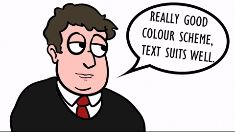
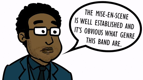
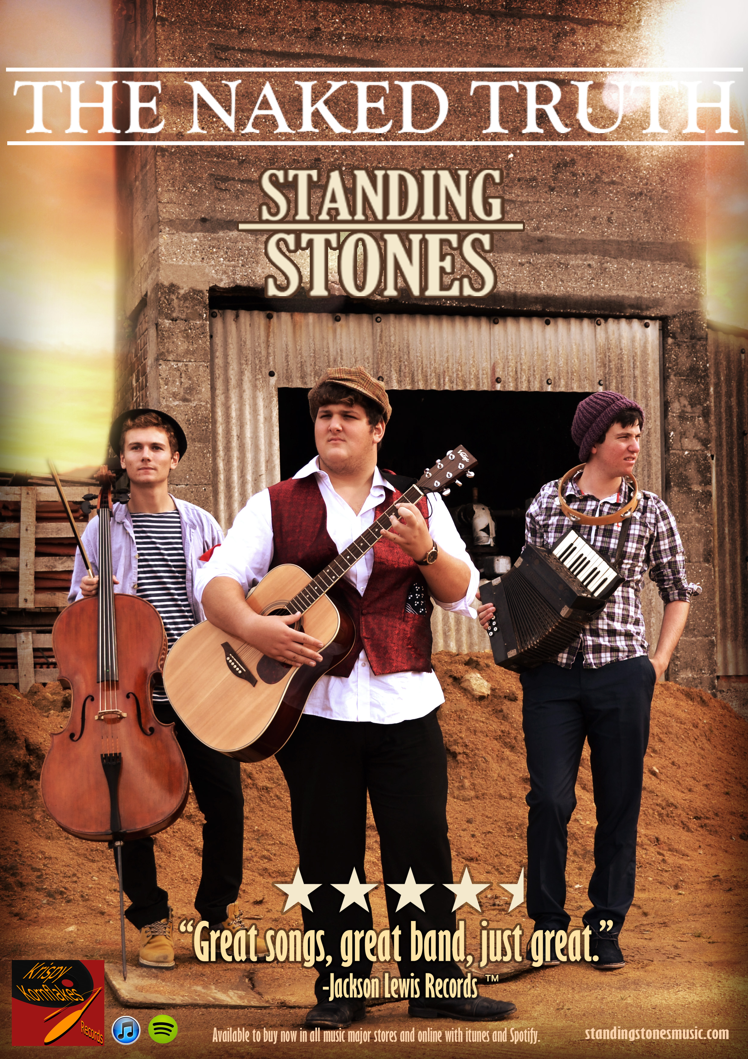
After we had all the footage for our performance section of the video, we created a rough edit in Adobe Premiere,  by cutting some random clips together with the razor tool. The benefit of this was to check all our footage would run well, and looked good on screen. We also used the rough edit as a chance to get some feedback on our footage. We showed the edit to some peers, and recorded their feedback. Then we overlayed that audio along our rough edit. The feedback was mainly positive, people really enjoyed the colours and the natural lighting. Also, our close ups and long shots were responded too well as people understood these were conventional shots of our genre. Watch the video above to see our rough edit with feedback.

VIDEO PRE-PRODUCTION 01: PERFORMANCE

PERFORMANCE SHOOT EVALUATION

perf shoot thum

Click above to view photos of our performance shoot in process.
I’m really happy with how the shoot for the performance of our video went, we were very lucky with the weather, and the natural lighting looked bright and golden which is just what we were going for, the western look. Everyone brought the necessary equipment, props and costumes thanks to our meeting agenda, and our performers, looked and performed brilliantly. We followed our shot list closely and were able to achieve nice big establishing shots, and colourful closes ups and more. One thing we’re not too happy with is that we had a limited amount of time to work with. Filming in winter meant that the sun set earlier, so we only had our golden light for an hour or so. So some shots are noticeable darker and these were shot when the sun was near to gone. Also we should have used a Steady-Cam because walking and moving around on rocky terrain made some shots quite shaky.

PRODUCTION MEETING AGENDA

pr meet 1

This is our production meeting agenda for our performance shoot. We arranged this so that our shoot would play out smoothly on the day, and no equipment would be forgotten. We made a list of props, costumes and equipment, and assigned each one to whoever could supply it, that way instead of one person supplying everything, it was a team effort. We thought hard about our performers costume design, and settled with generic ‘Mumford and Sons’ style waistcoats, shirts, trousers and boots. The document also includes a basic shot list. Please click the image to view our production meeting agenda.

VIDEO PLANNING

VIDEO SHOT LIST

shtlst

Here we have created two shot lists, one for our performance shots and one for our narrative. We have used our reverse storyboard to understand what kind of camerawork is conventional for our genre, and we have applied it to our shot list. We have also thought about composition, shot distances and briefly editing. Click the image to view the shot lists.


STORYBOARD

srybrd

Above is the storyboard for the narrative section of our video. We developed the story of a cowboy and his lover, that takes place in the wild west. When we originally came up with this idea, we had to think carefully, as mise-en-scene and locations etc. would be very specific. We have listed the shot types and length, and also sketched out what the shot will look like. Below the sketches is a short description of what will be happening in the shot. Please click the image to view the storyboard.


VIDEO TIMELINE

STUPID LIAM IS LEON

Here we have created a video timeline, which we will work from when shooting, and filming the video. In the center we have a timeline of the song, above is our song lyrics, and below is our narrative. We have written notes around the timeline for additional features, aswell as drawn small pictures for a basic storyboard to follow. From doing this we now know what we have to shoot, in what order, and the timings in which the shots will be placed with the song. Click the image above to view the timeline full size.

REVERSE STORYBOARD

reverse storyboard thumb

Here I have created a reverse storyboard of the performance in a professional music video by The Lumineers. I have closely analysed the conventional shot lengths, angles, movements etc. In order to try and stick to the genre when production our music video. From studying this professional text I now understand the conventional camera work of performance in the folk genre. Click the image above to view the reverse storyboard.

PRINT PRODUCTION DRAFT 2

Here is our second print production draft. We have made improvements based on our peer’s feedback. I’m really happy with how it all looks, and I think we’ve stuck to conventions well. Researching and analysis professional work has been useful in understanding the folk genre fully, and it’s conventions.

DIGI-PACK

Front:
1

 Here we have changed the text to a simpler,
easier to read font, and also created some
additional decoration.

Back:

2

We changed the text on the back, as our first
feedback revealed it wasn’t popular. Also we
added our record company logo.

Inside Left:
3

Here we increased some of the features like the
fabric and the colour, to make it stand out more.

Inside right:
4

Finally, here we added in silhouettes of our band,
aswell as changing the colour to a monochrome
brown to match the inside left cover.

ADVERT:
10155592_759035727466565_2531002799839410298_n

Here, we have changed the title text to a more intense font, with brighter colours.
Also, we moved the band’s logo down to the bottom right, and put the star review beneath the title, for a more conventional poster look. This looks alot better than our first draft, and comes across more professional and eye-peeling.

FEEDBACK:
Here is a short video featuring our peer’s feedback on our Print production draft 2.

FEEDBACK ON ADVERT DRAFT 1

Here I have created some cartoon gifs of some of our peers, and shown their feedback on our advert in speech bubbles. Click images see full moving gif.

ezgif.com-crop

ezgif.com-crop (1)

ezgif.com-crop (2)

Other than this positive feedback. We received a few comments about things people didn’t like. These were particularly things like our title text, as people thought this looked too small and not very eye-catching. Another suggestion people had for improvement, was that they weren’t fond of the way we have positioned the band logo. So it was suggested that we moved the band logo down, and put our star review underneath the title of the album, for a more conventional look, and eye-catching arrangement. We will go ahead and make these changes, to develop our advert to a higher quality.

ADVERT DRAFT 1

Here is the first draft of our band’s advert. We used the conventions we learnt from professional adverts such as harsh colours, bright lighting, dusty grainy photos, and folk style text. We also added our own record company label, aswell as icons for distribution platforms such as iTunes and Spotify. Click the image to view the advert full size.

POSTER DRAFT 1


ADVERT CONVENTIONS

Here we analysed a professional, folk genre poster of Mumford & Sons, and we explored the conventions of a folk poster. We looked at things like text, fonts, layouts, colours, information and pictures. Click the image to view the annotated poster. 
Picture1

 PREVIOUS STUDENTS WORK

Here we have analysed a students poster from last year, and looked for conventions in use. We firstly identified the genre of the band, and then explored the conventions that had been used. We looked at features like fonts, mise-en-scene, editing and information features. Click the image below to view our analysis.
GABY ADVERT

DIGI-PACK DRAFT 1

Here is the first draft of our digi-pack.
DRAFT 1

EVALUATION
I are really happy with the turn out of our digi-pack. One thing that we decided to discard was the edit of removing our bands heads. We tried this, and the band’s bodily proportions weren’t very clear, and people struggled to understand why we had done this. The colour correction we achieved is conventional and I am glad I achieved this. Also, the back cover in particular I am fond of because of the layout and sky edit. I also like how the inside of the digi-pack is monochrome, with brown on the left, and grey on the right. I think it works well and distinguishes the inside from the outside well.

FEEDBACK

Here we asked some peers for some feedback on our first draft. We gained some good responses and put them into a video. We will work from their opinions and hope to improve out digi-pack to satisfy their dislikes.

DIGI-PACK PRODUCTION

THE SHOOT

Here is a Slide-share of our Digi-pack shoot. We were really happy with how it
went, the location worked well, and the mise-en-scene looked authentic.

EDITING THE DIGI-PACK

Here we created a slide show of how we edited the first draft of our digi-pack.
Evaluation of Shoot:
  • We were pleased to have our planning documents. Our meeting agenda enabled us to be organised, and everybody turned up to the shoot with what they needed to provide.
  • Directing the actors was simple and efficient. Our performers were motivated and professional. Also, we didn’t require too difficult poses, just basic ‘hero shots’ of the band standing up. Their facial expressions were serious but don’t particularly matter seeing as we will remove their heads.
  • We are very happy with our location, the sand is a bright colour and contrasts well with the rusty, dark colours of the shack in the background. Our mise-en-scene worked very effectively, and looked authentic. Everybody provided the right clothing and looked good and full of character. We were also happy with the variety of shot distances we got, and decided to use a long shot showing the band’s whole body, with some space to the right of the shot, for text and titles. We used natural light, but it worked very well in bringing out the colours. We may replace the sky with a sunset, which we took as that is what we initially wanted to photography.
  • We will be editing the shots to bring the colours more contrast, and create the conventional ‘dusty’ look of folk albums. We will also remove our band’s heads, as we planned in our mock-up, and replace the sky.


DIGI-PACK PRE-PRODUCTION

We created a production meeting agenda for our digi-pack shoot, to ensure our performers knew what time we wanted to shoot, and that everyone knew what they needed to bring along for the shoot. We have organised a list of props and equipment to bring and who should bring them. Who requires transport, and who is our method of transport. We also prepared a shot list for each page of the digi-pack, so we knew what we had to shoot.

PRODUCTION MEETING AGENDA
Click the image to view our Production meeting agenda PDF.