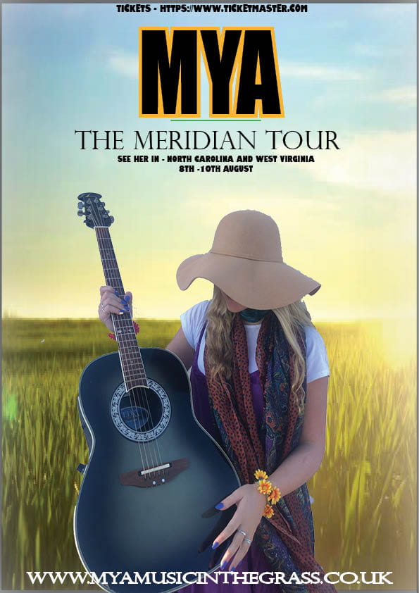
My Tour Poster
Below I have done some research on folk music tour posters/album covers, for my product I am aiming to design a Conventional tour poster, but also keeping a unique perspective. By looking at different tour posters I have been able to deconstruct ideas to use:
Fonts- Fonts have impact on the audience and also display the genre, by the genre being folk I think bold writing will have a good effect due to the fact it’s simple and clear, however, the ‘pacifico’ font will be useful since it is flowly creating a relaxing atmosphere for the reader, although it needs to be kept to a limited use.
Colour- Through researching I have been able to depict that pastel colours are most common as they signify a calm mood.
Overall the tour posters are portraying a organic image for the audience with a use of limited writing which gives off a stronger effect.
Above I have created a tour poster including the image I captured and the genre ‘Folk’. By using indesign and photoshop I have been able to cut and develop my image in ways I want, but also keeping in mind what is most appealing to my target audience. When creating my tour poster I kept in mind the slideshow I included above to help portray my ideas.

