
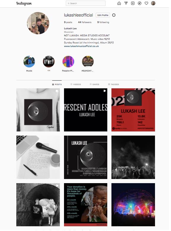
Here is the second draft of our social media page, we have adjusted comments and added in new highlights and posts to ensure that we have used all the technical conventions of an SMP.
After sending our draft 2 to our teacher, she has sent us feedback on improvements and additions that we could use to make our page to the best of our ability. With the analysis sent, we can now decode the information given and use it to modify our social media page.
TARGETS FOR IMPROVEMENT :
TEACHERS FEEDBACK:
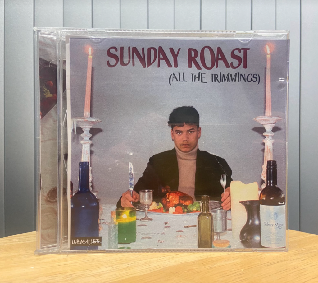


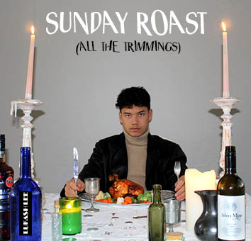
After putting our digipak into the casing, we asked people in our class to do a survey on which genre they think our digipack represents, this was to give us an idea of how well our work represents the album.
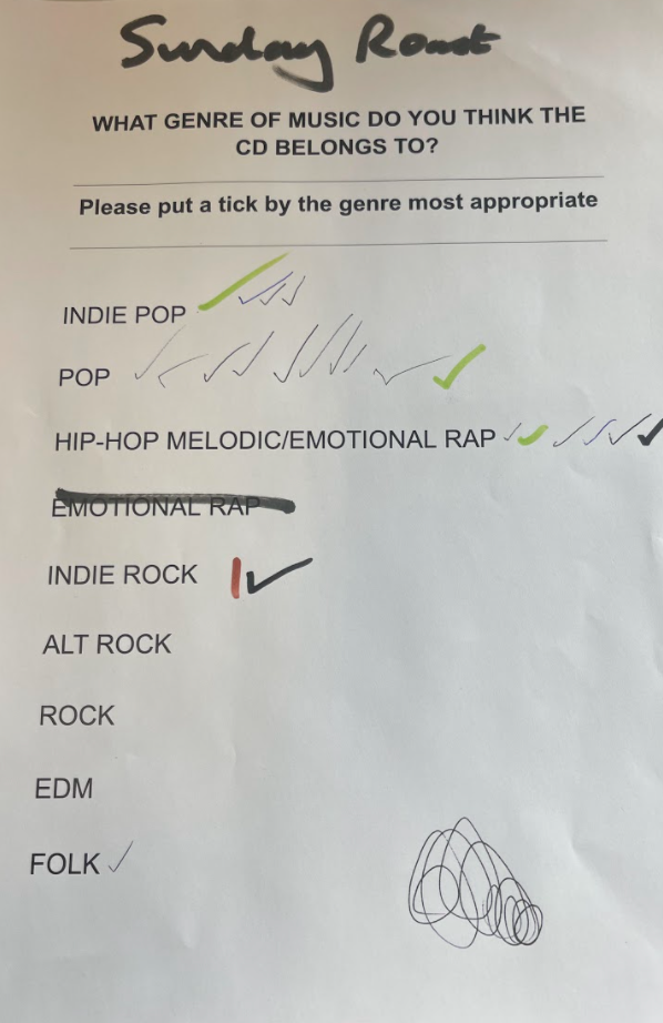
After looking at the results of our survey, it is clear that not many people thought that our digipack was from the indie-rock genre, however we have opted to not make too many dramatic changes as after doing in depth research of the genre, we know that ours fits the criteria well.
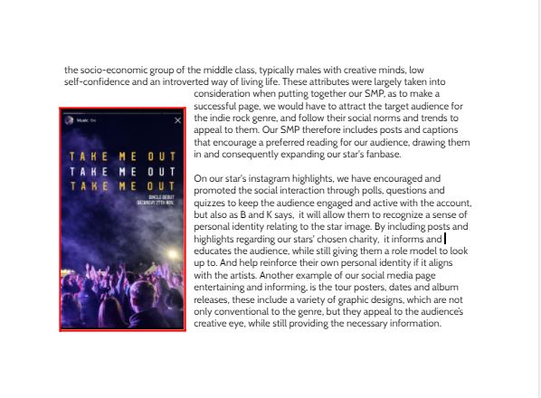
Below, is the first draft of our social media page. While creating a social media platform, we understand that it is important to include technical conventions, not only to the genre of indie rock, but also a social media page in general. For example, including a marketing campaign that will promote and create awareness of our star and ensure that it reaches our target audience.

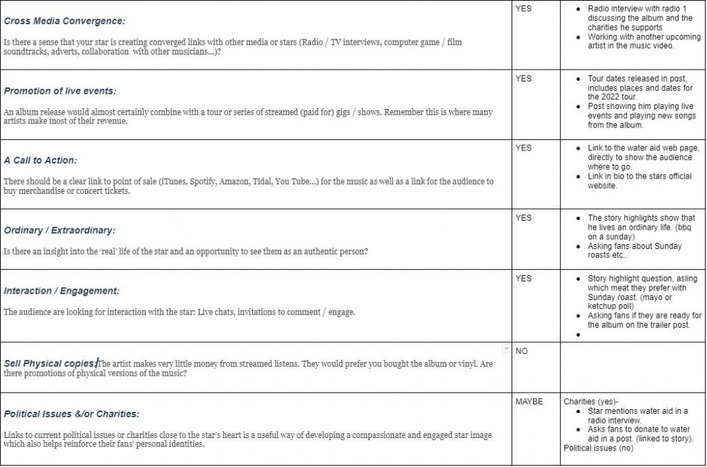
TARGETS FOR IMPROVEMENT:
By analysing a currents bands social media page from the indie rock genre, it allows us to understand the technical conventions that are used to create a successful social media platform. After looking at Oasis’ Facebook account, I am now aware that marketing campaigns and teasers can be useful in order to reach the target audience.
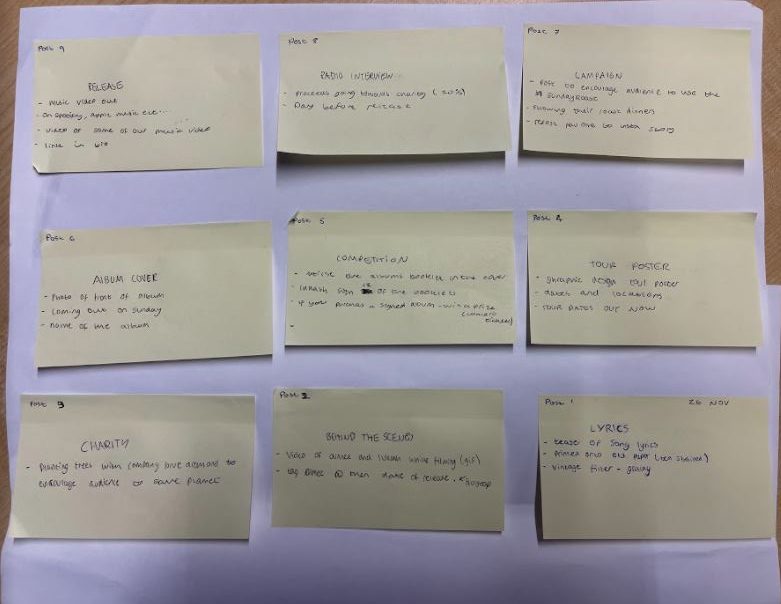
As a group we decided it was important to have a plan in order, of the timeline of what we want to post and when we want to post it. Even if we don’t follow this guideline directly, it is helpful to know that we have roughly planned a post for each day. Our plan needed to include posts that will entertain yet inform the audience, we needed to take AIDA into consideration as this is an useful way to keep the viewer engaged with the social media page. Teasers, promotions, tour dates and charity work are some of the tools we will use for our SMP, by doing so, it will create informative yet socially interactive posts which will allow our stars personal identity to come through, but also produce a personal connection with the audience.
For our social media marketing campaign, we researched into current artists ongoing and old campaigns in order to get a feeling for what would fit our star and brand. Here are a few ideas we came up with:
Campaign – inspired by Faithless’ campaign
Competition – inspired by Phoebe Bridgers campaign
Instagram filter – inspired by Phoebe Bridgers campaign
TikTok sound – inspired by Clean Bandit’s campaign
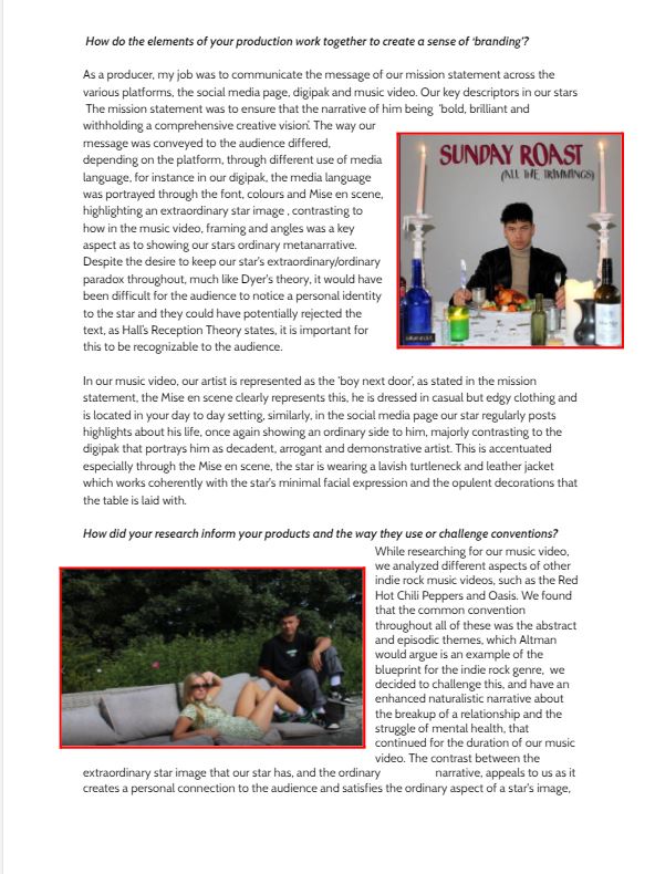
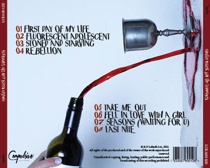
Below, is our second draft of our digipak, we have tried to include a simple structure throughout the four panes, but also keeping it conventional to the indie rock genre. In order to do this, we kept our colour pallete, font/typeface and overall aesthetic of the digipak the same. Although our images seem extraordinary to other genres, this is usual for ours, and fits in well with other band’s covers, such as Oasis and Arctic monkeys.
Before we put our images onto the digipak, we manipulated them on photoshop and played around with the filters, sharpness and graphics. This was because many of the photos we had taken were too sharp, and therefore did not represent our star image and branding in the way we wanted to.

Here is screen-castify of our teachers feedback for our digipak, we will work on the comments given in order to ensure that it is he best of our ability whilst still being conventional to the genre.
Targets:
It is important that we are able to self assess our work with a close analysis, this will enable us to look closely at our digipak to see what needs improving but also what works well. In order to complete my self assessment, I used the assessment criteria to compare with the front and back cover of our digipak, this included seeing whether the star image and brand package was being portrayed through the conventional and technical elements.
TARGETS FOR IMPROVEMENT:
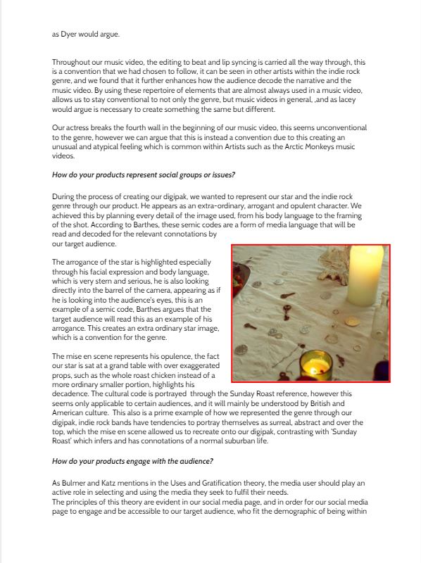
Here are the contact sheets for the shoot of our digipak, overall we are happy with how the shoot went, as the photos have turned out how we envisioned and planned. We were much more organized compared to other shoots we have done previously, and this made a big difference. Some of the images are not in focus, however we made sure that it was fixed in order to get photos that were sharp and focused. Despite us not using a variety of angles, this was purposefully done and the mise en scene keeps the audiences attention and keeps the image interesting.
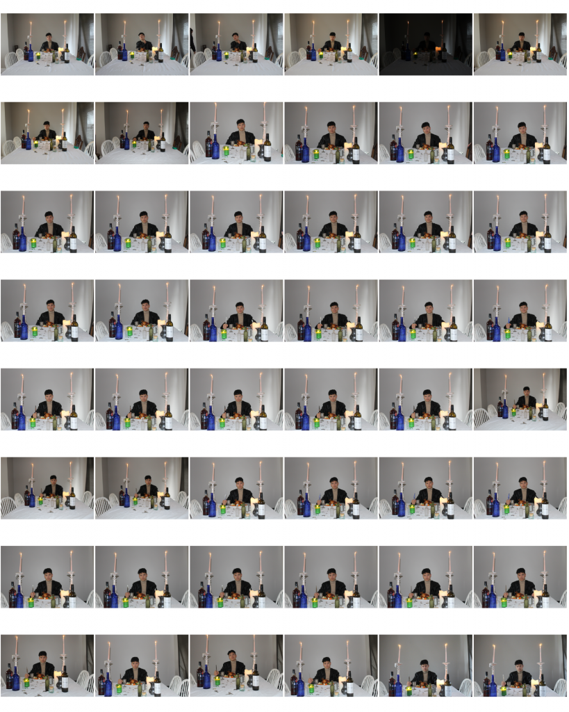


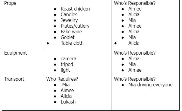
As a group, we sat down and planned our shoot, with a production meeting agenda and a risk assessment. These are crucial for the shoot, as it ensures everyone is kept safe and we are well prepared for it.