Category: Planning

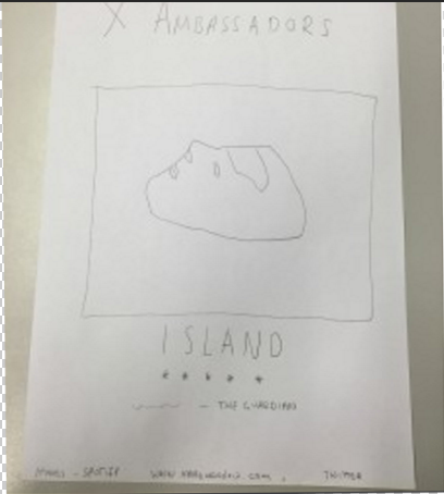
Advert Mock up – Feedback

This is our first mock up of our advert. We feel like this is a good first mock up as it gives a clear idea of what we need to produce when we come to digitally drawing up our product. We asked around and got some feedback so we could set ourselves some targets.

  • Put ‘out now’ underneath ‘island’.
  • Fill the gap between the review and the website.
  • Centre the picture a bit more.
  • Fill the outside edges.

Obviously this is our very first draft, so we still have a lot to do but these targets we have set are going to help us to produce our advert very well and give the audience a clear understanding of what we are trying to produce.

Hand Drawn Mock Up – Advert

This is our hand drawn mock up for our advert, we have decided to use our front cover as it will make people familiar with the front cover of our digi pack.

Screen Shot 2016-01-18 at 14.10.12

We are going to start our digital mock up now and recreate this mock up on photoshop.

Digi Pack – Risk Assessment

This is our risk assessment for our digi pack shoots, we are following this closely to ensure that nothing is going to go wrong and everything will go smoothly so we can complete our shoots easily.

image

We have assessed all the risks possible and we feel as though it is safe enough to shoot here and not be at much risk of anything on the sheet.

Digi Pack Production Meeting Agenda

This is our production meeting agenda for our digi pack shoot, our shoot is very simple so therefore we only have a few different shots to take, but we will take them at different angles and get the shots perfect.

Screen Shot 2016-01-07 at 09.05.31


We feel as though this shoot will give us all we need to product a good digi pack, and our effective editing to the shots will produce character and give the photos what they need to be exciting and really show off the ‘renegade’ style of our performer and song.

Digital Digi pack mock up – Feedback

We have taken some images that give us inspiration and how we want our digi pack to look. We really like the simplicity of the line drawings but from other feedback we have received our audience aren’t sure of the correlation between the line drawings and our genre.

  • Possibly put a picture of the band on the back cover and keep the inside covers for the other pictures.
  • Colour correct the pictures to be darker.

Although we didn’t get much feedback this time around, we feel like this feedback will help us to further our digi pack and produce it to our audiences’ likes and dislikes.

Digital Mock Up – Digi-Pack

This is our Digi Pack mock up, we aren’t going to copy the images that we have used but we are taking inspiration from them. We like the front cover because only being able to see the mans head gives a mysterious image and portrays our rebellious Genre. We like the simplicity of line art drawings and how they look roughly draw for the same reasoning. We feel like line art will go really well in our digi pack. The image of the band is very important as the audience are then able to see the band fully and not just in the Music Video.

DIGI PACK MOCK TF UP

The digi pack is very important and we have spent a lot of time thinking of different images we could take to make it look brilliant and really show what our Music Video and the Genre of alternative rock/folk is about.

Draft 1 Digi Pack Feedback and Targets

After showing a number of people our front, back and inside covers for our first draft of our digi pack, we were happy with their feedback, saying that our digi pack and video linked well together. Here are a number of things that they enjoyed about our digi pack:

  • The colours in the digi pack
  • The scenery for the pictures of the band
  • The connotations between Ben and an island and also the hat and an island, when asked, most people said they understood the relation.
  • Most people said they thought the fonts were a good choice for the genre.

Some things the people we asked said we could work on:

  • The line drawings don’t work with the genre so maybe just have the original photo with some minor editing to colour, contrast, brightness etc.
  • Consider changing some positioning around.

This feedback we received has been very positive and we are going to work from these targets we have set.

Digi Pack Mockup – Feedback

We took our hand drawn mock up around and asked people what they thought of our ideas for our digi pack – we took images from Google to help us with our ideas of what we wanted our digi pack to look similar to. We produced some targets to further our production.

  • Possibly change the name of the album to something other than the song name.
  • Change the tree – no significance.
  • Put the album title and band name on the spine.
  • Put more line drawings in on the back cover.

We are going to take these targets away and start to digitally produce our digi pack.

Digi Pack Mockup

This is our digi pack mockup, we have planned this throughly and although neither Elliot or I are particularly good at drawing we think the first three sides are done well and are going to keep our ideas. The stick men are actually going to be a picture of our performers and therefore we can’t draw them properly.

Screen Shot 2015-12-16 at 10.58.52


We are going to take our pictures for the digi pack soon and continue to progress with it.

Digi-Pack Moodboard

This is our Digi-pack moodboard, we have looked in depth into the different styles of drawing, different fonts and pictures that we like and we feel would suit our genre and artist’s style. From this we have found many different styles that we liked, such as Keaton Henson’s style of drawing, Alt-J’s album cover style and Bear’s Den’s font.

Screen Shot 2015-11-20 at 09.00.59


We are still undecided as to what we are going to do, but we feel like a line art drawing, such as the one of the tree on the light pink background. We feel as though line art is best to represent our band.