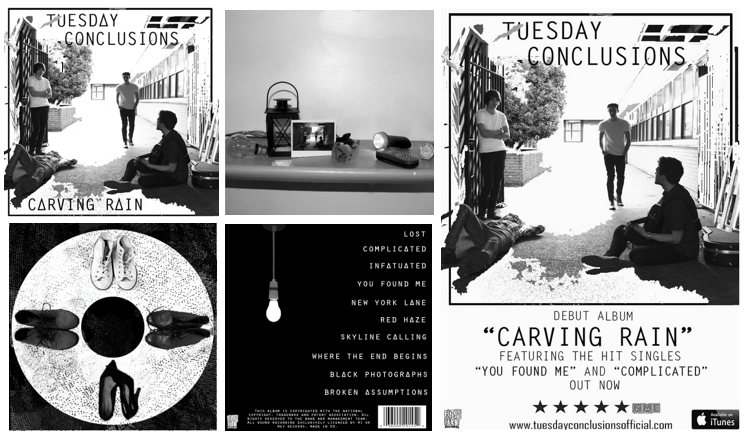
Here I have combined the final versions of both the digipack and advert so we can see how they both fit together as a package.
This is our final digipack and advert:
Here I have combined the final versions of both the digipack and advert so we can see how they both fit together as a package.
This is our final digipack and advert:
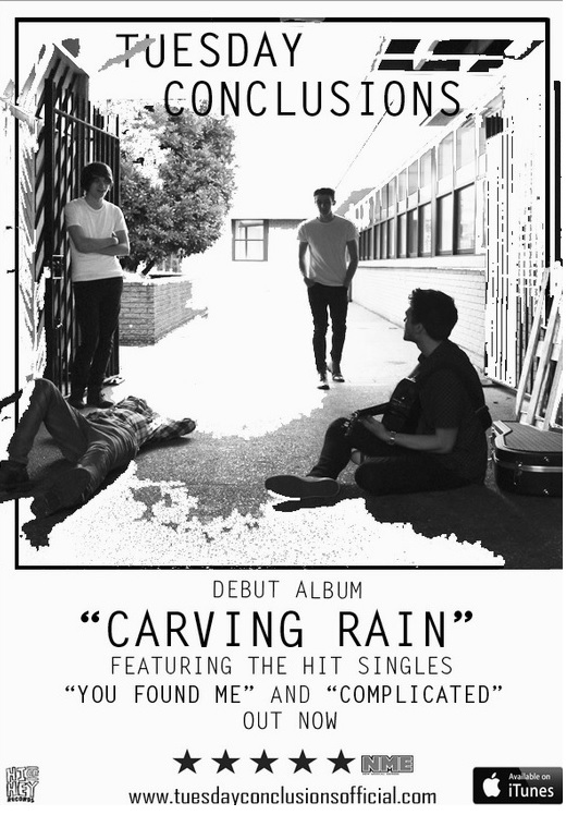
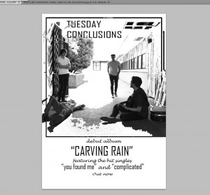
In our advert, we have included the conventional features such as the image, band name, album title, ratings, website, record label, hit singles and where you can find the album, e.g- iTunes.
We had decided to change the fonts as we preferred this and suited our genre better. We also added a rating from the NME magazine as their target audience is Indie/Rock enthusiasts which fits in well with our genre. Additionally, we have included the ‘available on iTunes’ logo so that our audience will be able to know where they can listen to the album.
This is our final advert:
Here is the feedback we received:
Front Cover:
Inside Left:
Inside Right:
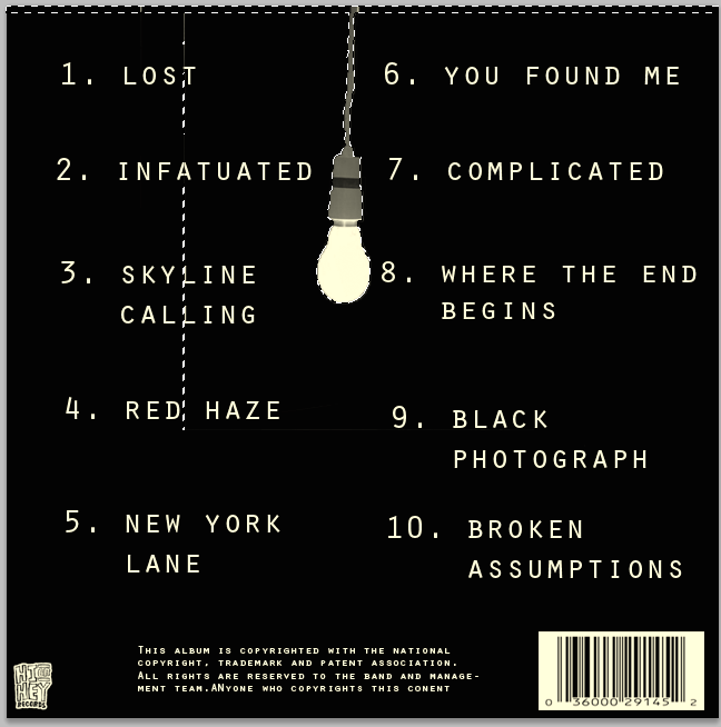
Back Cover:
Spine:
![]()
Below is our digipack in a CD case.
Front Cover:
Inside Left:
Inside Right:
Back Cover:
Spine:
Final feedback we received:
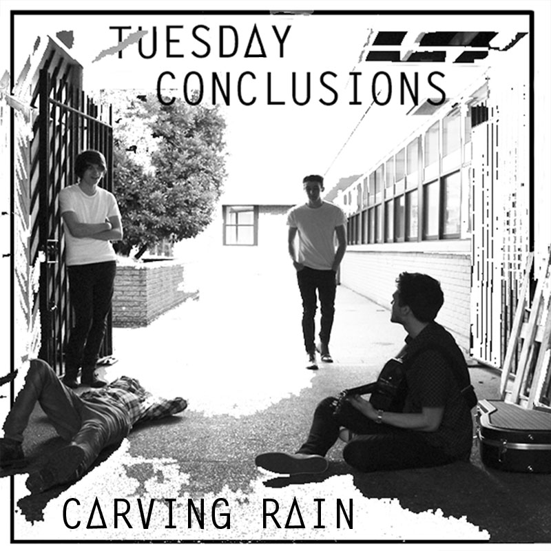
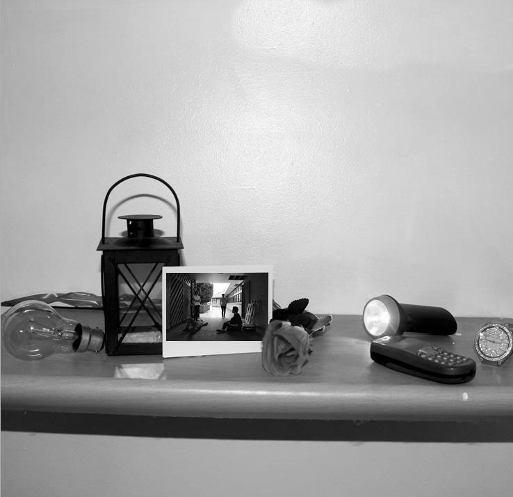
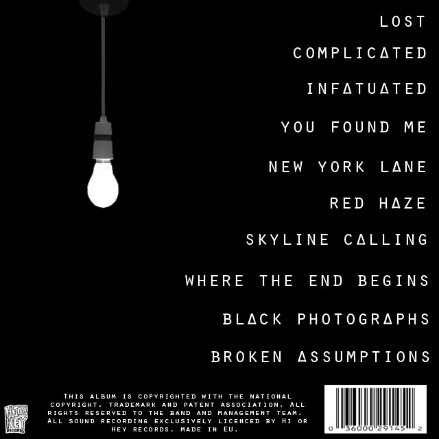
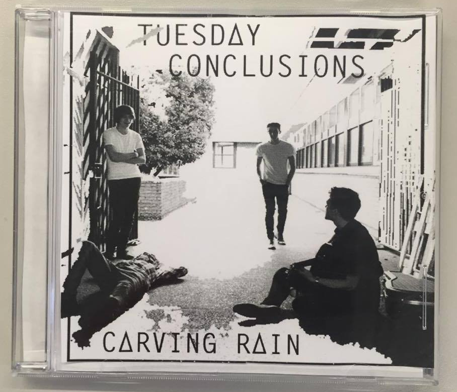
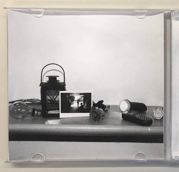
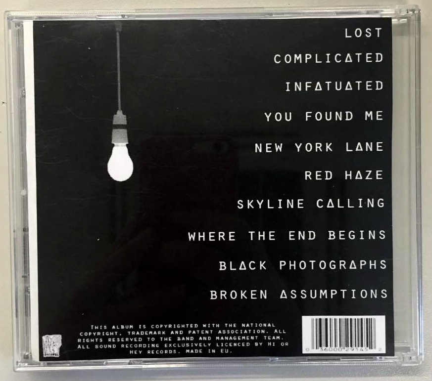
We have created a digipack that fits within our Indie/Rock genre and includes the conventional features of a digipack which consists of band name, album name, image, record label, copyright information and bar code. We altered this version by changing the font on the front cover in order for it to be consistent. Likewise, we changed the A’s to triangles to make it unique and different. Also, on the inside left we transformed the image to black and white so that it fits in with our genre. In the inside right we combined a texture from a blanket to form these black dots which turned out to be effective.
Front Cover:
Left Inside:

Right Inside:
Back Cover:
This is our feedback from Jess:
What went well:
After we had hand-drawn our advert, we then went on to experiment digitally and create a draft 1. I had originally created a border for the image to go into which also the band name went into as well.
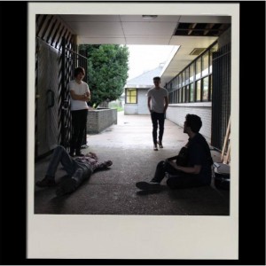
We took the photo which is on the polaroid in the digipack and transferred it to the advert which illustrates a link between both the advert and digipack. Viki changed the image to black and white which fits into our colour scheme on our digipack and explored ways of making this image more interesting and creative. She used a tool called the ‘magic eraser’ which added white elements to the image. Her original idea was to erase the image around the border however this turned out better than expected and we decided that really liked the outcome.
This is our draft 1:
This is our feedback:
Continuing from the digipack shoot, we incorporated the ideas we came up with from the digital mock up into this draft. However, in the post-production process we thought of new ideas which worked better that we experimented with such as using a horizontal shelf instead of a triangle shelf as this looked more professional.
This is our first draft of our digipack.
Front Cover:

Using Photoshop, we have transferred the image of the band onto the polaroid and in the inside left cover below there is a close up of the polaroid with the same image.
Inside Left:
Inside Right:
Back Cover:
This is our feedback we received:
What worked well:
To improve:
Whilst doing research for our digipack we came across a certain one that inspired us which was the Oasis ‘Definitely Maybe’ front cover. We really liked how relaxed and ordinary they appeared and wanted to do something similar in our digipack.
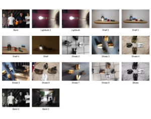
This is our contact sheet:
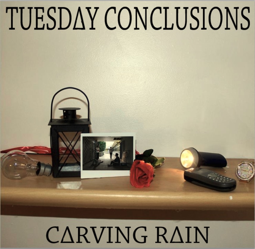
We were originally thinking of creating a triangle shelf for one of the covers of our digipack however we did not have time to create one or find one anywhere. However, Beth had a shelf in her house which is just horizontal but worked well instead.

Some of the band photos we captured were good but in my opinion I think we could have explored more locations to shoot and use interesting, unique composition to fit with our genre if we had more time to do so.
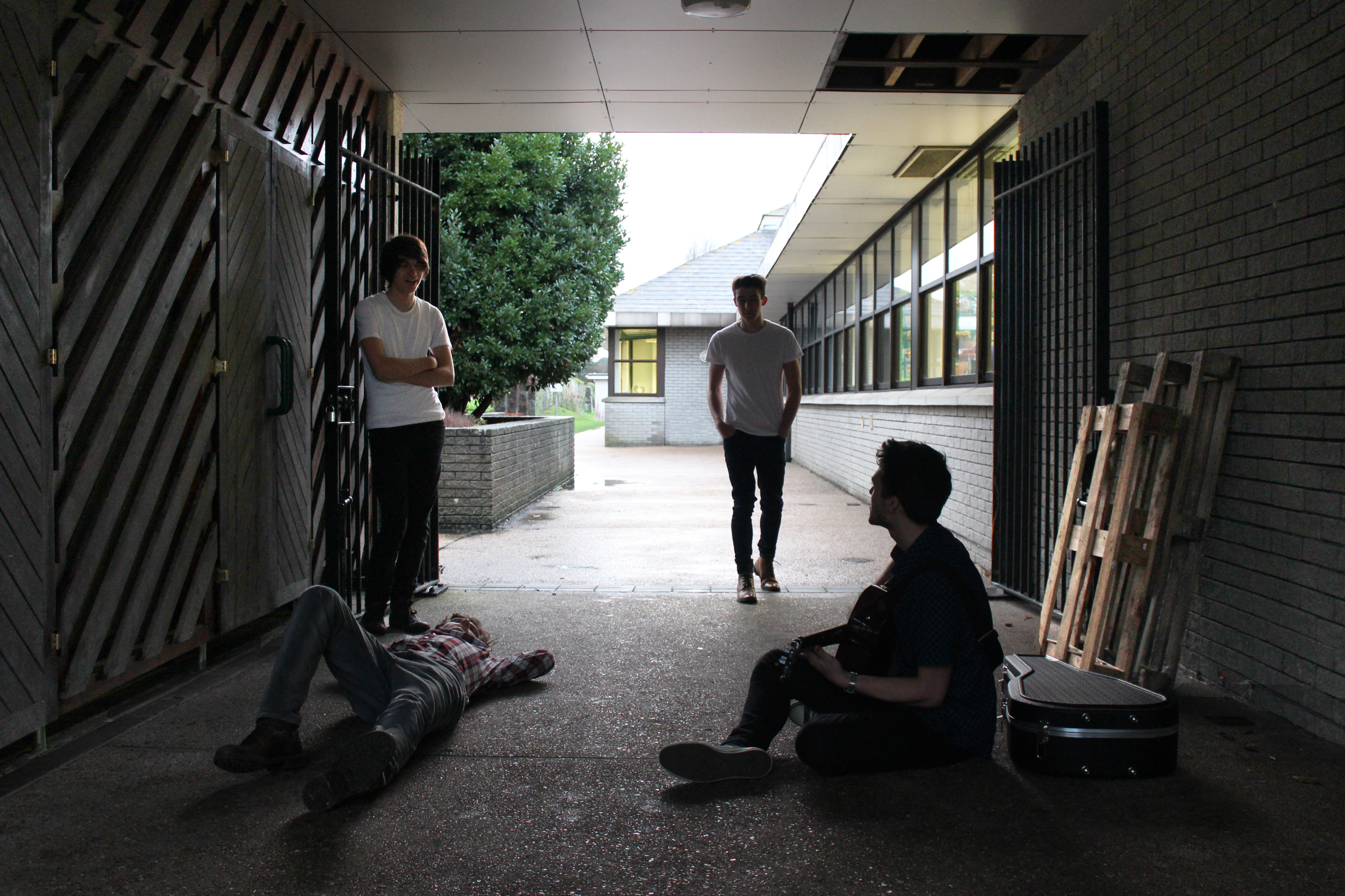
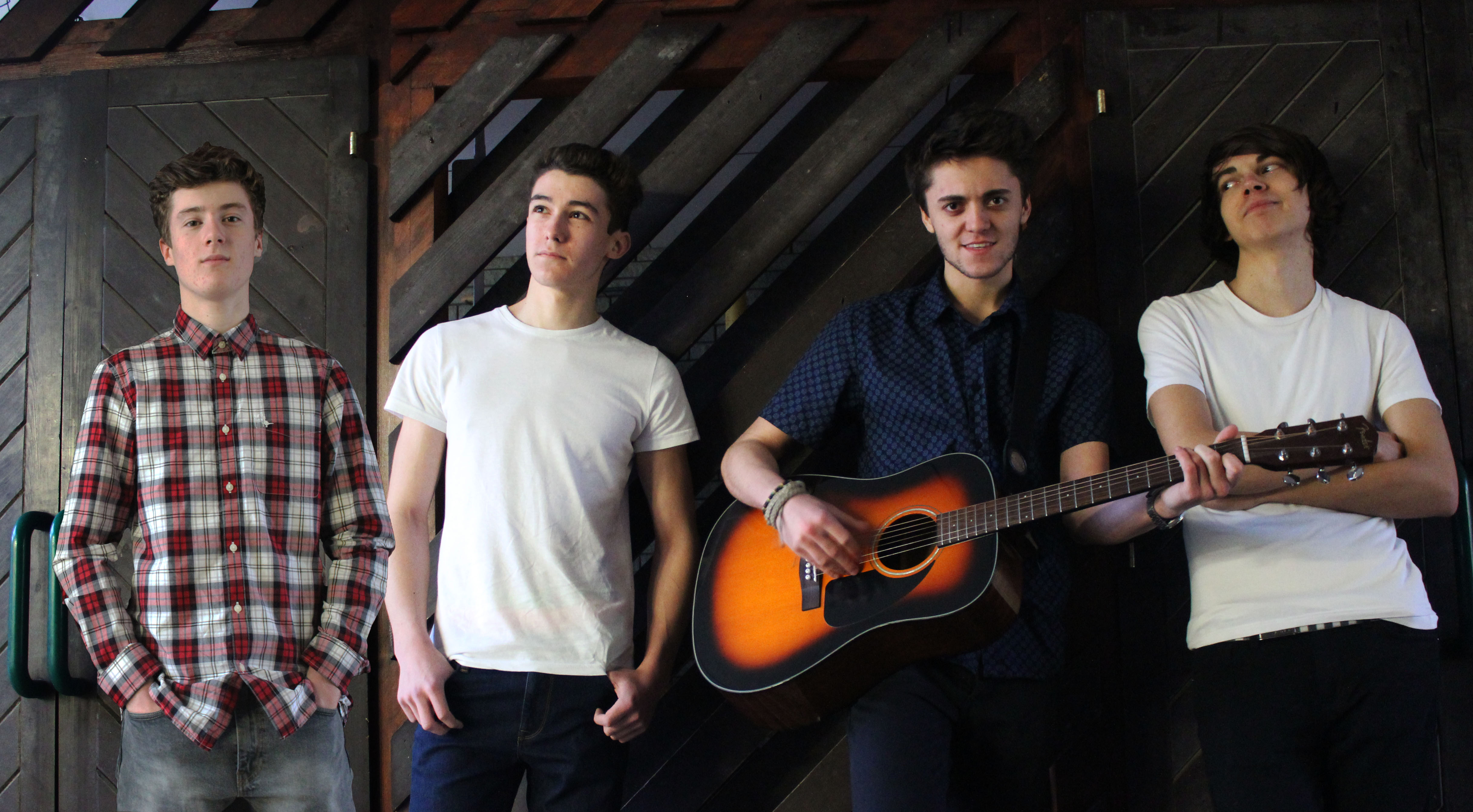
I prefer the first band photo because of their body language and composition. This works better for this genre rather than the second photo as this one looks staged, unnatural and more boy band-like. Additionally, the first photo is inspired by the Oasis front cover which I mentioned earlier.

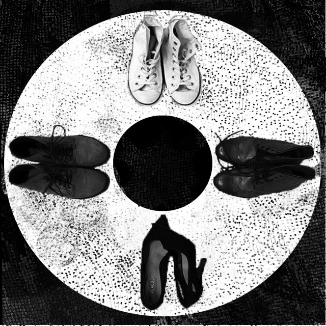
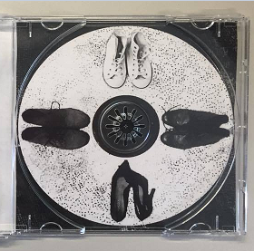
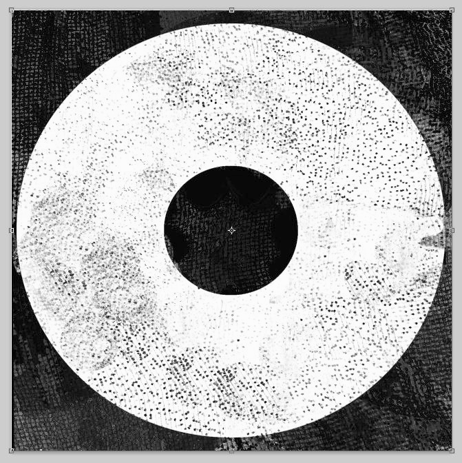
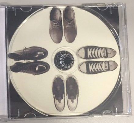
I really like the textured background to this image with the black dots. We were thinking of putting the 4 pairs of shoes on the inside right cover where the CD traditionally goes.

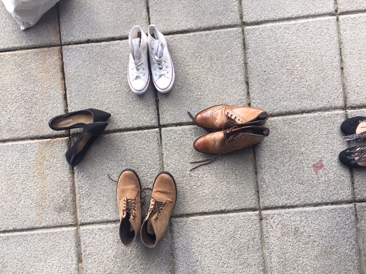
We also experimented with these shoes on different backgrounds such as on the floor inside the Grammar School and on the outside floor but I don’t think these worked as well in my opinion.
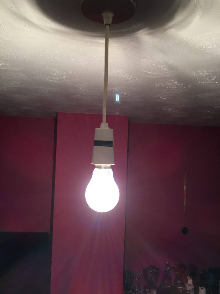
We captured a photo of a light bulb in which we could edit onto our back cover. We decided put the light on which looked quite effective.
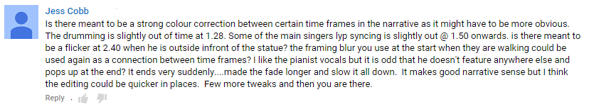
From our previous feedback, we took this into consideration and made sure that the narrative makes sense and the colour correction has been used appropriately. Furthermore, we replaced the shot of the drummer at 1.28 to a different shot of him drumming so that it was in time with the beat of the song.
This is our draft 2:
We recorded two peers giving their opinions of our draft 2 and what we could improve, here is the video:
Likes:
Improvements that could be made:
In this draft, we added a transition called ‘dip to white’ to create a flashback effect which is used just after there is a trigger shot so we understand what has happened previously in the narrative.
This is our draft 1:
Here is the feedback we received from YouTube on this draft:
Targets and what to tweak:
This is our audio feedback: