January
23
Complete Magazine Draft
What went well:
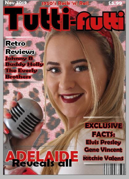
- Masthead is good
- Good star image
- Effective leopard background on the front cover
- Well-known 50’s artists, easily recognized
- Catchy cover lines nice image and columns
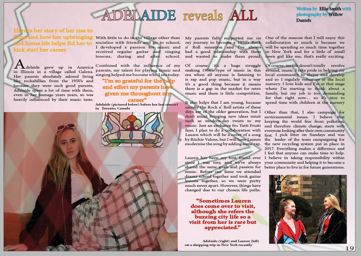
- Good idea to use fruity background in double page spread
- Quotes work well on double page spreads
Targets
Front cover:
- Masthead needs to have more of a 50’s vibe, maybe add a block colour behind it
- “Facts” could be removed and just keep the word “exclusive
- Change the names of artists on the front to shorter names for clarity
- Another colour to be added to keep it interesting
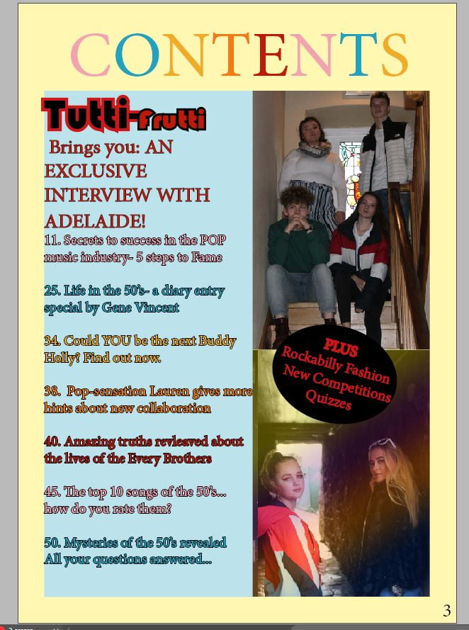
Contents page:
- Use tutti frutti font on the contents page so that it carries on the theme from the front cover
- Make headlines and layout more interesting by using block colours
- Center cover lines to add energy, use upper and lower case letters
- Crop images to just Adelaide and more rock and roll imagery to be embedded
- Images of old fashioned things like guitars
Double page spread:
- Fix the quote line spacing
- Make dress fabric image in the background smaller, use the cherry as a logo for tutti frutti on front cover
- Make image of her bigger or crop it
- Make headline bigger, make sure it doesn’t go across the fold
- Change the layout of the images
Screen castify