July 16

Design Skills 1

Editing footage is really important to help footage stand out and highlight aspects of the narrative. We used premier pro to achieve this:

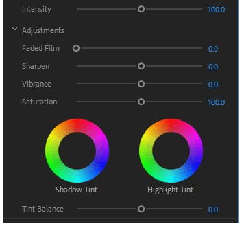
  • By using Lumetri colour we were able to make our shots more eye-catching and bright, helping to convey the performer as vibrant and strong. We used a variety of different colours and used our own that we had created on the wheel to add authenticity. Not only can you just add colour but you can change the vibrancy and saturation ect. This has been very useful when wanting to add something extra to the footage and make it more fun and attention grabbing. The colours impact on the star image as they make the artist look more edgy which compliments the genre of R&B


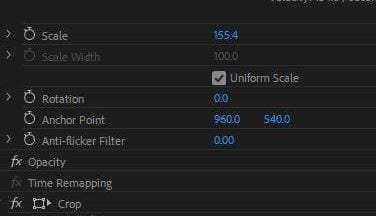
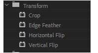
  • By using the effect controls we were able to change the positioning of footage, crop, rotate ect. This helped enlarge the desired areas of the image so it will make the audience concentrate on the specific area. By being able to position the star around it made us able to focus the star for when being viewed which could help portray a connection from the star to the performer so they don’t feel isolated and feel involved. It also helped when he had filmed footage too far away and needed to crop out things that didn’t fit in to the narrative or comply with Mis-en-scene (such as plug sockets)


  • Using generate has helped with adding unique effects to the footage, for example we used lighting in ours to add something small and new.  There are other special effects that we could use such as lens flare, and 4 colour gradient. Using bold effects represent the genre R&B as they are all confident, strong artists. It also displays a power for the star image, we used colours such as purple and orange to convey power.


January 28

A new Improved Complete Magazine Draft

Above my my new and improved pages of my magazine.

Targets to improve:

Front cover:

  • Add some dimension with a drop shadow to the yellow box behind the masthead
  • Check the line spacing
  • Add in more names along the bottom and on the left side
  • Change the “frutti” part of the mast head to the colours used on the contents page

Contents:

  • Separate the columns and images with boarders
  • Give a page number for the double page spread
  • Put another plug in near the top of the page
  • Make the headlines upper case and extra information lower case

Double page spread

  • Make background smaller to show off more of the design
  • Make title bigger
  • Add boarders to photos to make them stand out
  • Move the caption of the main cover star to make it clearer
January 28

Adverts


Above are some adverts I have selected to go in my magazine. I chose them because they fit my audience demographic.  I aim to reach out to middle aged members of society who appreciate older music even though they live in modern day society. I used my audience dating profile that I created to remind myself how to attract my target audience. They are good because

  • They have a strong 1950’s vibe to them, with Audrey Hepburn on the contemporary MacDonald’s advert who was a huge style and fashion icon during this time.
  • They are energetic and vibrant and which fits my narrative.
  • They don’t contain too much writing and so are easy to read and they feature modern day advertising for apps that give an element of pop to my work.
January 28

So…How is it going?

Transferable skills:

  • Transferable skills are those that you develop as you progress through employment, education or training.

Transferable skills I have learnt…

  •  Critical analysis: I’ve had to ask for feedback on my work and take into account the feedback to improve my work
  • Communication: I have had to communicate with my models to make sure I could take photos and ensure they had the correct costumes, and I have had to communicate with my teacher to receive feedback and also discuss ideas for my magazine
  • Managing time: I’ve also learnt how to manage my time effectively, for example setting times for photo shoots and making sure not to waste time so that the shoots could be completed
  • Teamwork: I’ve learnt how to work in a team and share out tasks, such as bringing in costumes and being a model

So far, I think there are many aspects of my magazine that have gone really well. For example:

  • The outcome of my first photo shoot was good and helped to make my magazine look sharp and fitted the genre.
  • My masthead design is very fitting to my narrative

However there are a couple of things to improve upon:

  • I need to add in some rockabilly icons on my contents page and front cover to keep my chosen genre clear to my audience
  • I also need to make some of the writing clearer on my double page spread as the background makes it difficult to read
January 24

Design Skills 2

I used a variety of tools on in design  in order to create unique effects on my pages to make my magazine stand out.

I used the circle text box frequently so that I could create vinyl themed bullet points to add to my narrative of 1950’s Rock and Roll.

The fx tool allowed me to create modern effects and add them to my magazine which was important because I needed to convey an element of pop to modernise my theme. I also used tools such as the gradient tool to add colour  to the my images of my models to help portray my genre. I chose colours and effects after studying the demographics of my target audience in order to grab their attention.

January 23

Complete Magazine Draft

What went well:

  • Masthead is good
  • Good star image
  • Effective leopard background on the front cover
  • Well-known 50’s artists, easily recognized
  • Catchy cover lines nice image and columns
  • Good idea to use fruity background in double page spread
  •  Quotes work well on double page spreads


Targets

Front cover:

  • Masthead needs to have more of a 50’s vibe, maybe add a block colour behind it
  • “Facts” could be removed and just keep the word “exclusive
  • Change the names of artists on the front to shorter names for clarity
  • Another colour to be added to keep it interesting

 Contents page:

  • Use tutti frutti font on the contents page so that it carries on the theme from the front cover
  • Make headlines and layout more interesting by using block colours
  • Center cover lines to add energy, use upper and lower case letters
  • Crop images to just Adelaide and more rock and roll imagery to be embedded
  • Images of old fashioned things like guitars

Double page spread:

  • Fix the quote line spacing
  • Make dress fabric image in the background smaller, use the cherry as a logo for tutti frutti on front cover
  • Make image of her bigger or crop it
  •  Make headline bigger, make sure it doesn’t go across the fold
  • Change the layout of the images

Screen castify