January
28
A new Improved Complete Magazine Draft
Above my my new and improved pages of my magazine.
Targets to improve:
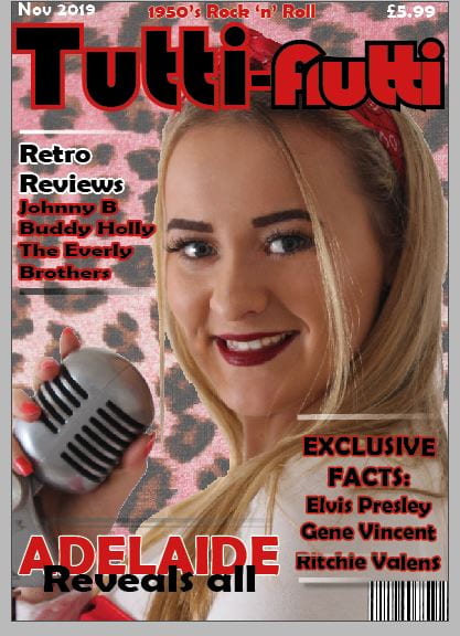
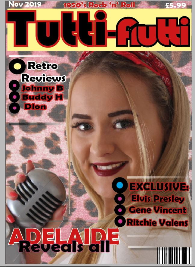
Front cover:
- Add some dimension with a drop shadow to the yellow box behind the masthead
- Check the line spacing
- Add in more names along the bottom and on the left side
- Change the “frutti” part of the mast head to the colours used on the contents page
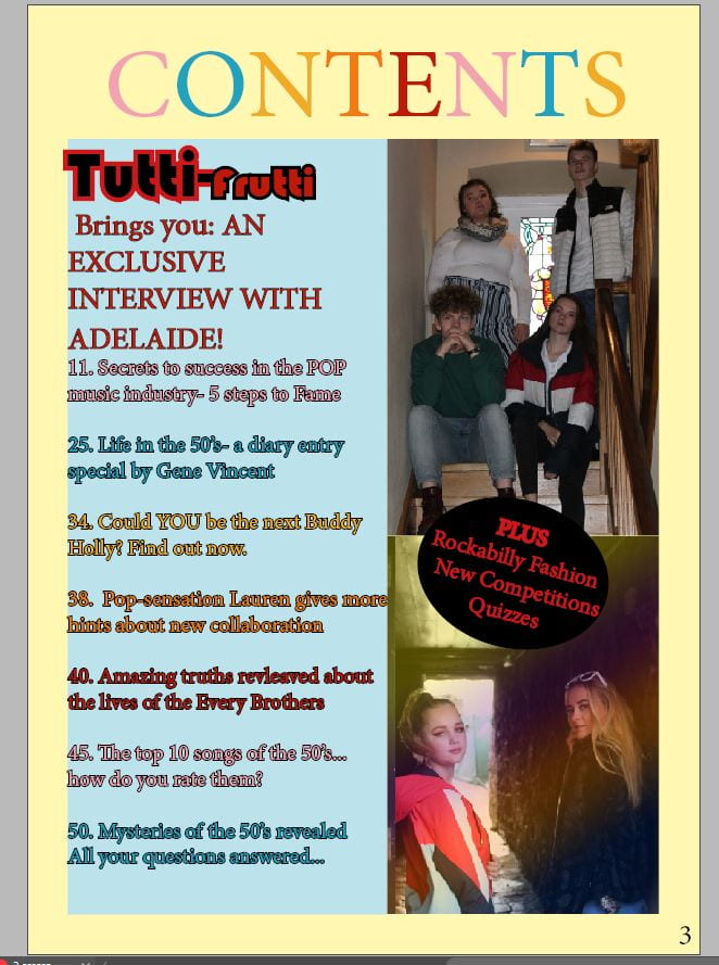
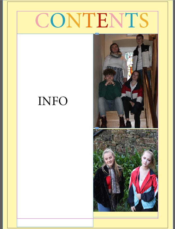
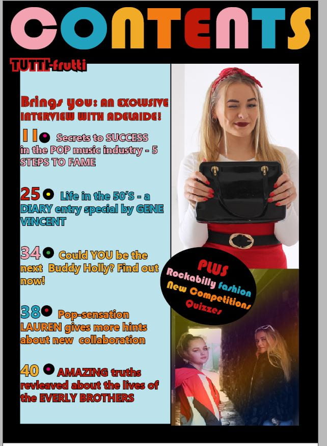
Contents:
- Separate the columns and images with boarders
- Give a page number for the double page spread
- Put another plug in near the top of the page
- Make the headlines upper case and extra information lower case
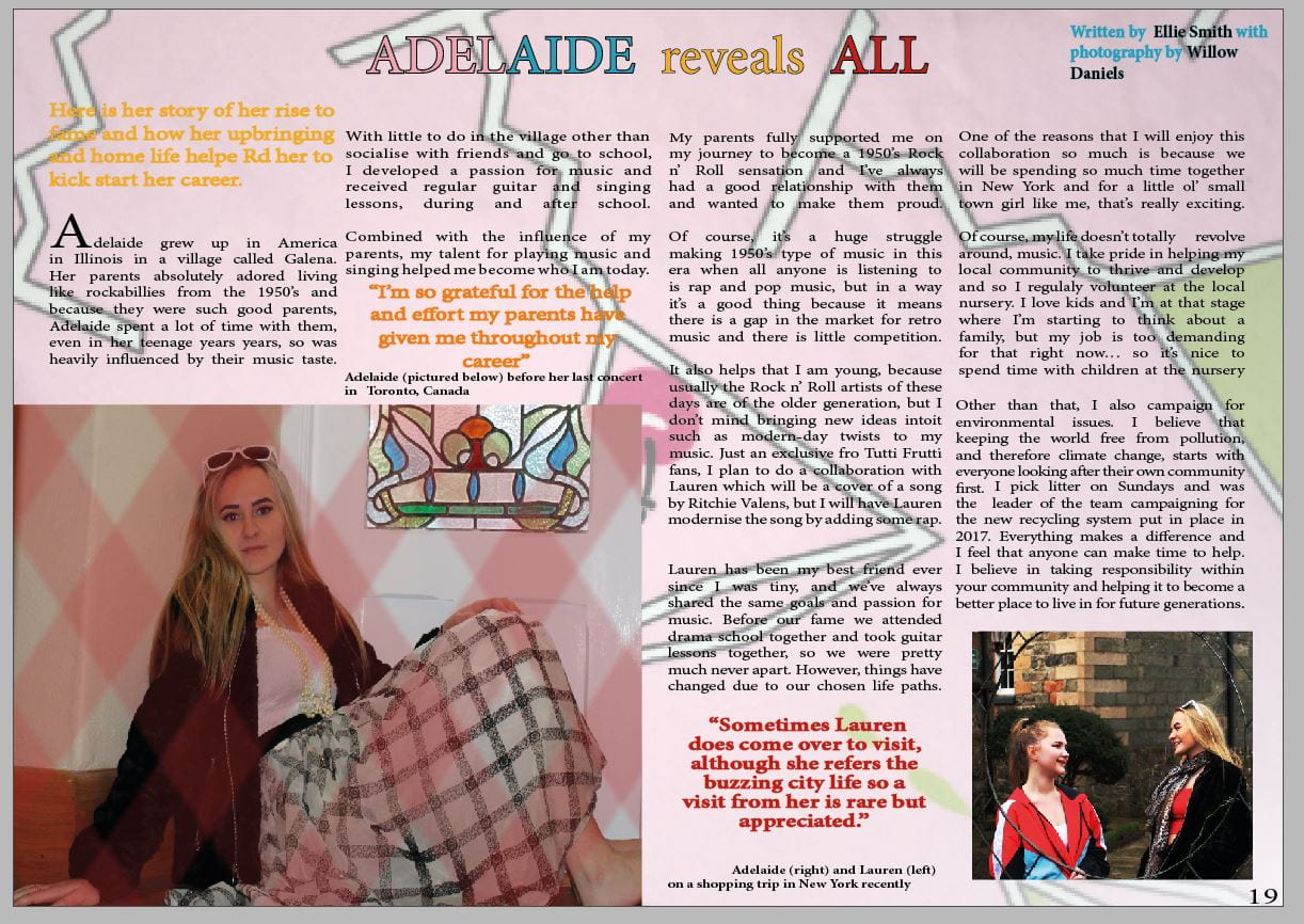
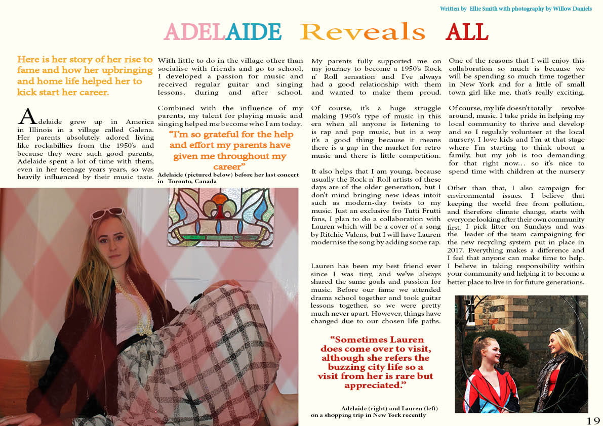
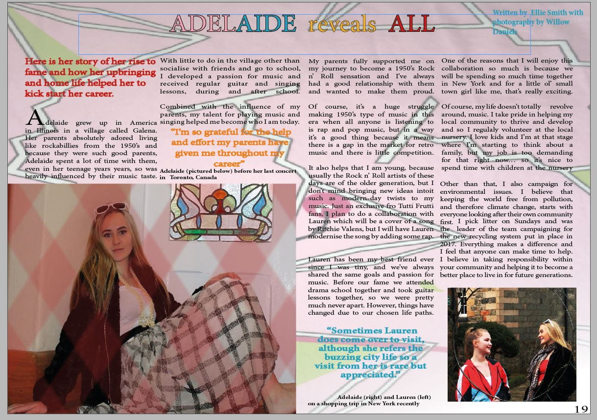
Double page spread
- Make background smaller to show off more of the design
- Make title bigger
- Add boarders to photos to make them stand out
- Move the caption of the main cover star to make it clearer