ccr
A promotion package for the release of an album, to include:
- A music video (major task)
- A social media page (minor task)
- A digipack (minor task)
Table of contents
How do the elements of your production work together to create a sense of ‘branding’?
how did your research inform your products and the way they use or challenge conventions?
How do your products represent social groups or issues?
How do your products engage with the audience?
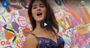
A brand needs to be easily recognisable by an audience so a producer must work hard to create a blended campaign that reflects the star and their ideologies and beliefs. We represented our star through social media, merchandise, the digipack and our music video. We presented her as talented yet ordinary and present for her fans to relate to easily. We involved the ideas of our mission statement to create an image of the star online: “Alice M is the must-see artist of this year, and with her new album set to release, her new song “we don’t have to take our clothes off” has her preparing to see the world of pop by storm. It features unique acoustics and gives a hint to the theme of her future songs. This individualistic take on the original will have everyone finally become aware of this artist’s capability and talent.”We evidenced the ideas of our mission statement across the merchandise and products we advertised on our social media page as well as throughout the video and digipack by using naturalistic approaches. Our target audience expects to see the star as confident and carefree as well as outspoken for important topics as friendly as an R and B artist and should be able to decode that she is a character who understands daily struggles and is aware of issues in the world and their effects.
In order to effectively portray our star to represent the genre of R&B music, we decided to watch videos of artists from the same genre to give us ideas. We watched the music videos of Ella Eyre, Jorja Smith and Rihanna and looked for the conventions mentioned by Lacey that our target audience would expect to see. The repertoire of elements acted as a guide and helped us to define our genre by making us think about setting, character, narrative, iconography and style. This meant that when filming, we had to think about the locations we were shooting footage in, the character stereotypes and representation, objects and symbolic codes such as buildings and relevant props and camera editing along with special effects all to help reflect our genre accurately. From our investigations, we learned that typical conventions of the R&B genre included stars filmed in bright costumes, colourful makeup, high key lighting to give an intense vibe and fast paced camera editing with special effects to ensure energy in the videos. After learning this we incorporated colourful costumes into our video to help portray the genre as fun and unique.
In order to attract our target audience with our genre, we used our inspiration from the other R&B artists to put together costumes for the star. We used mise-en-scene items such as bright blue flares, yellow, neon and patterned tops, and black trousers on occasion to help set off the makeup and colours of the tops. To elevate our looks, we added accessories such as simple necklaces and earrings and make sure to change them after each and paired them with simple accessories to bring together the look. We found that the use of accessories is a conventional feature of R and B culture by looking back at our investigative work. We looked at Rick Altman’s ideas about uses of genre and about minimising the risks to a producer by recognising how important it is to have a blueprint to reference so that we could make sure our video was successful.
We embedded a narrative that was like a blueprint the audience might expect from R and B narratives. For example, we looked at how R & B videos can have fast paced and slow paced editing depending of the mood of the song, usually some special effects to engage the audience but not as many as pop music videos and R & B is usually filmed with a more in-the-moment vibe to it with more naturalistic aspects. We wanted to make our video using but developing upon these conventional aspects but more unique and original. For example, we showed the star feeling peaceful in nature away from society, showing how toxic and judgemental the world is. We mainly had the star performing in the video and added in narrative parts, instead of the video being solely a narrative. For example, we filmed her walking through the bowling alleys and streets in town, showing an emotional side to the audience. This is conventional as many music videos contain elements of performance as well as narrative to break the fourth wall between them and the audience but also give an interesting story line for them to follow. We allowed the audience to imagine the rest of the story. We incorporated the ideas of Barthes structuralism and semiotics, such as the star giving a smile to the camera and shots with her head in her hands, and used tracking and panning movements to signify the star on a journey in a way that left the scenes somewhat open to audience interpretation. We made sure that we included individual signs that showed her emotions and linked them together for a structure of ideologies within the narrative so that although the audience could take the video how they felt, there was a simple and clear narrative.
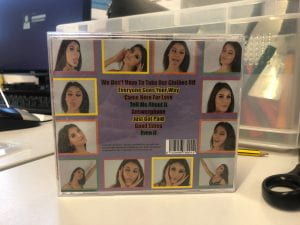
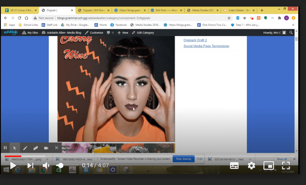
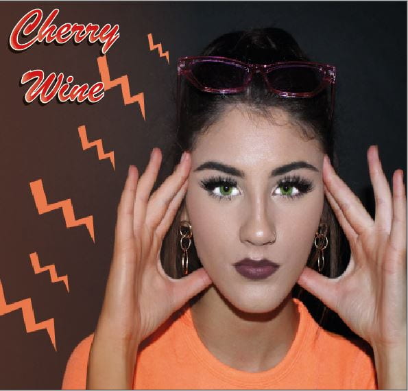
Our digipak had to reflect and represent the general mood of the star’s album, which was bold, out-spoken, and non-threatening, like the majority of R & B stars. We looked at how to portray her star image as friendly but assertive. We achieved this vibe by using bright colours such as oranges and yellows to convey a theme of natural beauty to pair with her carefree attitude. We also made sure to give off an ordinary star image and break the fourth wall between her and the audience in order to make her seem approachable and as having a connection to her fans. We used images of our model on the front and back of the digipack to draw the audience in with the star, showing her using different lively facial expressions and playing up to the camera. In this way we used Barthes semiotics and structuralism to help attract an active audience as this made her seem as if she was showing the audience a more personal side. On the front cover we had a singular image of her in a bright orange top, and on the back we utilised multiple photos from one shoot to create an effective border of pictures of her surrounding the names of the songs in her album. We used high key lighting to capture the images and incorporated mise-en-scene to elevate the photos and show her character as fun. In this way we incorporated the ideas of Richard dyer’s paradox of the star. Presenting the star as ordinary and sincere, instead of untouchable, to the audience. We used photos of flowers, linking back to the video symbolically, in the middle to break it up and continue the bold and fun theme This was also used to show authenticity and naturalism which correlated with some nature shots in our music video.
Hall’s theory of encoding media texts with signs and symbols was important for us to remember so that the audience could get a “preferred reading” of our video and decode it how they wished. We decoded other artists’ social media pages and found that it was important to include interactive features as well as merchandise and promotions relevant and tied in with their genre of music that they made. We looked into the demographics of our audience and found that they are usually 13-25 years of age, into streetwear and music festivals. We used Blumler and Katz Uses and Gratification theory to engage the audience and make them feel as if their identities could relate to the stars. We included teasers and tour dates as well as interactive features such as interviews and question answering to make the audience feel included, which helped with the entertainment and social interaction aspect of the theory and was necessary so that our star seemed reachable and present for her fans to interact with. We also made merchandise to advertise to draw the audience in and also allow them to explore our stars’ personal identity as well as their own political posts and positive statements also allowed us to show more of who our star was as a person and reinforced the paradox of the star idea, by Richard dyer, as being ordinary, allowing the fans to feel closer to her and be able to relate more.
