November 25

Digipack draft 3

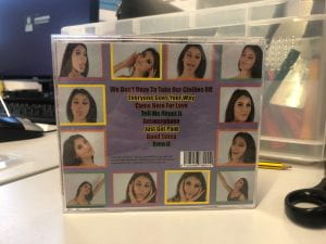
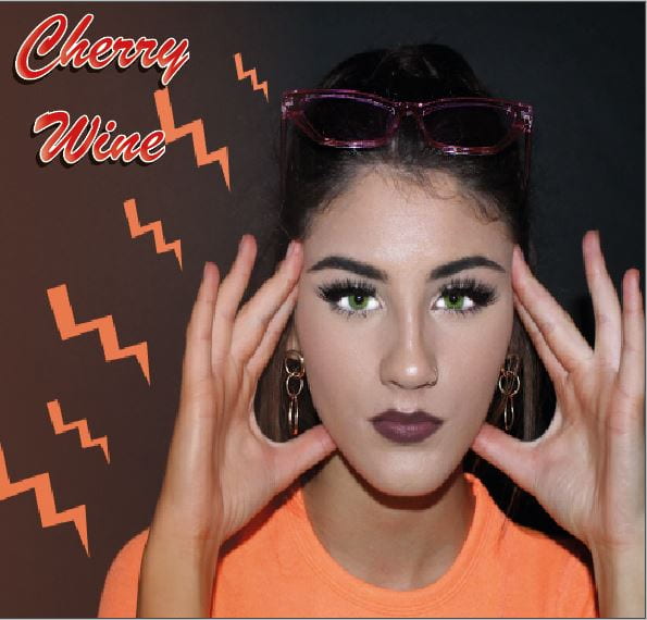
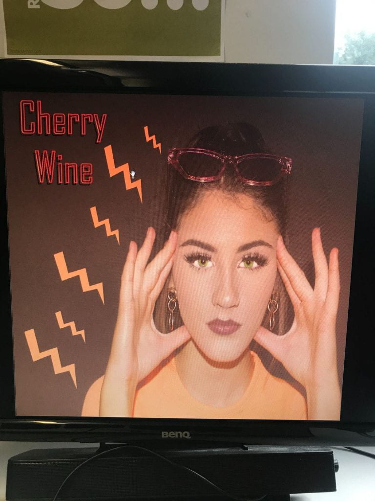
This is draft 3 of our digipack, we used peer feedback to help improve our images by adding in boarders and details to the writing, such as inner and outer glow and changing fonts to fit the genre more appropriately. We added in a simple spine with a matching colour to the theme to help bring together to digipack and make it look professional.


We then sent out a google form to see what people thought of our digipack. we asked questions such as what genre do you think the digipack is?” and “what adjectives describe our digipack?” People mainly replied with the correct answer that our digipack was R&B and used  exciting adjectives such as fun, bright, colourful and bold. These responses helped us to feel confident in our design and how well we have represented the genre and star on the digipack and helped us to justify our work and feel that we had achieved our goal of making her look like an R and B model. 


November 10

Digipack Draft 2


Targets

  • She is stretched in the face
  • add a sheen to the lips
  • do something different with the lightening stripes- they don’t work well too unrealistic
  • add the name of the artist
  • inside cover, change the words on the inside
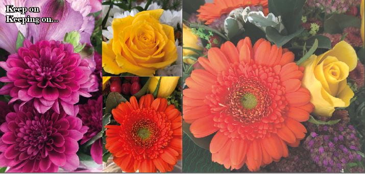
  • choose a filter on the flowers that matches
  • back pane needs to tie in with inside and front cover
  • the font on the back is too classic
  •  lightening strikes could be colors from the flowers
  • add in spines

What went well:

  • nice green on the eyes
  • good image on the front cover

November 2

Digipack Draft 1

Above we assessed our draft 1 CD panes.

  • We identified what is working and what we need to improve, this has made it clear for when we edit for draft 2.
  • Also by assessing it, we have been able to see our standard of work and how to improve to develop our grade.
  • Outlined key features that we are missing like copyright and displays how we can play around with writing and graphics more.

November 2

Evaluation of shoot

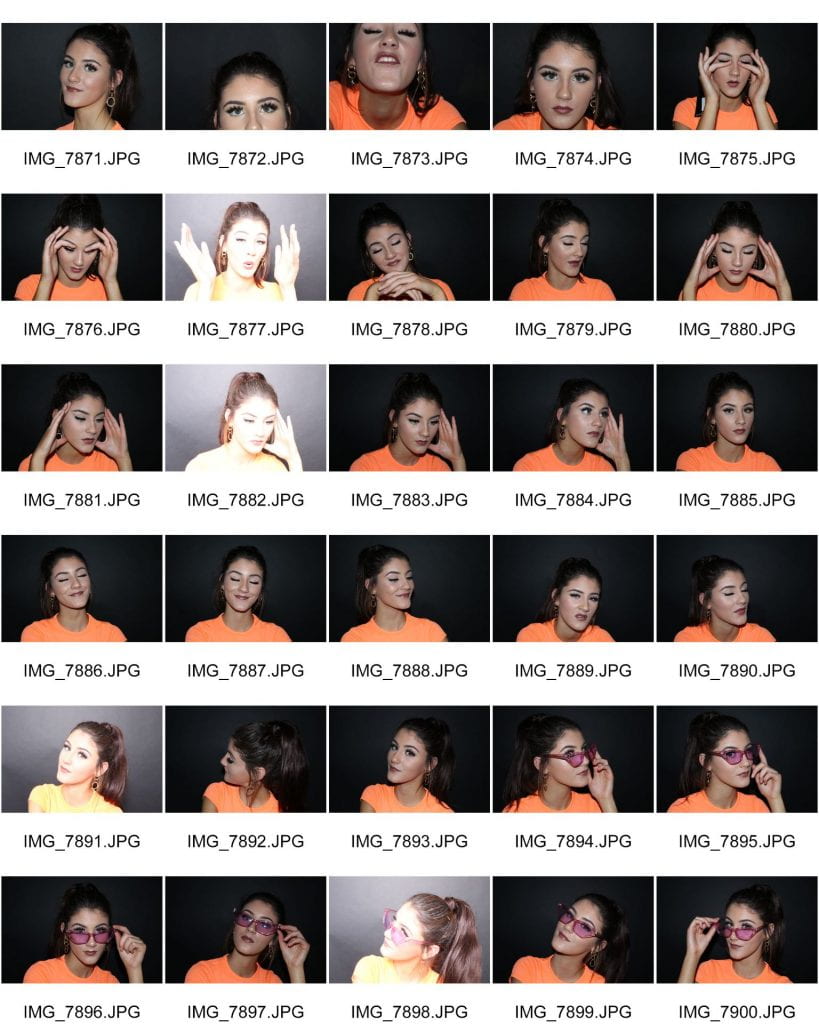
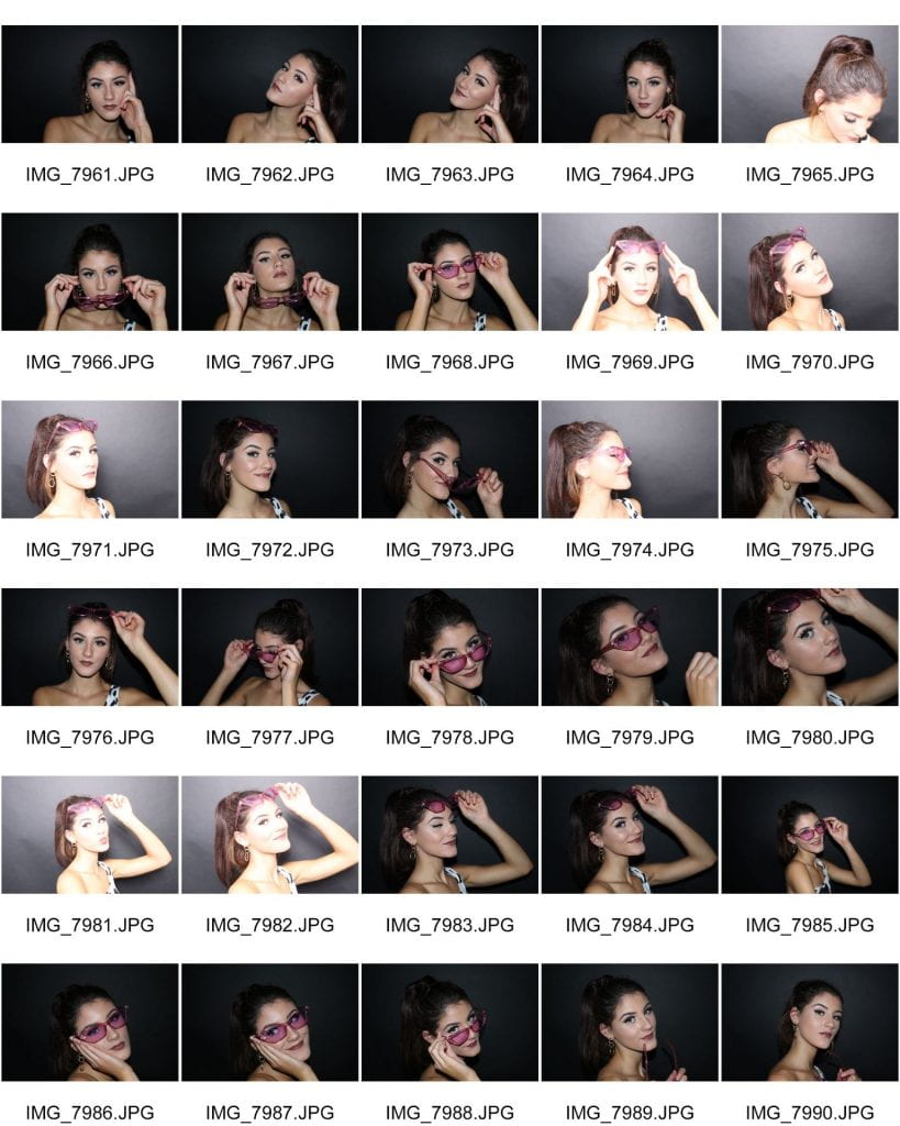
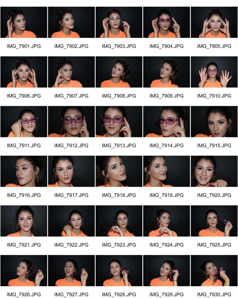
Because we had used lots of nature imagery in our music video and shot outside, for the most part, we decided that to contrast this we would take photos for our digipack in a studio to help focus the audience of the star and not be distracted by other imagery that we already have in the video. We took advantage of the darkness of the black studio to use bright coloured clothing and props to add a modern and vibrant atmosphere to the photos.  e also did a shoot over the half-term holiday using more props, such as all the clothes worn in the previous shoot spread out around the model to portray the narrative but it didn’t work a well as the image quality was bad as we used a phone with bad lighting.

what went well:

  • The orange top and cow print top stood out well in the dark
  • The pink glasses were enough to add a pop type feel but not too much to distract the attention away from the star
  • The images were good quality and there we used many different angles and poses so that we had lots to choose from
  • We used relevant and eyecatching props such as clothes and glasses.

Even better if:

  • We may have benefitted more from using the white studio as the colour of the star’s hair didn’t contrast enough with the darkness around her
  • The shoot we did during half term was not of good quality as we used a phone camera with flash which caused bad lighting quality.

November 2

Graphics / illustrations Drafts Ideas

Whilst drafting up our digipack, we used photoshop to enhance the appearance of the model, for example by making her eyes greener and her top brighter by using tools such as the burn, dodge and colour tools and we have also used features on Indesign to add in graphic detail such as orange lightning bolts and writing for the album cover name. We are exploring different fonts to use that help to portray the narrative and fit the genre as we are using bright, warm colours to portray the star as creative and expressive.

November 2

Contact Sheet

Below are our contact sheets from our shoot. We used the black studio because we wanted a plain background to make our colours stand out more as our genre has bright, bold colours. However, we did realise that perhaps the white studio would have been better to contrast against the model’s hair.

October 12

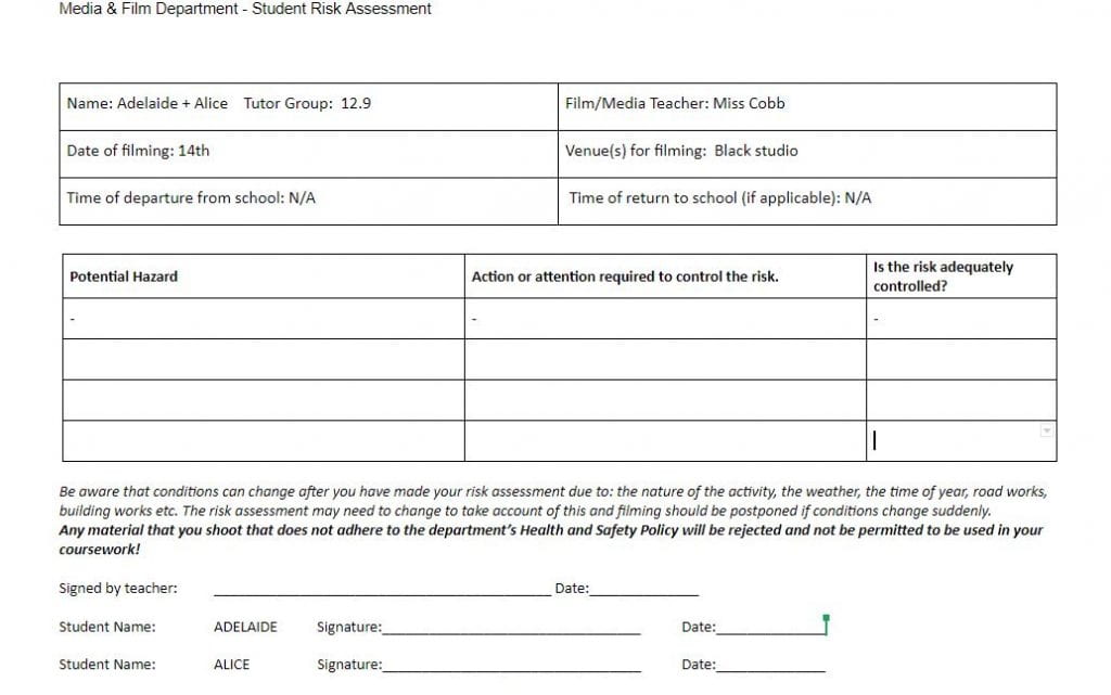
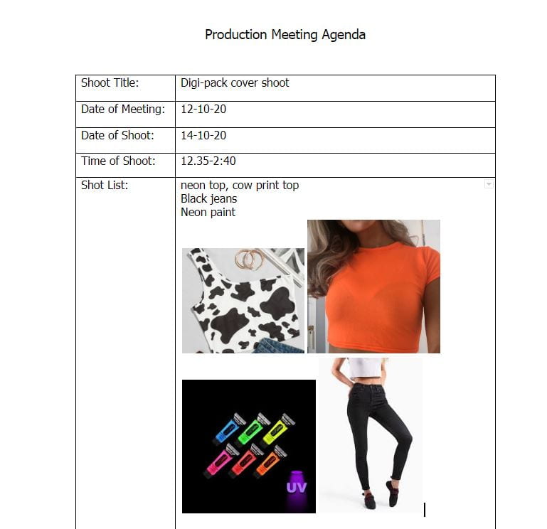
Photoshoot / Design Production Meeting and Risk Assessment

Here is evidence of our production meeting agenda as well as risk assessment we have completed and talked through together so that we can be organised and prepare on the day of our shoot and know what to bring to make a successful digipack cover.

In our shoot our shoot we aim to

  • Successfully portray the genre of music we have chosen by using bright colours and close ups for the digipack
  • Take many shots for lots of choice
  • add in props to create a narrative
  •  Take different angles of shot with different facial expressions to connote the nature of the performer.


We had to do a risk assessment to avoid hazards but seeing as we are shooting in the black studio in school, there are very limited risks.


October 8

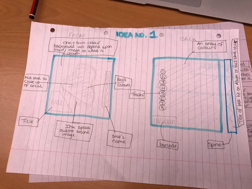
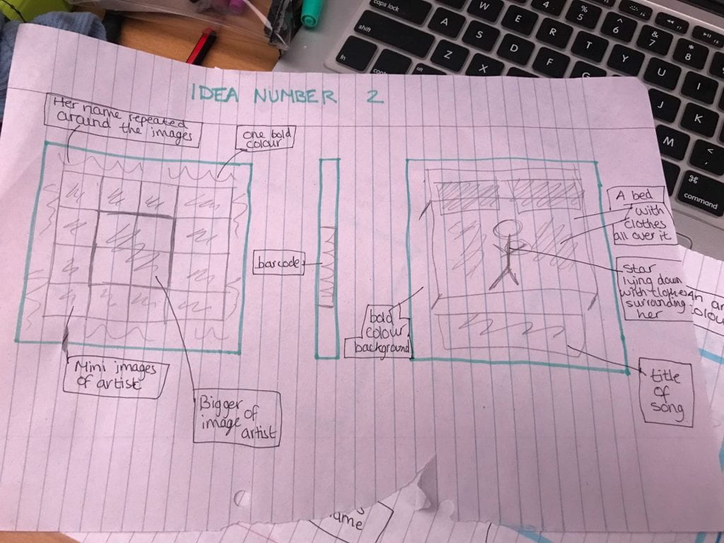
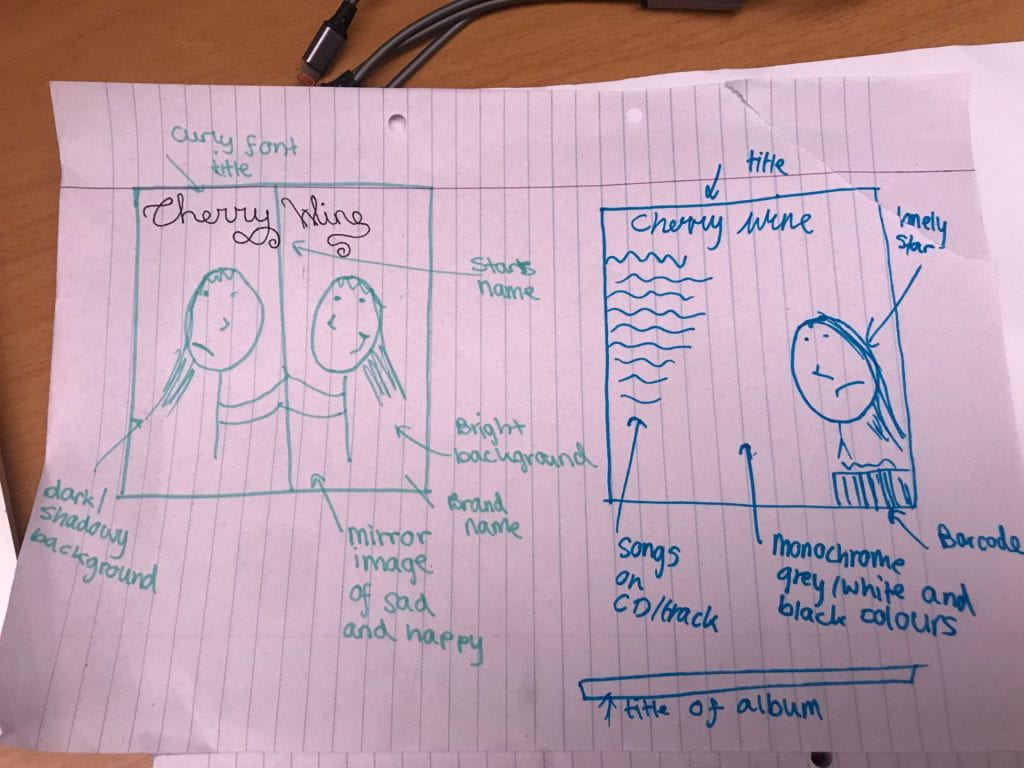
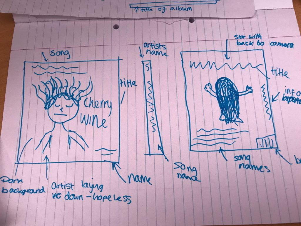
Hand drawn mock up

We drew up four different possible ideas for our album cover for our digipack to portray the vibe of the star and the music in the album. We involved different element in the mockups that we had found out related to our music genre by decoding old album covers by similar artists, in this way, we will manage to gradually build up the repertoire of our artist by encoding what we have learned about R and B in a way that we know will capture the attention of the audience. We want to build up a repertoire of elements for our genre, as well as portray the artist similarly to other R and B artists but as having unique connotations and shows her as better and more talented and diverse in her talent than the rest.

We want our star image to be the same but different from others in the genre and we have displayed this by drawing up abstract and different album covers that still relate to the R and B genre.


October 8

Branding Moodboard

In this exercise, we created a mood board to find denotations to connote R and B. This is the genre of music that we are recreating and the mood-board will be to help us learn how to promote the artist’s star image and represent them in our digipack when taking album cover shoots. We learnt that in our images we will need lots of colorful clothing to promote genre conventions and the idea of confidence with the music, minimal makeup to show facial expressions clearly, and close ups to zoom in on emotion.

Made with Padlet
October 7

Digipak Conventions Analysis

Here we analyzed the cover on an album to gain an insight as to what our digipack should look like. We noted the similarities between what we should be aiming for and what conventions stood out to us and looked at what other artists in our genre use on their album covers so that we can make ours fit in with our genre and gain an idea of how to present it. We looked at technical conventions such as barcode, prices, and copyright features and we all look at the connotations and denotations of the images and writing on the cover. This will help us know what to bring out in the shoot to show the star-image.