
Below is an Infographic exploring the impact of different forms of technology used throughout the production of my music magazine, and how I integrated them.
Category Archives: Component 1
CCR3 – How did your production skills develop throughout this project?
Here is my recorded response to how my production skills have developed throughout this magazine project. I wrote my response then recorded an illustrated letter to any future pupils who may consider A Level media studies.
CCR2 – How does your product engage with audiences and how would it be distributed as a real media text?
This is a pre-recorded Screencastify of a written script explaining how my product engages with my target audience and how it would be distributed in the real media world.
CCR1 – How does your product use or challenge conventions and how does it represent social groups or issues?
Below is an Emaze presentation that I have created, delving into how my magazine challenges or uses certain conventions of my genre, and whether it represents any social groups or issues.

Chosen Adverts
Advert 1

I chose this advert for numerous reasons. Firstly, Lana Del Rey is an incredibly well known music artist who can fit nicely under the indie genre so suits my demographic correctly. It can help to push the star image towards my target audience so that they have a better understanding of the genre that they engage with. I think it is important to have an advert in my magazine that publicizes a new album. This will encourage my audience to indulge deeper into my genre and the music that it represents.
Advert 2
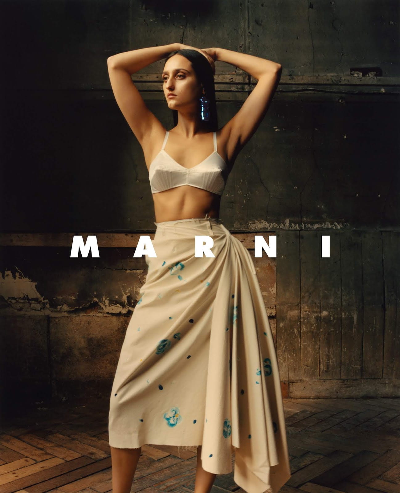
For my second advert I decided to use one from the fashion brand ‘Marni’. I think the style of their clothes heavily resembles the clothing that I decided to dress my models in for the photoshoots and fits very well with the star image that I am trying to achieve. I think that this advertisement will inspire my target audience to follow the demographic of indie music even more closely, and create a personal identity that reflects on their music taste also.
Final Drafts
Click on image to view PDF

Click on image to view PDF
Click to view PDF
Screen Castify of Third Draft
Targets
Front cover
- Masthead bigger – ‘P’ needs to be enlarged to catch attention of readers quicker when magazine is on the shelf
- Capital ‘i’ in independent
- Put the word ‘TOP’ in a different colour – red to match colour scheme?
Contents
- Add red somewhere else on the page – lower down where it is scarce
- Align cover lines
- Make line spacing the same on all cover lines
- Check good English – ‘tells behind the scenes’ ?
- Don’t overdose on the word ‘tells’
- Apostrophe on ‘editors’
- Try moving the editor’s note around – provocative photo so maybe cover a bit of it?
- Put the name of the artist somewhere around or on the album cover
- One of the lines surrounding ‘CONTENTS’ put into red to match colour scheme?
Double page spread
- Paragraphs in the article – needs more space – overwhelming for reader
- Spotify logo on the ‘Mirrors’ box
- Large gap on the bottom right – move the photo down?
- Quotes in article – longer third quote? add another small one? rearrange?
- Bring in some red – match the colour scheme of the magazine
- Main quote under headline – make it the same blue as ‘Prodigy’
Magazine Third Draft

Click on image to view PNG
What’s new?
- I have changed the typeface at the top of the front page to red so that it stands out on the page and catches my audience’s attention – they are famous indie music artists so important that they are what the reader sees initially
- Added a red pug at the bottom right to draw in the reader – by putting an opportunity to win something on the front cover, it makes the audience want to open the magazine
- I included an extra cover line at the bottom to fill the space and give my audience a better idea as to what is inside my magazine
- I changed name of other cover line back to Bon Iver as I thought there was too much about my cover star on one page
- Added a shadow on my cover star to make her stand out more on the page and feel more alive
Click on image to view PNG
What’s new?
- I added the Prodigy logo at the bottom left because it is conventional to have the magazines logo included on the contents page
- The highlight colour of the quote was white before with black font but by switching the colours around I feel it makes it pop more and fits better with the black boot
- I added blue lines on lines over and under ‘contents’ – this matches the colour scheme more and makes it more eye catching
- By changing the bubble colour under the album colour to red (matching the colour scheme) and bevel and embossing it, it allows the album to be one of the main focuses of the page
- I added a drop shadow on the album cover again to make it pop more
- Included the Spotify and Apple Music logo under the album cover to inform the reader where they can listen and buy the music
- Changed the page numbers so that they match with each other
- I moved the image up slightly to fill the space and allow the bright nails and rings to be more visible on the contents page
- Made the editor’s signature darker so that it stands out more
Click on image to view PNG
What’s new?
- I changed highlight colour on quote so that it matches the jeans, however it doesn’t stand out as much as I’d like so that might have to be adapted in further development
- Made the ‘mirrors’ advert box smaller and moved it to the bottom because it was not important enough to feature at the top of the article
- I spread out the stand first along the top above the article and changed the strike and typeface colour so it catches the readers attention and makes it clear that it is the stand first of the article
- Added a drop capital at start of article because it is conventional for not only a magazine article but any article in the media world
- Added captions to images
- I made the whole background of article transparent so that you can still slightly see the main image behind it, giving it a flowing and connected feeling
Second Draft of Double Page Spread
Here is my second draft of my double page spread. This is what I came out with after going over my targets from my first one. After assessing this draft and creating targets for my final product, I should turn out with a very successful double page spread.
Click on image to view PDF
What’s new?
I have changed many more things on my double page spread than I did on my contents page and front cover. I was not very happy with my first draft so was looking forward to making improvements. A lot of the targets that I made via feedback from my teacher were only minor things that were quick and easy to change, such as:
- Making the page numbers slightly higher – further up the page and a bigger number itself so that it doesn’t get lost at the edge of the magazine and so that it matches with the front cover numbers
- I made a minor spelling error – ‘avaliable’ – so that had to be changed to the correct spelling
- Turning the font of the quotes in the black boxes to bold and italic so that they stand out more on the page and attract the readers attention faster – drawing them into the article itself
- The standfirst needed to be bolder so that the reader immediately sees what the article is about
- Make the main image itself much bigger as the star is who the article is about – needs to take centre stage
- Changing the typeface of the headline so that it fits the genre better as well as matches the rest of the magazine more fluently
- Removed the black bordering lines of the double page spread as I felt like it made the whole thing feel much too enclosed and cramped
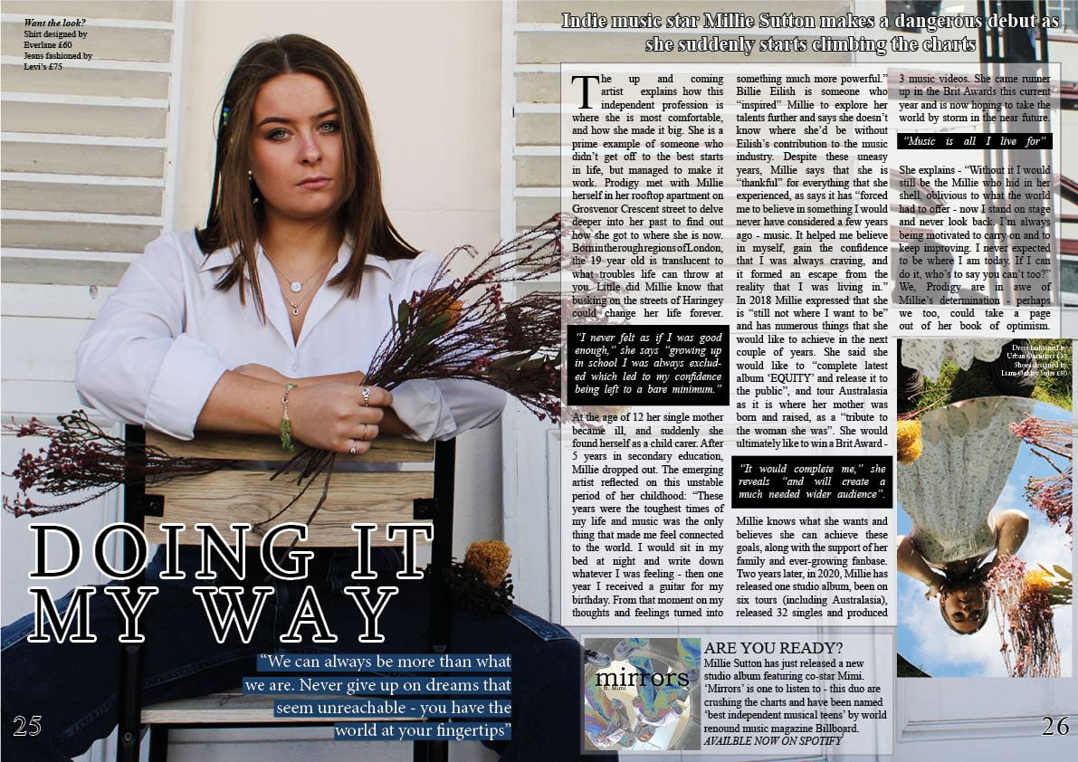
In addition to these minor changes there were still numerous other things that needed changing. I felt it was necessary to add in another quote within the article to make it appear more even to the eye – I think the rule of three that can be used as a language technique can also be applied here, but in a different context. Furthermore, the headline ‘Doing it my way’ seemed crowded at the top of the page so decided to relocate it down at the bottom. After changing the typeface and by outlining the letters in white, I think it stands out much more now and fills a space that was empty on my first draft. I also think it was necessary to move my headline to the bottom because when it was at the top it was distracting the attention from the cover stars face. By making the image itself bigger and relocating the headline, it is not only drawing more attention to the headline, but allowing the stars face to be the main focus which is what is conventional in magazines.
Next I thought that the inserted image at the bottom right was in need of a caption of some sort. In order to keep it conventional but not repeat myself I chose to put the prices and places of where the outfit my model was wearing in the picture was from. I put the prices fairly high on this to show my stars wealth through fame yet made it an affordable price because I expect people of all backgrounds to pick up and read my magazine.
Finally, in my first draft I did not consider the fact that I would end up with a staple fold on my double page spread – I had my quotation over where the fold would be. To avoid this I moved the quotation down to underneath the headline. Doing this meant that I had to rearrange a couple of things, however, it is now looking much better than what it was before. It is becoming more conventional and more unique by every edit.
What’s next?
- Move quote under headline further left to avoid staple fold
- Make the far right picture fit the text box?
- Add in a drop capital
- Rearrange – move ‘mirrors’ box to the bottom? and put headline along top?
- Have a very small white border around the article itself so not as cramped appearance
- Paragraphs
- Make the inset photo with a frame or less towards the right hand edge of the page
- Make the quote black a dark blue, like her jeans with rounded edges and italic font?
- Perhaps do the Mirrors inset in a different font to make it stand out like an advert?
- Flowers fade under the article?
Second Draft of Contents Page
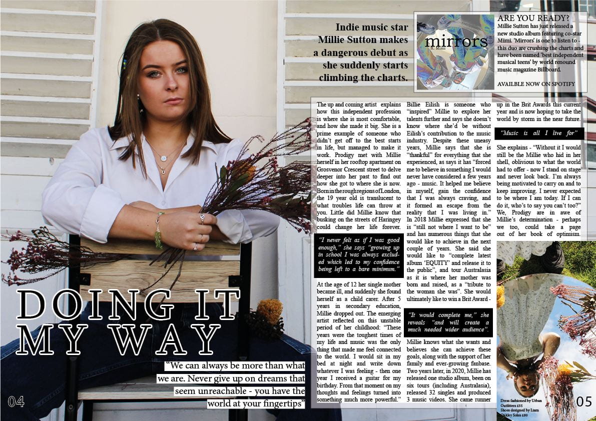
Below is my improved contents page that I have adapted in accordance with my targets from my first draft of the page. By making yet more improvements to my second draft, hopefully I can develop this contents page into something that considers all aspects of Mine En Scene and attracts my target audience.

Click on image to view PDF
What’s new?
From my first contents page draft there were a number of targets that I made so that my second draft could be even better. I firstly decided to change the general typefaces so that it would be more conventional for my genre. I changed it to ‘Times New Roman’, which also now matches my front cover – making the magazine really start to come together. However, for my second target which was to ‘spread out the cover lines so that it is clearer for the reader’, I chose to not act on this one because I felt that if I did increase the line spacing (which I did try), there would be a very limited space left on the page to add in insets and quotations etc. I think that is is clear enough for the reader to scan over the page and get a good idea of the contents of the magazine. Likewise to my second target, after many attempts, I also decided to not act on my third either. I wanted to cut out my model on Photoshop so that I could show more skill and play around with the text and image a bit more. Despite this, it proved incredibly difficult to do this due to the white dress matching the white background. I attempted to use the burn tool on Photoshop to make the dress darker than the background to make it easier for me, however it did not work.
The next thing that I wanted to improve on was the facial features. I decided that I wanted to make the features on her face – such as her eyes and lips – brighter so that it would draw more attention to the main part of her. I did successfully use the dodge tool on Photoshop on her eyes and mouth, however because her face is located so far away from the camera, it is difficult to tell what I actually did. To make this more conventional as a contents page I also made the target to consider including insets. Instead of adding in more images from my shoot and linking them to certain page numbers, I chose to design my own album cover, using an image from my photoshoot and the album name ‘Silver Linings’. I thought this would fit very well on my contents page as my cover star is an emerging artist, and this debut album will help draw the audience in. I tried to keep the cover conventional to other Indie music album covers and think I did it well.
A couple of other changes that I made excluding my written targets was firstly moving the quote to the bottom of the page in order to fill the blank space. I also highlighted it as I think it makes it stand out more – it is a key quote from the cover star herself so I felt it needed more recognition that what I gave it previously on my first draft. I also deleted one of the feature article titles as I felt I needed more space and established I didn’t really need as many as I had before. I think fewer headlines looks much more conventional than a crowded page.
The final change that I made was significant but I think it allows the contents page to make the magazine itself much more interactive for the reader. I decided to add in an editors note that I wrote myself. I really think it fills an empty space and allows my contents page to instantly become more conventional and look more professional.
What’s next?
- Change page numbers for articles eg. match up cover star number with quote number
- Make the signature a darker colour – black so that it stands out/matches the text
- Bigger main/star image?
- Attempt to change the brightness to accentuate facial features again
- Move around text so that ‘cover story’ ‘features’ and ‘interviews’ are all in one column?
- Take the quote off her fingers so that we can see the blue nail varnish
- Buy now…where…remember call to action…how and where do they get it? spotify logo add in?
- You have two different page numbers for Millie…4 and 64…which one is the one the relates to the DPS?
- Cover Stories, Features feel like different sizes to each other
- Get a blue line in or two?
- Put prodigy masthead as a tiny logo top right or where it is mentioned in the coverlines – it is a brand.
- Bit of drop shadow on the inset CD?