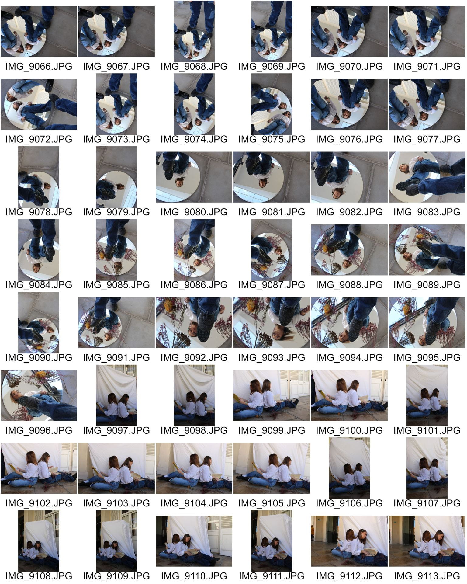
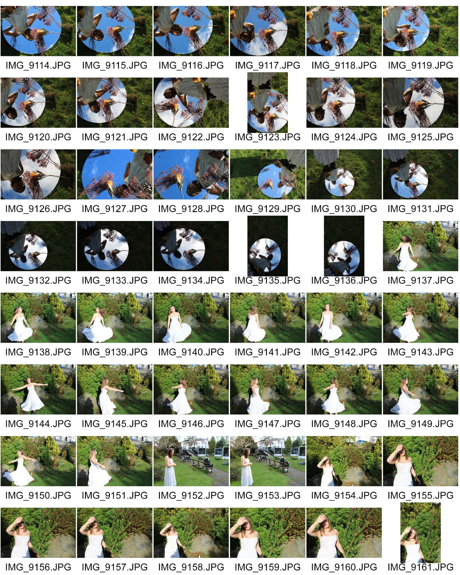
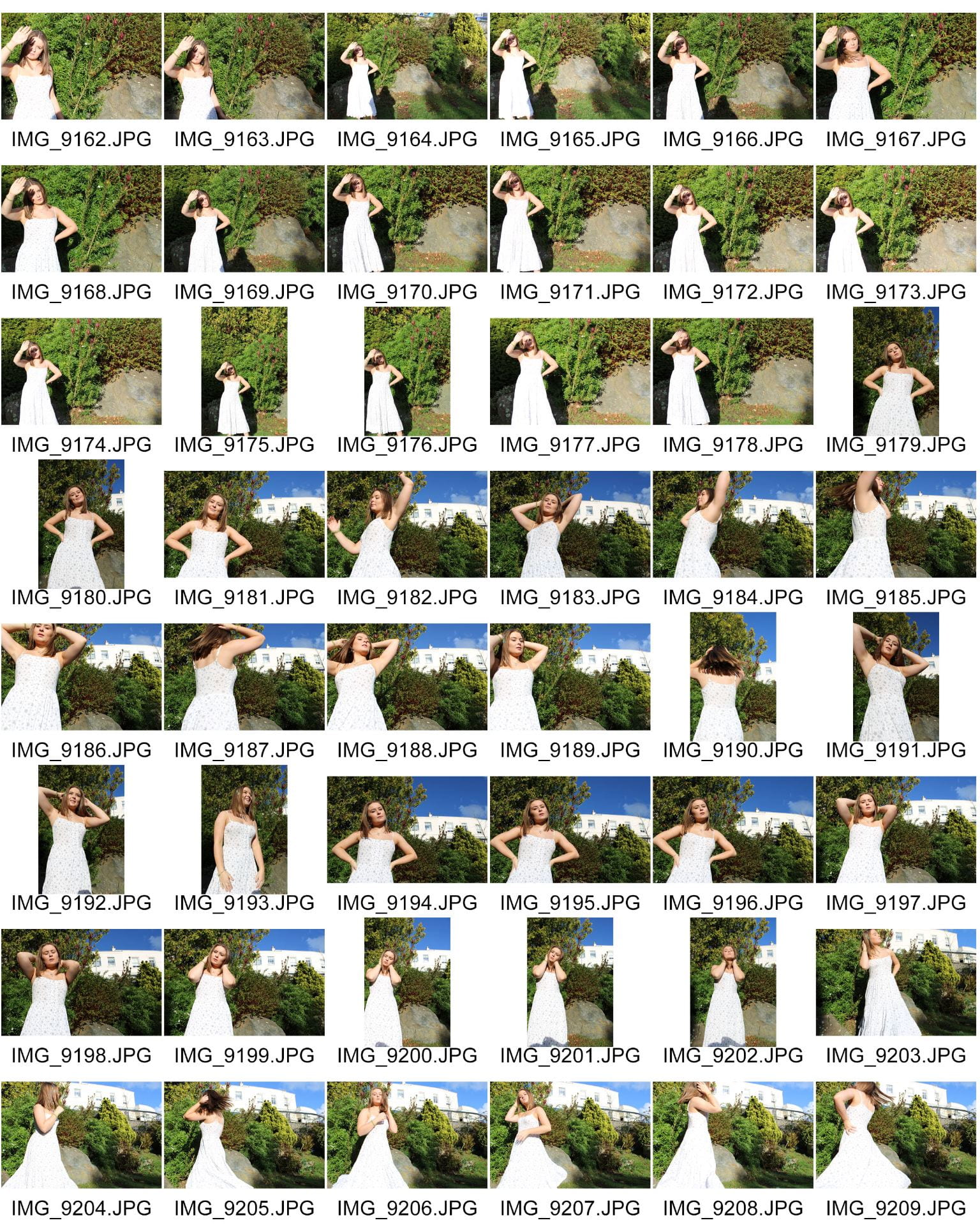
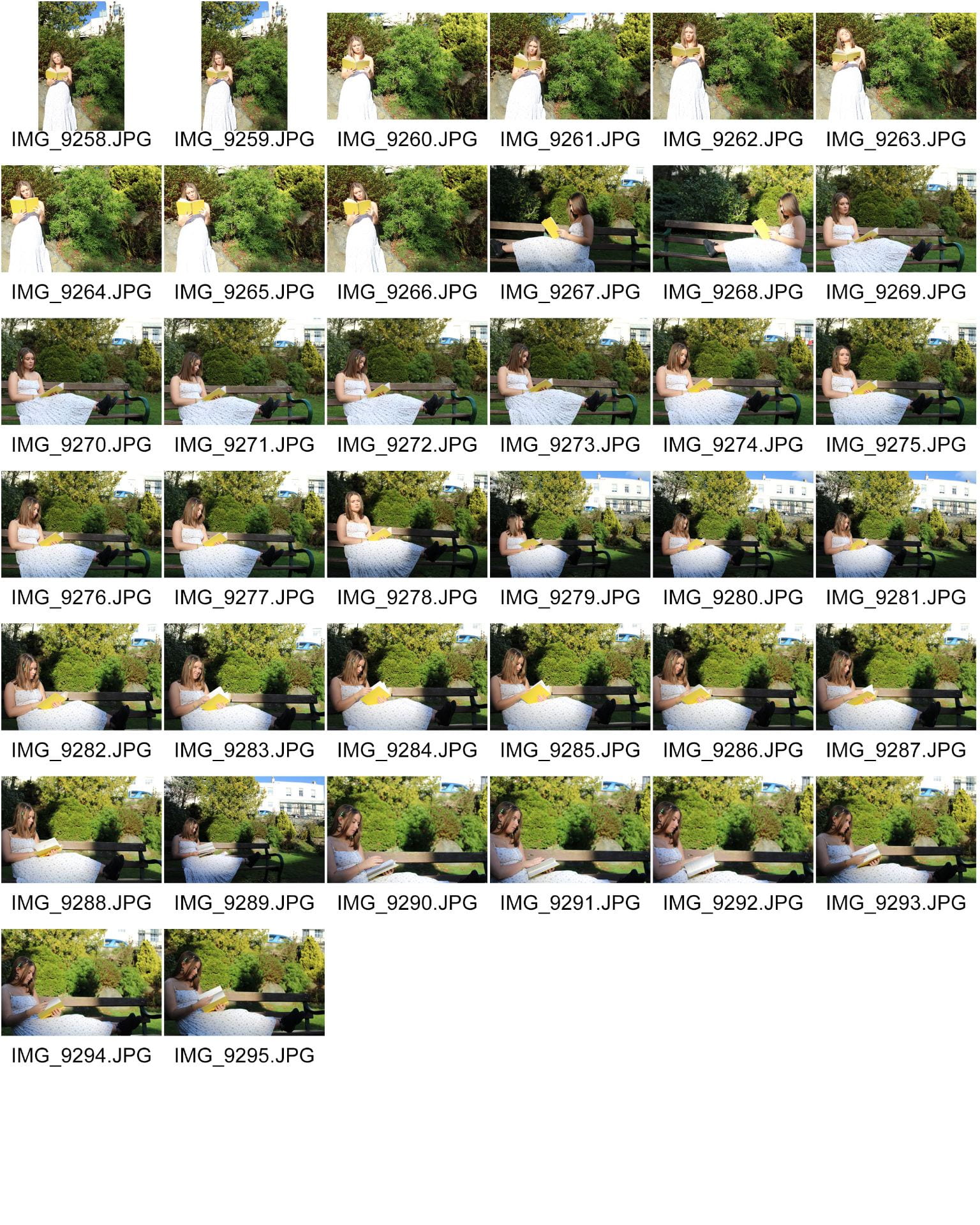
Below is a contact sheet of all the photos that I took when we went to town. I have created it using Adobe Bridge and Photoshop. My aim for this photoshoot was to take an image that could be used as a main image for my double page spread of my magazine. I think that I successfully have done this, as well as collected numerous other photos that I could use for different sections of my magazine eg. inserts for the contents page as well as for other stories on my double page spread.

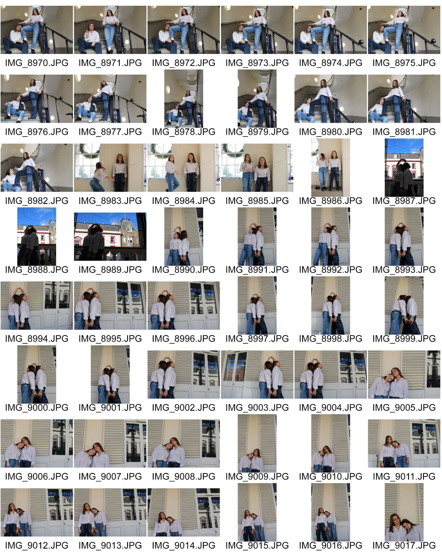


Overall I am very happy with how my photoshoot went. To make my photos have more meaning to them, and make them stand to from others I decided to bring numerous props with me to experiment with such as:
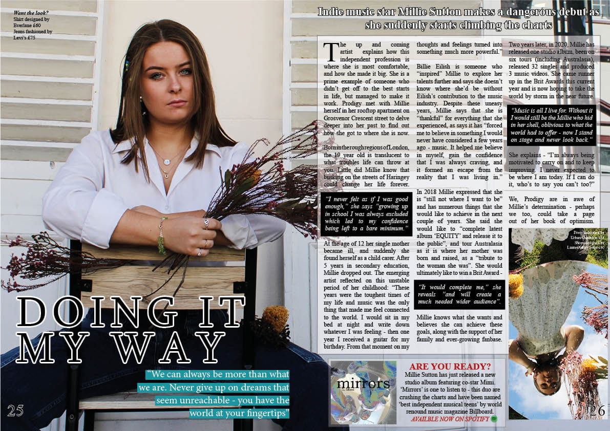
- A mirror
- Dead flowers
- Old books
I tried to use these props as much as I could in my shoot and think that they definitely helped to take my pictures to the next level – without them I don’t think I would have been able to come away with images that can tell a story.
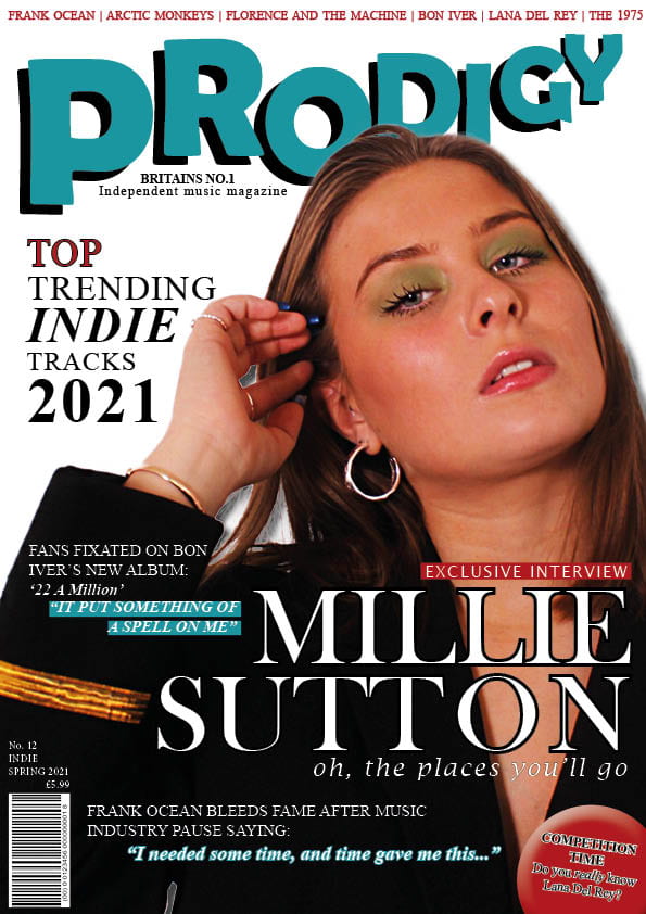
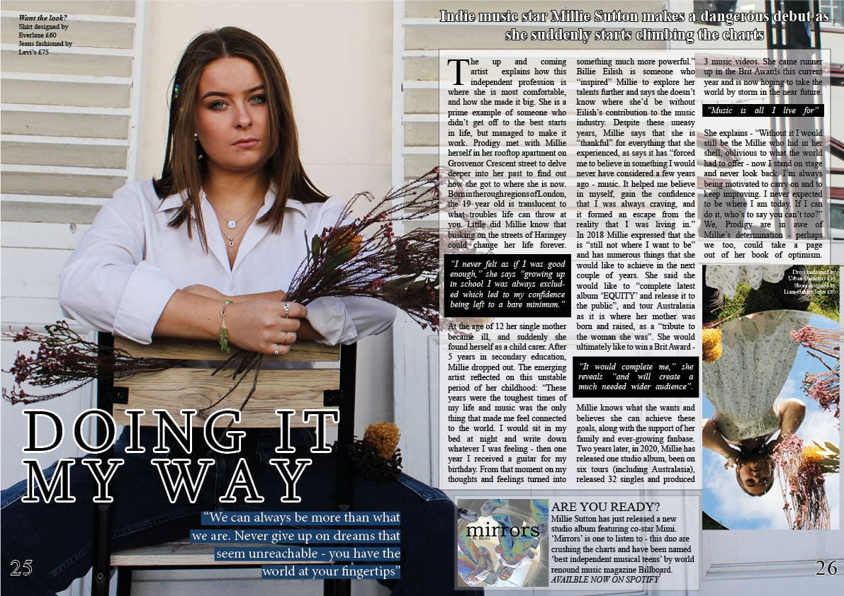
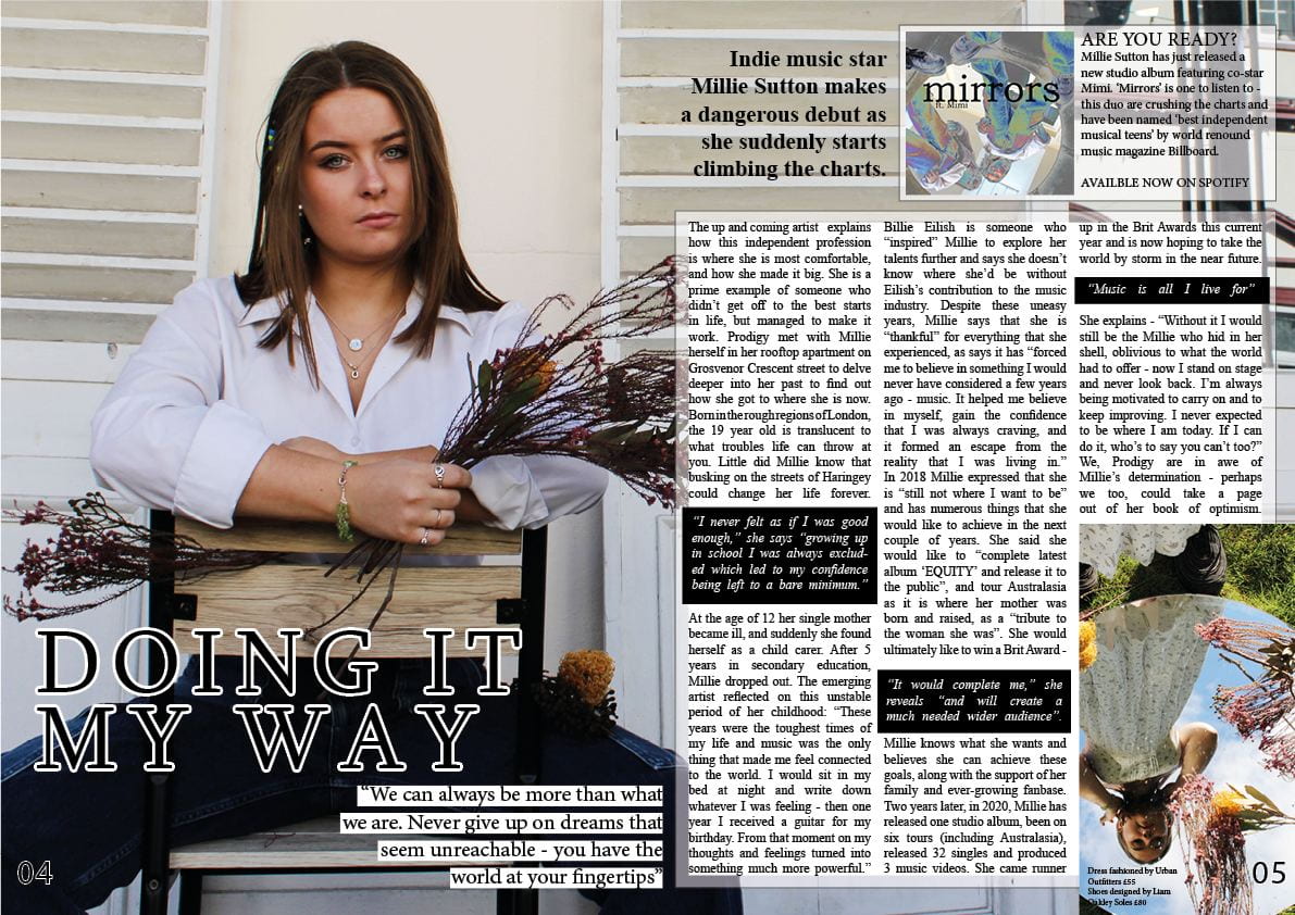
Furthermore, to enable me to come out with the images I did, it was essential for my models to look the part. After my progressive research on the Indie genre and music magazines that are targeted at that specific audience, I knew how to pose my models and how to dress them etc. I used Mine En Scene through the planning process and in the shoot itself. I also made a mood board on Pinterest for this shoot and it helped massively when taking my photos. This way I could quickly and efficiently return to this board whenever I was stuck for a pose for example. I tried to get my models to look as natural on the face as possible – with little to no make up, and a straight yet kind facial expression. I wanted them to interact with each other in unique ways, because I believe this reflects on Indie music itself. This genre is very individual and distinctive and I wanted this to be highlighted in their body language – which I think was successfully done. I wanted my shoot to have a vintage authentic feel, so decided to dress my models in basic yet effective clothing. The first costume was a plain white shirt tucked into blue baggy jeans. I think this will give a relaxed and common feel to my audience and allow them to see the stars as more ‘ordinary’ people rather than these ‘extraordinary’ stereotypes of musical stars being wealthy and vain. The second costume was a loose white floral maxi dress. I chose to do images with this dress in the sunken gardens. I thought the soft white of the dress would contrast very well with the bright greenery as surroundings. This again gave a laid back free vibe to the images – engaging the readers to hopefully permit them to feel more free within themselves.
I loved taking these pictures because I went to the shoot knowing exactly what I wanted to achieve. I particularly like the ones with the mirror in it as I could play around with different angles and think that the low angle that I have on the models conveys a sense of confidence – something that reflects on my genre brilliantly and will attract my target audience. Another collection of images that I liked were the ones on the balcony in the market. In particular when one of my models is sitting on the chair holding flowers. These worked well, especially the landscape ones because there was the fabulous reflection of the buildings shining on the window to the right of my models – this contacted very well with the white walls and shutters.
Although there are many photos that I like and am happy with, there are also ones that I don’t like as much. In my contact sheet there are an obvious few that could not be used for my magazine. There are a couple of my face up close – these were purely just to test the zoom and focus of the camera. In addition to this there are a few darker images. In these, due to my models posing in front of the light, it caused a shadow on them when the picture was taken – meaning that they came out as almost impossible to use images. However, they would be good pictures to use if I was aiming for a more silhouette approach as it has the bright background behind the models. There are also some images that were taken in the sunken gardens that have turned out to be too bright. This is because I did not consider the strength of the sun, therefore did not adjust the exposure on the camera before taking them. I could change this in Photoshop, however the quality of the image would not be quite as good.
To improve this shoot I think I could have experimented with a few more locations. This variety would have allowed me to have a wider range of images to choose from. After I have chosen my favourite images I will need to edit numerous things in Adobe Photoshop. I will most likely need to brighten facial features, add more contrast to them and make the images sharper – as on many of them the lens is very slightly out of focus.
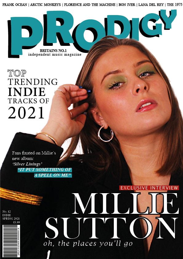
The images that will work best on my double page spread of my magazine will be the landscape ones that have a large space on the right hand side. I tried to get this space in all of my landscape images. I will want to wrap the text of my article or quotes around the star on the left and continue the writing onto the second half of the page. I will also be using numerous other images – that are not landscape – to pose as inserts on both the contents page (to show what will be in the magazine) and on the double page spread itself (to advertise new albums, relate to other smaller articles etc). I will need an image that portrays the star as confident in herself as that is what my article focuses on. Matching the image to the article will help my audience to accept my magazine as one from the genre and associate it with their form of entertainment and interest.
Top 5 Images
I have chosen these 4 images as my favourites as I think they connote the correct feelings for a confident independent music artist, and reflect very well on my genre. The Mise En Scene highlighted in these pictures highlight the relaxed, urban type feel that I was aiming for. I think with these images I can create a double page spread that can connect well with the reader.