My Tour Poster

By creating this mood board for the genre of Pop, it has helped me to understand numerous things in order to produce the best possible tour poster. I will have to consider AIDA to create a successful poster:

  • Attention
  • Interest
  • Desire
  • Action

To allow my poster to draw attention in from the audience I will have to include a high contrast in colours, have big and bold, yet simple font, make the star of the tour clearly visible (it is conventional for the poster to abide to the rule of thirds so that it catches the readers attention first, but doesn’t keep their attention focused there), it is also very conventional for Pop genre tour posters to come across very simple to the eye. Although the colour palette is varied across all the posters that I have imported above, for each poster the colours all allow the star and the writing to stand out on the page – a key thing to remember when designing my own tour poster. To make the audience interested in the poster itself I will ensure that it has all the tour dates on the poster yet make them simple and short enough so that the reader doesn’t become too overwhelmed with information. It is also important to make the poster desirable, and a tour that a Pop fan would like to attend. To do this I must make the star central and ensure the name doesn’t go unnoticed – it must be attractive to look at. Action is also necessary in AIDA. The ultimate goal is to persuade the audience to initiate action and purchase the product – in this case end up going to the tour advertised on the poster.

Taking all of this into consideration when designing my Pop tour poster, I feel I will be able to allow it to make my tour poster conventional yet unique so that the audience is not disappointed.

My Final Tour Poster

Click here to view PDF

Reflection

I think that my tour poster is conventional for the pop music genre as it includes typefaces that are typically used on pop tour posters and colour schemes that can be associated with the genre. I have tried hard to ensure that my tour poster is conventional yet unique so that the audience is drawn in. I think the part that is most unique about it is the design I have opted for, for the tour dates. I have yet to come across a poster for a pop tour where the dates are enclosed in coloured boxes. The thing I liked most about my poster is the colour scheme I have used. As I have used blue it has allowed me to be able to use many different shades that still stand out. I also like the typefaces that I have used as they are legible yet conventional and eye catching. The thing that I would improve upon if I was to do the task again would be to probably change the image so that the hand does not take up as much space as it currently is. I feel the face needs to be bigger and more central as that is meant to be the main focus of the poster. Overall, I am happy with the design and the messages it conveys. I think that it would be a successful poster for this specific tour.

This will help me in future media projects as this task has demonstrated to me how to follow AIDA and address a clear call to action. I have a clear understanding of Photoshop and Indesign which will massively assist me in designing my music magazine. I now know how colour schemes work together on a page and what types of font are most legible. By completing this task I feel I will be able to make a successful music magazine with my new-found knowledge of media design.

Click here to view full reflection

The Camera Talks

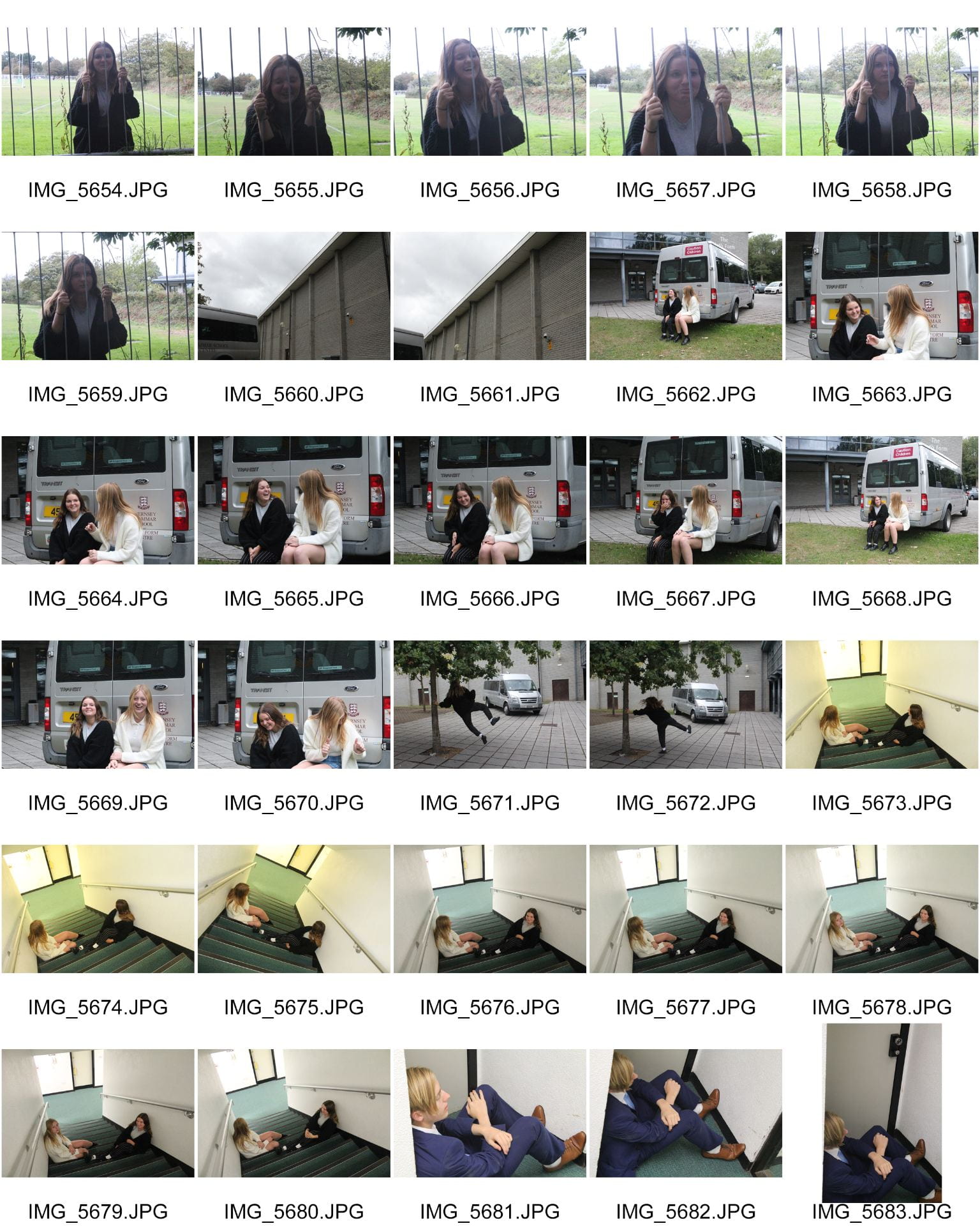
Contact sheet

For this task we were put into groups of 3 and were told to use locations around our school to take photos that convey a story. For this photo shoot we used a typical DSLR camera, that we successfully used in terms of getting the correct exposure and shutter speed etc. We mainly experimented with different exposures. We found that our images worked better at a lower exposure, as most of our images had a dark mood. We achieved our goal of telling stories using the camera by experimenting with different angles framing and distances. Furthermore, in the composition of our images we had to really think about embedding all the different aspects of MES.

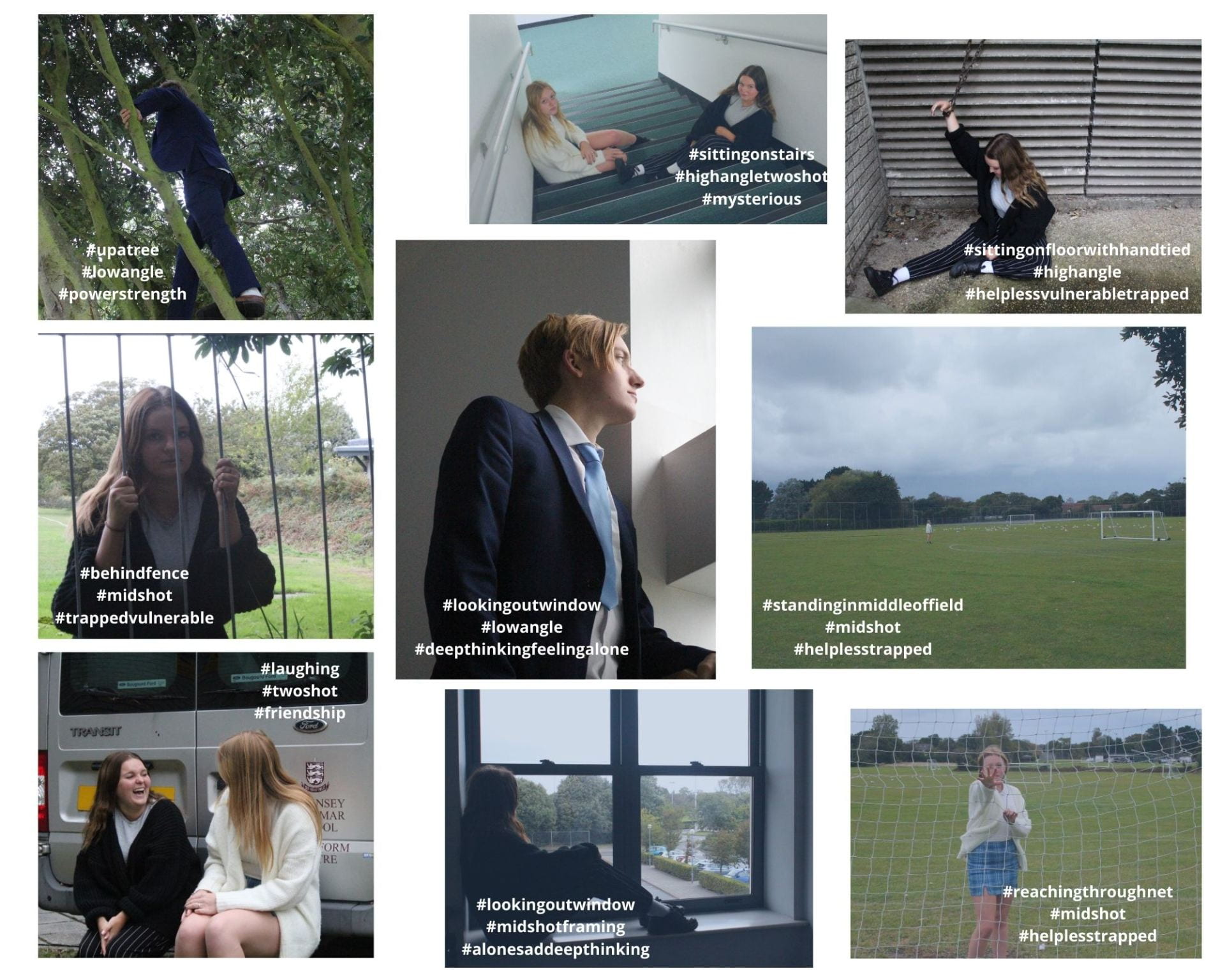
Collage

The aim of this photo shoot was to convey a narrative within all of our images, and I think that we successfully did this as a group. We managed to complete this through our understanding of Mise En Scene:

  • Facial expressions
  • Colour
  • Body language
  • Proxemics
  • Pose
  • Costume

It is important to remember that there are multiple parts to photographing a story. There is the set up of the image eg. MES, but then there is how you actually take the picture. Its how you take the image that tells the story. One of our photos that stood out to me was the bottom center image which had a denotation of the girl gazing out the window. I particularly like this one because the narrative is being fully connoted. We used mid shot framing in order to get the angle on this image. We used a mid shot so that the window could also be a main focus of the end result. If the window wasn’t there then the story in the photograph wouldn’t make sense. We also used the rule of thirds in the composition of it, again, in order to allow the model and window to be a main focus. The model is gazing out the window and this represents her as feeling quite lonely and possibly in deep thought. We also reduced the exposure on the camera – making the image darker and therefore emphasizing the connotation of a depressive/dark mood.

This approach of taking photographs will massively help me with my own music magazine production. It has allowed me to have a fuller insight into how images are able to go from being ‘just an image’ to being something much more – something that can tell a story. In my music magazine I feel I will now be able to display my knowledge of MES in my final product much more easily and successfully.

My Image that uses Mise En Scene to Communicate Meaning

Mood board

Made with Padlet


In an allocated group, me being with Chloe and Jacques, we researched in detail the genre ‘Pop’. We looked at images of ideas for how a performer from our allocated genre could be represented in terms of:

  • Body language
  • Pose
  • Costume
  • Facial expressions
  • Hair
  • Make-up
  • Props

After exploring the Pop genre into such detail I have learnt that typical Pop costumes can be described as casual, boy/girl next door, relaxed and self assured. I also found that there are many different variations of Pop and how it can be presented to an audience. Considering Mise En Scene when looking at images, ideas, costumes, settings that are appropriate to Pop. Some examples of MES that are related to Pop are plain t shirts, leather jackets, sunglasses, bright colour palettes etc. I now feel I have a good enough understanding to be able to carry out a successful photo shoot. Without Mise En Scene, you would not be able to tell any music genres apart.

Post-It

It is important to find connotations of any piece of media and analyse it in detail to get a full understanding – a genre decode. With this task we stood our performer in front of our peers and they all had to write down adjectives they would use to describe them. A few words that our performer received consisted of:

  • Laid back
  • Casual
  • Young/fun
  • Genuine

Photo shoot

Final chosen photo

This is the image that I thought best resembled the theme of Pop music. We decided to dress our performer in a colourful shirt and denim jacket. This casual attire allows him to come across very ordinary and welcoming. The denotation of accessories such as a bracelet and sunglasses – makes the performer give off connotations of being very laid back and ‘boy next door’. The facial expression that the performer is a clear representation of how self assured and confident he is. In addition to this, the body language of pointing and looking directly at the camera makes the performer become engaged with the audience – a very important aspect of media.

Reflection

Throughout this mini project I have learnt a number of things that will help me with my media journey over the next couple years. At the beginning when making the mood board, putting in each individual picture, I couldn’t really see how it was going to pan out. However, looking at the board as a whole, with annotations, it all came together to give me a clear understanding. Although our group didn’t stick to the exact style that went on our mood board, it definitely pointed us in the right direction.

The biggest thing I have learnt from undertaking this task, is getting a full interpretation on the importance of using Mise En Scene to convey meaning. By starting with looking for specific MES features in the mood board, it was much easier to establish what MES features were needed in our photoshoot – particularly the laid back body language, casual style and young/fun accessories.

This will now impact my own planning/research for my magazine production in a very positive way. I now know how to successfully plan using the key features of MES – this will dramatically help me with my mood board for my magazine. As we have gone through the process of also choosing our final photo, it will assist me in a way where I can identify which photo from the shoot best suits the genre I am aiming for in my magazine.

Tour Poster Analysis

Making your media attractive is very important in the world of media. After analysing this music tour poster, it has allowed me to enhance my understanding of just how important appearance is. In this poster I have looked into depth at:

  • Colour
  • Text
  • Body language
  • Clothing

All of these categories signify different aspects of media that must be fully considered when making any media products.

Due to looking through many music tour posters and deconstructing one, I have learnt that all forms of media have denotations, and all denotations have connotations. These connotations help media consumers understand media to a fuller extent. I have learnt that there are a lot of components that go into making an attractive piece of media, and by analysing this poster I feel I could make a very successful magazine. I would do this by incorporating the detail that I picked up on, into my work. An unsuccessful magazine, for example, would be one that has an image of a country singer, with robot font, and text about furniture for sale. It wouldn’t make sense. So to make my magazine the best it can be I will need to ensure that the body language, colour, images, clothing and text etc all display the correct narrative.