
How do your products represent social groups or issues?
Our star is portrayed as playful and anarchic, with the inclusion of his metanarrative representing him as arrogant and independent. He constitutes some extraordinary components to Dyer’s paradox of the star theory. Although absent in some areas, he is someone his audience aspires to be like. Despite this, his consistent presence in the music industry, reflects more on the ordinary aspects of Dyer’s theory – portraying himself as approachable and available on social 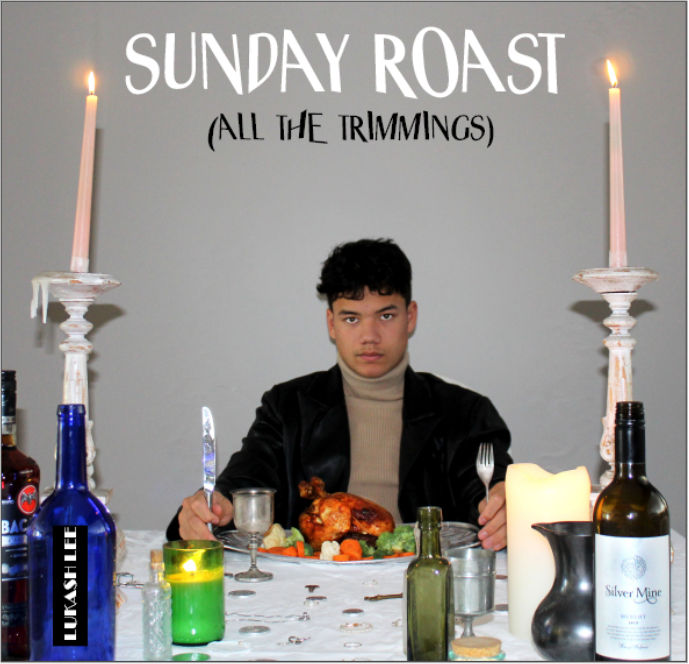 media, like the ‘boy next door’. The language that I used is direct, and the typeface is large and unique. The direct dialogue suggests that he is in control and authoritative, the bold, unique typeface allows him as an artist to pervade other artists in the industry. The contrast between the typeface and the images included in the DP suggest his anarchic tendencies and his variation between extraordinary and ordinary.
On the front cover of our DP, I wanted to represent our star as decadent, yet keep designs as conventional for an indie rock artist – the MES on the front cover represents this. The opulent leather jacket portrays him as someone of class and status, highlighting his confident and arrogant representation.
 With the addition of the goblets, candles and jewels, the audience can freely understand that he is an upper class, almost authoritative artist. I photographed him in dim light, in regards to the narrative codes, a stern facial expression that held a semic code of suggesting his authoritative nature. In relation to Barthes signifier theory, the colour red in correlation with the red wine pouring outside the goblet rather than in it on the back of our DP, could be signifying a symbolic code for someone special, representing him as outstanding and sentimental – his ordinary side. It also signifies the unique ways in which he stands out from other artists in the industry – his extraordinary side. It holds a sense of arrogance about the artist, as well as the transformation of the image onto its side. It connotes a sense of playfulness to his rebellious fans.
How do your products engage with the audience?
My audience are typically hold a middle class socio-economic group, and are mostly men. Usually they are introverted, intellectual, and creative. They also tend to be less hardworking and less gentle. Passivity, anxiousness, and low self-esteem are other common personality characteristics. They like to live a lifestyle that follows social trends which are considered to consciously deviate from the mainstream. I needed to bare this in mind and develop my products off this so that I attract the correct target audience.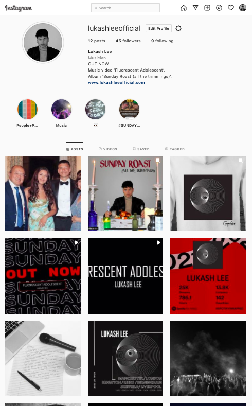
As the Blumer and Katz theory describes, it is necessary that in order for audiences to be engaged with media forms, they must include; significant social interaction, entertain the audience, inform the audience for engagement, and provoke a sense of personal identity. The SMP contains all of the above – it allows the audience and fans to decode texts and adopt a preferred reading. If the repertoire of elements is interchangeable, the audience will reject the text due to lack of engagement and understanding.
I ensured that the SMP included the essentials for engaging and maximizing audiences. An example of social interaction are the highlights. I included polls where followers could vote and make them feel part of what our artist is interested in. To develop the audience’s personal identity, a hashtag encouraged fans to utilize and join in with one another. B&K suggest that this creates a sense of togetherness, allowing fans to connect with one another, sharing their values. Additionally, I created a post about a charity the star supports – this encourages and reinforces the personal identities of the fans who are likely to look to the artist for guidance. Another aspect of B&K’s model is that the SMP contains relevant information and entertainment. I created teasers, tour posters and competitions, to maximize the artists fanbase and generate a higher reach. To encourage preferred reading, the SMP has numerous posts and videos with captions developed to entice the audience and keep them entertained and engaged.
How did your research inform your products and the way they use or challenge conventions?
I researched numerous professional indie rock music videos, videos of this genre use roughly a 90:10 linear narrative performance ratio. It seems to be conventional to have an overlying colour correction filter over the entirety of the video. It’s conventional for the videos to have a personal issue nearing the middle, that doesn’t resolve by the end. I watched an MV by Sam Fender, and it was evident that the typical MES featured; the characters wearing ordinary clothing – often simple, low-key lighting, and little-to-no accessories. Therefore, the generic shot conventions include reaction shots and mid shots to connect more with the audience. Lacey would refer to these as the repertoire of elements – what the audience expects to see when watching an indie rock music video.
During production I decided to both subvert and follow the generic conventions of indie rock videos. In regards to the content of our music video, a coloured filter on the whole thing would have disrupted the narrative sense. The audience would not expect this, as in reference to Altman, it is not part of the blueprint. The narrative included binary opposites of love and hate, and entrapment and freedom – causing a personal confrontation that did not resolve itself, forcing the characters into spirals of wistfulness and disbelief. Their relationship was much more symbolic and abstract compared to the  indie rock conventions, so challenged this greatly. Despite this, the close up, reaction and mid shots within the narrative helped to communicate to the audience that the artist is someone who strives to connect with his fanbase and is eager to express that he’s ordinary and can relate to others – generating a sense of authenticity from our artist, which is a generic convention of indie rock.
How do the elements of your production work together to create a sense of ‘branding’?
Mission statement: ‘Lukash isn’t your average boy next door, he cares for controversial issues that most other artists feel are taboo. He is propelling himself towards legendary status, and pushing the indie rock norms to the next level, and intends to continue exploring new musical terrain. His albums are bold, brilliant and hold a comprehensive creative vision.’ This mission statement helped me when developing my knowledge and portrayal of my star image, and what the audience would expect via the blueprints of indie rock stars.
The brand of a star needs to be easily recognizable to a target audience. As a producer, I needed to communicate to my audience across numerous platforms using various forms of media language – otherwise the image, genre and narrative would not be conveyed successfully. Branding also means that you need a deepened comprehension of the star image. Our mission statement includes descriptions such as; ‘exploring new  musical terrain’ which suggests he is on the independent music scene, and ‘bold, brilliant, holding a comprehensive creative vision’. Each product in this package synergizes with each other in order to represent the artist, genre and therefore the brand in different ways – portraying the artist as more than just what his SMP represents him as for example. Hall would suggest that demographics of the star’s audience are taken into consideration when creating the brand so the audience can decode his image to encourage a preferred reading. To ensure this I have followed many of the conventions of indie rock – this will develop the audience’s sense of personal identity.
Audiences and producers do not exist without each other so it’s crucial for me to create a package that engages the audience, and Dyer would recommend that a star image is constructed as both extraordinary and ordinary. The audience would expect to see a star with an anarchic, arrogant, opulent nature. This contrasts with Lacey’s theory, as the music video included a girl and boy that endured a personal issue. This aims to engage the audience in a new, unique way. However, the conventional close ups and upbeat rhythms, follows conventions and therefore promotes the typical indie rock branding. The DP resembles the arrogant nature of the star that is seen in the MV through his stern facial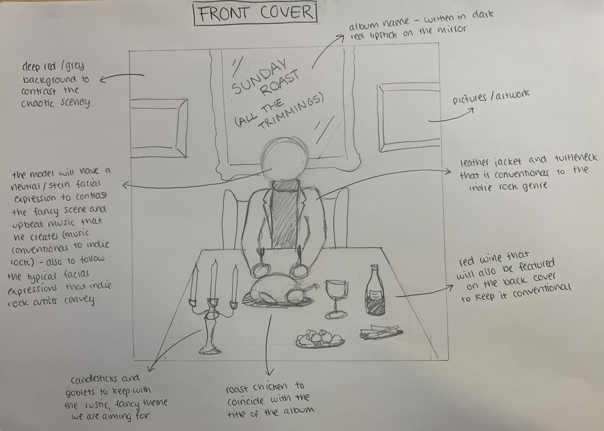 expression on the front cover. Meanwhile, in the SMP, I have worked to convey the same star image that’s represented throughout the DP and MV. The blunt, simplistic language along with the strict colour scheme emphasizes his control and opulence. Furthermore, the semic codes included in the MV and DP connote a sense of playfulness and cheekiness which can appeal to the demographics of the target audience. The mission statement aided me in creating the overall brand, as I was able to represent the package with a conventional metanarrative, a recognizable indie rock colour palette, and symbolic codes that create that of an anarchic yet free star image for the artist.