Digipak Draft 3


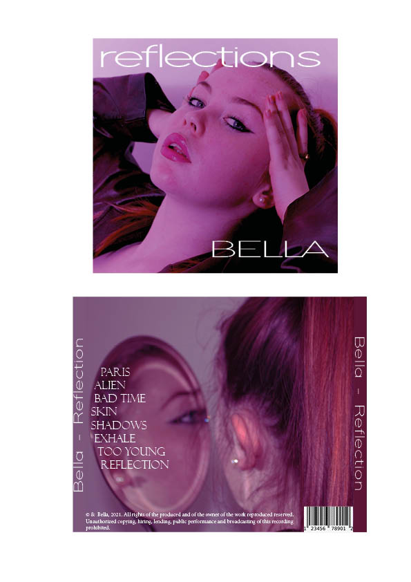
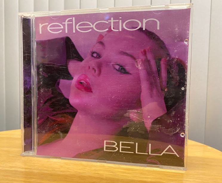
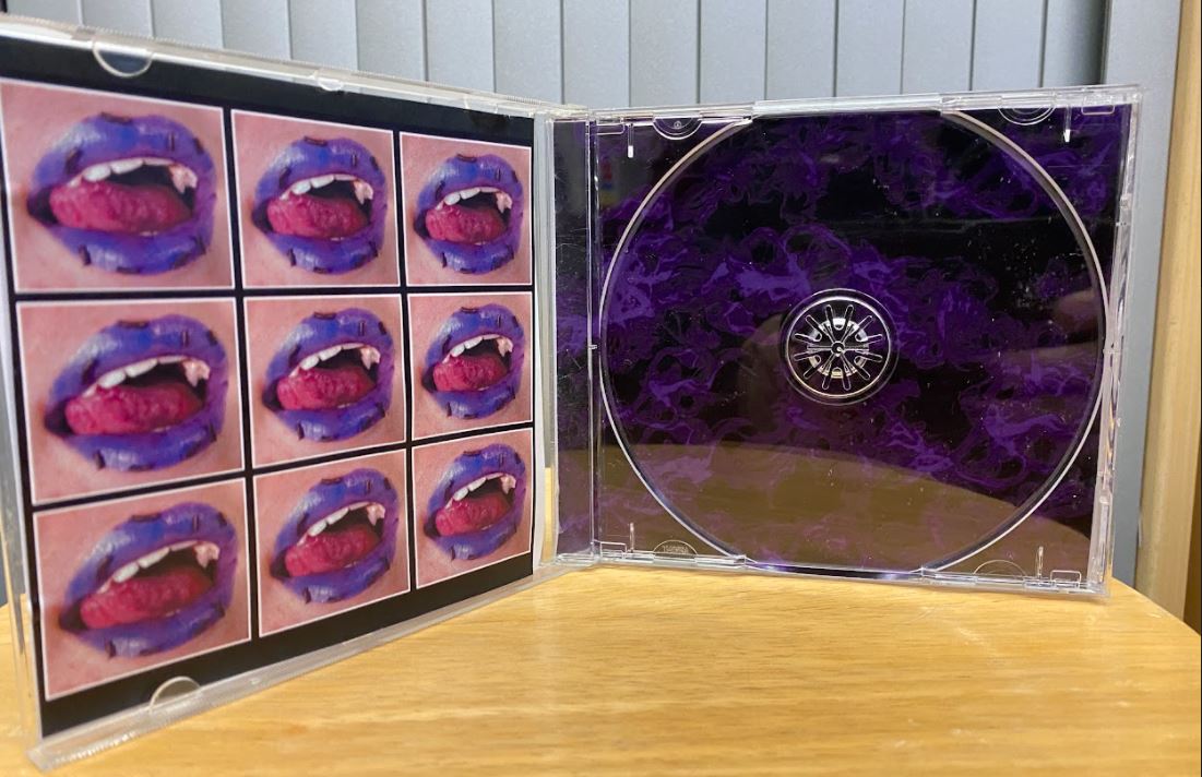
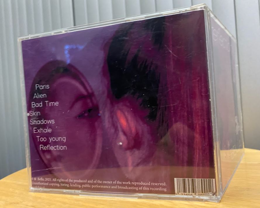
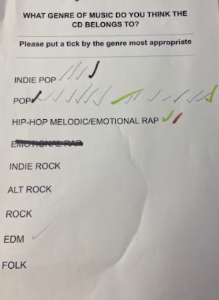
After creating our draft 3 of our digipak we placed them in a cd case to see how they looked, we then printed off a list of music genres to give to people so that we could create a tally on which genre most people thought ours was, most people guessed our genre correctly, this allows us to see that our digipak is mostly conventional to our genre.

Improvements 

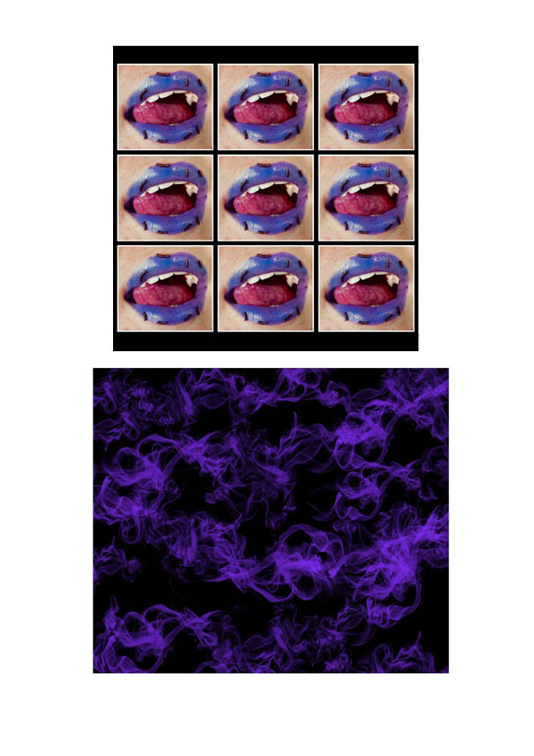
  • Add more vibrnacy and contrast.
  • Experiment more with different layouts.
  • Try more filters.

Graphics/illustrations

This was my original image I took, we opened it up on photoshop and selected the lips to change the hue of them, we decided to use purple lips. We then selected the tongue using the magic wand tool to turn it pink. After doing this we opened it up on picsart and whitened the teeth na dincraesed the contast and saturation of the final outcome, after doing this we created a border around each individual image to then display them in a 3×3 grid. To improve we could look at different colours we could have used on the lips and experimented more with the layout of the lips.

Digipak Draft 2


Targets for improvemnent from screen castify…

  • Add publisher logo.
  • Have bellas name in Upper case throughout.
  • Use same font name for tracks to fit with title font.
  • Add more contrast on back pane.
  • inside panes – add some lips where CD will go, lips melting or reverse colour of them.
  • Try white borders inside.
  • Add smoke on spines.

Overall targets…

  • Ensure there is consistent upper case throughout.
  • Add melting lips on the inside pane and smoke on spine.
  • Add more contrast and up vibrancy slightly.


Digipak Draft 1

I self assesed our digipak using the assesment criteria and taking into account the star image, brand, package and intergrated advertising.

Further improvements for our digipak…

  • Enhance colours and vibrancy of hair, lips and eyes etc.
  • Add more highlight to certian aspects of the face to bighten it uo and make it glow more.
  • Use burn tool to deepen some of the shadows and create more contrast.


Contact sheet

This was a photoshoot that we took within the white studio. We set up artficial lighting to create sharp shadows and harsh lighting within our images. We used a variety of angles and different shots. If were to do this again we could do different styles of makeup and different costumes within the images. From taking these many photos we were able to have a lot of different images to choose from, enabling us to select our favourtites easier.

Design Production Meeting and Risk Assessment


Before our shoot for our digipak we planned out what we would need for our shoot and when and where it would take place in order to help us be prepared. We wrote down a list of equipment and props that would be needed and organised who would bring what so that we were able to ensure that we have evrything. We also filled in a risk assesment to allow us to consider different locations and to see if there are any risks or hazards we may come across.


DP mockup

For our digipak we drew out what would go on the outer covers and inner covers, as we were planning out our ideas to draw we made sure that the star image wel well portrayed and realted well with the genre. We also considered what our narrative was as well as the repertoire of elements ensuring that it would be up to our audience standards and expectatiosn to attract and draw them in. We also considered preffered reading to make sure that the audience wants the text to come accross as how we want it to. We also wanted to make sure that after our final stages of production within our digipak that the audience would encode and decode it in the correct way.


We chose an artist similar to look at that has a similar colur theme to what want to use within our digipak. This enables us to visualise and now what colours we need.

Our Mission Statement – The Package Brand

We created a presentation for our star, explaining how she will stand out from others, gain a wider fanbase and keep her fans intriguied. In this slideshow our brand was described and how the star will be promoted, as well as her unique selling points and integrated advertsting that will be used. Each slideshow spoke about the audience, call to action and promotion. If we don’t provide the right brand the audience could reject the text, to avoid this we will create bold graphics that relate to the star and brand, in order to get the fans to respond how we like.


Skip to toolbar