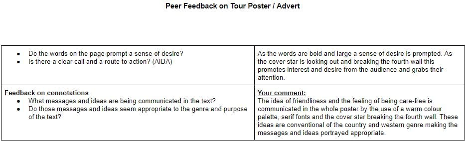
When creating my own tour poster for a country and western artist there are certain conventions that need to be used to fit the typicality’s of the specific genre. From my own research I can see that the conventions of the country and western genre are:
- Colours are generally yellow, orange or blue
- The cover almost always feature the country and western star generally appearing relaxed and easy-going
- Fonts are mostly bold serif fonts with some san serif fonts incorporated

Please click on the image to see a clearer PDF
Country and Western Tour Poster
I believe that my tour poster was successful in portraying the country and western genre as I used the conventions that are typical for example I used a colour scheme of orange and yellow and used mainly serif fonts. However there are some things I could improve to make my tour poster better including:
- Better cut out hair on my image of the country and western star as there was still little patches of green
- Use a less pixilated background image
- I misspelled the word Birmingham so next time I would get someone to proof read my work before I upload it.