
Above is a screen cast done by my teacher commenting on my magazine as a whole. Gladly, a lot of the feedback was positive however the criticisms will be highly useful in making my magazine more effectively portray the indie genre. I have summarised her comments below:
Front Page
- Portrays the indie genre effectively
- Reorganise cover lines so that they do not cover the cover stars face
- Make “The Future Issue” bolder
- Cross is effective
- Add borders like on my DPS to create more of a house style
- Change font of cover star caption
- Add more of a stroke to “AWARE”
- Change background colour so the baby blue colour is not used as much
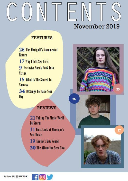
Contents Page
- Put numbers in numerical order
- Add captions to images
- Move the pink bordered image to the middle
- Add borders from DPS to create a house style
- Make the images stand out from the borders by adding a drop shadow
- Add a third section e.g Regulars
- Add a page number
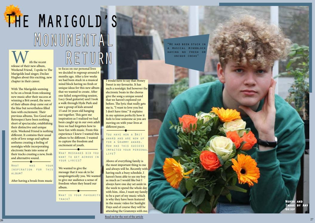
Double Page Spread
- Create a gap between the top of the boxes and first line
- Change the drop capital to after the stand first
- Lines and spots are effective at breaking up the questions
- Add a caption on the image
- Add a bigger strike on “The Marigolds” and move the headline lines closer together
- Clear house style throughout