Digipack Draft 1

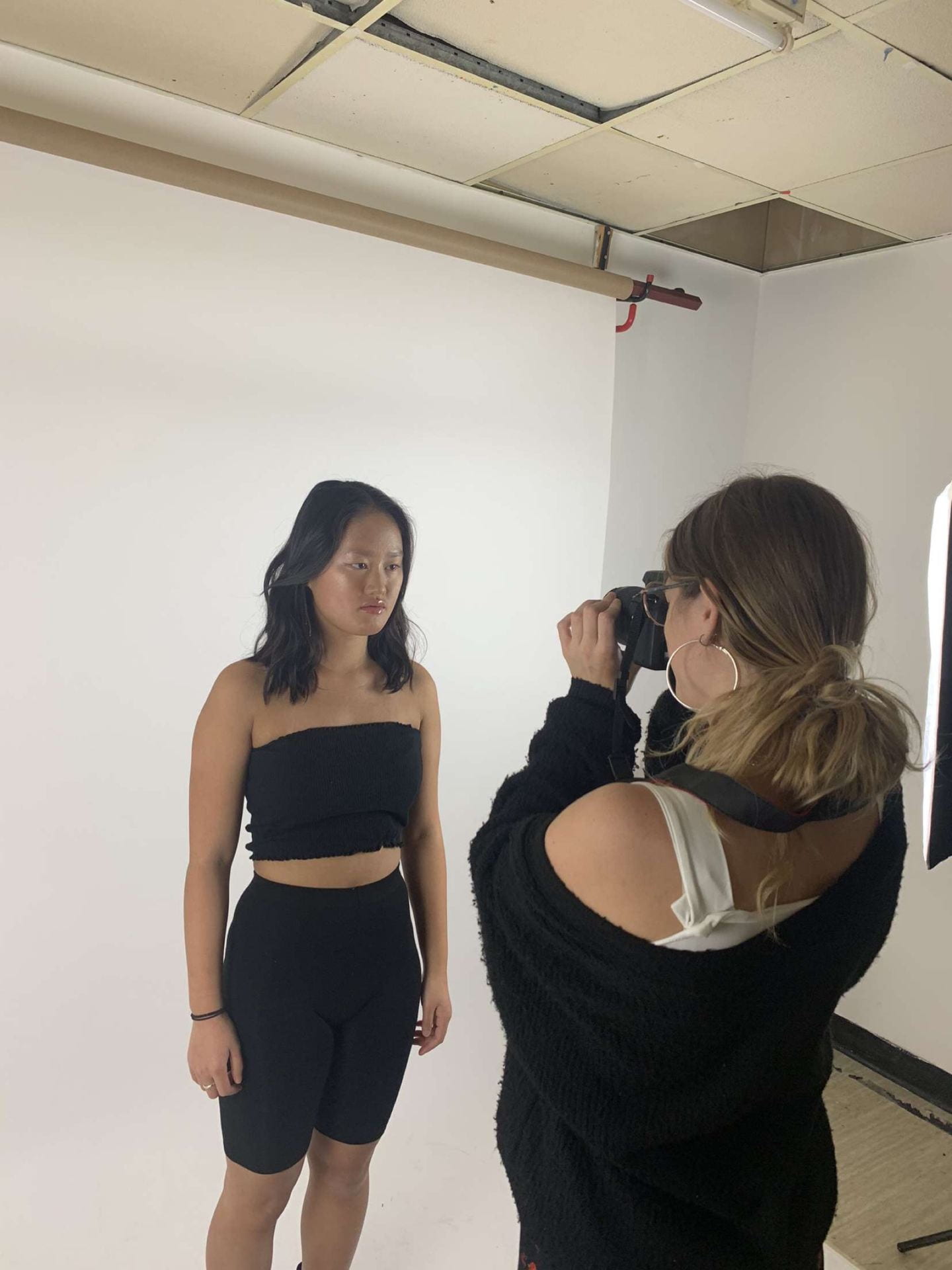
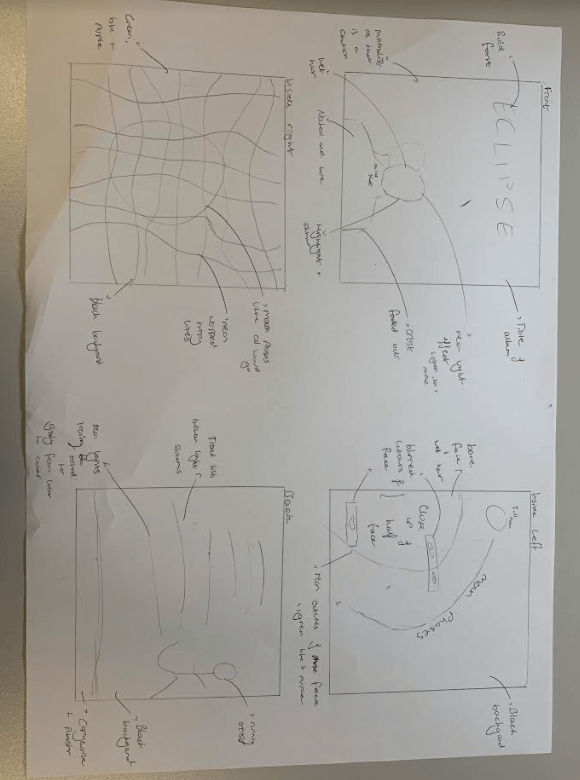
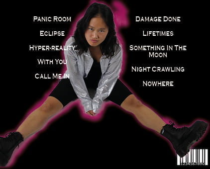
Below is our first draft of our digipak. Overall I think that there are many improvements to be made but what we have done is a good foundation to build upon.

Self Assessment:

I graded our first draft around a D/C as there are many improvements to be made. I evaluated our digipack against three criteria to establish this initial grade which were:

  • The use of camera and photoshop to take and manipulate engaging images
  • The selection of mise en scene in the photos and the meaning it communicates
  • The creative use of DPT to integrate images and text and use colour/typefaces

My detailed responses to these 3 criteria can be found below:

Teacher’s feedback:

Our teacher also sent us feedback after the completion of the first draft. Particular points for improvement that she made was:

  • Place a photo on the front of her looking directly at the camera to create audience connection
  • Need the name of the star on the front pane
  • Add some depth to the paint stripe on the front pane by maybe adding in another colour
  • Correct the odd section of the outer glow on the back pane that goes out from the image
  • Add copywrite to the back pane
  • Add something to the spines
  • Either put a photo of the star on all 4 or only 2 as having 3 panes with the star on is odd

Evaluation of shoot

Overall I think our shoot was exceedingly good as we got a large range of shots so we have a lot of options when it comes to make our digipak. Specific things that went well include:

  • Accurate mise en scene for the electropop genre with the all black then the pop of silver of the jacket
  • All shots in focus
  • All shots well lit
  • Range of angles and shots to use of our 4 panes e.g close ups, mid shots, long shots and high and low angles

Below our some photos that were taken on the shoot.

Contact Sheet

Overall I think our shoot went well as we definitely got a wide variety of shots to use for our front, inside right and back page of our digipak. After reviewing we have found that almost all of out shots are clearly in focus which is great as it means we can choose almost any of the photos taken.

On top of this, I think our mise en scene worked well with the electropop genre, accurately portraying our star image. The only thing that could have gone better is that the chair that we used doesn’t exactly fit with our quirky and edgy star image so if we use one of the shots containing the chair we will have to edit and photoshop the chair to better fit our genre.


Photoshoot / Design Production Meeting

Production meeting agendas are of high importance if we want our digipak to be a success. They outline what is needed for shoot and who is responsible which is vital as everything has to be there in order to get the correct star and brand image. For example if we forgot the silver shirt the quirkiness and edginess of the star image. It would also make our artist seem more ordinary rather than extraordinary as her costume would be bland and plain.

For this shoot it was unnecessary to do a risk assessment as we are shooting onsite at the school.

Hand drawn mock up

Planning what we want our digipak to look like before stepping into the studio is paramount so that we already now what kind of look and vibe we are going for. Below is our hand drawn mock up and colour palette which we will take into our shoot.

Within this we we made sure we included any technical conventions for example a title and a barcode as well as genre conventionsĀ of the electropop genre. These include a neon colour palette of colours shown below, graphics and a bold typeface.

This is important as if we encode the correct information for our target audience, they will have preferred reading making our digipak a success. This includes encoding the edgy and quirky side of the star and brand image.

Branding Moodboard

A convention is anything that is typical of a particular genre of music. It is important that we study the conventions of our chosen genre, electropop, before attempting to start on our digipak so that our target audience has a preferred reading and accepts our work.

Made with Padlet

The mood board shown above is a collection of all things conventional to electropop and are therefore things that we should aim to include in our own work. All of these things will help connote our brand and star image. Specific things that we have found are very conventional to our genre include:

  • Bright, neon colours
  • Bold fonts
  • Quirky and unique shapes and effects


Digipak Conventions Analysis

Before creating our own digipak we analysed a digipak of our chosen genre, electropop, to work out what was conventional. I learnt that conventionally a digipak includes:

  • Name of artist and album
  • Barcode
  • Track list
  • Copywrite information and music publishing company

Specifically for the electropop genre I have found that conventionally digipak’s contain:

  • A bright colour/colours contrasted with darkness
  • Bold fonts
  • Minimalistic covers with quite a lot of empty space
  • Distorted/faded images

This will be very helpful when we come to produce our own as we can make sure that our audience will have a preferred reading to our digipak which in turn makes profit. The way to guarantee a preferred reading is to stick to many of the conventions listed above however we have to be careful and make sure that we are still unique so that we can make our mark and stand out within the music industry.

Our Mission Statement – The Package Brand

In order to complete our digipak, we first had to understand our audience and competition. This is vital when it comes to creating our own digipak as we have to understand how to get a preferred reading with our audience while also being different from our competition so our audiences chooses us over others. In this task we also wrote our mission statement which captured all that our album will stand for as brand/star image is highly important for our audience. In this we wrote what would make our album/artist stand out and why audiences should listen to us and buy our digipak.

Music Video Draft 4

Below is our draft 4 for our music video to the song Panic Room. We have improved upon the comments given my fellow media students in order to improve our video. Things we have changed include:

  • Colour correcting all our clips to make them look brighter and less grainy
  • Changed the order of the clips around 0:53 as they were a repeat of the previous clips
  • Faded the shots at 3:17 to black to create a blinking montage

In order to evaluate our video we asked some fellow media studies students for their opinions on our music video. These are their comments below:

Our teacher also gave us some good feedback which has been detailed below:

Specific actions we will take to improve our final draft include:

  • Colour correcting the shots of Min in the bunker
  • Colour correct some shots of Millie
  • More cuts in the performance shots to create more pace
  • Increase shots in jump cut sequence at 3:36
  • Extend the last clip of Millie running and fade to black
  • Change one of the shots of her feet running in the footprints as our peers noticed that it had been used twice


Music Video Draft 3

Below is draft 3 of our music video to the song panic room by AU/RA. Specific changes that I have made include:

  • Added the black/white Lumetri colour filters to all studio lip sync shots
  • Changed the scale/position/rotation of the lip sync shots in the bunker
  • Placed narrative over the lyrics “welcome to the” rather than performance shots
  • Reversed/flipped some shots that we have used multiple times for example the hand dragging along the wall and 3:03
  • Quickened the pace of edit by adding more clips to the montage coming up to the last chorus
  • Deleted the clip of out actor looking out the wall as it was too dark and we were unable to get it light enough in postproduction

We asked some of our peers to give feedback and this feedback is listed below:

Amber:

James:

To improve our next draft we will:

  • Correct some of the bunker lip-syncing shots as some have different filters on
  • Reverse/flip the shot at 0:51 so it doesn’t look as if we have repeated the same shot
  • Colour correct some shots by using Lumetri scopes so that they look more vibrant and clear
  • Fade to black at the end where the music is very faint
  • Create a title shot at the start
  • Fade to black between each clip in the location montage at 3:17 to create a blinking effect