Draft of Content Page

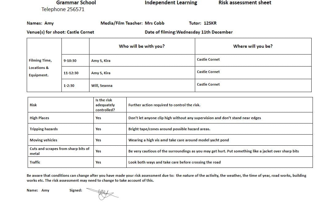
Click on the link below to see a clearer PDF

Contents Page First Draft

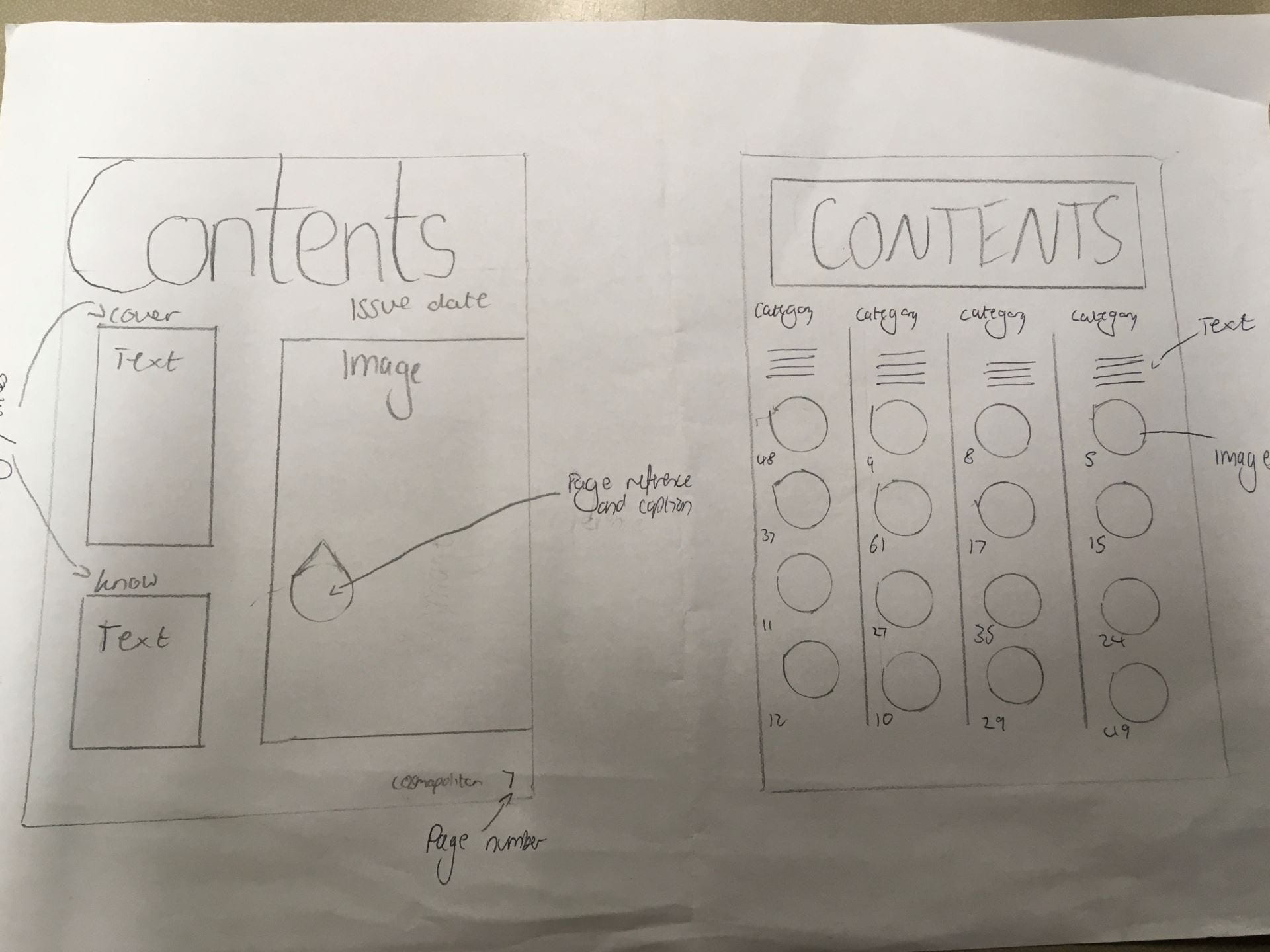
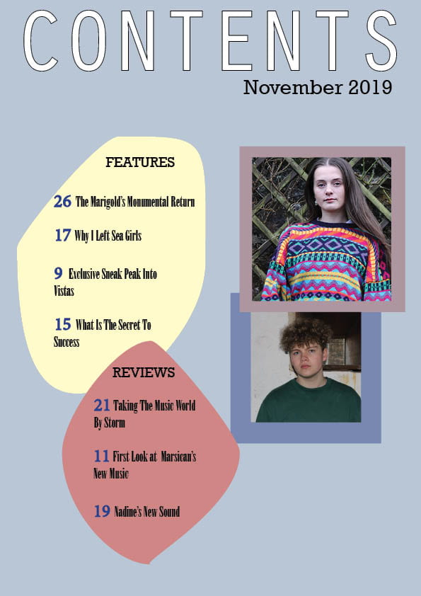
Above is my first draft for my magazine contents page. Overall I think it is effective in portraying the indie genre as the colour scheme is pastel and the type faces give a unique and retro vibe which is conventional of the indie genre. A classmate also commented on the fact that the uniquely shaped boxes and the minimalistic apporach is effective

Things that I will change to improve my next draft are:

  • Make borders the same thickness of play around with them more to make the different thickness seem more deliberate
  • Space out the lettering on the captions so that the font is easier to read
  • Add another image to fill up some of the empty space
  • Add socials and contact details so that the audience feel more included in the magazine


What is a Contents Page?

Below are 3 interesting designs for contents pages that I copied from magazines as well as 5 caption ideas that my peers and I came up with.

To make my contents page informative for the reader there are many aspects that I need to consider including making sure I include the typical conventions of a magazine which are:

  • Title
  • Images with page references
  • Catchy captions to draw the reader in
  • Page numbers
  • An editorial

On top of this I will need to make the page interesting and engaging to captivate the reader to want to read an article and buy the magazine. To do this I will consider AIDA.

  • Attention
  • Interest
  • Desire
  • Action

I will also consider Blumler and Katz’s uses and gratifications theory so my magazine appeals to as many uses as possible to attract the largest audience. I need my contents page to be informative so that the readers know where to find their desired article. I need to use exciting and powerful language in my captions so that the readers feel like reading the article will increase their sense of personal identity and can discuss their views on the article to improve social interaction. On top of that the readers also need to find reading the magazine enjoyable so that they keep buying it.

If I consider all of these aspects when creating my contents page it will mean that my magazine will sell to my target audience.

A New Improved DPS

Above is my second draft for my double page spread. Changes I have made are:

  • Deleted the smaller image of Will
  • Added the two lines to the bottom left of the page
  • Added a third column
  • Added in the credits for the article and image
  • Changed the number which was bottom left
  • Added an image of a flower to “The Marigolds” to make it more interesting
  • Moved the text to the left hand side
  • Changed the font of the questions so they stand out

These changes have made a big improvement but there are still things that I can do to improve my double page spread further. These include:

  • Make the picture of Will bigger
  • Have gaps between the text and the edge of the box
  • Change the wording of “Article continues on next page”
  • Add lines between each question
  • Put something underneath the first column bottom left to fill the empty space


Feedback & Reflection on Draft DPS

Overall my first draft for my double page spread was successful as my peers were able to identify the indie genre. Comments that Lauren, a classmate, made were:

  • The pastel colour scheme works well with the indie genre
  • Add something to “The Marigolds” to make it more interesting
  • Make the smaller picture of Will bigger
  • Change the number bottom left to 26

On my second draft I will take these comments on as well as my teacher’s comments to improve my double page spread. I am hoping that with the use of these comments my double page spread will more effectively portray the indie genre and therefore will mean that my target audience have a preferred reading of my magazine.

Specific actions I am certain that I will take to improve my DPS are:

  • Add an image of a flower behind “The Marigold” lettering to make it more interesting
  • Remove or move the smaller picture of Will
  • Add in a third column
  • Change the number that is bottom left to 26
  • Add in the reference to the author and photographer

Draft of The Double Page Spread

Please click on link to see a clearer pdf

Above is my first draft for my double page spread for my indie magazine. Overall I think it is successful as it shows the indie genre.

Comments from my teacher include:

  • Add a third column and move the image over
  • Add the 2 lines I have top right to bottom left
  • Make the questions bigger and change the font
  • Move “article continues on next page” underneath the last column
  • Move the smaller picture of Will
  • Get rid of dashes


Design Skills 1

Completing my front cover and beginning my double page spread for my own music magazine has taught me a lot about design and production. These skills have helped the indie genre to effectively come through in what I currently have of my magazine. New skills that I have learnt in Photoshop to make my images look better and more suit the indie genre include:

  • Using the clone tool to erase imperfections in my image for example I erased spots on my cover star to make the star appear more spectacular and without flaws to add to his meta-narrative as a star.

Image result for clone tool photoshop

  • Using levels to change the saturation and hue of my image for example I changed the saturation of the image of my cover star to add a retro and vintage feel which is a convention of the indie genre.

See the source image

  • Using sharpen/blur tool to make the main focus of my image stand out for example I sharpened my cover star so that he stood out from his background to make him appear more lively and real and present for his audience.

  • Using crop to get rid of distractions on the edge of the image for example I cropped the image of my cover star so that the image was mainly my cover star and not the pink background making him seem important and worth of taking up space on the cover. This adds to his meta-narrative and makes him seem special and spectacular.                                             See the source image

I have also learnt how to use InDesign in order to make my magazine. Specific skills that I have used include:

  • Creating boxes of different shapes and sizes for example in my double page spread I created a unique box shape for a quote to go in to make my dps unique and funky which is a convention of the indie genre. Also I have used boxes when placing my images so that my images are the correct size on the page.

  • Adding text and changing typefaces, size, stroke and colour for example for my masthead I chose the font Orator standard to fit with the indie genre as it is bold and used a black font. However to contrast my cover star’s name is white with a black stroke to give a retro feel


A New Improved Feature Article

Above is the third and final draft of my feature article to go on my double page spread. The changes that I have made will help the article sound better and make it easier for the audience to read.The changes I have made are:

  • Written the album name in the first sentence and deleted it from further on in the article as it made the most sense to have it as early on as possible as the album in the basis for the article
  • Added commas in places where they were needed to help the article flow
  • Changed the wording in the last paragraph to help it flow better


Third Shoot Contact Sheet(s)

Above are my contact sheets for the location shoot at Castle Cornet. Overall it was a successful shoot as I have now got some images to go on my double page spread and contents page.

The day went well as Castle Cornet has a lot of unique places for backgrounds which can create some interesting storylines, however the weather was an issue as it was very windy and had a lot of rain therefore I couldn’t spend as much time outside that I would’ve liked to.

Below are my five favourite shots that will make in into my magazine. The two shots will go on my contents page and the individual shots will go on the double page spread with my article. I think that these shots are good as they effectively show the indie genre while having interesting backgrounds that tell a story.

Draft Feature Article

Above is a recording of me reading my first draft of my article out loud. This has been useful as I have realised areas that do not sound right and that break up the flow of the article. Applying the corrections that I mention in the recording will help improve my article greatly.

Below is a second draft of my article the I have corrected after listening back to the voice recording and after peer and teacher feedback.

The changes that I have made means that my article now flows better and better fits with my star so that he appears more genuine and present. The changes I have made are:

  • I have said the album name earlier on
  • Deleted the sentence at the end of the first paragraph as it was repeat of a sentence earlier on.
  • Added a comma before the lyric quote
  • Changed the adjective used to describe Mylo to make Declan seem more real and genuine

I think that this is a good article to go on my double page spread. Along with the article there will also be images of the star which I will take on the 11th of December. In these photos I want to show off that the star is down to earth and real as the article is talking about his extraordinary life.