My Tour Poster

When creating my own tour poster for a country and western artist there are certain conventions that need to be used to fit the typicality’s of the specific genre. From my own research I can see that the conventions of the country and western genre are:

  • Colours are generally yellow, orange or blue
  • The cover almost always feature the country and western star generally appearing relaxed and easy-going
  • Fonts are mostly bold serif fonts with some san serif fonts incorporated

Please click on the image to see a clearer PDF

Country and Western Tour Poster

I believe that my tour poster was successful in portraying the country and western genre as I used the conventions that are typical for example I used a colour scheme of orange and yellow and used mainly serif fonts. However there are some things I could improve to make my tour poster better including:

  • Better cut out hair on my image of the country and western star as there was still little patches of green
  • Use a less pixilated background image
  • I misspelled the word Birmingham so next time I would get someone to proof read my work before I upload it.

My Magazine Front Page Swede


Please click on the image to see a clearer PDF

Original Magazine Cover

Copied Magazine Cover

This was a highly useful task to learn how to effectively use InDesign to create magazine covers which will be very helpful when I come to design my own magazine cover as I will be able to add my desired effects to the text and imagery.

It was also helpful as a way of learning the technical conventions of a magazine cover for example I now understand what kind of information goes into a cover line and how to make certain parts of the cover lines stand out. For example in the magazine that I was copying certain parts of the cover lines were in a bolder typeface and in red so that they were more prominent to the audience.

I believe that I was somewhat successful in replicating my chosen magazine cover as I found the same image and used the same colours for text however their are some things that I thought I could’ve done better. These include:

  • Placing the cover lines closer together
  • Not having such large gap between the cover lines and the edge of the magazine cover
  • Not having uneven gaps between the masthead letters
  • I also struggled to find the exact font for some parts

Below are some YouTube videos that I found helped with this task

The Camera Talks

This task of creating a mood board helped me to understand what makes a good photo as I had to pick my favourite 9 shots from all of the photos that we took and write the denotation and connotation of each image.

My favourite photo out of the selected 9 is the low angle photo in the middle of the mood board as I believe that it was most successful in portraying our intended narrative. I think this as the low angle creates the idea of superiority, strength and power which represents the narrative of the rebellion of the girl in the photo.

I thought that we were quite successful in portraying our ideas, which was the main task focus, however I feel that we needed to take more time adjusting the camera so that the images were fully in focus and lit with a correct level of brightness. For example in my opinion the middle photo in the top row is too dark so we should’ve used a slower shutter speed or made the F number smaller. This will be helpful when creating my own music magazine as I now have a better understanding of DSLR cameras and how to fix issues like lighting and focus and I also have an idea of how angles and distances can convey a narrative. This will be helpful as getting across my intended narrative will make my own music magazine more successful and it will increase sales.

Technical Camera Terms

Above is a collection of photos that we took displaying different distances and angles to convey a narrative.

I learnt from the task the importance of aperture and shutter speed in creating a narrative. Aperture is how big the hole is to let in light. If more light is needed a smaller F number will be used whereas if less light is needed a larger F number will be used. Shutter speed is how quickly the shutter closes over the hole. A high shutter speed is used in bright light as not a lot of light enters and a low shutter speed is used in dark lighting as a lot of light can enter.

The use of camera is a very effective tool in conveying an idea. The distance that the camera is away from the subject of the photo and the angle that the photo is taken at is key in portraying the intended narrative. For example a close up is used to show emotion and to feel connected to the character and what they are feeling where an extreme long shot can be used to either show the relationship to the character and their surroundings or to convey loneliness and isolation. The angle at which the photo is taken is also useful. A high angle is generally used to represent vulnerability and inferiority whereas a low angle portrays power and superiority.

My image that uses mise-en-scene to communicate meaning

Made with Padlet

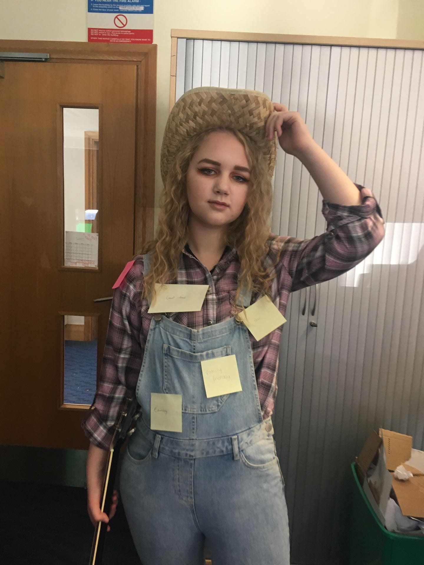
Our music genre was country and western and in our research we found that the conventions of country and western are:

  • Denim clothing e.g dungarees
  • Plaid shirts
  • Acoustic guitar to give off a relaxing and laidback vibe
  • Cowboy hats as the music genre of country and western is generally prevalent in America

Creating a mood board will be helpful when I am designing my own music magazine as it will help me to understand the conventions of the genre of music and what mise en scene should be.

In this image people were asked to stick a post it note on the model dressed as a country and western star with a word that they thought described her costume in relation to the music genre. Examples of these words were:

  • Laidback
  • Family friendly
  • Earthy
  • Helpful
  • Chill

This was useful for us as it gave us gratification that the conventions of the country and western music genre were noticeable and prevalent. This will also be useful when creating my own music magazine as getting peer feedback will make sure that my magazine is as effective in conveying my ideas as possible.

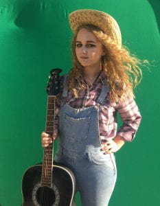
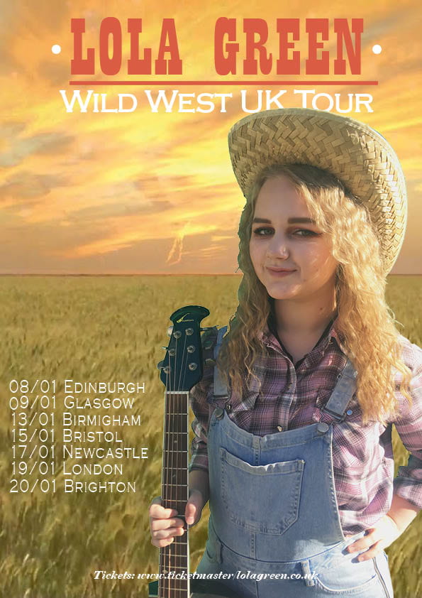
In my opinion this is the best shot from the photoshoot as the mise en scene worked well collectively to depict the message of a country and western singer. The aspects of the photo that showed this were:

  • The plaid shirt is a convention of country and western however the purple in the shirt gave off a feminine vibe which created a caring and family friendly tone
  • The straw cowboy hat fit with the conventions of the genre but also the fact that it was straw gave off a softer, more caring and helpful feel
  • The hair of the model was loosely curled giving the impression of being laid back, approachable and care free
  • The body language of the model suggests a strength and independence but also gave off the feeling of the feeling that the character was caring as she was looking at the camera

This task will be useful when I am creating my own music magazine as I am aware of how each individual feature in the photo adds to the idea that I am trying to convey for example the fact that the cowboy hat was made of straw gave a feminine and caring feel while also sticking to the conventions of the country and western genre. This attention to every little detail that I have learnt while doing this task will make sure that my music magazine is as successful as possible.


Print Media that Communicates Meaning

This task taught me how important every aspect is in media in creating the desired narrative for example the red colour of the dress suggests romance and passion. In this task I analysed the mise en scene and thought about how these aspects added to the overall vibe of this individual tour poster. This information will help me when creating my music magazine as:

  • I know what needs to go on the tour poster, as using Blumler and Katz’s theory we can tell that this particular media is an informative piece of text, and the uses of each aspect
  • I understand how the colours I use will convey a message and give off a specific vibe
  • I understand about the body language of a model and how it can be used to show a certain idea along with the costume and makeup on the model
  • I am able to choose a typeface that would suit the poster and convey the message that I was trying to put across

All of these aspects will make sure that my magazine is successful in portraying my ideas and that the artist has sales and and audience to perform to.