Component 3 Brief:
‘A promotion package for the release of an album, to include a music video (major task), together with a website for the band and a digipak for the album’s release (minor tasks).’
How do the elements of your production work together to create a sense of ‘branding’?
How did your research inform your products and the way they use or challenge conventions?
How do your products represent social groups or issues?
How do your products engage with the audience?
 Brands need to be easily recognisable by their target audience so it is important that all of our products work well together and have continuity. The mission statement that we created before beginning production, described our star as a “sensation with a quirky and edgy style”. We attempted to channel these aspects into all our products creating a sense of branding that our target audience would have a preferred reading to. Saussure would describe this as using clear denotations that have relevant connotations.
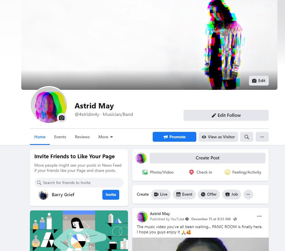
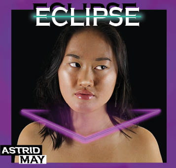
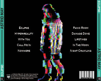
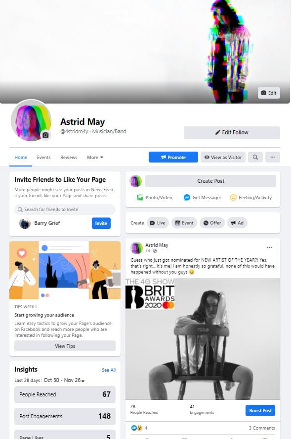
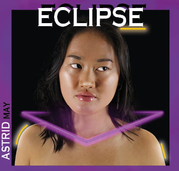
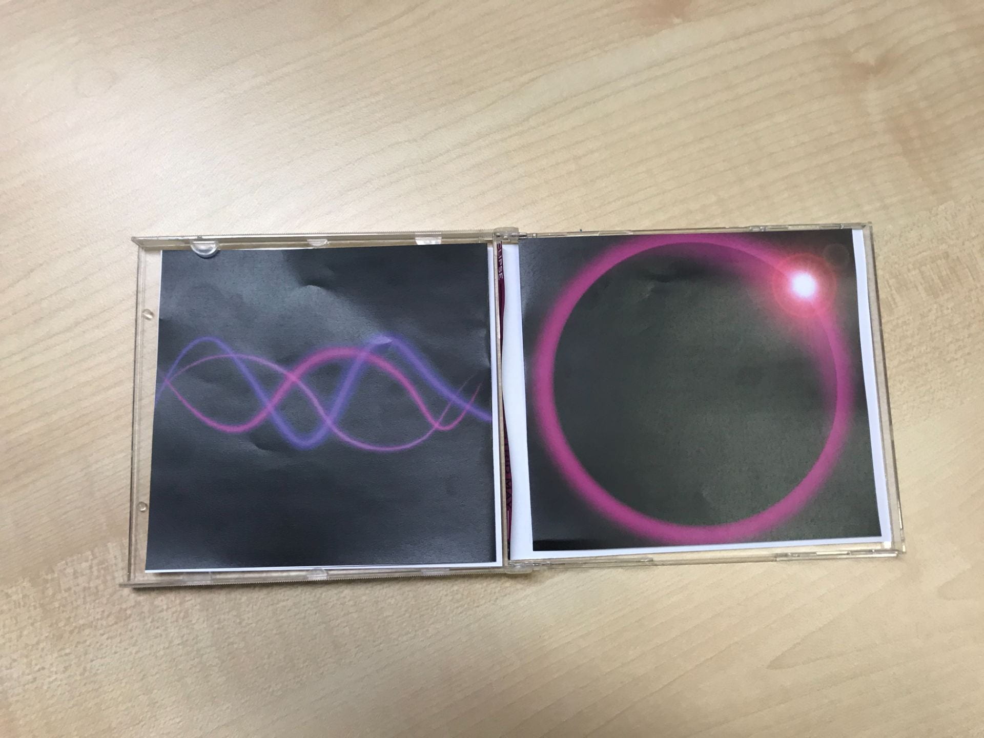
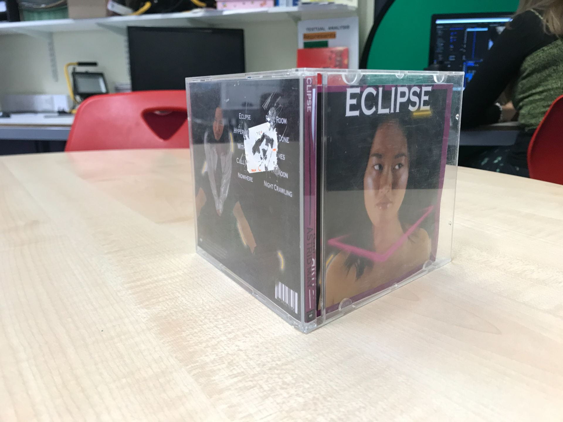
Colour palette was an important signifier in portraying our genre and star image accurately. Conventionally bright, neon colours are used and we took this idea as a starting point for coherence across our products. A typical colour palette contained the colours pink, purple and blue. We thought this a good palette as it had a moody and dark quality while juxtaposing the fun and quirky aspect introduced when we made them neon. The two sides perfectly captured the essence of our brand. An example of this from the music video was the filter that we placed over our artist in the performance aspect of the video. The clips were all in black and white but had a neon filter over the top effectively portraying the two different aspects aforementioned. As well as colour, we  introduced a key motif of soundwaves that ran through our products. This was not so prevalent in our music video but was definitely well-established in our other products. This motif features most prominently in the digipak as it’s the image on the inside right pane of the product. This is then carried on throughout our social media page as it’s featured on our star’s merchandise and her Body Shop collaboration post.
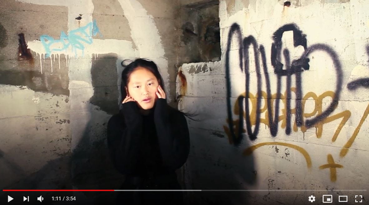
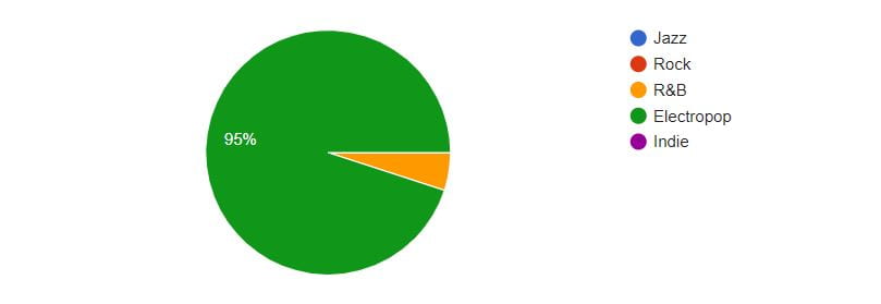
As our chosen artist belonged to the electropop genre, our research began with looking at professional music videos from that genre. We quickly  understood that there was, as Altman would argue, a set blueprint for electropop music videos with both narrative and performance aspects being, generally in equal proportion. A particularly helpful video we watched was Billie Eilish’s video for her song, Bury a Friend. We mainly used Billie Eilish for research purposes as we believed that she was the artist most like AU/RA. From watching this, and many other videos of our chosen genre we were able to grasp a good idea of our chosen genre’s conventions. Narratives were rarely illustrative and most often amplified the meaning of the song in a symbolic way. One video we watched that effectively showed this was Billie Eilish’s video for, When the Party’s Over. This video showed Billie crying black tears symbolising the sadness of the song. Barthes would describe this approach as using symbolic codes. In regards to mise en scene, music videos of the electropop genre generally use low key lighting to give a dark and edgy feel. This low key lighting would be a semic code that would be decoded in a negative way for example, as depression. On top of this, costumes are conventionally dark in colour and frequently minimalist. For example in Billie Eilish’s video for her song, You Should See Me in a Crown, she wears a plain white top white and joggers feeding into the minimalist and monochromatic convention of electropop. All of these elements together, that Lacey would call the repertoire of elements, help to portray our genre and our artist’s star image.
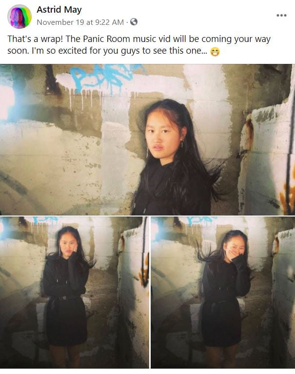
Naturally, we followed the conventions we had found within other artist’s videos. For example, we ran with the idea of a dark but minimalist costume, dressing our artist in a plain black dress and boots. This also represented her as heavily androgynous, especially in regards to the boots. We followed a conventional, amplified narrative with symbolic codes. Our narrative detailed a girl imprisoned within her own thoughts which was symbolised by her being trapped underground and running through endless tunnels. Our narrative could also be argued as unconventional due to the fact that we used an actor and 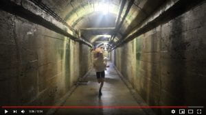 not our own artist in our narrative. We did this to show the difference between the extraordinary aspect of our star and the narrative she was singing about. Another unconventional aspect of our project was that, even though we followed a linear narrative structure, our music video did not come to a complete resolution, however it could be argued that this is conventional of music video narratives. This goes against Todorov’s narrative theory as there is no resolution leading to a new equilibrium.
AU/RA, is often portrayed as fun, carefree and exciting which is conventional  of electropop. In order for this to be accurately represented, neon colours and bold and contemporary typefaces are often used. Another convention of the electropop genre proposed by Richard Dyer was the idea that each star has an ordinary and extraordinary aspect to them. Portraying our star in this way was important to us as we wanted to get the authenticity as well as the infamy of the star across.
In our digipak we used photoshop as a tool to make our star seem extraordinary. We smoothed her skin, darkened her eyebrows and all round made her look more iconic. We further made her seem more extraordinary by creating a neon purple collar to go around her neck. Not only did this portray our star in a fun way, with the use of neon, but it also elevated her status symbolising the power of the star. Barthes would state that the use of the collar 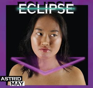 is a symbolic code as we symbolically illustrated her power without explicitly stating it. On top of this to fit in with the electropop genre and to keep a contract with the fans, as Altman would argue, we kept our digipak highly conventional using bright neon pinks and blues. This implies the fun and carefree aspect of the genre and the image of our star helping to feed into the electropop fan’s sense of personal identity as, what is inferred by the use of the neon colours fits into their lifestyle and beliefs.
 Audience engagement is a key aim of advertising campaigns. For our audience to appropriately engage with the product we must encode what is expected so that our target audience has a preferred reading. Hall argues, if encoding is not completed properly, audiences don’t decode our messages appropriately causing an oppositional reading. Blumler and Katz also put forward a theory relating to audience engagement. They argue that audiences engage with the media for four key reasons; gain information, entertainment , strengthening the audience’s sense of personal identity and social interaction.
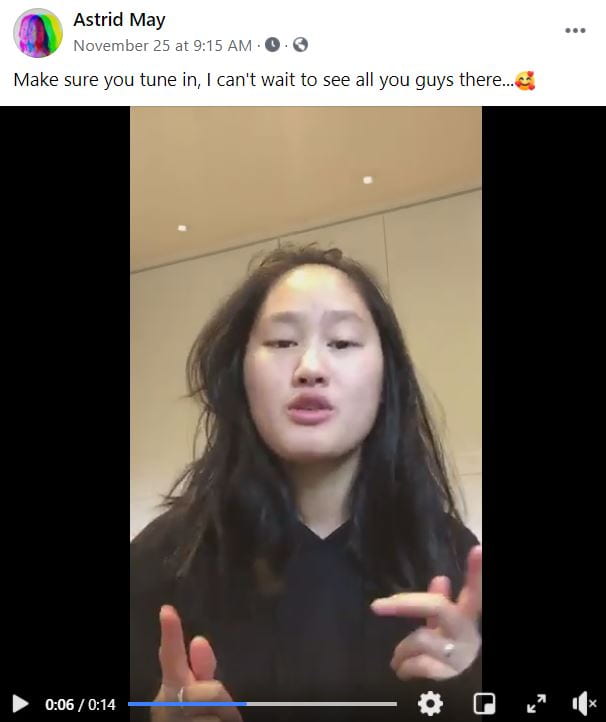
One specific post on our social media page is of our star speaking directly to the audience about her upcoming livestream concert. This direct address fits into many categories in Blumler and Katz’s theory including the information and social interaction use. The video gave her fans information about her future endeavours for example the time of the livestream while also creating social interaction within the comment section as her fans are getting excited. In captions and comments we used the language of our audience which included  emojis and fun, young language, encoding the idea of a fun, quirky and exciting star. This use of appropriate language made sure that our audience had a preferred reading to our product. We further showed engagement with the use of comments as fans engaged by commenting on our artist’s posts. Our star then created further engagement by replying which led to our star appearing more ordinary as she was happily engaging with her fans as if they were equals.