Here is my new improved contents page which is complete of all my own personal targets. However, I recordered a conversation with my peer asking questions about my contents page to make more improvements to make it as successful as it can.
This is my peer assessment for my feedback on my new improved draft of my contents page.
Summary of the points:
- Contents page works well with the front cover as the backgrounds both have pastel colours and go well with the pop genre of the magazine. It has bold and catchy elements between both pages.
- The typeface looks the same throughout both the front cover and contents page which portrays an elegant side to both pages
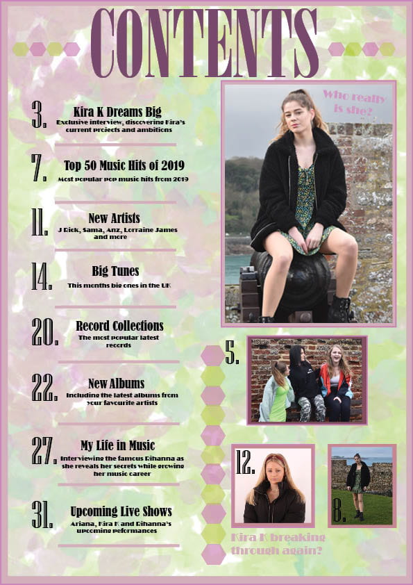
- The genre of music featuring in the contents page looks like pop as it is very stylish, friendly and simple.
- The star is portrayed as glamorous, girly and innocent.
- The cover lines that stand out are Kira K dreams big as it reflects one of the images and you know who Kira K is.
- The cover lines are very catchy and bring an intriguing side to the magazine which goes well with the images. They are very bold and so stand out well.
- Captions next to the picture are quite bright so are hard to read which could be distracting.
- There are conventional aspects such as the main image is clear and goes well with the colour scheme and pastel colour palette. The images are all bubbly and stylish. The unconventional parts may be the different colours of the images which don’t go as well with the background. You could add a colourful banner around them as well as the main image.