Here is my draft 2 for my digipak, I am happy with the progress I am making with my digipak however there are many adjustments and improvements I want to make.


![]()
What’s different to Draft 1?
- Added a bright and distinct gradient colour to the image used on the front cover.
- Changed the typefaces into a more bold and unusual typeface.
- Experimented with the colours of the border and the typefaces to coordinate with the gradient on the image.
- Changed the images for the inside and back covers to experiment with new creative ideas for the digipak.
Teacher feedback:
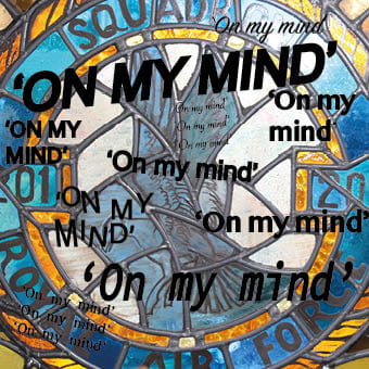
- The border on the front page works effectively as it creates a frame within a frame.
- The colour theme of blue and orange are complimentary.
- Add different fonts for artist name and track list to make it softer.
- Switch pages two and three to link the stain glass image to the circle from the CD.
- Use less quotes and possibly use the quote instead of the writing on the actual image itself.
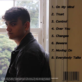
- The picture of the jewellery should have an element added to create more engagement with the audience.
From this feedback, I am going to make improvements to my digipak:
- For the front page I am going to experiment with lighter colours for the border to gain back the vibrant blue used in album title, and add stroke to the image of the artist to make it pop from the border. Also I will change the font of the artist name to create a softer look from the bold album title, which also adds to the contrast of his different emotions.
- The middle two pages will be switched around so that the circle affect in the stain glass window will fit with the circle of the disc. I will also use less fonts and maybe remove the writing on the window using a clone tool and replace with the quotes to create a more minimalistic look as it’s too busy. For the jewellery picture I will need to add an effect possibly a glow line affect to represent the feelings flowing through him. This will then lead onto the track list and both images will have a different colour to represent the orange and blue connotations of anger and sorrow.
- For the tracklist I will need to crop and remove the wall from the image and change the fonts to create more engagement with the audience as there is an element missing. This will include a glow of fluidity of glow through the page linking to the middle page.