Adverts

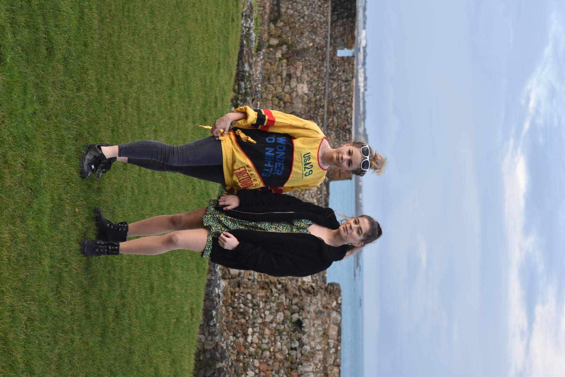
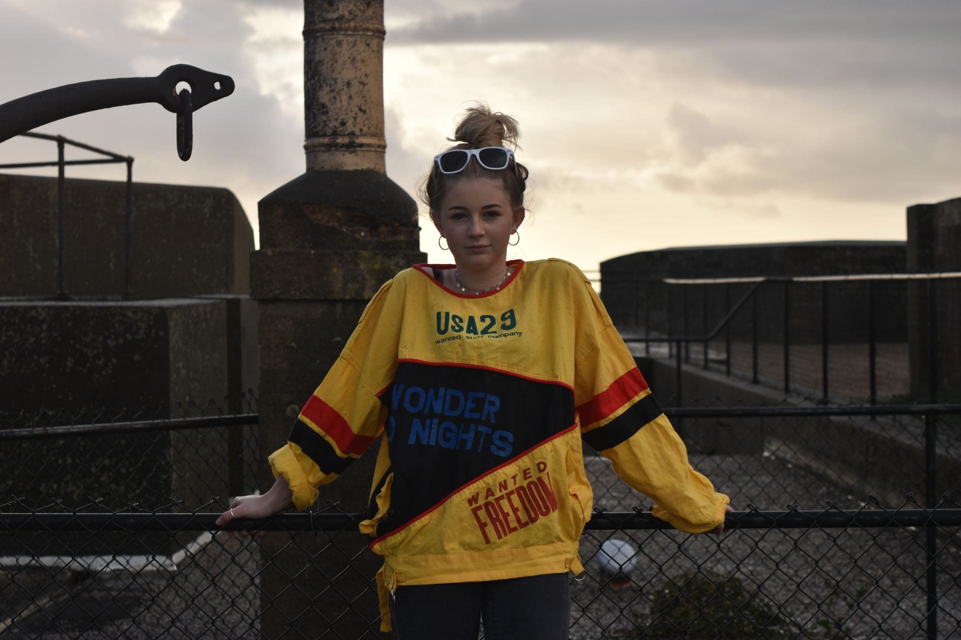
Here are some adverts that I can include in my magazine. I believe they fit appropriately with my target audience as they’re from Ariana Grande’s perfume product and Dua Lipa who are singers that are extremely popular with teenage girls. I found that these adverts were the most suitable to use in my own magazine because they are light toned colours like my own magazine but also are very eye-catching to my young teenage girl target audience.


I chose this Ariana Grande perfume advert for my music magazine as she is an inspiring young pop artists which many of my target audience love and listen to regularly. The advertisement fits in with the colours and themes I chose in my magazine but looks different for the readers eye and contains interesting fonts and images that will attract.

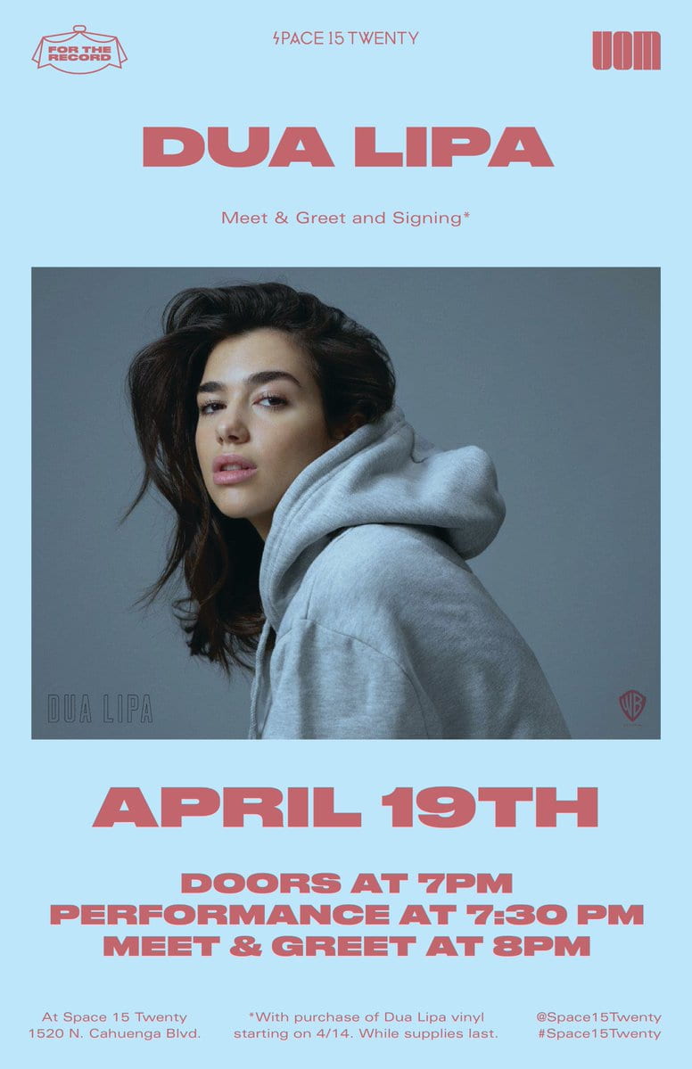
I also chose this Dua Lipa performance advertistement as she is another artist that my target audience love and listen to and would be interested in seeing in a magazine. Dua Lipa’s fashion is also appreciated by my target audience so they will be more drawn into the magazine and buying future copies if she is included.

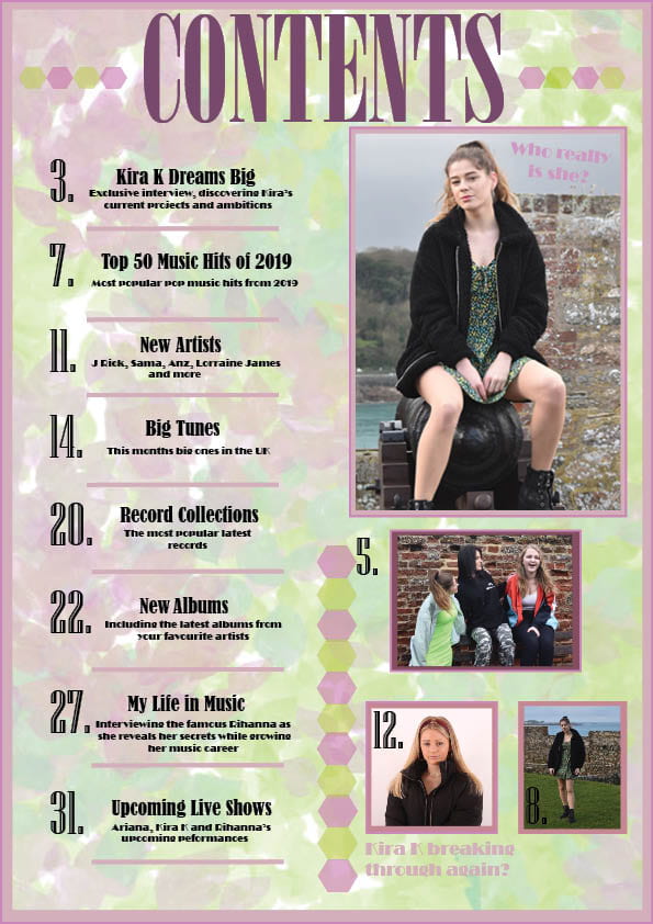
To conclude, I appreciate this isn’t going to be marked but for the purposes of presentation, having an extra page in the magazine helped make the Flipsnack platform work better.  However, it was an interesting exercise in reaffirming that I know who exactly my target audience, young teenage girls, and can prove I know what adverts this audience would be interested in seeing if they were buying a pop music magazine.


A New Improved Complete Magazine Draft

Here is my new improved magazine draft that I have completed after listening to my teacher’s past feedback.


My teachers last improvements she believes I need to make are:

FRONT PAGE

  • Make cover lines more bold to stand out more to the reader.
  • Add lines to pug to make it more interesting and detailed.
  • The spacing between “Confidence is key” should be closer together.

CONTENTS PAGE

  • Photos need captions to know who they are.
  • Only need one Kira K picture.
  • Numbers to pages in green or purple.

DOUBLE PAGE SPREAD

  • Add more quotes in remaining boxes on top of main picture.
  • Justify text to the right in the boxes.
  • Tone down opacity of background as it makes the text hard to read.
  • Make page numbers a larger number.

Complete Magazine Draft

These are my complete drafts for my music magazine as they still have a few improvements that my teacher has set for me to change so I can be happy with my finished designs.


This is the screen castify my teacher completed for me so that I know what amendments and improvements to make to my music magazine to make it as successful as possible.

These are the improvements my teacher set:

  • FRONT COVER
    • Make title more bold by adding stroke around.
    • Bring down all headlines associated with my star “Kira K” to beneath her name.
    • Write down who says quotes.
    • List the pop stars included in magazine so consumer knows they’re getting what their paid for.
    • Add gold to ‘Collectors Addition’ pug
    • Make barcode smaller and move price to the right hand side.
    • Add banner to the space at the bottom
    • Change name to Kira K as it’s more youthful and interesting
  • CONTENTS
    • ‘Who really is she’- state who, add page number that the image relates to.
    • Change photo on bottom right because it’s too similar to main star image.
    • Add thick borders around the images and make sure they all include page numbers.
  • DOUBLE PAGE SPREAD
    • Move image down so the title doesn’t cover the model.
    • Enlarge the page numbers towards the bottom.
    • Make the standfirst in big bold letters and put the drop capital at the start of the article.
    • Include byline for the photography image.
    • Include information/text/quotes in boxes over image.
    • Make the quotes in the article white or put them in normal size with a break.
    • A few hyphens that I need to remove.
    • Change colour of background to a green or light pink.

A New Improved Contents Page

Here is my new improved contents page which is complete of all my own personal targets. However, I recordered a conversation with my peer asking questions about my contents page to make more improvements to make it as successful as it can.

This is my peer assessment for my feedback on my new improved draft of my contents page.


Summary of the points:

  • Contents page works well with the front cover as the backgrounds both have pastel colours and go well with the pop genre of the magazine. It has bold and catchy elements between both pages.
  • The typeface looks the same throughout both the front cover and contents page which portrays an elegant side to both pages
  • The genre of music featuring in the contents page looks like pop as it is very stylish, friendly and simple.
  • The star is portrayed as glamorous, girly and innocent.
  • The cover lines that stand out are Kira K dreams big as it reflects one of the images and you know who Kira K is.
  • The cover lines are very catchy and bring an intriguing side to the magazine which goes well with the images. They are very bold and so stand out well.
  • Captions next to the picture are quite bright so are hard to read which could be distracting.
  • There are conventional aspects such as the main image is clear and goes well with the colour scheme and pastel colour palette. The images are all bubbly and stylish. The unconventional parts may be the different colours of the images which don’t go as well with the background. You could add a colourful banner around them as well as the main image.

Draft of Content Page

Here is my draft contents page for my music magazine. I kept my design simple but I still think I can add and improve to this draft to make it successful and link to my pop genre.

In my design I included the following:

  • Hyperbole and superlatives in headlines
  • Images and word clues
  • Graphic illustrations and designs
  • Reminder of the magazine’s name and mission statement
  • Appropriate fonts

The next improvements I would like to make to my contents page will be:

  • Re-position images
  • Change layout of the contents
  • Add page numbers/ dates

What is a Contents Page?

For this task, I hand drew some draft layouts to plan for my contents page and thought of some catchy headlines that I can use in my own contents page for my magazine. This task helped me to come up with some ideas and inspiration so I now have an image in my head of what my contents page will look like. These are the plans that I made:

From

These are some components that I found are including in a lot of magazines on their contents page:

  • Editors hello
  • Page numbers
  • Hyperbole and superlatives in headlines
  • Images and word clues
  • Graphic illustrations and designs
  • Reminder of the magazine’s name and mission statement

Other components I need to consider when making my contents page is:

  • AIDA-
    • A- Attract
    • I- Interest
    • D- Create desire
    • A- Call to action
  • Entertain
  • Inform/Educate
  • Social Interaction
  • Personal identity

It’s also important to tempt, tease and intrigue and use hyperbole, superlative, descriptive and alliteration when making a contents page to make it as interesting and attracting to the audience.


A New Improved DPS

After listening to all my feedback on my first draft of my double page spread, I have created a new improved version with all the appropriate changes I needed to make. Some of the changes I made to my double page spread are:

  • Increasing the saturation of the photo so it’s more bright and interesting.
  • Adding shapes and borders to make the pages more attractive to the audience.
  • Changing fonts and colours to fit theme of my magazine.
  • Making quotes larger or bold to make them noticed by audience.
  • Adding page numbers and By Line.

This is my new version:

Overall, I am reasonably pleased with my double page spread however there are still a few changes I would like to make to it.

The next changes I would like to make to my double page spread would be:

  • Adding a by line to credit the photographer of the photo.
  • Changing the colour of quotes to white
  • Bring my model down in the picture
  • Making my stand first stand out as it’s an introduction to the article but doesn’t stand out enough.

Feedback & Reflection on Draft DPS

Feedback from my peers are:

  • Up the saturation of the picture to brighten the image to make it look more interesting
  • Add page numbers
  • Add a byline so it’s more professional showing who wrote the article.

Feedback from my teacher:

  • Make quotes more bold and bigger to stand out to the reader.
  • Up the saturation so the image isn’t as dull and boring.
  • Look at other double page spreads for inspiration to make the pages interesting.

From listening to my peers and teacher’s feedback I will make the changes that are necessary to my double page spread in order to make it successful and include the components needed.

Second Shoot Contact Sheet(s)

Overall, my shoot was successful and I produced many strong photos that have an appropriate use of mise-en-scene for my pop genre. As well as modelling for two other media students I dressed my models up in outfits I had prepared in my Production Agenda Meeting. We got to go to different locations and I was allocated Castle Cornet, this was a good place to take pictures as there was many different backgrounds to take pictures, such as lots of gardens and green areas as well as old doors and staircases. The day was very successful as I achieved many strong images which I can use for my double page spread.

Here are my contact sheets from my second photo shoot.


These are my strongest images from my shoot:


Skip to toolbar