After taking into consideration the feedback we revived for our first drafts, we immediately set out to implementing these suggestions into our print productions. In summary, we did not make any major changes to either the digipak or the advert. The reason for the lack of significant change being that the feedback validated our existing ideas for the digipak and advert.
Digipak Draft 2:
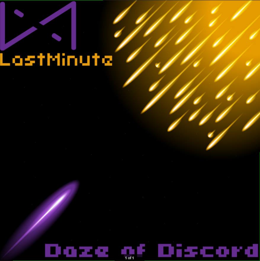
Front Cover:
Inside Left:
Inside Right:
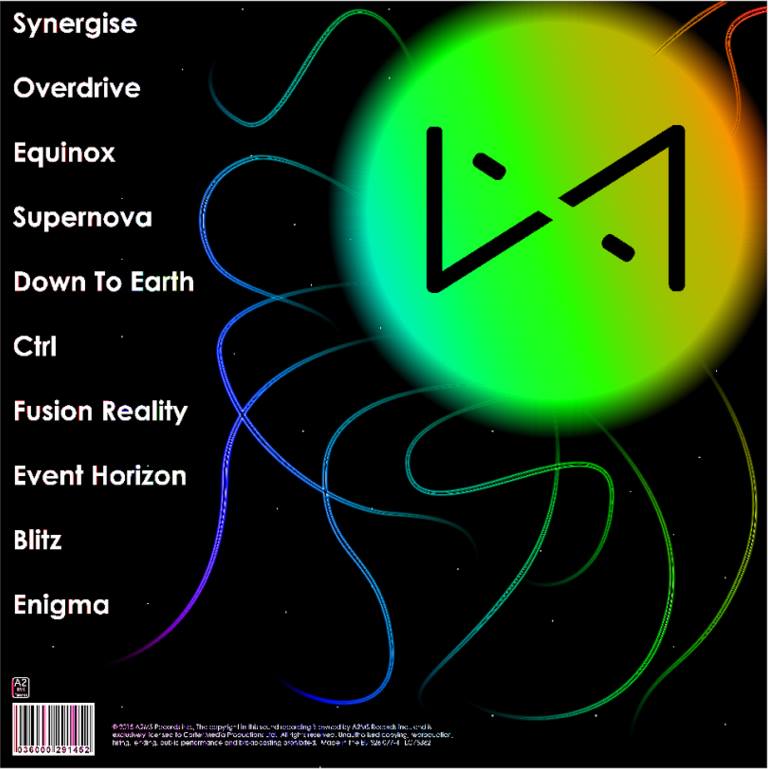
Back Cover:
Digipak Draft 2 Verbal Feedback:
I asked Anthony Lawn, a media studies student, what he thought of our second digipak draft. See below for Anthony’s feedback.
In summary, here is Anthony’s feedback, his likes and his suggestions.
Likes:
The use of colour represents the electronic genre effectively
Likes the narrative idea of the front cover being a representation of 1 vs 100 (the idea that you have to overcome difficulties)
Suggestions:
Change the name of the album to be more conventional to the electronic genre
Digipak Draft 2 Peer Assessment Sheet:
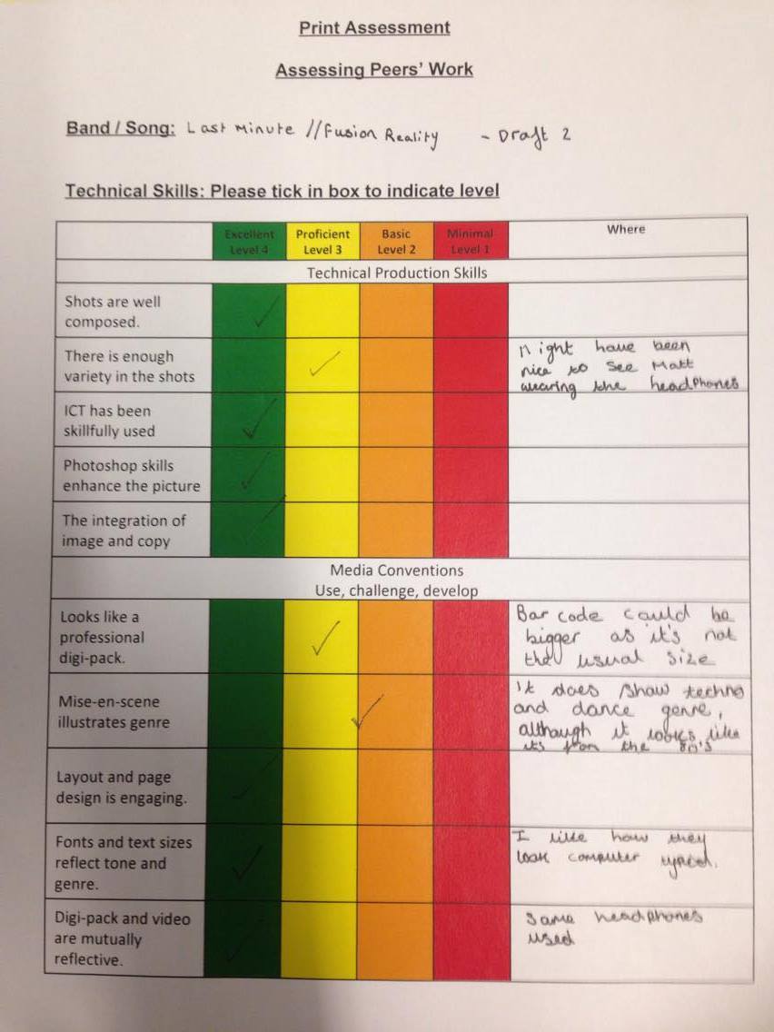
Katie De Carteret, also a media studies student, filled out a peer assessment sheet of our digipak and we documented the feedback she provided. Click on the image below to view the peer assessment.
Katie’s peer assessment.
In summary, here is Katie’s feedback, her likes and some other comments.
Likes:
Good implementation of Photoshop skills
Well composed shots
Digipak and music video combine together well and reflect each other
The use of font effectively reflects the genre
The layout of the images are effective
Katie also commented that:
The size of the bar code could be increased
The cover looks more representative of an older version of the electronic genre
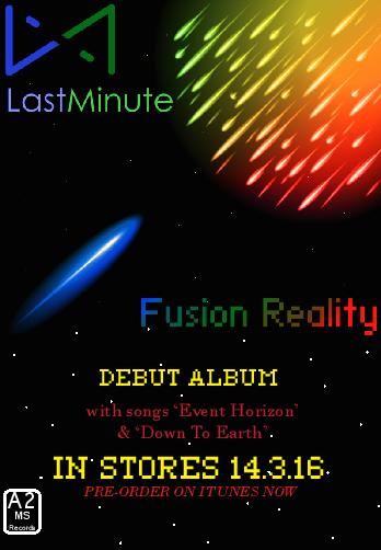
Advert Draft 2:
Advert Draft 2 Feedback:
We asked 3 people if they had any notes or suggestions about the second draft of our advert. I vine’d their responses and below are the video files of their likes and suggestions.
Vine 1: Feedback from Tom Porter
Vine 2: Feedback from Max Simpson Cohen
Vine 3: Feedback from James Newton
The following is a summary of the likes and suggestions from the feedback.
Likes:
The colour is used effectively in the advert
the themes of the song (Down To Earth) have been effectively embedded into the advert
The logo is very effective
Suggestions:
The font could be improved (no alternative font was suggested)
The text at the bottom of the advert could be improved
Overall:
I am very pleased with the feedback I have received, mainly because all 4 people I interviewed thought that the print production was fundamentally good and only had minor suggested changes. The main suggestions that we will apply to our product will be the changing of the album name and the alteration of the text in the advert. The advice to change the name of the album was particularly helpful as my group and I were not wholly convinced about the album name prior to interviewing people for feedback. The feedback confirmed the idea that the album name was not conventional enough to the electronic genre.
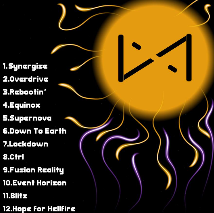
After we received feedback for our first draft we went to work implementing the suggested changes. Our second draft is the same for all covers excluding the back cover which we changed due to feedback received from our first draft, being that the names of certain tracks were not conventional. The reason we have not modified the other images is that we did not receive any particular critical feedback in relation to them and we had not ourselves identified any need to modify them.
Front Cover:
Inside Left:
Inside Right:
Back Cover:
Advert Draft 2:
Analysis (Digipak):
I am pleased with our second draft. The only change we have made since the first draft is the back cover, where we have edited the colours used in the image. The trails of colour that exit the circle have also been modified to create a more refined look. We also edited the titles of certain songs to make them appear more conventional to the electronic genre. Furthermore, we added a bar code and text at the bottom left of the back cover, to make it appear more professional.
Analysis (Advert):
I am pleased with the second draft of our advert. We have made very few fundamental changes since the first draft. We have edited the font slightly to attempt to make the album art stand out more. We have reduced the font size on both the yellow and red segments of text as we felt the large size was taking attention away from the main image and the name of the album and artist.
After completing the first draft of our advert, we collected feedback, so we could get suggestions for what could be improved. I asked an A2 Media Studies student (Cameron Le Page) to look at the first draft of my advert, I then transcribed what he told me.
Draft 1 of Advert:
Below is the image Cameron provided feedback for.
Feedback:
“The colours in the advert contrast and mix together well to create an interesting and attention grabbing poster, The text fonts work well with the electro genre and the image at the top works well with the style of music. The pixelated text also adds the electronic genre feel to the advert, which combines with the image. The headings and sub-text also attracts the audiences attention to all the right places.” – Cameron Le Page
Overview:
Good use of colour
Grabbing poster
Effective fonts used in relation to genre
Front cover image works well with advert
Heading and sub-text attracts the audience’s attention to all the right places.
What I have learnt:
Based on this feedback I am happy with the overall quality of our advert after receiving this response. I feel that we will not need to drastically modify our advert from its current form. However, we will still be editing aspects of the advert as we feel there are some aspects that need to be modified. For instance, in the feedback Cameron states the font is effective for the electronic genre, although we feel that the font size is too large. In our next draft we will be looking to reduce the size of the font at the bottom of the page.
Once we had a drawn plan for our advert we began creating our advert in Photoshop. We used our digipak front cover as the main image in our advert, we then had to decide on the fonts we would use. The font choice was not straightforward as we wanted it to be different from the font used in the actual digipak but have a similar design.
Draft 1:
Click on the image below to view our first draft for our advertisement.
Analysis:
We are pleased with our first draft and we feel that there is little needed to change before our final draft. We will now be collecting feedback on our first draft. We feel that the image at the top of the advert is effective as it would stand out and grab a potential customer’s attention. One thing that we are not 100% sure about would be the size of the font at the bottom of the advert. We feel that the title ‘IN STORES 14.3.16’ is too large, we will most likely change this for our second draft.
We asked several students to take a look at the first draft of our digipak, below is the digipak that Wiktor asked interviewees to provide feedback for.
Digipak Draft 1:
Front Cover:
Back Cover:
Inside Left Cover:
Inside Right Cover:
Digipak Draft 1 – Feedback:
In order to gauge our digipak’s effectiveness, Wiktor interviewed students from around the Sixth Form Centre enquiring if they could identify which genre of music our first digipak design was representing.
Below is a video of the feedback recieved.
Feedback included the following:
Alter the names of certain tracks to make them seem more conventional to the electronic genre
Attempt to make the digipak appear more representative of modern electronic music (some comments suggested that our album appeared to resemble an older genre of electronic music)
Overall:
The feedback was generally positive as all but one of the students interviewed could identify the digipak as being from the electronic genre. One piece of feedback that particularly grabbed our attention was the criticism that our digipak resembled an older genre of electronic music. I think the reason the respondent associated our album with an older version of electronic music was the fact that the colours used in our digipak draft 1 are not as vibrant as we might want. Taking this into consideration, we will be adjusting the colours used in our next draft.
After finishing our digital mock-up, which was made up of images taken from the internet and arranged in a manner that would reflect our design ideas. We then began producing the first draft of our digipak. We wanted the emphasis of our digipak to be on the use of colour. We have included a variety of different colours in our first design. The most notable colours would be purple and yellow, both of which are included on the front and back cover.
Front Cover:
Back Cover:
Inside Left:
Inside Right:
Overall:
We feel that our first draft matched our initial design ideas outlined in our drawn mock up. We are happy with the implementation of different colours and we feel the simplistic design is very effective (and that this is conventional of the electronic genre). We will now be collecting feedback on the first draft, then taking that feedback into consideration when creating our next draft. One note to add would be that we plan on further developing the front cover. One thing that concerns us about the front cover would be that there is a large area of the artwork that is just blank.
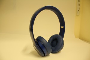
Our shoot for our digipak was very straightforward as we only need to take one picture. The only picture we needed to take was of some headphones. We would then edit the picture later in Adobe Illustrator. Matthew Wakeford provided the headphones which were the same headphones used in the performance aspect of our music video.
For the shoot we had to create an improvised white background. We did this by using a piece of A3 white paper and positioning it so that the background of the photo would be mainly white. The white background makes the picture easier to edit in Adobe Illustrator.
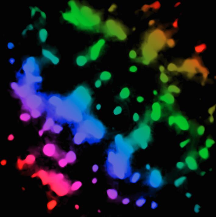
Original Photo:
The camera we used was an iPhone based camera, which was of high quality. Using an iPhone was more convenient as it meant that we didn’t have to borrow a DSLR or other camera.
Overall:
The shoot itself took about 5 minutes. Overall, the majority of the time will be spent editing the original photo in Adobe Illustrator. We are intending to adjust the colour of the headphones to have a neon appearance, the picture will then be used in the inside left of our digipak.
Here is my contact sheet from the image we took during the shoot for our digipak and advert. Unlike most contact sheets, my sheet only contains one image as we only took a single photograph. As the design of our digipak revolved around creating images from scratch using Adobe Illustrator, we only needed to take one picture.
Contact Sheet:
Below is the sole image we took for use in our digipak and advert.
Overall:
The creation of a contact sheet for my product felt unnecessary as we only took a single photo. The idea of a contact sheet is to provide a collage of different images taken during the digipak/advert shoot. We are unable to do this as we only have one picture. The photograph we took will be heavily edited and will eventually look very different to the original.
After we took into consideration the feedback given in response to our first draft, we implemented the suggestions and updated our video. After we made the changes, we then posted ‘Draft 2’ of our music video. We then interviewed Brittany Chippendale an A2 Media Studies student about her thoughts on the video. We filmed the interview.
Feedback:
Click on the video below to view the feedback from Brittany on the second draft of our music video.
Summary of feedback from Brittany:
Positives:
POV shots were used effectively
Reaction shots are very good
Slow motion shots of ball being kicked are very effective
Suggested changes:
Shots of arms close to camera are too close to each other during the video
Work more on a high energy feeling
My analysis:
The feedback was encouraging and positive, with very useful suggestions that we will implement before our final draft. I am particularly happy that the POV shots were praised highly, as they make up the majority of the narrative aspect of our music video.
Notes:
The slow motion shots were particularly praised. In this draft the slow motion shots were not high quality, we will re-film these in higher quality and then add them to our video.
Since our first draft we have edited certain aspects such as some narrative-related elements. We have also refined the editing of certain parts, including changes to contrast and colouring.
Draft 2:
We still need to add certain things to our video.
More narrative related clips
Refine editing
Colour effects and image effects.
Overall:
I am content with our second draft but I am still not personally pleased with our video in its’ current state. I want to add more clips to help progress the narrative as well as to improve certain shots that are not a high enough quality for my liking. In summary, we are close to a final product but there is still more to edit. We will now be collecting feedback for our second draft.
")