My image that uses mise-en-scene to communicate meaning

For this task we got split into groups of 2 and 3 in class and I was put with Elliot, we then had to pick a piece of paper out a hat, written on them were names of genres of music. When we picked ours Elliot picked out hard rock, at first I was disappointed as I didn’t listen to this genre of music and therefore didn’t know much about it. To insure we both knew enough about the type of music and what it looked like, how they Dressed and what it was all about we had to research it to make sure we knew what we were talking about.

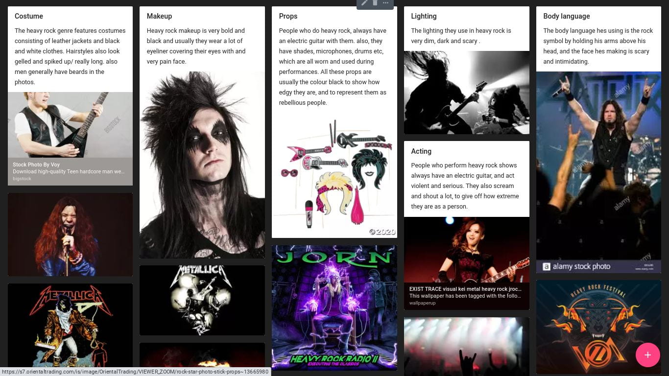
We then created a mood board of hard rock images and thought of words to describe each image, we did this on padlet so we could write up about each image and what it meant.

We then had to choses between me and Elliot as to who would be the model, I thought Elliot would be perfect for this as he has the hair and there aren’t many female artists in the genera. We then had to decide on what Elliot would be wearing, how his hair would be styled, if he was wearing makeup and if we needed to bring in any props. For this we decided

  • Outfit- Black, dark, gloomy
  • Hair- Spiky
  • Makeup- Black
  • Props- Glasses, guitar
  • Facial expressions- moody, sad, angry

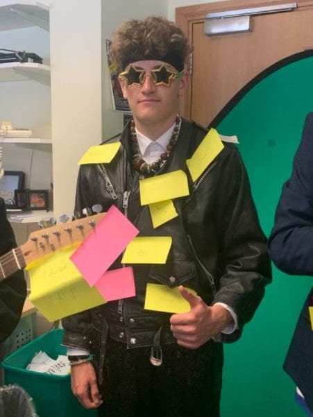
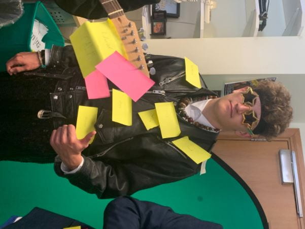
The words that were written on him…

  • mean
  • Rebellious
  • Angry
  • Hard core
  • Edgy
  • Hard
  • Aggressive

I feel our photo-shoot went well as we got the images we needed but I do feel as if we could have got more, for example we could have got some with different props and outfits. We also could have used makeup and I feel this would have made it better as we didn’t end up using any.

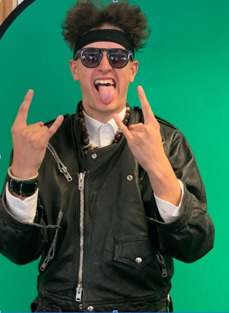
When taking this picture of Elliot we decided to focus on facial expressions as in a lot of the research we did they had wide mouths and tongues stick out and I think we mastered this look. We also got to mess around with the hair to make it look more like he’s a rock star and I this this made it the little bit better.


My Magazine front page swede

For this Task I got given a magazine cover and had to remake it as close as I can to try and make it look identical. To do this I had to use in design for the first time and at the start I was struggling as I didn’t know how it worked or how to do it but after a few minutes of fiddling and trying out different tools to see what they did I managed to figure it out and get a hand on it, this means that I can comfortably use this in the future when it comes to making one of my own.

3 Strengths

  • One strength I had while recreating this magazine cover is finding the right image and inserting it with the black outline/border.
  • Another strength I found I had while making this is that I managed to get kind of the right font even tho it may not be perfect.
  • The last of my strengths is that I change the background to orange like it is in the real poster.

3 Weaknesses

  • The first of my weakness that I found is that I didn’t manage to make the orange background the same exact shade as the one in the real magazine and this makes a big difference as you can clearly see the different shades.
  • Another weakness is that I didn’t quite manage to get the image the right size so it doesn’t look right or fit perfectly in the box.
  • I also could have done with more time because as you can tell I didn’t quite get to finish therefore with more I time I feel as I could perfect this and make it much better.

My Tour Poster

My Heavy rock research posterĀ 


After researching my genre I started on making one of my own and to do this I started with a picture of Elliot and then uploaded it to Photoshop. I started with cutting it out to then delete the background. Once I had cut out and deleted the background I started playing and experimenting with different background colors and I ended up settling for a grey as it fits in with the rest of the Heavy rock posters I looked at. I then faded the background so it didn’t look as bland and to make it look more like a heavy rock poster, to do this I used the gradient tool to fade the grey into white in the top right corner to give it more of an illusion of smoke which is used a lot in Heavy rock. After this I moved onto the text, I started with the title which is the band name and for this I used a generator which then picked out the name ‘Blood Head’. I put this on the top of my posted and changed the font and color to fit in with the rest of it. I carried out with the red, white and black theme when making the rest of the text and to make sure the color scene worked.


Self assessment:

  • Something I feel went well when making this tour poster is the model and the photo shoot as I feel the image I used is quite clear and not that bury, I am especially proud of this as it was one of my first Photo shoots.
  • Something else I think I did well is cutting Elliot out on Photoshop as there aren’t any noticeably mines of mistakes that you can see.
  • Another thing is the color scheme, I think this went good as it all firs in with the theme and makes the over all look fit together as a heavy rock magazine.
  • Something I could improve on is the font I used as it isn’t great and its quite boring and if I used a different font it would make the overall look much more professional.
  • The color of the background is another aspect I could improve on as its quite dull and maybe if there was more of a gradient it would look better.
  • Lastly I feel I could improve on the layout and overall placement of each element of the tour poster to make it look more like its a tour poster.
  • Over all as a first try I feel this didn’t go to bad but I could definitely do better if I was to do it again.

The camera talks

For this project me and two other people went outside with a phone and a camera to take 30 photos. First we thought of ideas of locations we wanted to take pictures of then we took the camera and headed out. We went out the the front of the school and started taking photos of the wood, leaves and other things outside then we too some of people before heading inside to take more. We did all of this while thinking about the DLSR and all the different techniques such as aperture and shutter speed and other ways to make a photo look good.


For these photos we tried to use a variety of different techniques, an example of these is a low angle. We used a low angle when taking pictures of the concrete ball and we used this so it would a story. We wanted to make the ball the biggest focus in the picture making it seem bigger, scary and dangerous. Other angles we used are high angles and close ups and we used these to create a story to go with the pictures for example a close up will give you more detail therefore making the image and the object in the picture look more important.

These are my chosen photos and I chose these as each one tells a different story for example the first picture looks good as the ball and the rotting wood is in focus whereas the background is blurred making the ball look bigger an more important. Another technique we used when taking these photos are high angles and close ups and we used these to give the photos different stories for example a high angle makes the image look more important where as a close up gives the image more detail making the photo look more interesting and therefore makes you think its more important.