

My Targets…
Front cover…
- leave more bleed and slug area
- make the cover image bigger
- make the main coverline bigger
- add more yellow
- add more coverlines, make the cover more busy
- make the coverlines bigger and more eye catching
- change the plain masthead to something more interesting
Contents page…
- the font doesn’t follow the conventions of a pop magazine
- make the coverlines upper case
- add a page number
- the fade on the contents heading is too pale (could outline)
- alignment of coverlines and description
- fix staggering of numbers
- check spelling accuracy
- utilise empty space (add an editors welcome)
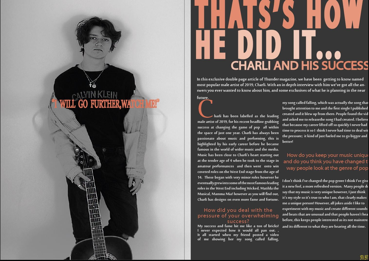
Double Page Spread…
- make sure there is more bleed and slug area
- check accuracy of spelling
- bring the title of the article down
- hyphenate the article and stand first
- add in a drop capital
- make column width more accurate to the layout of the DPS
- image is squashed
- cover the branding on models top
- put magazine logo somewhere on page
- try different colour schemes
- add graphic designs to make it more interesting
- add a ‘to be continued” at the end of unfinished article.