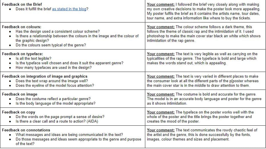
My Tour Poster

When creating the tour poster for my music magazine there are several conventions that I need to keep in mind to fit the typicality’s of the chosen genre, my genre is Rap.

The typical conventions of Rap that I have seen are…

  • a graphic or highly edited background
  • the main rapper large on the poster to highlight who they are
  • simple bold font to make it readable and eye catching

Click image to see clearer PDF

My Magazine Front Page Swede


Please click image to see the linked PDF


In this task I learned how to use Adobe Indesign to make a mock up of a published magazine cover. The basic skills that I learnt to was the use of gradients, background colours as well as adding text and images and how those images can be edited in a specific way to get the image desired. The task was to pick from a variety of magazine covers and try to recreate them as accurately as possible, I chose this NME Rihanna cover because there are varieties of fonts and colours which I thought would be useful practice. Another reason I chose this magazine cover was because I could identify the demographics and psychographics of the cover. I made the assumption that the cover would mainly appeal to women as the masthead and most of the captions are in pink, which is a stereotypical colour to appeal women.

Overall, this task will be one of the most significantly important in the creation of my music magazine, this is because this software will be used a lot fun the creation of mu music magazine and this introduction gave me the basics and a simple understanding of how to make an effective cover, this is because I now know how to edit fonts, move images to the desired place and make gradients which will all be used in the creation of my music magazine.

My Reflection:

Overall, I believe I carried pit this task very well and applied my skills very well however there are a few things that I think this cover could be improved on…

  • Firstly, “the state of music today” caption,  think the the font could have. been closer together and not as spaced out.
  • Secondly, although the fonts are accurate I believe that they could be more accurate as they do not hold the same effectiveness as the original
  • Finally, in the top right hand corner I think this type could be improved as I could not get the stroke on the font as accurate to the original, the line is also crooked as it would not lay straight due to the type of front and I did not know how to fix this, however with research I am sure I could learn how to do this.

However, here is what I believe I did well in regards to the similarity of the magazine covers…

  • The Masthead is very accurate
  • The caption that contained all different artists is almost identical in font, letter sizing and spacing
  • The caption underneath “RIHANNA” is almost identical.

Finally, I have researched and found some videos about things I struggled with on InDesign, this should give me some more experience on how to get the best out of the programme.


The Camera Talks

The creation of this Moodboard is a collection of all the best photos taken during the task, shown in the Moodboard are 9 of the pictures that create the most meaning to the audience. Along with the photos shown I have also written the connotation of the pictures and what narrative that they portray to the audience.

Many of the pictures taken were long shots as I wanted to portray the narrative of loneliness and mystery however, there are some contrasting images that have a chaotic nature.

Finally, this is key in the creation of my music magazine this is important as I now have a better understanding of how to use a DSLR camera and how to show a narrative through, lighting, framing and poses. However the most vital part is the use of different shots as this communicates the most meaning the the targeted audience.


Technical Camera Terms

The contact sheet above contains pictures that I took with the idea in mind to take shots at different contrasting angles. I took these pictures to communicate meaning to the audience using the denotations. Using different camera angles can produce meaning for example a close up gives the audience a sense of involvement and intimacy. I took several photos as. it is important to have many different shots to communicate different meanings to the audience. Poses and Framing are important as this becomes the main focus of the picture. In the pictures on my contact sheet I tried to create as many long shots and mid shots as possible as I wanted to communicate a feeling of distance from the audience. The composition of my pictures are very similar as I was trying to limit the narrative. Ultimately, this is key in the creation of my music magazine as this practices the use of camera angle and how it produces a narrative.

My image that uses mise-en-scene to communicate meaning.

MOODBOARD

We were given the genre of Rap and created a Moodboard containing the aesthetics of Rap and associations of Rap. Our Moodboard consisted of how Rappers look, certain artists, and objects that are associated with Rappers. From our Moodboard we found out these conventions of rappers:

  • Wealth
  • Intimidation
  • Appearance 

This further helps the development of my Music Magazine as it helps with the understanding of Mise En Scene.
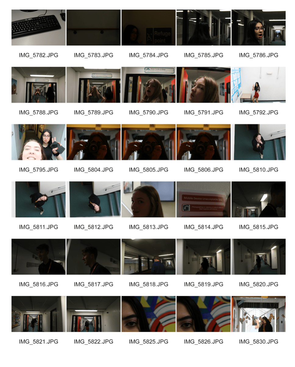
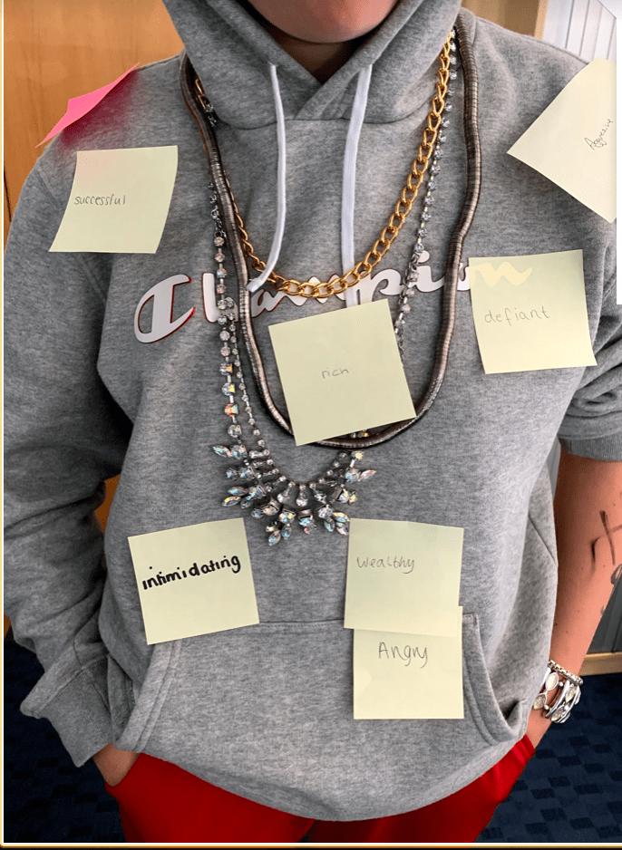


Made with Padlet
Made with Padlet


POST IT PHOTO

Using the moodboard we then dressed one member of our team accordingly to our genre and had a photoshoot, whilst taking pictures we kept CLAMPS (costume,lighting,acting,makeup,props,setting) in mind, this meant that the body language/poses that are shown to the audience relates the mood of the ‘rapper’ and what adjectives convey to them.  For example we carried out this task in class where other students would take a post it note ans write an adjective that they think our model conveys, here are some that they came up with:

  • Intimidating 
  • Defiant 
  • Angry 
  • Aggressive

I believe that because of these adjectives that our class gave our model we were successful in Mise En Scene , as these were the impressions we wanted to portray to our audience.
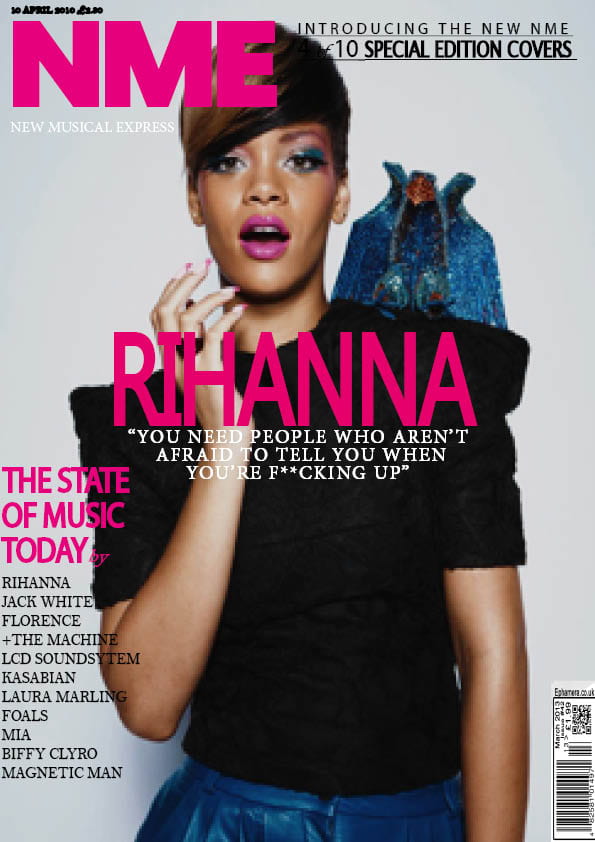
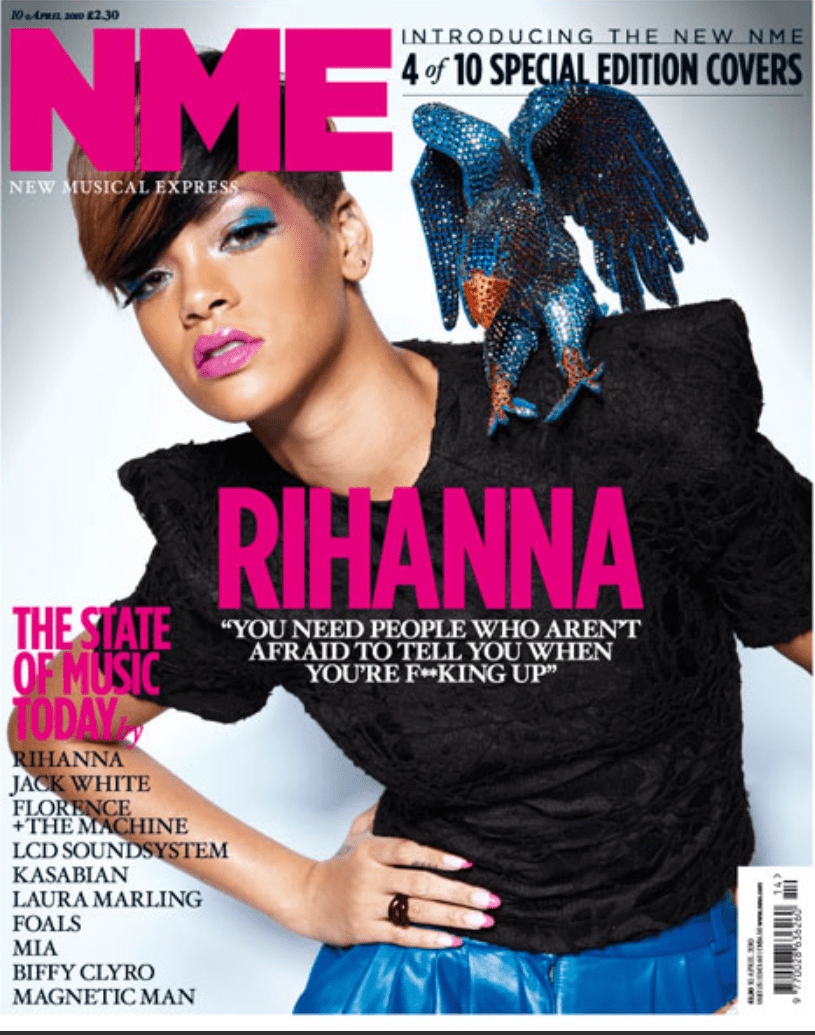


FINAL PHOTO

I chose this as the final photo as i think it represents what we were trying to portray very successfully, Ithink this because the body language and direct look into the camera portrays an aggressive vibe towards the audience. I believe that this picture is better than any of the other pictures as it directly addresses the audience and conveys the Rapper genre and relates to our moodboard specifically


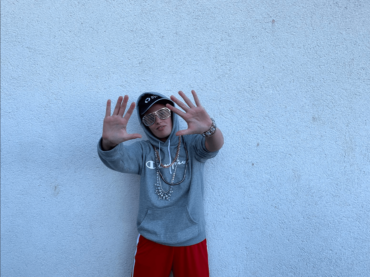
Finally, this task will significantly help in the creations of my music magazine as I now know how to portray the conventions to an audience to communicate meaning.

Print Media that communicates meaning

  • This task demonstrates the use of Mise En Scene and the use of CLAMPS (Costume,Lighting,Acting,Makeup,Props and Setting) 
  • When deconstructing a poster in this task all of the above factors have to be thought about in detail along with factors such as font (type and colour), other images and such things as backgrounds. 
  • This task helps in the creation of my own music magazine, as when I am deconstructing the poster I am thinking about what factors the poster contains as well as how these factors appeal to the audience and what meaning they convey.