January 4

Critical Reflection Essay

A promotion package for the release of an album, to include:

  • A music video (major task)
  • A social media page (minor task)
  • A digipack (minor task)

Table of contents

How do the elements of your production work together to create a sense of ‘branding’?

how did your research inform your products and the way they use or challenge conventions?

How do your products represent social groups or issues?

How do your products engage with the audience?

Brands need to be easily recognisable in order for their target audience to be engaged with them, therefore producers have to work hard in order for their products to be sucessfull which is why all of my products had to work well together and be similar. Being a producer includes a variety of different skills needed to know prior to the production such as being able to encode the ideologies leaving the audience to then decode through branding. This leads to a preffered reading for the audience which is what Stuart Hall agrees with.

I created a mission statement before the beginning of all the production work which I used to describe my star as “mysterious, charming, truthful and sincere” which I had to keep in mind throughout all of the production to know exactly how I was going to portray this star and what conventions I was going to use to do that. All of my prodcuts work well together to lead to the audience getting a preffered reading which de Saussure would describe as using clear denotations that have relevant connotations. An example of this would be using a colour palette. These were pink, white and yellow. This colour palette is conventional to the genre of Pop/R&B which are bright and vibrant colours.

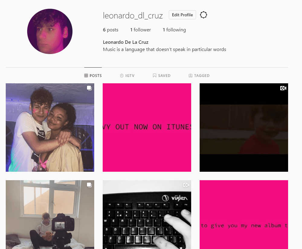
My social media page was made clear in portraying the star as ordinary but also extraodinary. This relates to Richard Dyer’s star image theory, this is done so the star is portrayed as relatable, but also respectable. The social media page helped display a clear sense of branding to the audience. Each product contributes towards building the sense of branding and paradox of the star which is then conveyed to the audience.

As my chosen artist belonged to the genre of Pop/R&B, I decided to research a lot of other artists of the same genre and looking at their music videos. I discovered that most of the music videos they all included as Altman would argue, a set blueprint for Pop/R&B music videos with both narrative and performance aspects being, generally in equal proportion. From watching a multitude of music videos of the same genre I began to understand the typical conventions included in that genre. The narratives were mainly amplified and rarely illustrative as it creates a symbolic meaning which makes it mysterious, this relates to my mission statement when I was describing my star and how I wanted to portray him showing I was following the conventions.

One music video that I watched which spesifically showed symbolic meanings was Billie Eilish’s video for the song When The Partys Over. Within the video I saw Billie crying black tears, this symbolises how dark and sad the song is compared to if they were just normal clear tears. Barthes would describe this as using symbolic codes. Mise-en-scene wise Pop/R&B music videos typically include high key lighting and very ‘sheek’ costumes especially for women but also men. The high key lighting would be a semic code which would then be decoded in a positive way such as happiness. The costumes are conventionally bright and poppy and not minimalistic at all. However it does depend on the narrative as a sad narrative with sad lyrics fromt he song would have a different style of costume such as plain and dull which is what my music video represents.

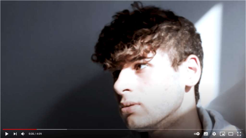
Obviously I followed the conventions of the genre for my music video which I found in other artists’ music videos. For example I mixed my music video with a narrative and performance throughout and also with a lot of symbolic codes and objects making my music video amplified. My narative included a teenage boy who has a bad relationship with his father which was symbolised through flashbacks of the teenager who was happy as a boy playing with his father and changing to the present to a sad and trapped teenage boy. I also created the father figure in the music video by including a manequin to resemble him, connoting that he is there but not really present in the teenagers life. My narrative could be argued that its not conventional as the stars mise-en-scene is not of a typical pop genre however baring in mind the narrative which is a sad story I think it fits well. My music video follows a non-linear narrative structure because it kept on flahing from past to present throughout which is seen as conventional for Pop/R&B music videos. Another convetional aspect of my music video is that the ending did not have a complete resolution, it was left on a cliff hanger which goes against Todorov’s narrative theory as there is no resolution leading to a new equilibrium.

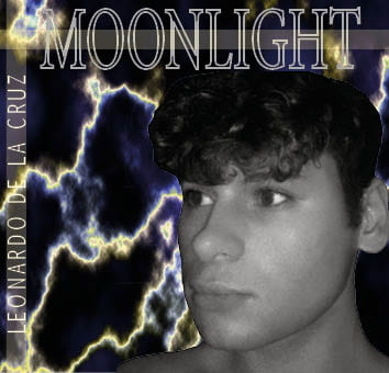
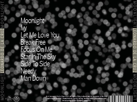
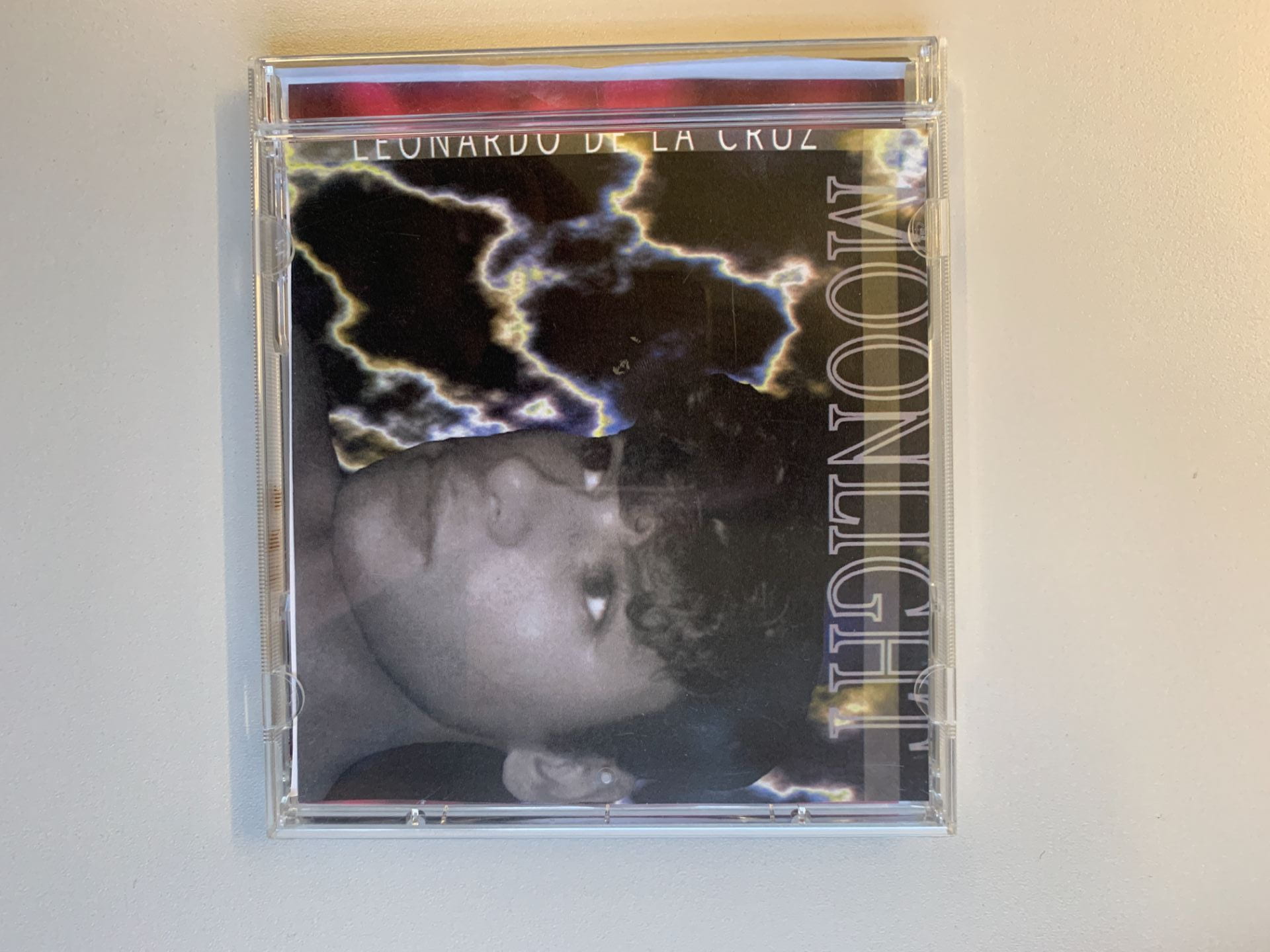
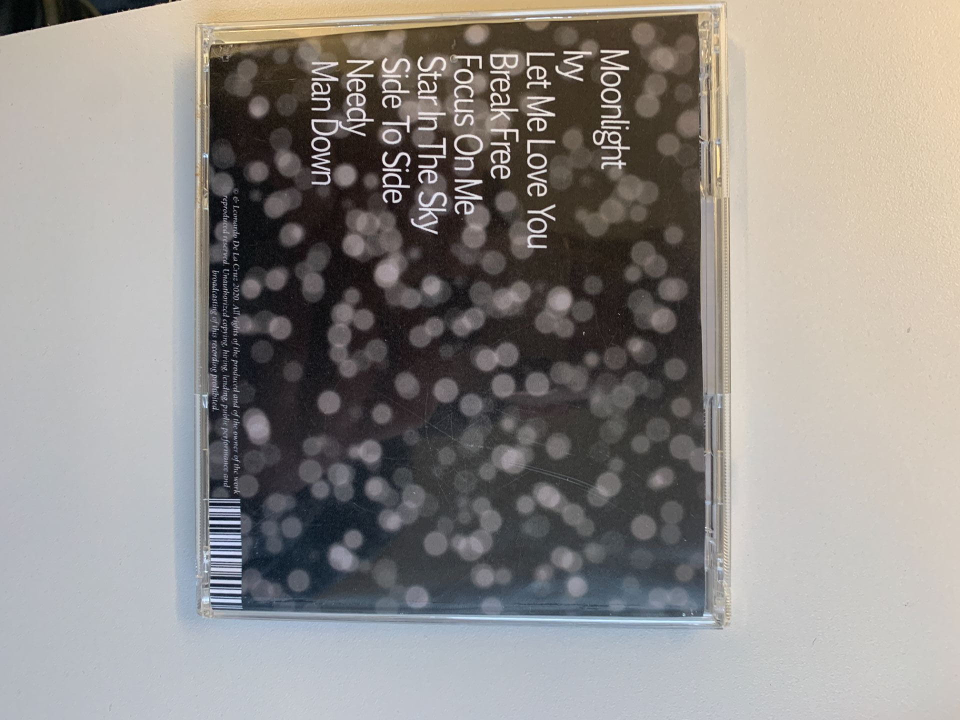
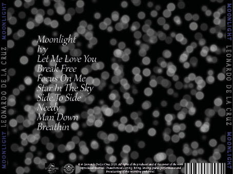
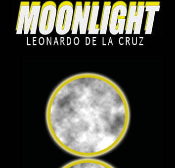
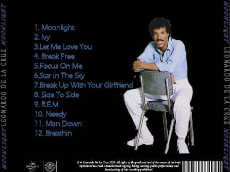
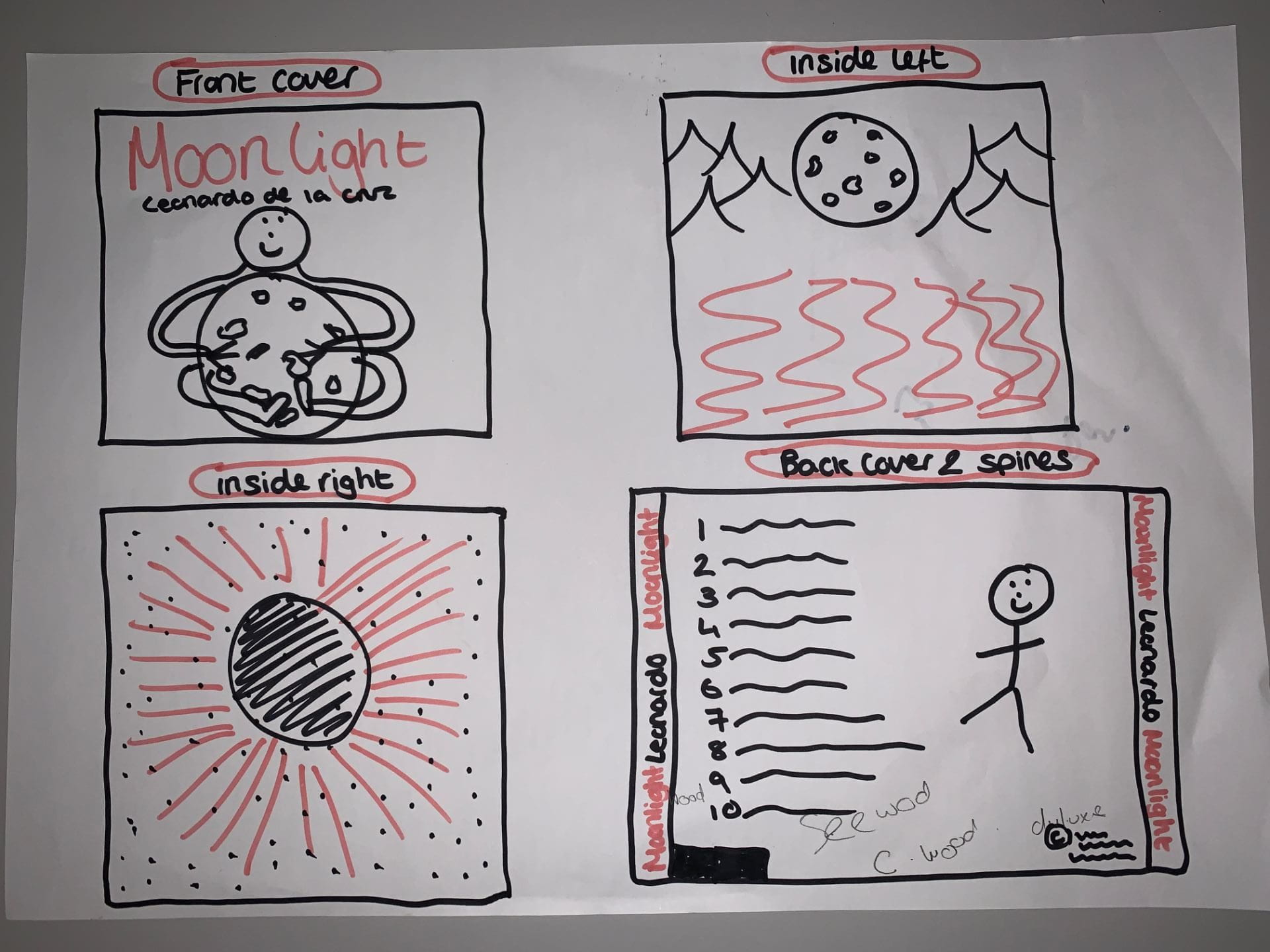
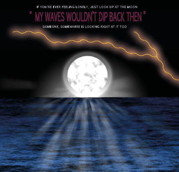
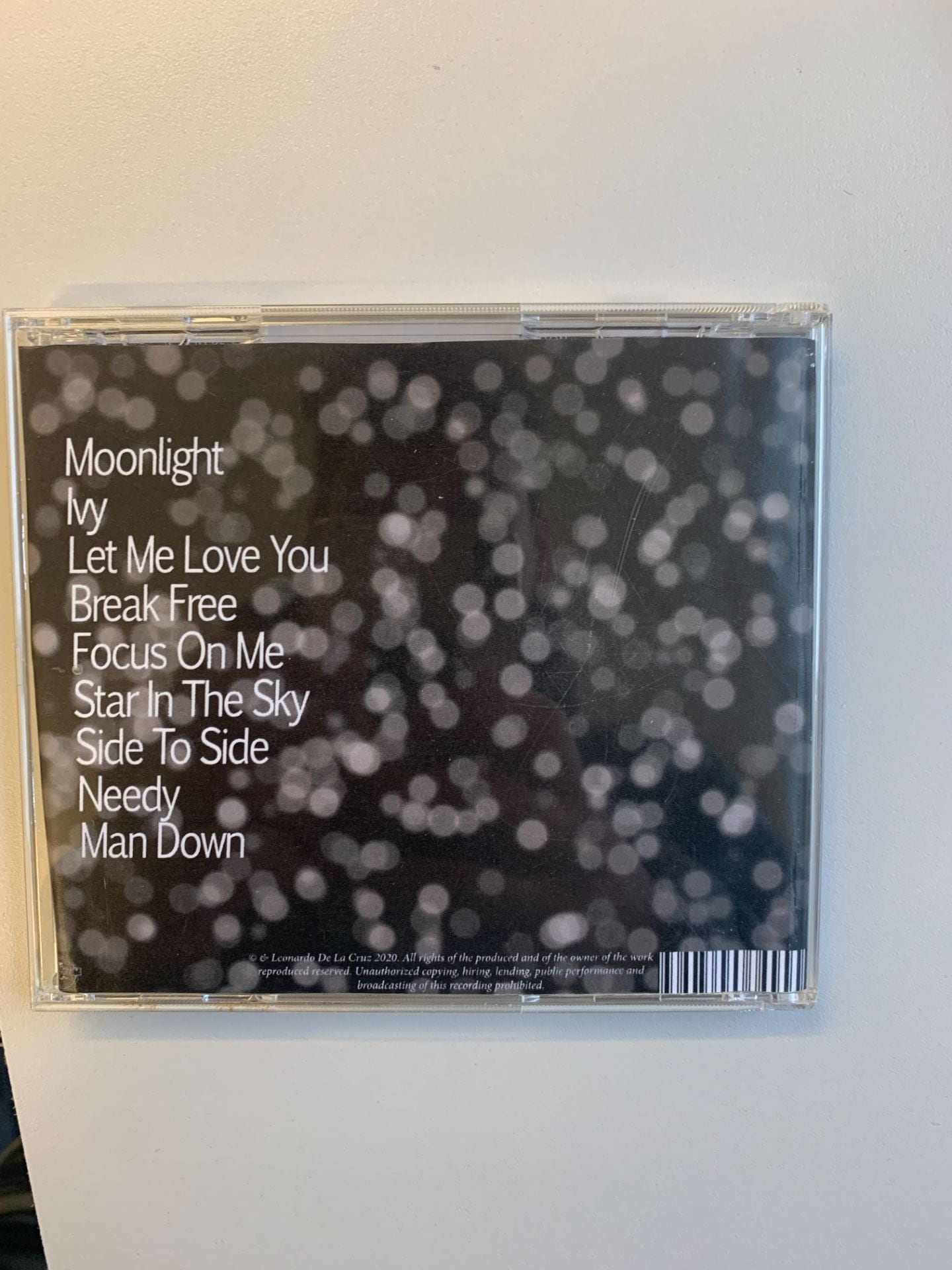
My digipak had to be presented and reflect as much as the general tone and mood of the star’s album which was truthful, sincere and caring which is conventional for Pop/R&B artists to be like. I looked at many different album covers such as Niki Minaj’s album cover to create new ideas of the same vibe for my star to portray him as caring, truthful, handsome etc and ordinary and extrodinary at the same time which is Richard Dyer’s theory. I achieved this by adding bright neon like colours with dark backgrounds such as pink, orange and black. The main theme of the digipak is space and the moon which gives a mysterious but extrodinary vibe. I placed the star on the front cover in plain black and white with just his face and nothing else to infer the ordinariness but caringness aswell. Having the star on the front cover is very conventional for Pop/R&B genre as it connects the audience and the star together especially if the star on the front cover is staring right at the audience as it creates this intimacy with the audience. Having my star on the front cover broke the fourth wall between him and the audience making him more approachable and creating that connection with the fans.

I also used Barthes semiotics and structuralism to help attract an active audience as this made the star seem as if he was showing the audience a more personal side to him. I did this by using a black and white cut out of the star with a blank facial expression. This connotes sadness infering that the album is very personal and a lot about opening up to his fans. This was also used to show authenticity and naturalism which correlated with the natural mise-en-scene the star had in the video and also correlates with the lyrics of the song as they’re quite personal.


Hall’s theory of encoding media texts with signs and symbols was definetly one of the most important theory that was on my mind throughout as it gives the audience a chance to get a preferred reading and they gives them the option to decode it in any way they wish to. I also decoded many artists’ social media pages and discovered that its important to include interactive features as well as the information, merchandise and promotions as this allows the audience to obviously interact with your social media page and keep them intrigued.

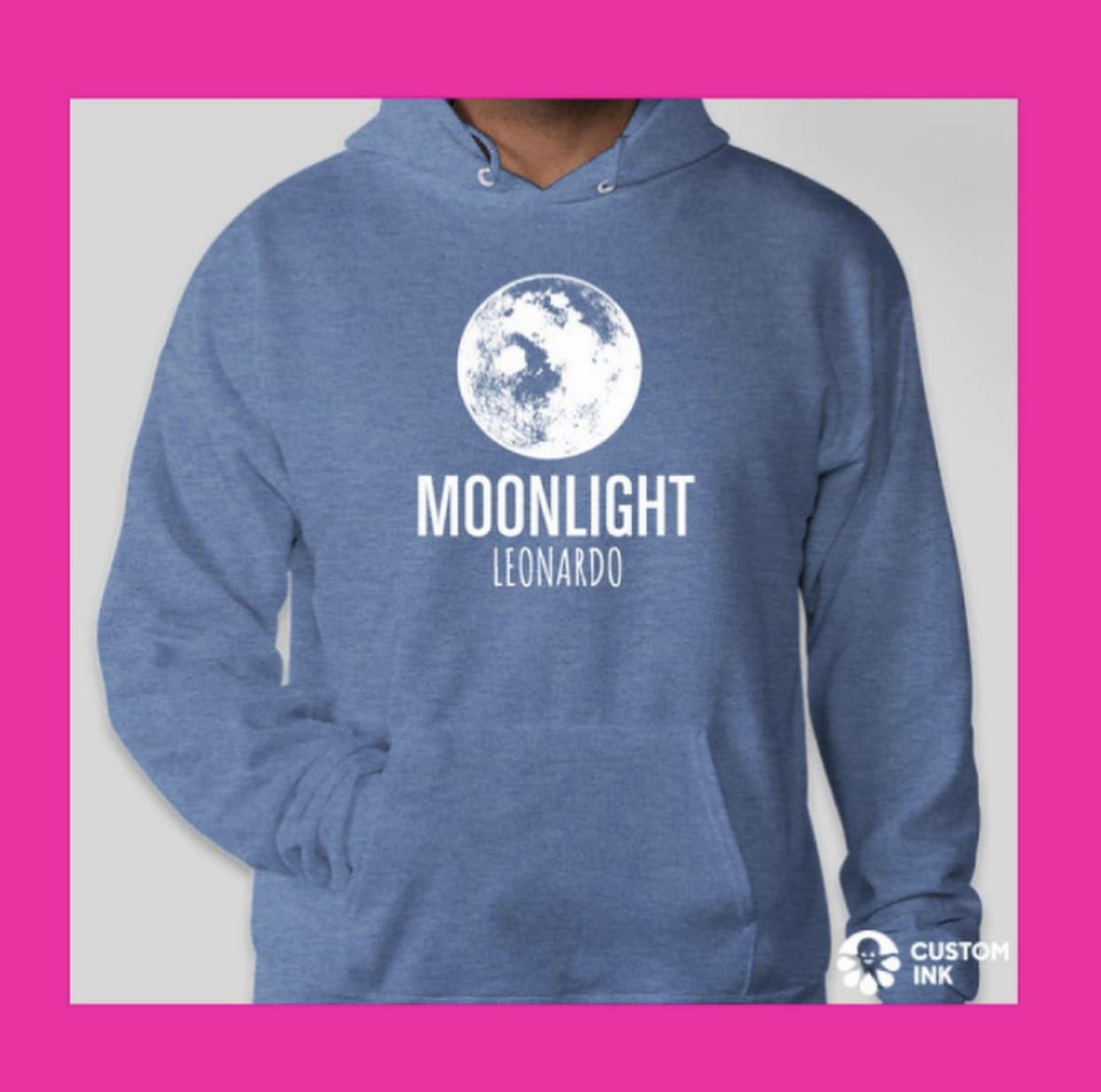
Another very important aspect I looked into was the demographics of my audience and found that they are usually between the ages of 13 and 25, therefore I used Blumler and Katz Uses and Gratification theory to engage my audience and make them feel as if they could relate to the star and build a community. For my social media page I included information such as teasers for the new album and tour dates. I also included interactive features such as interviews so that the audience feels they are included. This helped the entertainment and social interaction remain at a good level. It made my star seem reachable. I also created my own merchandise for my star to promote himself. This pulls the audience in to explore the star’s personal identity.


December 7

Social Media page Draft 1 self assessment

Below is my first draft of my social media page which I created on Instagram

Below is a scren castifty my teacher did adding some suggestions and targets to improve it

Targets for improvement 

  • Add a link to the new music on iTunes aswell as YouTube
  • Add some posts with some lyrics
  • Add some tour dates
  • Add some cross media convergence such as talk shows
  • Some merchandise
  • Name the poeple that I am featuring on the social media page

Self Assessment 

  • Design Coherence – I made sure that my social media page looked like a complete and coherent product as well as it looking like it fitted with the rest of my products e.g. the digipak. This was well achieved with the use of colour as I had a common colour palette of neon pink and black and white
  • Content – I added in some teasers leading towards the release of the new music and music video
  • Timeline – I included many teaser posts before fully announcing the music video and album. An example of this was that I posted a preview from the music video shoot to create a buzz with fans creating excitement
  • Cross Media Convergence – I posted a post which announced the star was going on a talk show to talk about his new album (interview)
  • Promotion of Live Events – Posted tour dates and slowly announcing it prior t the release of the tour dates to build up the tension
  • A Call To Action – I  included many calls to action within my Instagram page. These included links to an actual website to buy the products on the merchandise announcement post and a iTunes link to listen to the actual song being promoted.
  • Ordinary/Extraordinary – My star is presented as extraordinary as its always teasing the audience about new products coming out wether that be music video or merch however one post shows the star at a party with his crew mates showing his ordinary side
  • Interaction/Engagement – Interaction is seen in the comment section of his posts and some have commented. Audiences can engage with the posts as there is a comment section
  • Sell Physical Copies – I created a merch site which included products relating to our artist’s upcoming album.
November 23

Digipak Draft 3

In order to get some feedback on my digipak I sent out a google form with the images from my digipak which different options of genres from people to choose from. Below is the google handout. The majority of the 19 responses guessed correctly in saying the genre was Pop/R&B however the majority of these people thought I was trying to represent him as sinister and cunning rather than truthful and honest.

Below are two images of my digipak in a CD case so I could see what my finished product looked like after completion

Category: Digipak | LEAVE A COMMENT
November 16

Timeline and Marketing ideas

Below is a timeline I create which is a plan for what I am aiming to include and post onto my social media page to promote my artist. They are in chronological order so that the announcements of the posts for new music and new merch makes sense so that it teases the audience. These posts are designed so that the audience can interact with the star as well as promoting the star. The announcements on the posts which include the new merchandise, music and tour dates will keep the audience engaged and interested.

November 16

Social Media Page Terminology

To prepare for creating my own social media page I looked at some terminology for a social media page for my artist. I have researched Ariana Grande’s facebook page for this task.

I have learnt different technical conventions of a social media page which will help me create a realistic and conventional page to promote my artist with. I will need to choose a suitable markjeting campaign in order to promote my artist and his music.

Ariana Grande’s Facebook Page 

November 16

Digipack Draft 2

Front Cover 

Inside Left

Inside Right 

Back Cover 

Teacher Feedback 

After I completed my draft 2, my teacher did a screencastify commenting on my digipak. There were many positives from the feeback such as the digital creation of the moon and space etc however there was room for improvement.

Targets For Improvement 

  • Make the artist bigger to cover the mirror image as it looks a bit weird
  • Add some coloured spotlights to the dots on the front cover
  • Make the inside right cover connect with the inside left by merging something off the two together
  • Make the fonts all the same as the front cover
  • Match the colours of moonlight and Leonardo De La Cruz for the back cover
  • Instead of the blue drop shadow on the inside left cover add in the pink to link it with the right cover
  • Add some colour onto the back cover aswell
Category: Digipak | LEAVE A COMMENT
October 23

Evaluation of shoot or graphic design

The making of my graphic designs went very well, I was able to create a realistic looking moon along with a solar flare. I did most of this creating in photoshop. I used a variety of diffeent tools in photoshop, for example new layers, masks, filters and much more in order to create a realistic moon and solar flares. I had some help from youtube videos which explained to me the step I had to do in order for me to create different colours on my image and dark spots for the moon.

Before creating these designs I was planning on going out and taking a picture of the moon to edit but thought it would be much easier to edit in photoshop if the moon was also made in photoshop. This helped me later watching the videos on YouTube as I wouldn’t have been able to create the same design if I took a picture of the moon.

After completing my draft 1 of my digipak I am going to have to have a shoot which includes me taking selfies in order for me to photoshop myself onto the digipak. Because my first draft is already completed before any shoots, I know more or less what shots and positions I want myself in so that it fits onto my digipak keeping the typical conventions relevant to it.

Images of the designs I have created

Category: Digipak | LEAVE A COMMENT
October 22

Digipack Draft 1

Below is my first draft of my digipak, I have included some of the typical features that I have seen for the R&B/Pop genre like big mastheads and images and copyright logos and the producers

Front Cover

Inside Left

Inside Right

Back Cover And Spines

Things I Need To Improve On For Second Draft

  • I will be taking pictures of myself so that I am on the front cover and the back cover of the digipak
  • Maybe adding a little more design to the front cover maybe some mountains
  • Adding some text to the inside right of the digipak

In relation to the assessment criteria, the use of photoshop is to a good standard as most of the images in this draft were made using photoshop. The mise-en-scene for my genre still needs to be added in as I should have bright colours on most of my pages. The digipak’s layout as a whole is fairly good as its set out like a basic digipak which includes the barcode and copyright etc. I think the DPT is conventional using big bold writing and different typefaces however their are no images which have not been created digitally therefore for this first draft I will probably grade it a C/B

Category: Digipak | LEAVE A COMMENT
October 22

Hand drawn mock up

Below is my hand drawn mock up of my idea for creating my digipak. This helped me get some inspiration as to what colours I want to include and what images I want to include into it. When drawing this mock up I made sure that I included most of the technical conventions of a digipak e.g big title, imaged and the copyright writing etc. This very rough draw includes the bright pink which is conventional in my genre having bright colours.

Including typical conventions of my genre into my digipak will ensure that it will reach out to my target audience

below is the colour palette that I am aiming to have on my digipak

101 Brilliant Color Combinations for 2020 | Adobe Spark

Category: Digipak | LEAVE A COMMENT
October 22

Branding Moodboard

Below is a moodboard that I have created on padlet which shows the different technical conventions of my genre for an album cover or digipak. This helped in giving me inspiration for the type of elements I need to include into my digipak such as poses for my artist and colour schemes. I discovered that my genres conventions are typical in many different artists’ album covers. This repertoire of elements and the general conventions of a Pop/R&B digipak combined, will make up our brand image so the audience can decode it successfully.

Made with Padlet
Category: Digipak | LEAVE A COMMENT