So… how did you integrate technology ( software, hardware and online) in this project.
I created a piktochart presentation on this…

Loading…
So… how did you integrate technology ( software, hardware and online) in this project.
I created a piktochart presentation on this…
Loading…
Here is my screencastify of me going through my magazine.

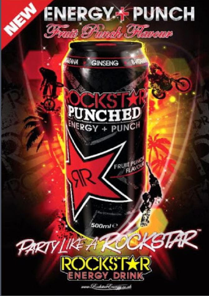

These are the two adverts I picked out to go with my music magazine. I chose these because I think they match my audience and the rock genre. Firstly I chose a rockstar energy advert because its a drink that gives you lots of energy and is shown as a rebellious and extreme drink. Even the name is ‘rockstar’ which obviously fits my genre of rock music.
The next advert I chose was a guitar advert. I chose this because the audience for rock music might be interested in creating their own music I know this because of the audience research I did before creating my magazine.
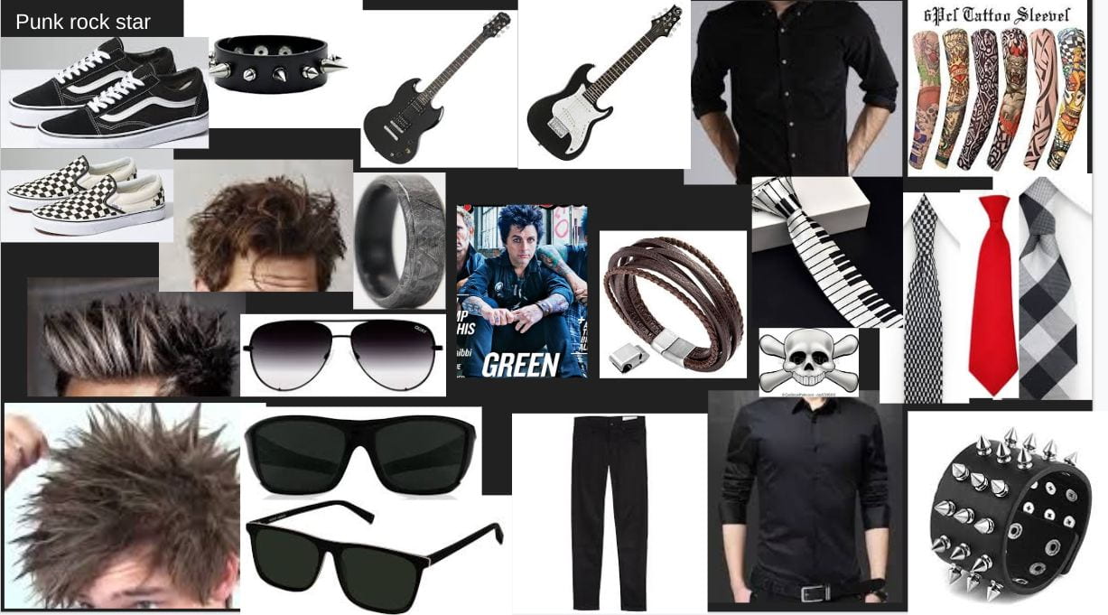
To gather my research I created mood boards and created a ‘dating’ profile on a fictional fan of my genre got info from sites such as yougov.
Overall I am happy with my final pages and I think I have created a clean and good looking music magazine. After I received my most recent feedback I made the following changes.
For my front cover I improved my masthead and overall layout of the page. For my DPS I improved the image by cutting out the background, brightening it up and making it less grainy. Finally for my contents page I competently changed the look and layout from a very basic and poor looking contents page into a good looking contents page with a good colour scheme and I think it looks good.
These are my complete music magazine pages.
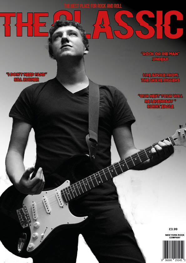

This first image is my most recent draft of my front cover.
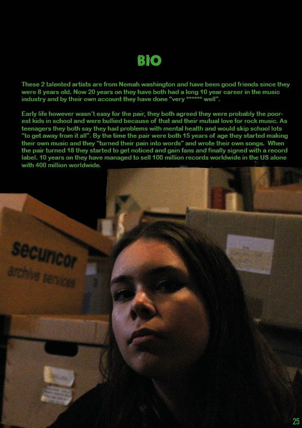
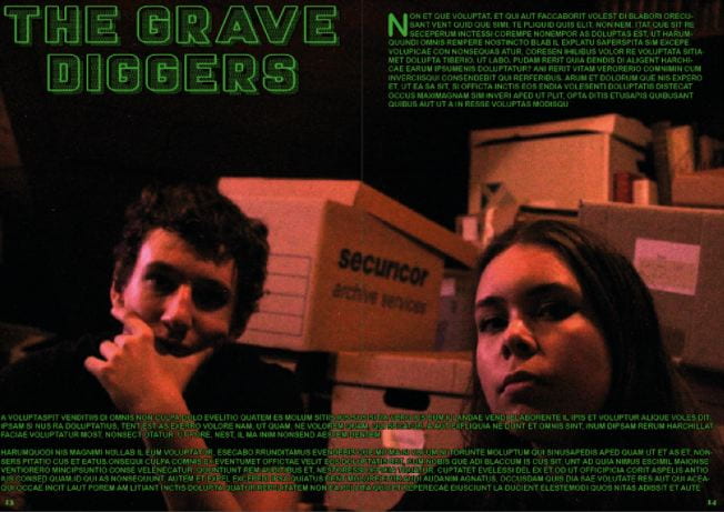
This next image is my most recent copy of my double page spread.
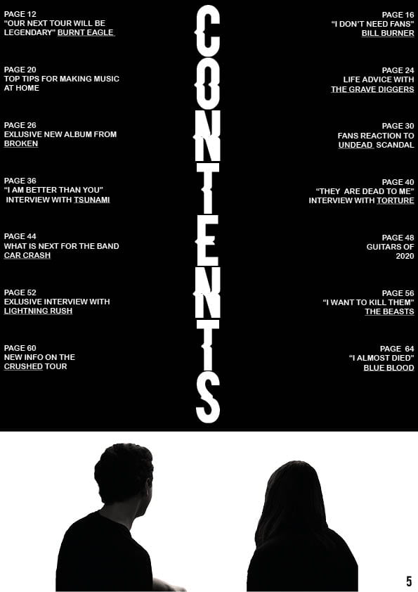
This final image is my most recent draft of my contents page.
The bulk of the text is mostly filler text at this point but I am still pleased with these drafts so far. I think they can link together and have a similar theme as well as they all fit my genre. My favourite at this point is my DPS as I spent a long time on the layout and I like how it looks the most. My least favourite is my contents page as I have had the least time to shape it into something that looks really good and clean.

CLICK IMAGE FOR SCREENCASTIFY
My screencastify feedback for my front page is mostly layout and text based. I need to work on making the text readable and bold while also filling up some of the space on the top of the screen
For my DPS the feedback was on the background image. The image I used was quite dark and grainy so I need to either find a new image or make my current image brighter and smaller and possibly cut it out.
Finally my contents page I need to add page numbers and change how I wrote out all the page headings. I need to look at some real contents pages to find what I like and copy it.
This process of creating my magazine has been hard work but has also been very fun and rewarding. My favourite part of the project has been editing and putting together my magazine as well as the researching phase and I think I have learnt a great deal in how to research topics to a good standard. Some of the skills I have learnt through this process have been in:
Camera work and camera skill
Team working and organising skills
Finally I have learnt lots in the editing phase
In the future I would really like to push myself in the editing phase to create very good quality content that is to a professional level. I also hope to develop my camera skills more and try to get the very best shots and lighting conditions. I hope to achieve this in my up and coming projects.
In the making of my two contents page drafts I learned a few skills and techniques which will help me in future projects.
Firstly, because I played around much more on indesign to try and drastically improve my contents page I think I learned some valuable skills and lessons as a result. I really wasn’t happy with my first two drafts of my contents page because the layout and colour scheme didn’t seem to work and they didn’t look clean or professional at all. My more recent and final draft however I think is great improvement on previous drafts because I took my teacher and peers advice and redesigned it from the ground up. When I did this I learnt a lots more not only on indesign but in the actual design phase as well. I learnt:
The following are some of the tools I used on indesign:
![]()

Overall I am much happier with my new draft of my contents page. I also learnt a number of lesson in creating something like this and will use these skills on future projects.
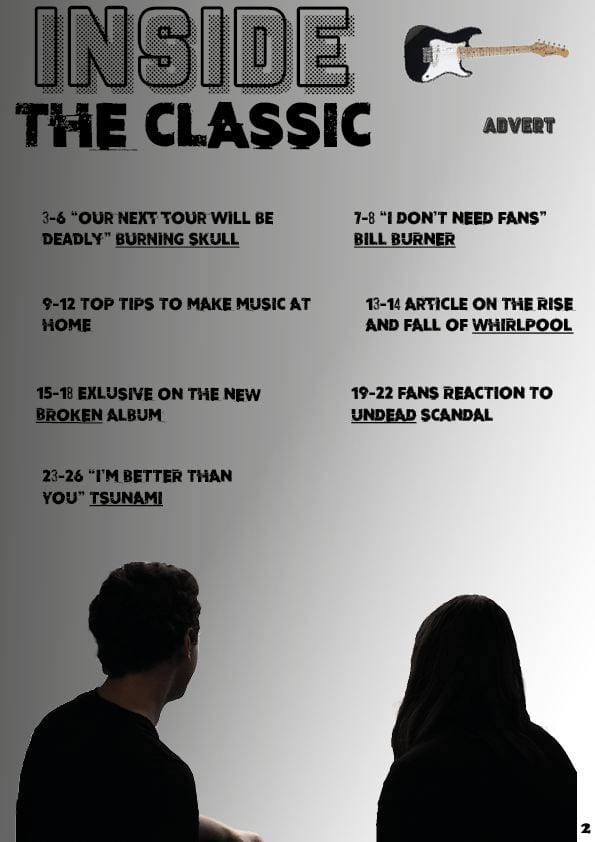
These are my two drafts of my contents page. On the top left is my first draft and on the right is my most recent draft. I think overall my most recent draft is much cleaner and looks much better. Firstly I got my friend Casey give feedback on my first draft.
Next I will talk about the changes I have made:
Overall I thing the second draft is a cleaner and much more complete contents page, however I think I still need another draft to get the extra features and details.