So… how did you integrate technology ( software, hardware and online) in this project.
I created a piktochart presentation on this…

Loading…
So… how did you integrate technology ( software, hardware and online) in this project.
I created a piktochart presentation on this…
Loading…
Here is my screencastify of me going through my magazine.

This process of creating my magazine has been hard work but has also been very fun and rewarding. My favourite part of the project has been editing and putting together my magazine as well as the researching phase and I think I have learnt a great deal in how to research topics to a good standard. Some of the skills I have learnt through this process have been in:
Camera work and camera skill
Team working and organising skills
Finally I have learnt lots in the editing phase
In the future I would really like to push myself in the editing phase to create very good quality content that is to a professional level. I also hope to develop my camera skills more and try to get the very best shots and lighting conditions. I hope to achieve this in my up and coming projects.
In the making of my two contents page drafts I learned a few skills and techniques which will help me in future projects.
Firstly, because I played around much more on indesign to try and drastically improve my contents page I think I learned some valuable skills and lessons as a result. I really wasn’t happy with my first two drafts of my contents page because the layout and colour scheme didn’t seem to work and they didn’t look clean or professional at all. My more recent and final draft however I think is great improvement on previous drafts because I took my teacher and peers advice and redesigned it from the ground up. When I did this I learnt a lots more not only on indesign but in the actual design phase as well. I learnt:
The following are some of the tools I used on indesign:
![]()

Overall I am much happier with my new draft of my contents page. I also learnt a number of lesson in creating something like this and will use these skills on future projects.
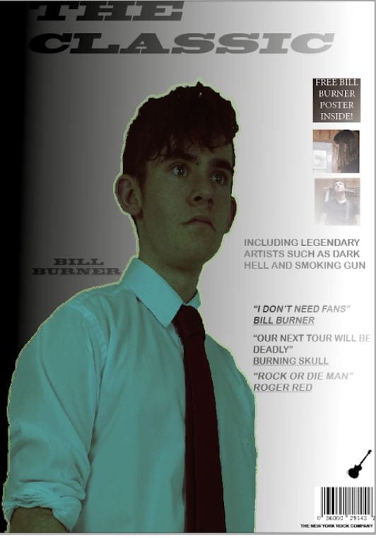
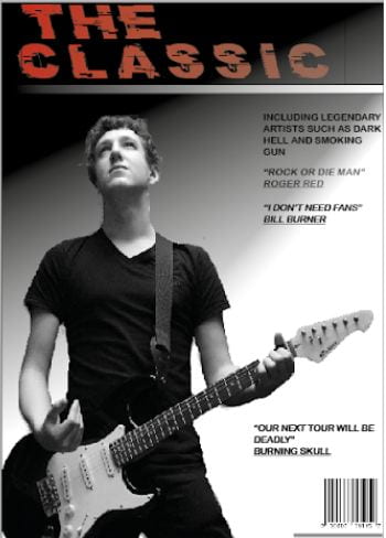
I learned a few important skills in the making of these two magazine covers. Firstly I improved my photoshop and indesign skills because I learned on the job while I improved my magazine cover from its first to second draft, this will help me in the future because I will use the skills I learned to make better pieces of work the first time around.
On photoshop I learned to use these tools better:
On indesign I learned to use these tools and techniques better:
What impact did using these tools have on my end product?
Using these tools allowed me to create a far better and more professional product.
When I went from my first draft of my front cover to my second draft I had to cut out a far more challenging image to cut out so I learned to use this tool and a few others to cut out images much better and made my image much cleaner on the second draft.

This is another tool I used on both drafts. This tool I used when I was on indesign and I used it to create my backgrounds. On my second draft however I made a much cleaner and more professional looking background and I think that using what I have learned making my second draft I can create a much better third draft.
Brand values
My music magazine is called ‘The Classic’ and I want my brand and mission statement to be built on the word classic. I want it to be simple yet eye catching, and something that could change a lot from issue to issue but still be recognisable. To achieve this I will need the masthead/title to stick to the mission statement of being classic and iconic.
Why I picked my star/model
I picked my friend Lewis to be my model and star of my magazine. The reasons for this are that we get on well so it will be easy to direct him to get the shots I want. I also think he fits the genre and I think he can be changed easily into the rock style I am looking for.
Mission Statement
We aim to provide a magazine for all rock music lovers. We want to give fans interesting stories and information about their favourite bands and artists. We will feature any type of rock from country rock to classic rock.
What I want to achieve
The style and genre also has to reflect in the images on the cover. Things such as framing, shots and angles are very important to show a story in the image and also show a clear theme and genre. I will use the all aspects of mise-en-scene to create the best images I possibly can. My aims are to create high quality images of a model in various positions and will use different angles and frames to capture those positions. I want to get a wide range of options for my magazine.
Firstly I think that the camera is the most important feature. I think creating a sharp image with the right light levels mix with the right shot and angle is really important, Shutter speed controls how much light will get into the image so it important to keep a close eye on that.
How does an image communicate meaning? Well its a mixture of lots of things, mainly focusing on camera angles,shots and techniques while also focusing on clamps ( Costume, lighting, acting, make up/ hair, props and setting). You could also use the blumler and katz theory. By focusing on mise-en-scene you can also create and carve a good story from one image. Using all the things I have spoken about, you can make the audience feel the image and really understand it on a more advanced level. If you do all of this well you can not only make the audience understand the image but also make the audience feel emotion such as anger or happiness.
My magazine genre is rock music. I want it to include a few genes of rock but I will probably have a rock/ metal band for my front cover.
Acting/ Facial expressions
The first thing I want to focus on is the way the model/s look on the cover. Is there body language and facial expressions attracting customers. I will also want to focus on where the model/s are looking on the cover are their eyes looking at the text on the page or looking directly towards someone reading it.
Costume/props/makeup and hair
Secondly I want to focus on what the model/s are wearing. I want the genre to be clear from what the model/s are wearing and I would also like it to portray a message. Props will go with costume and I will have to find props that fit the genre and show the same message as the costume. Make up and hair also fits in with this as it is very important for the overall look of the model/s , again I want the makeup and hair to portray a message of rock music, this could be punk, metal or more classic rock.
Lighting and location
Next I will focus on lighting and location. I want the model/s to be clear so I will have to use a well lit location. The location will probably a plain background so I can take away the background just leaving the model/s , this will allow me to create any rock themed background I want using photoshop and indesign.
Use of camera
Finally I will think about how I will take the photographs. For example will I add a slight angle to the photo or use a close up or long long shot for the cover image. Another thing I want to focus on is layout, my idea is to have the main cover image directly in the middle of the image with the masthead above the main image with other bits of text to the side and below.