Category Archives: Preliminary Print Tasks

My Tour Poster

To make the tour poster I first had to get some ideas on what to add to the poster. I got a collection of ‘punk’ themed tour posters and CD covers. I saw a recurring theme of black, cartoons, skulls and violence.

Below is my finished tour poster. I didn’t want it packed with text so I made it fairly simple, but my main theme is dark and depressing and that is shown through the black and white colour choice and the image of the model looking moody directly at the camera. I also added cartoon skull around the page to add to the theme.  I added reviews and how to buy tickets in smaller writing to make sure other bits of information were seen such as the name of the band, the location and date and also the “final tour” to make bring in the audience. I wanted to add this so there would be demand for it as it would be the last show.


Click the image for the pdf.


My Magazine Front Page Swede


The image on the left is my own copy of the magazine that I created and the image on the right is the real thing.

Our task was to recreate a magazine of our choice and make it look as much like the real thing as possible. I decided to copy a NME magazine with the artist Joe Strummer on the cover. I wanted to create an almost identical magazine and I think I got close to that goal.

My strengths 

I think I did well in the overall layout because I got everything in the right place accurately. I also think that the small details on the magazine like the certain lines under words and in the yellow plug were done well.  Finally I think the colours overall were quite good  especially the yellow plug.

Weaknesses

I think that my mast head/ title could have been improved on as the font wasn’t quite right ,  I also think the fonts in general were not perfect and the main cover image wasn’t as similar to the original as I wanted. But I think I struggled most on the fonts.

We all used indesign as a way of recreating our magazines. The skills I have used in creating this are researching, indesign usage and basic photoshop usage. To learn these skills I got teacher feedback and I watched youtube tutorials.  When I was creating the magazine on Indesign the first skill I learned was how to put an image into it. I needed to add the main back image, so I had to look around on google to find the background image from the magazine without all the writing/editing on top. I learned to create a rectangle and drag the image into it and I molded it to fit the page by dragging it and sometimes using shift to create an even image. I then needed to add text to the magazine. I used the box tool from before but instead of dragging an image inside I just used the text tool. I then had to play around with the various fonts to try and match the writing of the actual magazine. I placed different bits of text around the page and tried to make it copy the original as much as I could.

Here are two of the videos I used to learn skills below.

The Camera Talks

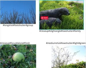
After the photo shoot I took my 9 favourite images that I think worked well and told a story. I used hashtags to describe camera techniques and show meaning in the image.

An example of finding meaning in these images probably works best with the mushroom picture. I think it show loneliness and isolation and I think the image shows this through the positioning of the main object and how the camera focused on the main object and blurred the surroundings.  The image is also shot from a higher angle further showing the object to be alone and below everything else.

The skill of picking out meaning and stories from an image will help in creating our magazines as it means we can pick the best images to fit our genres and our narratives.

Technical Camera Terms

When using camera there is a number of things you need to keep in mind mainly being:

Shutter speed, ISO and aperture.

Firstly shutter speed. This is how quickly the shutter moves over the lens.  The higher the shutter speed the clearer the image.  But in different levels of light a faster shutter speed and a lower shutter speed can give the image light. For example a if you take a photo in a dark room you need to let more light into the camera and so a slower shutter speed is needed. If you are in a bright room a faster shutter speed is need to let less light in.

when it comes to ISO we usually leave that on automatic and let the camera do the work to get the best image.

Lastly there is aperture.  Put simply its how open the front of the camera is and depending ion how open it is you will get more or less light. More open means more light and less open is less light.

The next big thing you need to remember when using a camera is camera angle. You can have various camera angles but the most common are high and low angle and a wide angle.

The last thing to remember is camera frame. There are lots of frames you can use. For example  Mid shot, medium shot. long shot, extreme long shot, close up and extreme close up.

Different angles and frames can really change how a scene is portrayed. For example  a close up shot on a character can give that character importance and the audience might focus on that character without being aware of it.  Another way focus is placed on a character is through camera focus, what I mean is if one character is perfectly clear and in focus the audiences attention would be on that character and not another character that is not in camera focus.

Here are my images that I have taken. They are mostly nature shots and they range from close up shots to long shots. I used various shutter speeds  to get different amounts of light into the image.  I also used different angles  to create some sort of story from the image.

One image that I think that worked well is this image. The reasons for this are that it is a clear image that has the main part of the image is perfectly in focus and a story can also  be picked from the image. Images. For me a story of the solitary plant in the centre is shown through the image.

Print Media That Communicates Meaning

In a lesson we all learned to be media detectives and we were shown how to break down an image and find more meaning to pictures and forms of media. This particular form of media is a tour poster for the band Muse. The style is clear and it is a western theme, and in my opinion it is a wanted poster design. I think the theme of a western wanted poster clearly shows the American location is a big part of the poster. I  also think that the American theme of the poster is smart as the audience for a performance in America would be Americans. One other part of the poster I think is important is the way the picture of the band members are portrayed, and they are shown as a all black drawing. This of course ties in with the wanted poster theme but I also think this shows them in a way to be a rock band possibly with a rebellious or criminal reputation .  Lastly I think that calling the fans part of the resistance is also another clever part of the poster because that might create a bigger and more committed fan base as they might be seen as a rebellious fan base. This could also bring in more fans to create a bigger audience.

The slide shows an annotated poster of a  the band muse on an American tour.


My Image That Uses Mise-en-Scene To Communicate Meaning.

My group were given the music genre of punk.  This meant we had to research this genre and collect picture for an online mood board. The mood wall below shows  different styles, bands and objects that people would imagine to be punk. . Overall the general feel is dark, different and rebellious. The main colour involved is black and this gives the feeling of dark, depressed and cold theme. Another thing I noticed was the black and white images. It seems like the style of the pictures taken match the clothing and style on the people, which is why I think that an all black and white music magazine would capture the genre perfectly.

I think that a music magazine on this genre would need to be dark and slightly depressing. I also think that it would have to have lots of rebellious articles and photos.

After this we had a clear way we wanted our model to look. We went for dark clothing including leather jackets and black boots. The accessories were chains,  a studded band and a guitar.
Made with Padlet