January
16
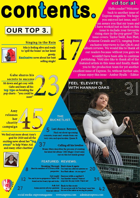
A New Improved Contents Page
Click on image to view PDF
What has changed:
- removed any imperfections on my main image
- added an editorial and contact details to complete the page
- added larger line specing in between the articles on the blue section
- changed ‘Last chance: Beyonce’
- made the blue words letters further apart to increase readability
What remains:
- add colour to the main image to fit with the genre and stand out on the page
- decide on a final colour scheme and change on here and the rest of the mag so it all links in
I asked for some feedback from my friends on my new contents page, and asked them these questions:
- How does the contents page work in tandem with the front cover?
- Is the font/typeface consistent with the front cover?
- What genre of music is the contents page featuring?
- Describe the images of the stars using adjectives.
- Which cover-lines tempt the audience to read on and which ones stand out and why?
- How do the cover-lines reflect a music magazine? If they don’t, which ones need to be adapted?
- Which areas, aspects have distracting areas of integration of copy and images?
- What aspects do you consider conventional or unconventional? (page numbers, inserts, captions, catchy cover lines, editors comment)
Feedback and targets:
- the same fonts are used – can tell the two pages are linked together
- change the colours on the front page to link it to contents page
- the colours used on contents page are very bright and reflect the pop genre
- my star looks: confident, intelligent, knows what she’s doing, a very up-lifting person
- ‘Charity campaign’ – very wholesome, reflects the modern day audience, young people want to make a change – appealing to a teenage audience
- like the highlighted words – brings attention to the articles
- ‘gossip’ – trendy vocab, modern, reflects target audience
- the blue box with the black writing – could make the writing a bit bigger or change the font or change the colour to white – then highlight section headers to make them stand out again
- make the images inside the numbers more obvious – can’t really tell who is inside them
- the shapes and layout is conventional to the pop genre
- confused where to look first – lots of information