Digipak Draft 1

Introduction

In this task, Harry and I attempted to create Draft 1 of our digipak. We only focused on creating our front and back page for our draft one since these are the most important. We achieved this on Indesign and Photoshop, where we mostly tried to manipulate our back page to make it almost complete for our final draft. The front page we’ll continue with later because Harry and I thought it was the easiest to design, hence why we wanted to attempt it last.

If I was being realistic, I think this would receive a C grade or similar. This is because there aren’t enough conventional features included, and the overall design (mostly the front cover) is poor and we haven’t had enough time to focus on any proper photoshop for it yet.

What went well:

  • We manipulated the back page very well
  • Our shots were framed nicely and it was the main focus of attention
  • Our mise-en-scene held a strong message, and golf conventions are obvious

What we need to improve on

  • The typeface we used and the text sizes
  • Using conventions/layout of our page designs
  • Photoshop / Indesign for our front cover
  • Appropriate and engaging language (We haven’t quite covered that yet)

Overall, I think this task was particularly successful, but it definitely needs some improvement in the future. As a first base, I think it’s definitely a great place to improve from… We have the right ideas but we haven’t had the proper chance to implement them yet. In our second and third drafts, we’ll definitely spend as much time as possible to improve upon this.

Evaluation of shoot or graphic design

Evaluation

Our shoot for our Digipak went accordingly. We booked out the white studio for this task, and we used the camera equipment such as a tripod, DSLR and studio lights. It took Harry and I a really long time trying to set the shoot up… We had a few problems with lighting and our camera’s exposure was playing up throughout our shoot. We did fix this however and we did manage to get the array of shots we were hoping for. Our mise-en-scene was also good. We managed to create a really conventional golfing outfit, and we had some other accessories to play with such as a knitted fleece and bucket hat to try and add some unconventional features to contrast with.

What went well:

  • Good use of Mise-en-scene
  • Collected the right amount of shots we were aiming for
  • We had tons of poses we could use for different pages of our digipak
  • We used time effectively

What could’ve been improved

  • Could have used more camera angles and distances
  • Practised using a camera beforehand to lower the odds of facing any problems when shooting.
  • Some shots appeared blurry which could have been easily avoided
  • Could have used a green screen to cut out our pictures easier in post-production

Concluding all of this though, We have enough shots to play around with in post-production which is the most important thing for a task like this. These tasks are also always great to reflect on because if there’s a next time we would avoid the same mistakes we made for our digipak.

Contact Sheet + Ideas

INTRODUCTION

In this task, Harry and I collected all the shots we took for our digipak, and we put them into adobe software to create a contact sheet. Contact sheets are really useful when navigating pictures, and it shows every angle and idea used all in one place.

Here is our contact sheet:

Some of the main pictures we liked were


The picture quality of this image was one of the better ones, and the mid-shot allowed us to display all of our golfing attire.
We liked this image because the clothing is unconventional to our genre, and the pose symbolizes reflection and anticipation which was perfect for our back cover
This shot was actually accidentally taken, but the motion blur and the action of putting the golf bag around my shoulder made the image look fast-paced which was really effective. It definitely makes the image look more dramatic which is perfect for our back or middle cover.

Conclusion

Overall, I think this shoot went pretty well. Although Harry and I struggled to familiarize ourselves with the camera equipment due to not using it for a very long time, we finally got back into motion and collected some good images for our Digipak. Some of them did turn out quite blurry but post-production can transform them into a higher quality image. I think we can both say if we have another shoot again we’ll be able to use equipment with greater confidence and minimize any issues which could occur.


Photoshoot / Design Production Meeting and Risk Assesment

INTRODUCTION

In this task, Harry and I filled out our production meeting agenda and risk assessment for our first shoot for our digipak. We filled out a sheet showing the sort of mise-en-scene we were aiming for, and structure our day out to make sure everything goes as smooth as possible prior to the shoot.


We didn’t have much to fill out in terms of the risks, because our only location was at school, and our mise-en-scene was a simplistic selection. Even so, the production meeting agenda allowed for Harry and me to bring enough props and additions to make sure we had enough shots for our product, and to have some back-ups just in case some shots didn’t go to plan.

Digipak Mockup

INTRODUCTION

In this task, Harry and I created a roughly sketched plan to show what our digipak was going to look like. We created both our front page, double-page, and back page for this task.

These sketches are the 4 mockups we created. In the creation process, our ideas may change but it’s always good to have a base to work from.

The main idea we have stuck with is a golf-themed digipak. From previous tasks, we learned individuality was the main success in rap digipaks so we thought almost creating a parody-like product would be quite successful.

The front page will be a simplistic image of our star on a stall, so the audience can focus on his outfit/connotations. Almost like a Tyler the creator approach in his cricket jumper. The back page will also feature a golf dispenser, with the name of the songs listed on the digital screen. We’ll use bright colours to make the machine look digital and make it stand out as much as possible.

Tyler the Creator

The double-page spread will have our main character posing as well, and a golf ball will hold the cd inside of the digipak to continue the golf theme.

I think this task was really good to do, It was challenging to create our plan because both of us are not particularly good at drawing but our end result was very clear. We just need to remember to include some of those conventional features such as a bar-code, record labels etc when we create the real thing.

Digipak Conventions Analysis

INTRODUCTION

In this task, I analysed a digipak cover created by The Weeknd to look at what conventional features were used, and what will be useful in the creation process of my own product. I looked at different aspects including colour palettes, typefaces, mise-en-scene and other fundamental ideas to support my understanding of the sort of criteria I’m trying to achieve.

This task was really important and insightful to research. It was an eye-opener to see what specifically was used and why, and what meaning these sorts of features connoted. The Starboy was a really good one to look at, because it featured a very standard layout, although there were a few unique ideas. The key ideas were his representation of wealth and status, familiarity, supernaturalism and independence.

Overall, I now know confidently what to include in my own product which goes under the same genre, and what to focus on. This analysis has definitely inspired me to be unique by adding some unconventional ideas of my own, whilst still being a rap digipak.

Our Mission Statement – the brand package

Introduction

In this task, Harry and I created a google slide that showed: what our audience looked like, depending on their psychographics and demographics. A call to action to show how the audience will interact and support Joji, and ways of doing this. Who the competition was in terms of music artists and record labels, our USP (Unique selling point) and finally our Mission statement.

This task was a really good way of understanding who our target audience is and how we will effectively distribute and make the digipak as suitable as possible for our chosen genre. The mission statement will also remind us what we’re trying to achieve from our product, and what our main focus is in terms of delivering a message and presenting our star.

Final Draft Music Video

Introduction

In this task, Harry and I managed to complete the fourth and final draft for our music video. The focus of this task was to primarily fix and add any other final touches to improve our video even more than before and to recieve any last bits of feedback which could further improve our grade and to meet the required criteria as much as possible.

The flashback edit I made, added a sense of reflection, and made the star question whether ending his life over the redundancy he was given was really worth it after all. The smashed image effect I added in the underground hospital scene was paralell to the stars emotions, showing his life was breaking into a shatter of sadness and confusion. The dark colour scheme and the slow pace of edit also drew out those key emotions of sadness which was consistent throughout the whole video.

Conclusion

I think overall, the music video turned out very well. For our final adaptation we tweaked and added some new effects to increase creativity and to make sure it look as smooth and as proffesional as possible. I also focused on making the video masked on the television to be in the right position and look more believable (before the video was not fit properly onto the screen) which went as planned. The feedback given from both our peers and supervisors definitely polished up some silly mistakes and gave us a new range of ideas that made it easier to improve our video.

Concluding all this though, the video did follow through in terms of our planning and initial ideas, and we got the right mise-en-scene, camera angles and post production to make this a success. As a moment of reflection, If we ever did re-create a video, we would most certaintly film in more appropriate enviroments and try and collect more clips to play with.

Draft 3 Music Video

Introduction

In this task, Harry and I attempted to create our 3rd and penultimate drafts. We used the feedback from Specsavers and our teacher to further improve the quality of our video, and we also added some new additional effects and features to make it stand out that little bit more.


Feedback from Peers

Music video peer review

Conclusion

This task was by far one of the most time-consuming drafts. We had to cram in a lot of feedback from two very professional sources, so we had a lot to improve on in a very short amount of time. Looking back on it though, it was very worth it, and it definitely elevated our video to the next step. I think the most obvious and beneficial change was the start of our video. I really like how the new meeting scene turned out and it is exactly what we were aiming for in the initial stages of our video.

The peer feedback was also a very important task to do because now Harry and I know what our video looks like from a demographic similar to ours, which is a very important thing to achieve. We’ll definitely include them changes for our fourth and final draft.

Specsavers Feedback

Introduction

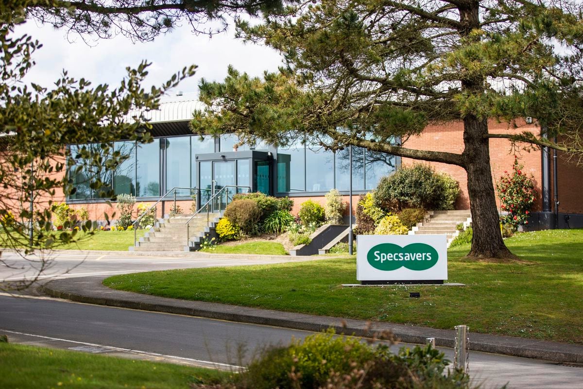
In this task, Harry and I were fortunate enough to get a visit from professionals at Specsavers to take a look at our music video. Specsavers is a worldwide brand that manufactures glasses and contact lenses and is one of the biggest businesses out there. Lenny visited us and his main job is to edit and produce content for them. He watched our whole video and told us what he liked, and things we could improve on.

Jobs likely to go at Specsavers | Guernsey Press
Specsavers, Guernsey

What he liked:

The editing and array of effects that I used in our video

The range of camera shots and angles we used

Performance


What he thought we could improve on:

Mask out the performance to make us look smaller

Some more filters especially in the bunker to add more shadows.

do even more after-effects as he says it’s better to edit on than premiere pro

Conclusion

In conclusion, it was really beneficial to get some more feedback, especially from a professional in such a big company. Harry and I will both take what he said into consideration, and continue to develop and improve our video to make it look as good as possible in its end product