How do the elements of your production work together to create a sense of ‘branding’?
The production elements within my media studies work have coherently worked together in order to create a sense of branding which is consistent throughout the entirety of the production work. We first started off by determining our genre of emotional rap. We then researched the typical demographics and psychographics that the fans of an artist from this genre would typically have used to decide how to design the graphics, colour palettes and to design the text to have the audience view it through the preferred reading we wanted the audience to see it from. This helped to build the foundations of branding within the production work as all of the text, MES and imagery match together throughout the work allowing the audience to see our work and know it belongs to our brand by the way it is designed and presented.
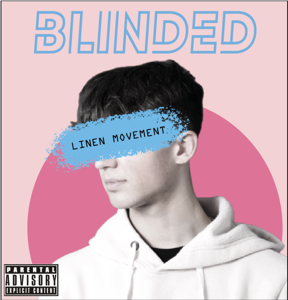
The colour palette we chose consisted of pink, blue, black white and purple which gave a relaxed and contrasted vibe to what has traditionally been used within the genre which typically consists of darker colours including reds and blacks.
Throughout our media we represented our star in a way that is relatable to the fans by making them young and having them face the same problems an everyday ordinary person would face, we did this to create a relatable brand image to sell the artist to the audience by making them as relatable as possible.
A key feature of a brand is that it needs to be easily recognisable to the audience to allow them to identify the brand automatically. When doing this we made sure if we were to put all of our work next to each other you could tell that they all belong to the same genre and follows our mission statement key descriptors such as edgy, over the top, emotional and socially aware. We did this by constantly comparing and contrasting our work to examples of real-life work within the industry that relates to our genre. For example, when making the magazine we chose to incorporate a textual piece about our artist’s struggle with family and friends, this gave the artists a connection to the audience that they can relate to on a personal level this gives them more loyalty to our artist as a brand as they relate to them and will keep returning to it
We also communicated the key descriptors when editing our music video and adding filters in the digipak to give the images more emotion and depth throughout the various platforms they are represented on.
The use of multiple types of media within our brand (eg, music video, digipak and social media page) allows us to represent our brand using various platforms which allows us to use cross-media convergence to create an integrated advertising campaign that represents our brand with a clear and coherent brand image throughout. Such as using the same colour palette and fonts throughout all areas of our media
How did your research inform your products and the way they use or challenge conventions?
My research helped to inform the way that my products used and challenged conventions as it allowed me to dig deeper into the design choices and the different repertoire of elements and decode them to unveil their deeper meaning within the genre. For example, within our music video, we used Lacey’s repertoire of elements in order to produce and create a music video containing all of the elements that the audience would expect to see within a music video in our genre. We went through and analysed each convention within our genre and compared them with how we wanted to represent our star image to the fans. We then decided which conventions would fit this star image the best and then created the blueprints to what would become the music video.

Within our music video, when choosing which conventions to follow and which to subvert against we chose to follow the costume conventions of emotional rap which usually includes plain everyday clothing with expensive chains and jewellery on in order to seem relatable yet successful to the audience.
We chose not to follow the general performance conventions of emotional rap which conventionally has a large percentage of the video as performance. This performance is usually in outdoor locations with scenery matching the vibe, lyrics and general nature of the song itself, however, in our video, we chose to use a mix of outdoor and studio work to connote a mix between perfect and imperfect, natural and supernatural to the audience showing there is a mix, as with costume in the artist between a star and a normal person. We did this to make the personality of the star more complex yet still relatable to the audience
How do your products represent social groups or issues?
The star and genre are represented within the digipak through many different ways to show the values, attitudes and beliefs of the star and therefore the genre of Emotional rap
For example, we used the artist’s mise en scene to connote the genre and relate and represent social groups and issues, for our mise en scene we went through the process of analysing other artists work such as juice WRLD, Lil peep, Kendrick, Lil Tecca and Polo G who are artists within our genre to find the conventions for costume, lighting, graphics, colour and makeup. We concluded that emotional rap album covers usually follow similar conventions. One of these conventions is dark, homemade-looking covers with the artist on the front wearing everyday clothes like a hoodie and jeans, or they use bright colours showing the artist in a graphic or real image, wearing high fashion looking almost godlike, really pushing for the Extraordinary feel. In our digipak, we went for a mix of the two conventions using a very ordinary artist in normal everyday clothes yet we used a bright colour palette of pinks, blues and dark colours.
We used Richard dyer’s ideas of the ‘star image’ in order to relate to as many people as possible, expanding the possible target market resulting in a larger fan/customer base.
On our digipak we used some different graphics to connote and add some context to the title ‘blinded.’ We achieved this by adding a blue bright stroke over the artist’s eyes in order to show that has been blindfolded and blinded from the world this is semic code as it is a sign that the audience can decide for themselves that it is a reference to being blinded
Our use of a pink colour palette also challenges the usual stereotypes for a male artist showing he is not afraid to challenge stereotypes and to stand out from the crowd this challenges the symbolic social and cultural connotations to femininity that the colour pink holds within society and flipping that around and using it within our cover. This shows our artist is metrosexual, accepting and easy going and likes to challenge connotations and social views of male and female stereotypes.

How do your products engage with the audience?
Our social media page is full of media that engages the audience in many ways through posts, comments, stories and hashtags.
These can be used to maximise engagement through social interactions between the star and the fans. These engagements with the audience help build connections between the fans and the star working with the uses and gratification theory to gratify the audience through giving them access to information and interactions.
The use of comments and stories also allow for the transfer of information between the star and audience allowing them to share their thoughts, feelings and emotions. however, there can be an optimal amount of engagement the maximise the gratification gained by the audience through the interaction.
For example, if the star interacted with every fan that commented or liked the post the gratification and excitement the fan would receive each time would go down
This means that there is an optimum amount of engagement that allows for common interaction between fans yet is not so common that it decreases the gratification gained from the interactions