First Draft of the Front Page
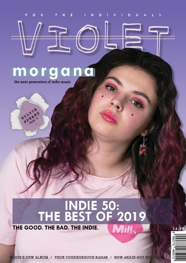
Feedback from the 1st Draft
- Don’t like the border around the edge
- Masthead – Good font, nice bold drop shadow, strike-through needs to be bolder
- Possibly change plug to ‘for the individualists’ instead
- ‘Morgana’ cover line font good, change background colour to match scheme more, shorter body text and a different font
- Pug good, nice effect
- Editing around model’s hair looks messy, don’t keep the logo on the shirt if it’s not going to have any significance
- Remove negative in main cover line, consider the design of it more
- Include issue date and price by barcode
- Bolder cover lines along the bottom of the page
My Main Targets
My main 5 targets to improve this draft are:
- Work in Photoshop to improve the edit of my cover star
- Add all necessary information by the barcode
- Use a different, better body text
- Ensure all features match colour scheme
- Remove the border from the cover
I will take these notes and targets into consideration in order to create a more successful second draft.