Below is my Piktochart about how I integrated various technologies in the production of my magazine.
Component 1

Adverts
2 Appropriate Adverts for my Audience
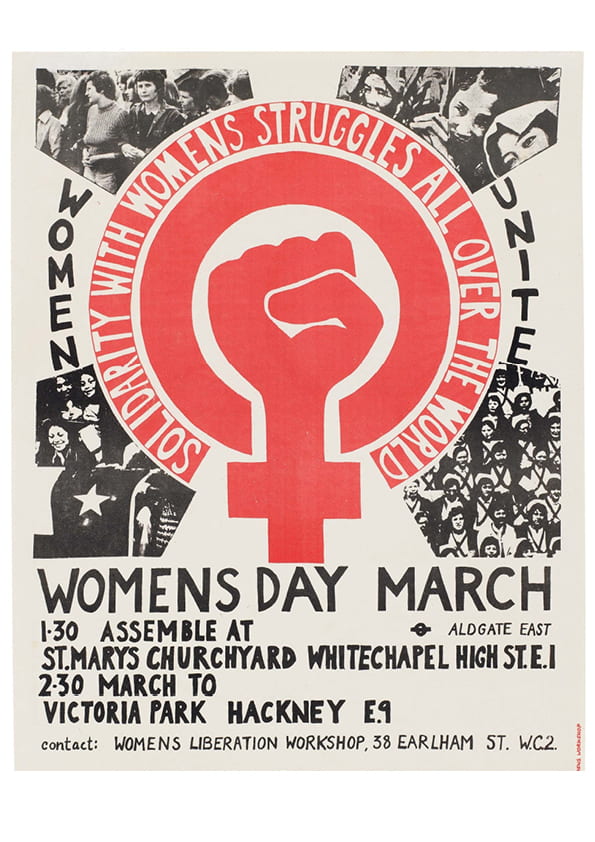

I feel that the above 2 advertisements would be appropriate for my target audience. I chose the poster for the Women’s March as those who enjoy Indie music are likely to be politically aware leftists who care about activism and getting their voices heard. I chose the advertisement for streetwear brand Lazy Oaf, as, based on my research, my audience are likely to be fashion forward. On top of this, the company value rebellion and non-conformity, an ideology that runs throughout the Indie genre.
Design Skills 2
In the creation of my magazine, I have picked up a number of design skills and production techniques.
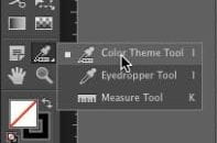
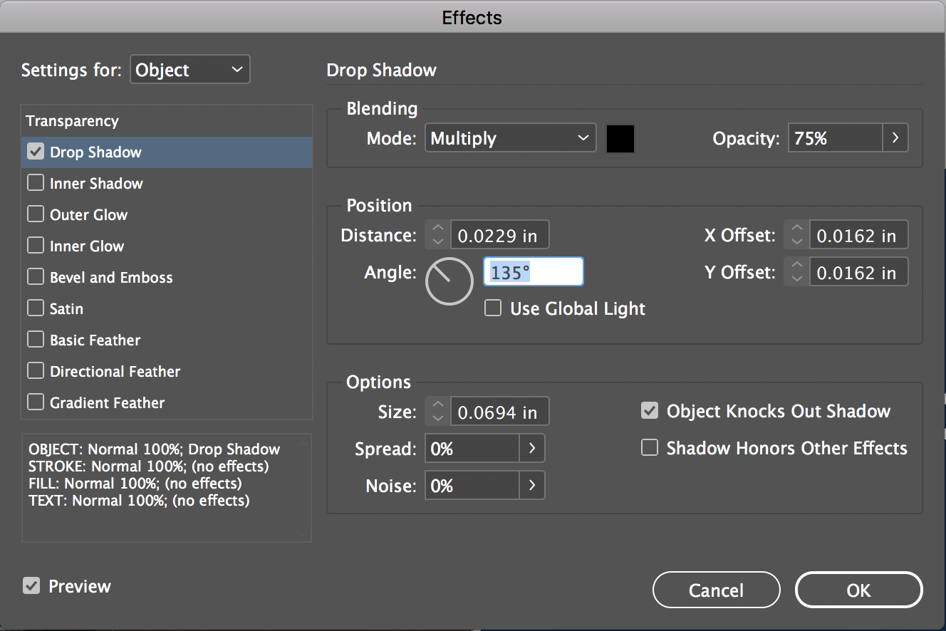
Design Skills
I have learned how to use the eyedropper tool in order to create a clear, aesthetically pleasing colour scheme for my magazine.
Another tool that I’ve learned to use is the drop shadow tool, which helps to enhance the titles and text throughout my magazine.
Production Techniques
- I have learned how to lay out my work in order to fit the brief for each individual task
- I have improved on my ability to convey various moods through the texts that I create, allowing an effective representation of of emotion
What went well…
I was able to create my magazine to a good quality finish, and the skills I developed throughout this significantly improved the end result. When looking at the magazine it’s apparent that a lot of thought had been put into creating a well constructed finished product.
Even better if…
I feel that I could have planned more thoroughly for my photoshoots, as when I was with my models I didn’t have a very clear sense of direction, resulting in a not very diverse selection of shots. Also, I think that my cover could have been improved by having a background that better matched my theme, as I feel that the colour behind my model was too bright to fit with the pastels throughout the rest of my magazine.
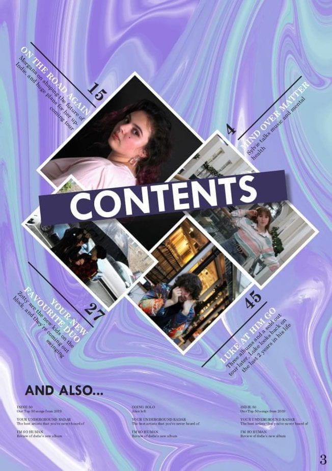
A New Improved Contents Page
New Draft

Peer Assessment
Summary
- Colour palette ties the cover and contents page together
- The contents page is within the same font family as the cover
- Can tell that the magazine is for Indie music
- Adjectives to describe the stars fit the conventions of the genre
- Cover lines encourage audience engagement
- Cover lines convey that it’s a music magazine
- Has the conventional features of a contents page
My thoughts based on this feedback is that overall I have managed to create a successful contents page for my music magazine.
Draft of Contents Page
First Draft
For the first draft of cover page, I followed the outline of my hand drawn draft and added my own images and text. Some feedback I received for this draft was:
- Strong background
- Interesting layout
- ‘Contents’ title well defined
- Graphic of photos/borders well done
- Article descriptions and titles hard to read against background
- ‘And also…’ section is unconventional
- Text is too small
For my next draft of the contents page, I will focus on these targets:
- Make the article titles and descriptions stand out more against the background to increase legibility
- Alter ‘and also’ section at the bottom of the page
- Increase the text size so that it’s more readable
What is a Contents Page?
Three Draft Layouts for Contents Page

 Five Possible Headlines
- Your New Favourite Band!
- The Very Best of 2019
- We asked *artist* what YOU wanted to know!
- The truth about *artist*
- All About the Artist
Conventions of a Contents Page
- Large title
- Page number
- Article titles which gauge interest
- Short descriptions of articles
- Images, often in various sizes
- Feature of the cover story
- Limited colour scheme
- Columns, or division of some variety between various segments
Thoughts
I have chosen my second drawing for the layout of my contents page, as I feel that this layout is unique and bold, something that I want through my magazine as it emphasizes the magazine’s value of individuality. I think that this will also aid in gauging my audiences interest as it is interesting to look at, causing them to desire reading the rest of the magazine.