Preliminary Print Tasks
My Tour Poster
In order to create an effective tour poster, I first completed some research into other tour posters of the genre.
Moodboard of Rock Tour Posters
In my research, I found some of the following conventions:
- Colour schemes of red, yellow, black, and white – block colours
- Artists name usually written in capitals and in a large text size
- Image often fills a large portion of the posters
- Many artists are pictured with their instruments
From this research, I created my own Heavy Rock tour poster.
My Tour Poster
My Tour Poster – Analysis
Here is the link to my analysis for my finished tour poster.
The Camera Talks
Moodboard
For this task, we were tasked with creating a moodboard of our favourite images from our photoshoots, and for each image, we included 3 hashtags; one for the camera term, one for the denotation, and one for the connotation. The denotation of an image is its literal, clear meaning, and the connotation of an image is what is implied. I feel that I was successful in accurately labeling the photographs I took.
I think that I achieved the aims of taking high quality images that can convey meaning through camera work. My favourite image was the one of my school bag on a wall, as I felt it effectively connotes the idea of being left behind. The fact that the bag doesn’t fill a large portion of the screen could imply its unimportance, and the smiley face on show on the bag contrasts effectively with the overall depressing tone of the image, creating almost a sense of irony.
My Magazine Front Page Swede
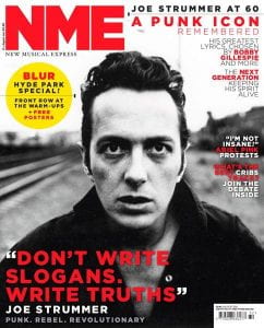
This week, my class were taught how to use the features of InDesign, a popular desktop publisher. We learned some basic skills, such as how to set up a new document, navigate the toolbar, insert text and images, and export the finished product, as well as being taught how to use columns and grids in order to arrange the aspects of our covers. We also revisited the main conventions of a magazine, for example, masthead, plug, pug, and main cover star. In order to test our skills and knowledge, we were set the task to recreate a magazine cover from NME, a music magazine, as closely as possible. The main aims for this of this were to:
- Consider and apply the main conventions of a magazine
- Recreate the layout
- Practice using InDesign and its features, such as fonts, sizing, spacing etc.
NME Cover to Recreate
My Recreation
Reflection
Overall, I think I managed to effectively and closely re-create the original NME cover which I was provided with. I managed to re-create the pug quite accurately with its background colour, spacing, and the dotted line through its centre. I also managed to source the exact image that was used on the original cover, which I found was very helpful when it came to recreating its layout, as well as giving it a sense of authenticity. Finally, I think that my font choices were as accurate as they could be within the options provided, and that they generally resemble the fonts on the original quite closely.
Something that I struggled with in this recreation was the accuracy of my colours. The default colours provided weren’t the correct shade, and I particularly struggled to find a true to tone red. Another difficulty that I encountered was with the spacing and size of the letters. Most of the text on my cover needed to be edited in order to resemble the original, and I struggled to determine which aspect of the letters needed to be changed, such as font size, height, width, word spacing, or line spacing. Finally, I found it complicated to place the text correctly in relation to the image and other text. I will need to improve on these aspects when I create my own cover in order to make a magazine which is as effective as possible.
Targets
One thing that I would like to improve on is the spacing and placement of my text, as it’s something that I struggled with in this recreation, and that I feel is vital in the creation of any future pieces. Something that I would like to learn is how to create a gradient in the background of an image, as I feel this will aid me in creating an aesthetically pleasing finished product. I would also like to learn how to use more complex text effects, as I feel they are interesting, pleasing to look at, and more visually exciting.
Technical Camera Terms
Contact Sheet 1
Contact Sheet 2
Reflection
In order to use my DSLR camera effectively, I took into consideration the instructions that had been provided by our technician. The three main aspects that we focused on were Shutter Speed, Aperture, and ISO. Shutter Speed is the speed that the shutter closes, which allows in as much light is necessary for the shot. A lower shutter speed is used in darker environments, as it closes more slowly, allowing more light in; a higher shutter speed is used in lighter environments, and it closes more quickly, because less light is needed. The faster the shutter speed, the higher the number will be. Aperture controls the amount of light entering the camera’s lens. If more light is needed it will be a bigger hole, and if less light is needed, a smaller hole; the lower the number, the bigger the aperture. These two aspects work together to control how much light is being allowed in to the shot. ISO is about sensitivity to light, if the number is lower, it will be less sensitive to light, and, therefore, have a finer grain. As I took photos, I feel I improved on my use of these features. For example, I took a some overexposed photos, such as image 0120, and some underexposed photos, such as image 0122. I tried to rectify this in the images following by decreasing the aperture and increasing the shutter speed for the overexposed photos, and increasing the aperture and decreasing the shutter speed for the underexposed photos.
I feel I achieved my goal in using different angles and framing to portray different moods when photographing objects. One of my photos of a lamppost, 0162, is shot from a low angle, which connotes that it is an object of power and superiority, whereas in a different photo of it, 0161, it is shown in a wide angle shot which features more peripheral detail, implying that it is not something notable, but rather just a part of a bigger picture.
This knowledge of camera usage will be helpful for the creation of my music magazine because I will know how to take photos effectively, and in a way that can convey meaning.
My Image: Mise en Scene to communicate meaning
In class, we were set a task in using Mise en Scene in order to communicate meaning; we would select a piece of paper with an unknown music genre written on it, and, in groups, we would have to consider CLAMPS in order to stage a photoshoot and create a tour poster for that genre. My group were assigned the genre ‘Heavy Rock’. In order to better understand the conventions of Heavy Rock, we created a moodboard detailing what we feel are key features and conventions, including hairstyles, makeup, and clothing.
Heavy Rock Moodboard
I feel this task was helpful in the visualization of the Heavy Rock genre. From this moodboard, I considered Mise en Scene, and determined some key conventions for each aspect of CLAMPS:
- Costume
- Leather clothing, particularly jackets
- Denim clothing, particularly jackets and flared jeans
- Band tees
- Black clothing
- Accessories, such as metal jewelry
- Lighting
- Photos well lit
- Sometimes photographed in black and white
- Acting and Proxemics
- Serious expressions
- Usually making direct eye contact with the camera
- If in groups, usually stood close together
- High energy action shots
- Strong, confident stance
- Makeup and Hair
- Long, often slightly messy, hair
- Dark makeup if worn, eg. dark lipstick, eyeliner
- Props
- Action shots often feature instruments generally associated with Metal, eg. electric guitar, microphone
- Setting
- Venue in background from gigs
- Often industrial backgrounds for more staged shoots
With these aspects in mind, we completed our photoshoot.
Heavy Rock – Final Photo Analysis
For this shoot, we referred to our moodboard in order to analyse which ideas were the most common and why that might be. For example, we mostly stuck to dark clothing and makeup, as we found these colours were most prominently used in the Heavy Rock, and this gives connotations of seriousness, intensity, confidence, and edge. This fits with the conventions of this genre, as the music often focuses on resistance, non-conformity, taking a stand, and generally going against the grain.
When I photograph in the studio, I will probably use dimmer lighting, as this more closely follows the conventions of the Heavy Rock genre and its association with darkness for the purpose of edge. I will also photograph my model either with a higher energy action shot, or with a more deliberate, intimidating stance, as I feel this better reflects the genre.
Through this task I have learned the importance of considering all aspects of Mise en Scene, as it is immensely important in creating a piece of Media with the correct overall tone, as well as being highly necessary in order to distinguish between various genres. I will ensure I apply this level of thought to any content I create in the future in order to be as successful as possible in conveying my desired message.
Print Media that Communicates Meaning
Every aspect of Print Media has the capacity to portray a number of different narratives and meanings based on its key components. In order to create an effective piece of media, there are 6 main components that need to be considered. These are known as ‘Mise En Scene’, and can be abbreviated to form the word CLAMPS. This stands for:
- Costume
- Lighting
- Acting and Proxemics
- Makeup and Hair
- Props
- Setting
Below, I have analysed a tour poster in order to derive its meaning and the message it’s aiming to portray.
Tour Poster Analysis
For this poster, Muse didn’t go for a traditional ‘glossy’ look, and instead went for a more rough and edgy style. I feel that this was done portray the band as not being something shiny and unattainable, but rather as more relatable to the masses; they aren’t different from anybody else. This helps their fans connect to them and view them as other human beings, rather than idols, therefore encouraging them to attend their tour by appealing to their target audience.
In order to create my Music Magazine, I will need to consider all aspects of Mise En Scene in order to convey the message that I want; I will do this by making sure I remember the 6 aspects of CLAMPS, and ensuring I have thought through every decision I make thoroughly.