My Tour Poster

Before actually making our tour poster, we had to research different ideas and gain inspiration from past real-life tour posters of actual artists from our genre, mine being folk. After browsing around, we made a moodboard of all the posters we found and we saw a correlation in the design features, below is my moodboard:

Some of the distinct similarities were:

  • All photos of the model were in black and white or drawings/portraits of the artist
  • Text was all in capitals
  • The colour scheme was not too complex – most only consisted of 2-3 colours
  • All the fonts were basic and legible

After making the moodboard and brainstorming ideas on how I can make my tour poster look authentic and fit the theme and design I wanted, i put my ideas straight onto the indesign page and this was my outcome.

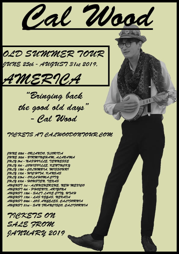
This finish product was exactly what I was going for and, in my eyes, fit the genre and colour scheme of the Folk genre. The black and white image on top of the sandy-yellow background gave the poster an authentic, ‘olden days’ feel, even though the tour is set to start in the modern days. The font looked as if all the words were hand written. Targets I might have for any future tour posters could be to make the information less wordy and make it more brief and punchy.

My Magazine Front Page Swede

In this lesson, we were taught the basics on the Adobe program, Indesign which is a Photoshop software. Simple skills such as :

  • Using text boxes
  • Inserting and playing with the sizes and rotation of images

After learning and practicing some of these skills, we were assigned the task of remaking a magazine front cover, which called making a swede. Below on the left is the original magazine front cover and to the right of it is my swede.

As you can see, my swede wasn’t as much of a spitting image which is why we did this, to practice and potentially get the hang of how to use Indesign of the real cover as I would have liked it to be but there were some good aspects:

  • All of the writing are close to/ dead on where the original cover had them at
  • My colour scheme was accurate (orange, black and white)
  • I managed to find the same image as the original

On the downside:

  • My orange wasn’t the same tone in the mast head and the main cover line
  • My image wasn’t as good quality as the original, evident to how pix-elated it is
  • Very few of my text boxes were out of place and the wrong size

My targets for the next swede are:

  • To have more accurate shades of colours
  • Make sure I can see both the original and my swede so I can create a more accurate swede.


Below are some links to videos that helped me in making my swede. One aspect that caught everyone off guard was how to export and save our designs as images and links, so we were given this video link to watch and it helped us.

Another helpful video was this one below now, it gave us the ideas of what not to do and how not to make a successful product in indesign, which was very helpful.

This final video shown below gave us tips and tricks on how to make a successful piece of work in indesign. It showed us how to make boxes to paste our images in, and how to insert things such as text boxes, shapes and images.


The Camera Talks

Below is a moodboard consisting of 9 images handpicked by me, with 3 hashtags underneath with the shot type connotations and denotations. Each image contains their own meaning and in this exercise, I dug deeper and analysed the photos and stated what they could potentially be meaning.

These images each showed their own meanings and stories. Even though a lot of the pictures were of the same type of shot, they each owned it and told their story from their perspective. Pictures have the power and ability to state and tell a lot about the contents of the image, they have meanings hidden in them and looking into them deeper can help us to understand what the photographer was trying to tell us/ what is going on.

Technical Camera Terms

This post is learning and understanding after our lesson on learning how to work and operate a DSLR camera.

The four main controllable features that will be important when using the camera for taking normal photos are:

  • ISO – A high ISO (3200) allowing little light into the frame, making the resulting picture dark, opposed to a low ISO (100) will allow a lot of light into the frame, making the picture bright
  • Shutter speed – How fast the shutter closes then opens – A low/slow shutter speed (1/10) will make the picture blurry and won’t take a crisp picture. A high/fast shutter speed (1/250) will make the picture crisp and won’t be as blurry/blurry at all.
  • Aperture – This controls thew width of the hole inside the main camera, it also controls the depth of field
  • Exposure – How much light the pictures intakes, balanced by all three other aspects; ISO, aperture and shutter speed

After learning how to use a DSLR, we were sent round the school and we took pictures using the skills we had learnt from the previous lesson. Image 9674 is an example of a mid shot, as it is only showing James’ body from the shoulders up. Image 9691 is also an example of a mid shot but this time it it from behind.

In my opinion, the pictures my group and I took around the school were very successful and there were examples of most of the different types of shots and angles. The interesting thing I found out from taking pictures was that the angle and shot can determine what kind of theme there is, for example a low angled mid shot can be used to show the undermining state of a person or entity, but a high angled extreme long shot can show the grandness and magnificence of a large building or entity, showing its power and the shear size of something.

My Image that Uses Mise-en-scene to Communicate meaning

The item below is a mood board of all aspects of the music genre Folk. It includes famous artists such as Bob Dylan and Birdy.


The Mis-en-scene of this folk wall is very simple and straight forward:

  • Costumes – The clothing worn by these folk artists are very basic but portray the Folk genre very well. The dress is typically jeans and low-buttoned red and blue checkered shirts, with boots.
  • Lighting – In folk pictures and music videos, the lighting is very dark. Pictures are taken and/or edited in black and white to give an older feel.
  • Acting – Almost all pictures of Folk artists are taken of the artist or band smiling. This shows that the musicians love their music and enjoy performing.
  • Make up and Hair – The aesthetics of the musicians are very minimalist. A very simplistic take on an entire music genre.
  • Props – Folk uses many instruments, some being the banjo, acoustic guitar, harmonica
  • Setting – Folk music was popular around the 1940s/1950s and was popular in america

As well as making a folk wall with all ideas and facts based around the folk genre, we also got into costumed we brought in and associated with folk and took some pictures.

We dressed up on of our classmates and then we wrote ideas and moods we associated with the genre and the costume our peer was in. Some of these words were:

  • Natural
  • Freedom
  • Calm
  • Traditional
  • Happy
  • Nature lover
  • Jolly
  • Hippy
  • Artsy

We also took some scenic photos of our classmate in costume in places considered to be related to their genre and their natural element. Here is an example:

This picture visually implies the jolly and good mood and mindset associated with the folk genre, and how nature is important to the folk community.

From this exercise, I learnt that a lot can be said and portrayed from just a photo, and a lot more can be shown by the Mise-en-scene of the picture. This is going to help with my work as it will help me to think about the aesthetics of the picture and how my model and their surroundings can have a great impact on the authenticity of the look of the picture.

Print Media that Communicates Meaning

In this lesson, we analysed a album poster from a current artist and stated the implicit and explicit factors on what made the album poster effective and how it communicated its meanings and ideas.

From this exercise, I learnt that a lot of ideas can communicate different meanings if they are executed in the right way and format, like the colours of the model, there are a few colours that make it eye catching, but it could also mean that he is a very abstract artist with meaningful music.