Shown below is my new and improved Double Page Spread, after my reflection on the conventions I needed to include I added them as seen below.
I added a byline (Photograph by Keith James and article by Francesca Cable), I then added a quote which appeared in my article. This helps to draw my audience in and the quote is also relatable as we have all had to conquer fears which at some point have limited us. I moved the headline to the left of the page as I felt it fitted more there and was more effective. After this I changed the font of the questions and colour so that they would stand out more, then finally I added the page numbers.
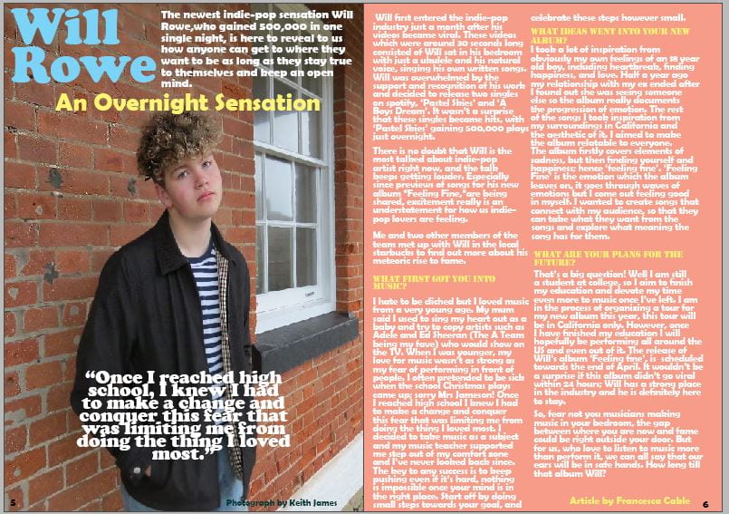
I am happy with how this double page spread turned out, I feel that it fits in well with my front cover and my aims of my magazine. It is simple yet aesthetic and the article provides just the right amount of information and facts for my target audience to enjoy.