


During the process of making my music magazines I have learnt many lessons and transferable skills, I really enjoyed the designing although I did get rather stressed when certain things wouldn’t work.I learnt to take a deep breath and relax and not put so much pressure on myself. The other transferable skills I have learnt are patience, you have to be patient with designing and not rush things, time management is also something which I can take from designing my music magazine. I struggle a lot with time management but getting used to the applications and exploring them has helped a lot with my time management issue. One thing which could of gone better is if I stepped completely out my comfort zone, this would encourage more creativity in my magazine.
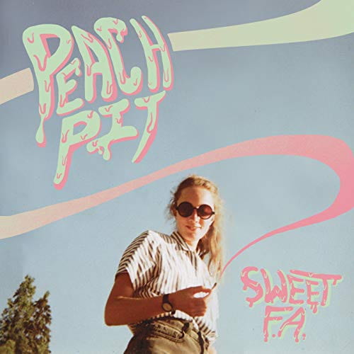
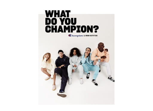
Shown below are two adverts which I believe are appropriate for my magazine and I would therefore like to include. I have based my decision of choosing two adverts on artists/ brands which are appropriate to my magazine on indie-pop. Whilst also keeping in mind the demographics of my audience,including their interests (clothing,brands,artists). The first advert is of a popular indie pop band named Peach Pit, they are well known among my genre and target audience. The second advert is a clothing brand, champion which is also well known to my target audience and appeals to the demographic.
-6


Shown above is my complete magazine draft with below a screen cast which my teacher has made assessing my complete draft.
The feedback from my teacher overall included many targets and ideas of how I can make my magazine bolder, my targets for improvement are as follows:
Front cover
Contents page
Double page spread
Overall from my feedback I have a lot of tweaking to do in order for my magazine to be the best it can be.