October 23

Communicating my Brand

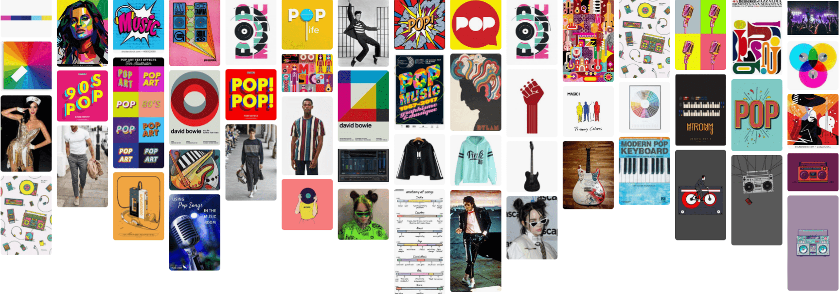
Please click on the image to see a clearer version.

I have created this mood board on Pinterest and researched all different areas of the music genre ‘pop’ such as:

  • Colours
  • Clothing
  • Fonts
  • Instruments
  • Styles
  • Graphic Designs

I have learnt that graphic designers are always researching their genre because the media is music world is constantly changing.  I will use this mood board as inspiration when designing my magazine to know what colours suit the genre and what fonts suit the colours and the genre.


October 23

My Audience Profile

I will aim to produce media that is relevant to my target audience, hopefully my encoded ideas will be successful so then they will decode it for more useful reading, this is called preferred reading.  If my audience do not like it and reject my ideas then that is called oppositional reading.

I have gained knowledge form this task and that knowledge is understanding what my audience will from reading my magazine.  This helps me understand the audiences uses of the media that I will produce (magazine).

I have also done some research on YouGov about the genre of pop.

October 22

Branding Ideas + Mission Statement

The name for my magazine cover is LP (Let’s Play).  The genre of my magazine cover is Pop.  In order to make sure my magazine as popular as possible I will make sure that it includes:

  • articles
  • news
  • features
  • competitions
  • tours
  • fashion etc

This is to ensure that they are as entertained, informed as possible and also that they have lots of chances to socially interact and reinforce their personal identity.  This means that the Uses and Gratification theory by Blumler and Katz will be fulfilled.

I created a word cloud with all the words linking the the genre of Pop, this can help me when creating my magazine cover because I will know what to include on my cover.

My mission statement:  My magazine is aiming to get as many people as possible to listen to the artists music and to get everyone that reads the magazine to like the genre Pop.  The aim is also to sell my magazine and to get people from around the world to buy this.  It is the best magazine created to date due to the fantastic features included, you can find those features when you buy the magazine.

October 22

So… I’m ready to make some media!

When making my own magazine cover I will need to think about:

  • Audience
  • Costume
  • Lighting
  • Fonts
  • Colours
  • Genre

I will also use all my camera knowledge:

  • Close up
  • long shot
  • Mid shot
  • High angle
  • Low angle

All of this will help me create my magazine cover because I will know how to make my magazine cover look the best it can will all of my knowledge.  MES will also help me when creating my own magazine cover because I will consider the following:

  • The lighting
  • Colours
  • Fonts
  • Images
  • Gestures
  • Body language
October 15

My Tour Poster

I have just done some research into some conventional folk, I am going to be trying to design a conventional but unique folk tour poster.

I found out:

  • The fonts are serif
  • Quite a few different colours
  • Black, Brown, Green, Blue, Red, Grey, White, Purple and Yellow
  • I also found that this genre is a lot to do with the country side and nature.
  • Older instruments are used
  • All very natural colours

I want my folk tour poster to be conventional but unique due to the fact that I don’t want to disappoint my target audience.

Please click on the image to see a clearer PDF.

I commented and made my own feedback.


October 10

My Magazine Front Page Swede

Please click on the picture to see a clearer image.


This week the task I was given was to copy a music magazine front cover, I created my version on Adobe InDesign.  This week we also learnt how to use InDesign and now I know the basic skills on how to use it.  Using my knowledge I created a duplicate of the image myself.  The skills I learnt allowed me to make my version as similar to the real one as possible.  In this task I managed to include many magazine conventions:

  • Cover lines
  • Pug
  • Plug
  • Inset
  • Barcode
  • Price
  • Main Cover Star
  • Captions
  • Masthead

What Went Well:

  • I managed to find the exact picture and made it so it wasn’t blurry.
  • I was able to find the correct colours for each text.

What Did I Struggle With:

  • I struggled with the spacing between the text and the edge of the page.
  • My fonts were not quite accurate, they shouldn’t have been curly but they were.  I found some fonts that were similar.
  • I also found that my image was a little zoomed in so some of the spacing wasn’t quite right.

These particular Youtube videos are great tutorials on how to use InDesign. They all give detailed instructions and advice on how to use it and create the best piece possible:


October 3

A Front Cover Analysed

I analysed this magazine cover and eventually found the target audience for this specific magazine.  From just one magazine so much can be found:

  • Cover lines
  • Pug
  • Plug
  • Inset
  • Barcode
  • Price
  • Main Cover Star
  • Captions
  • Masthead

And many more features that make the magazine stand out so much.  This also helped my find the target audience and make it appeal to them.  This magazine cover allowed me to uncover the target audience demographics.  The target audience are attracted to the colours and large text because it stands out to the audience and brings them in and closer to the poster.

When I come to do my music magazine I will need to research my target audience because I need to know their likes and dislikes and what kind of music they enjoy.  This will help because it will end up bringing in my target audience.  However the main features that appeal to the target audience are:

  • Colours
  • Fonts
  • Images
  • Language
October 2

Audience Profiling


Our task was to annotate a Magazine cover that we were given.  We annotated it with:

  • Masthead
  • Name
  • Colours
  • Design
  • Articles
  • Images

I pulled apart this magazine cover and found all of these features that make up the front cover.  By doing this I was able to find out the covers demographics, psychographics and target audience.

Demographics are categorised in terms of age, class, geographical location, gender and socio-economic groups.  Whereas Psychographics represents the groups of people by personality traits, values & beliefs , attitudes, interests and lifestyles and this may be because middle-age men still want to believe they are in their youth and still want to seem young.

I now understand it is important to know about my target audience.  This will help me when I am creating my music magazine because I will take into consideration all of these features to make sure I show my intended narrative.


October 2

Conventional design features of a magazine

A magazine cover can have lots of different features on it because it is what attracts the audience.  Each technical convention plays an important role to make the front cover look aesthetically pleasing:

  • Cover lines
  • Pug
  • Plug
  • Inset
  • Barcode
  • Price
  • Main Cover Star
  • Captions
  • Masthead

When making my music magazine I will know I need to use all of the feature on my cover to make sure I show my target audience my intended purpose, with this knowledge I should be successful when creating my Music Magazine cover.

October 1

So… How can an image communicate meaning?

There are many things you need to consider when creating an image (MES)

  • Costume
  • Lighting
  • Audience
  • Makeup
  • Props
  • Setting

These are in very important factors of mes-en-scene in portraying the intended narrative in media.  The costume for example, will help the audience understand which specific year it is in the image.

Camera shots and angles are very important when deciding which theme and image you are wanting to create:

  • XLS– extra long shot
  • LS– long shot
  • MLS– medium long shot
  • MS– medium shot
  • MCU– medium close up
  • CU– close up
  • XCU– extra close up

A low camera angle maybe represent to the audience different sizes which also could represent that the object is powerful, low angles look up so it could be a smaller person looking up at a better person who has power over them.  A high camera angle could represent power over the object in the image.  A close up shot could show fear in the persons eyes/face in a lot of detail, close ups can also show reflections of items of someone’s face (glasses) which could have a deeper meaning in the future.  A long shot can show somebody and their surrounding environment.

By knowing all of this it will help me with my final design because I will know when to take what image and what shot.