January 27

Adverts

Here are some adverts I was thinking could go in my magazine:

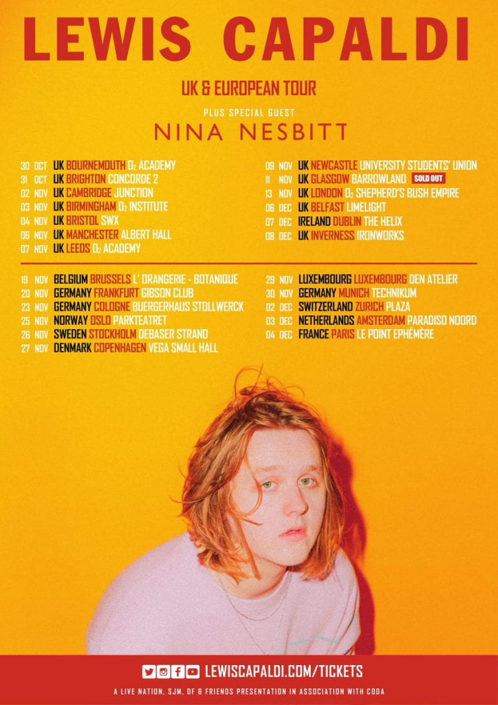
These adverts are both appropriate for my magazine because both of these artists are pop artists and my genre for my magazine is pop.  Both of these artists are very well known around the whole world with both of them having sold millions of records.  The first advert also links with my magazine because the crisps are called ‘popchips’ and the genre is pop.  The second advert also links with my magazine because it is a tour poster, and the artist sings pop songs.  I also got my ideas for the adverts from my dating profile for someone who would listen to pop music-these ideas are for people who ‘enjoy a good night out’.  These adverts will also work for my demographic because the colours used are bright and eye-catching and that is what pp music is all about.

January 22

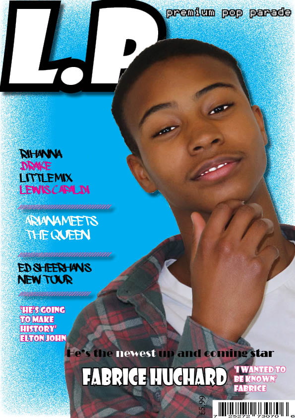
A New Improved Complete Magazine Draft

Feedback:

Front cover:

  • Fabrice in yellow writing
  • Make the cover line straight
  • The dot in L.P in yellow
  • Apostrophe in ‘he’s’
  • Line spacing on cover line
  • Cover line yellow
  • PPP bigger
  • Cover line more to the left
  • Mast head off of edges

Contents Page:

  • Who are the models
  • Border inserts stutters
  • Do more with the page numbers
  • The NSS bigger and at the bottom
  • Link page number with article about Seanna

Double Page Spread:

  • Sort stand-first out-add to stand-first
  • Text size bigger
  • Orange or yellow writing in the insert
  • Higher numbers
  • Line spacing
  • Full stop at end of article

Below are my new and improved three pages:

January 20

So… How is it going?

New Transferable skills are the skills you learn as you progress through education, employment or training.

Transferable skills that I have learnt:

  • Time Management- Being able to book a slot and take all the pictures I needed for my magazine, kept on top of my blog and kept up to date with my magazine design.
  • Leadership- I have had to be in charge when being the photographer and had to tell my model what I wanted them to do, I also had to tell them what to wear.
  • Communication- I had to talk to new people to discus when they were free to be apart of my magazine.
  • Research- I also had to research the genre of my magazine to know what the main colours used in other pop magazines are.

What Went Well:

In general I think my magazine has gone really well but here are a few things that have really worked well:

  • My use of the main colours in the pop genre ‘pop’.
  • My design has been constantly improving over the weeks of my production.
  • My camera techniques have also been improving and I have taken some of my best pictures during these weeks.

Even Better If:

However, I still can improve:

  • By getting more feedback from my peers
  • Maybe use another main colour instead of blue
  • Use a picture that doesn’t involve Seanna.
January 20

Design Skills 2

Below are some simple tools that I have used on indesign when creating my magazine.  These tools allowed me to create boxes, shapes and draws lines:

I have also learnt how to change the way a photo or text stands out by using these tools:

These tools add a more professional look to the image that I applied them to and made them stand out more.  You can change the gradients of the image or text selected to give it a cool, pop look which was useful for me because of my genre.

WWW:

I managed to create all my pages to a suitable standard using a lot of the tools to give them all the best look that they could have.

EBI:

The spacing between some of the writing was all accurate and if i used a different net colour to blue for the background.


January 16

Complete Magazine Draft

Below are all three of my magazine drafts:

Feedback:

  • All at a good level with a few corrections needed
  • Pages link and look similar
  • Completed all three pages

Targets:

  • I need to sort out line spacing
  • Try use another colour instead of blue
  • Write a little caption for the images
  • Sort out numbers on the contents (symmetric)
  • More cover lines
  • Line up cover lines
  • Change some fonts
  • Be more specific about cover lines
  • Too many fonts
  • Write more about some of the captions on the contents
  • Different font for title
  • Un-stretch photo on DPS
  • Who took pictures
  • Who wrote the article
  • Page numbers
  • Do more with stand-first
January 14

Draft of Content Page/ New Improved


I have recently included:

  • Another picture that I took
  • Page number
  • Contents

Below is my new improved DPS:

I have:

  • Made the main image bigger
  • Key words stand out
  • Made everything stand out more
  • A page number

Here is some feedback from a peer:

In this audio I have asked a peer some questions about my contents page, these are the questions that I asked:

  • How does the contents page work in tandem with the front cover?
  • Is the font/typeface consistent with the front cover?
  • What genre of music is the contents page featuring?
  • Describe the images of the stars using adjectives.
  • Which cover-lines tempt the audience to read on and which ones stand out and why?
  • How do the cover-lines reflect a music magazine? If they don’t,  which ones need to be adapted?
  • What aspects do you consider conventional or unconventional (page numbers, inserts, captions, catchy cover lines, editors comment?

In my opinion, after listening to my peers feedback, I think I could make the Masthead stand out a little more.

January 8

What is a Contents Page?

5 Catchy Captions:

  • Are you a star?
  • You don’t want to miss out…
  • Where are these songs coming from?
  • Music is in their blood
  • From nothing to something

A contents page is one of many very important aspects of the magazine which informs the reader where to look for each section.  It is crucial that the page is eye-catching but not over creative as its main purpose is to let the reader easily  locate what they are interested in reading about.  The reader just wants to find the page that they are looking for so they do not want to be distracted by other aspects on the page.