December
15

November
19
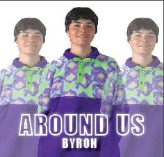
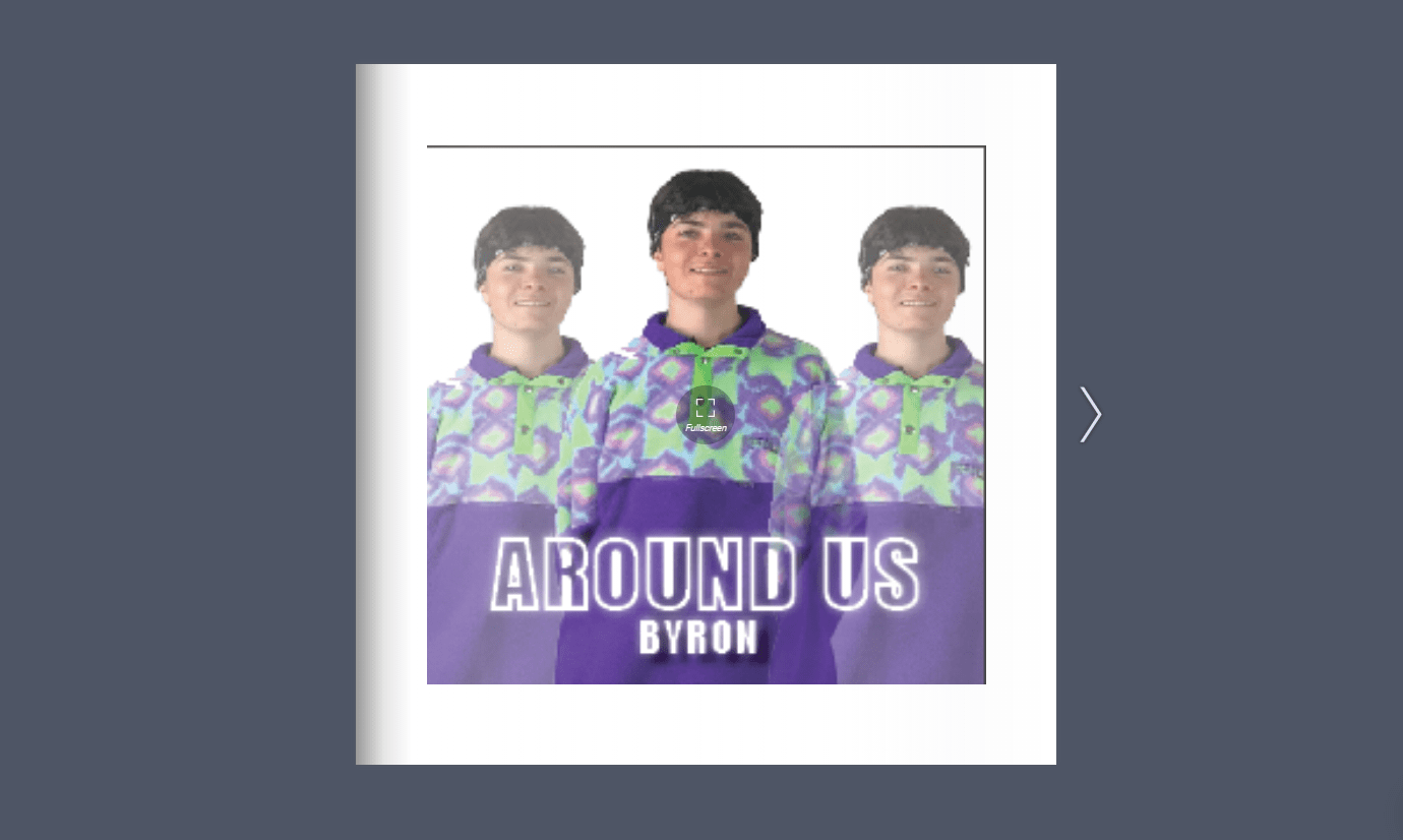
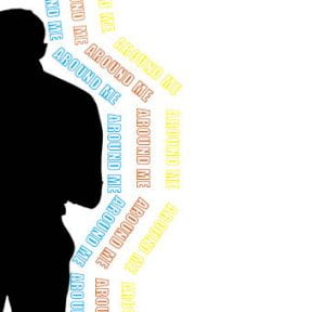
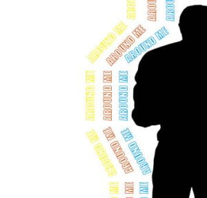
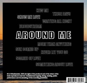
Digipack Draft 2
Targets for improvement:
- move the sun up and be bigger, looks insignificant
- add the name of the artist
- stretch the silhouette on middle panes
- add more detail/definition to white panes, looks empty
- take lyrics across two panes
- create contact, link between panes
- see more of background on back, wider border
- change colours of songs on back
- make the spacing certain-(patterned or in line)
- more sunset
- bring colour from landscape into the words
- add spine for back pane.
November
16
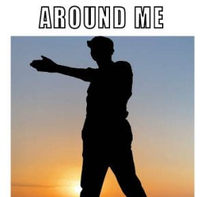
Digipack Draft 1
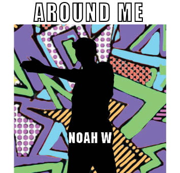
Feedback From Teacher:
- Front pane – make the cut out bigger
- Perhaps make Noah W a bit smaller
- Left hand silhouette has a stumpy arm
- The back is good….perhaps have some odd letters in colour to break up the white
- Some odd coloured letters in the album title?
- Would a white silhouette on the back work to contrast with the front? Or make the right hand inner pane a white silhouette on a black background i.e. transpose the colours?
- Is the album called These Days or Around me…if so the featured main track ought to have the main title on the back?
November
12
Evaluation of shoot or graphic design
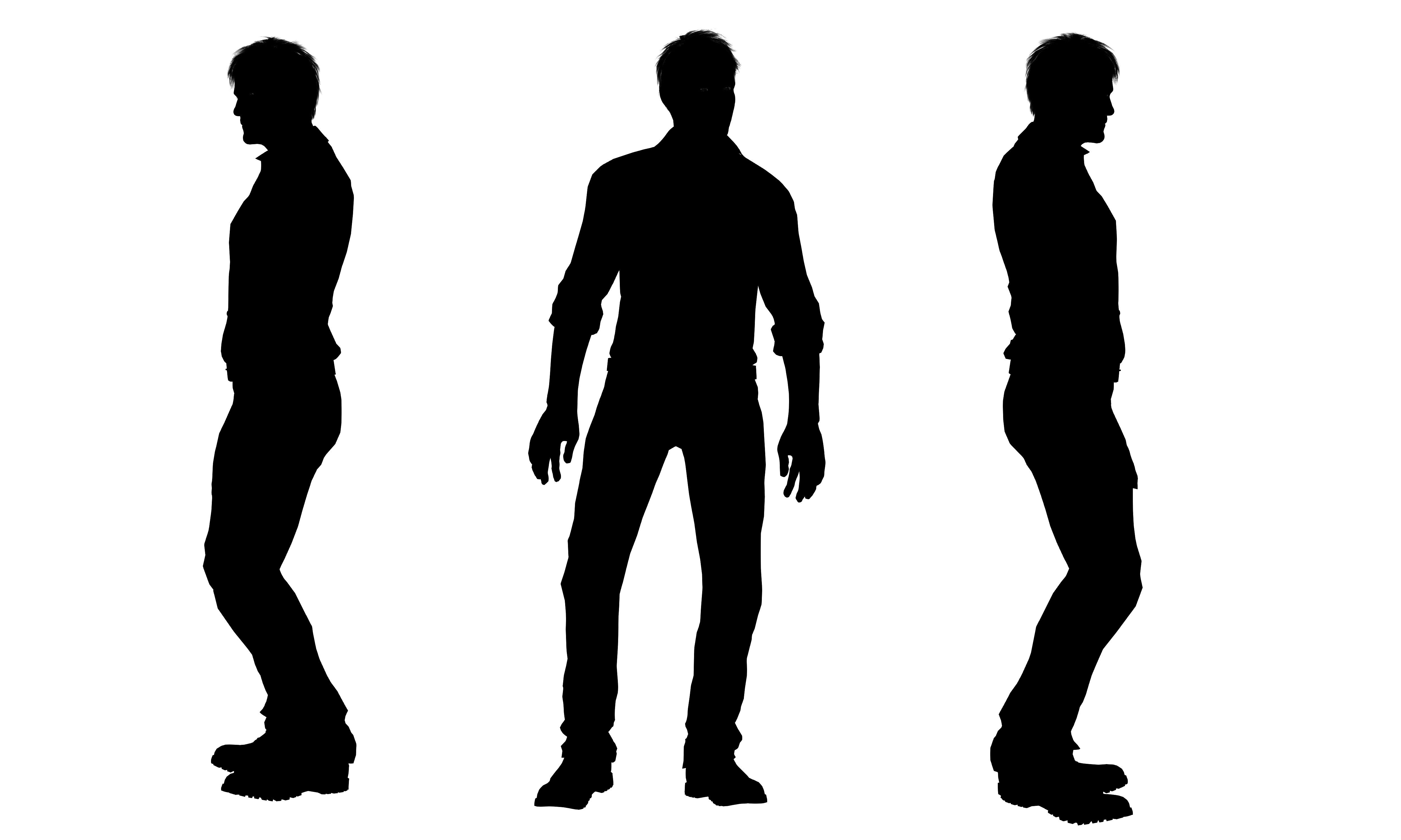
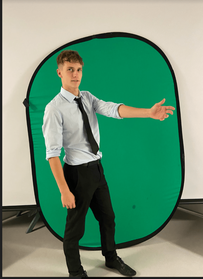
We took several images for our digipak, all of them were effective but simple and we have the resources to now create silhouette’s in many positions. We didn’t need to focus much on what the star was wearing as we were not going to show the stars face, we also didn’t need to be anywhere in particular for our shoot. We took pictures on a green screen background in the lecture theatre of the school, because it was an open space and there was somewhere we could place the green screen background, it also made it a lot easier to get out the model as it was not a white background.
What Went Well:
- Took all different kind of photos in different positions
- The shots linked well to the genre, as they are not too arrogant or cocky, just plain, simple and humble
Even Better If:
- Planned the shoot a bit better, in advanced, so we could bring props or could’ve taken some photo’s from different angles
- Make the model’s positioning more noticeable for a silhouette.
November
2
Graphics / illustrations Drafts Ideas
While creating our Digipack, we used photoshop to cut out the model and turn them into a black silhouette. So we used the cutting out tool and then copied and pasted the cut out model onto our digipack which was on indesign.
We also went round the island looking for bright, pop related backgrounds which we eventually found, we took photos of these walls and then made our very own background based on inspiration from this graffiti wall:
November
2
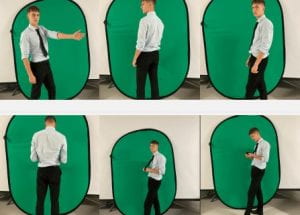
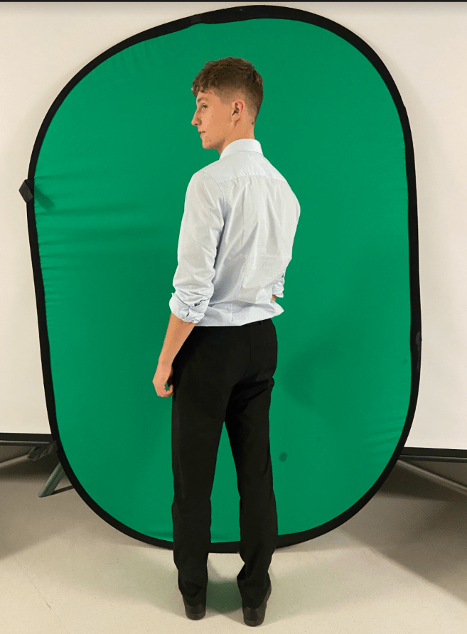
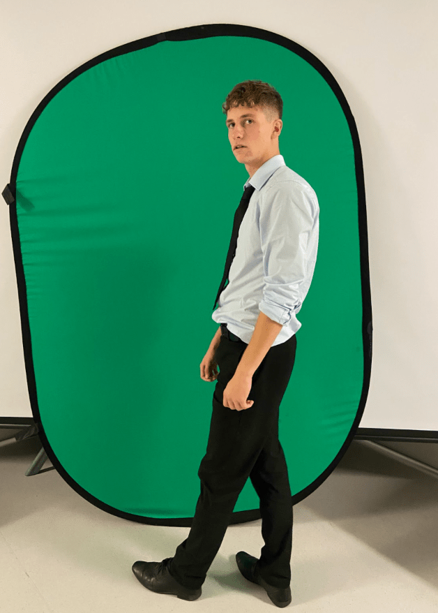
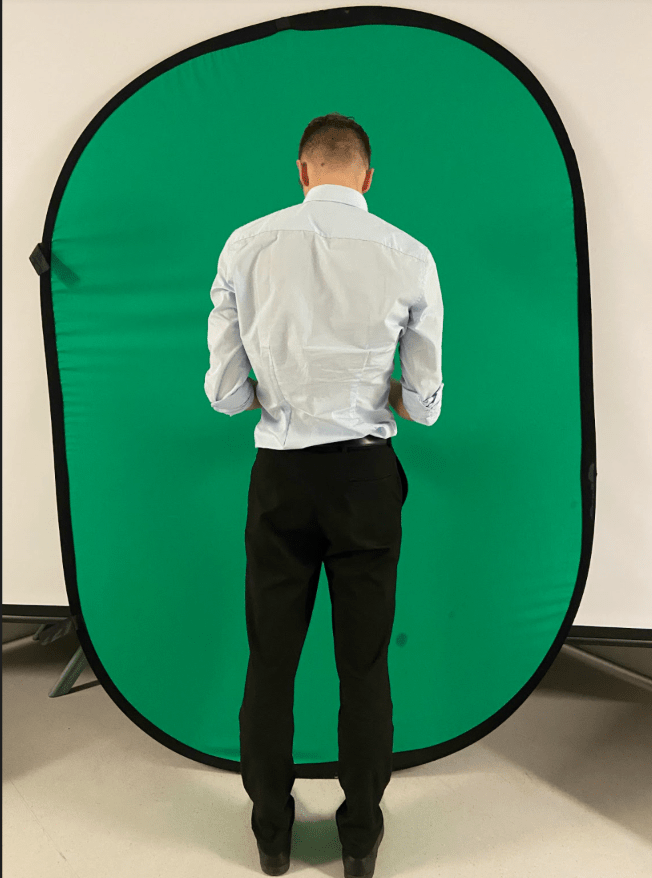
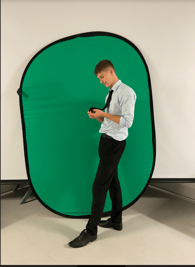
Contact Sheet
We did not create a contact sheet for our images we took, this is because we only took a few photos in different positions. However, below are the pictures we took in the Lecture Theatre for our Digipack, it didn’t matter about the lighting, costume or props because we will edit these photos, the reason these key factors when taking a photo do not matter is because we will change the select photo into a silhouette.

November
2
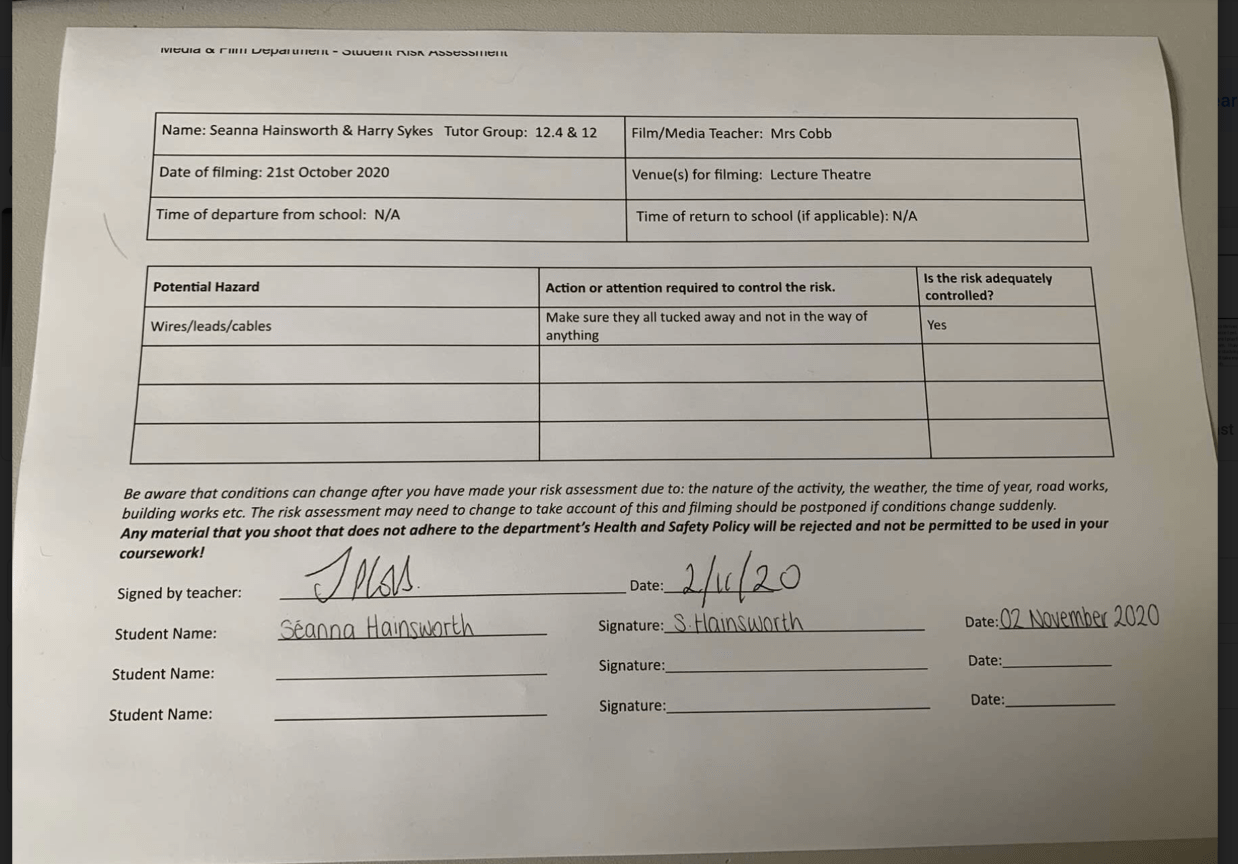
Photoshoot / Design Production Meeting and Risk Assessment
Below is our meeting agenda which includes dates and times, and everything we need to know to bring to the shoot:
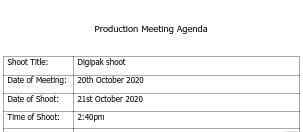
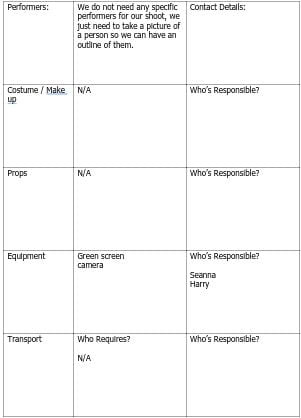
This is our PMA for our shoot which we did for our digipak. Our aims for the shoot is to get a picture of Harry in a position where we can cut him out and then make him black, looking like a silhouette. We do not need anything for the shoot other than a green screen and a camera. There is no attention to detail within the model as we wanted to make it as minimal as possible, however it is important we get him in the right position where we can see the different parts of his body and they do not all blend into one.
We were not going outside of school or in the studio for our shoot, we went into the lecture theatre with the green screen as there was a large open space and enough room for us to do what we want. We still assessed any risk which were possible when doing our shoot and completed the risk assessment sheet:
October
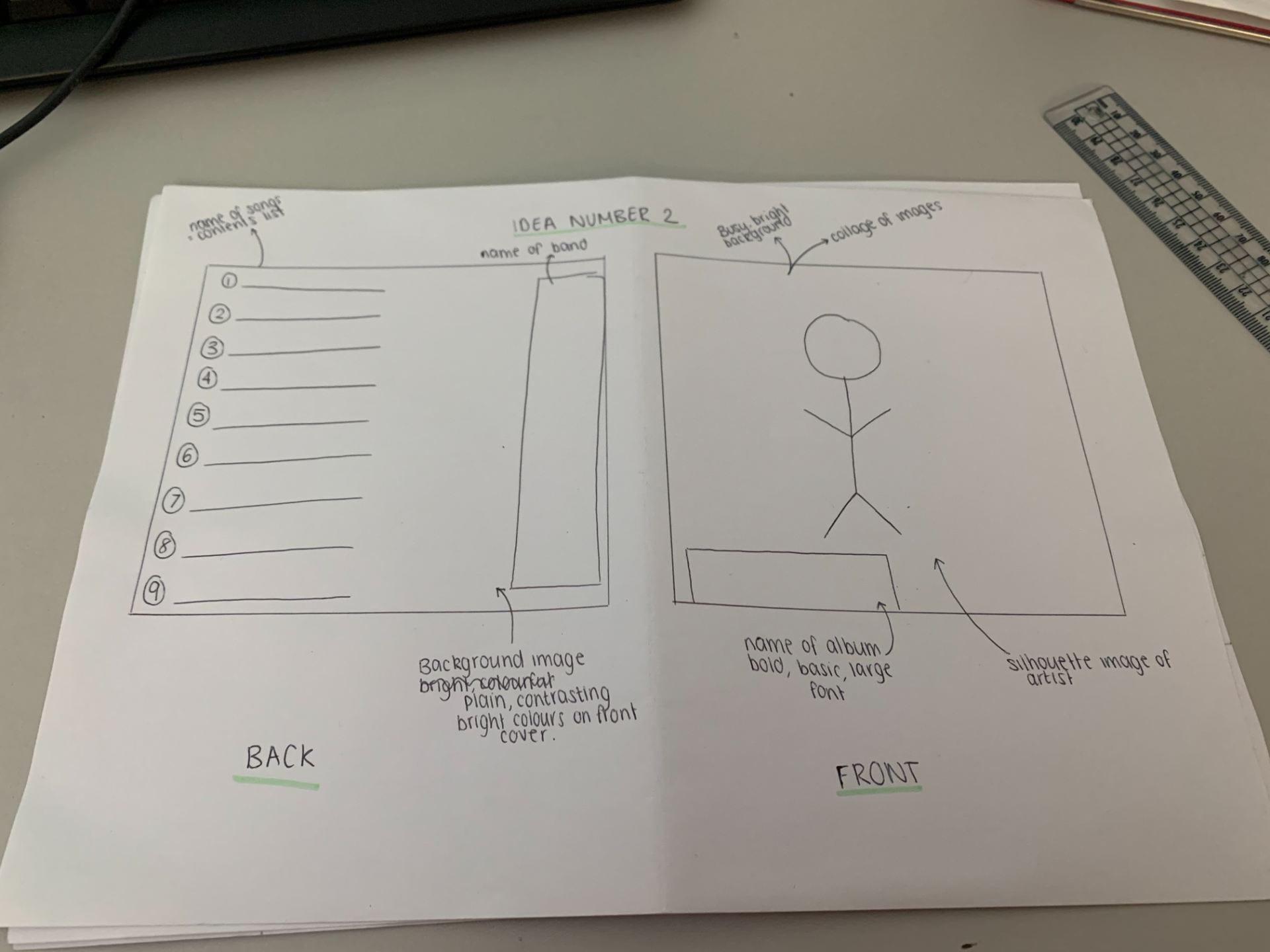
15
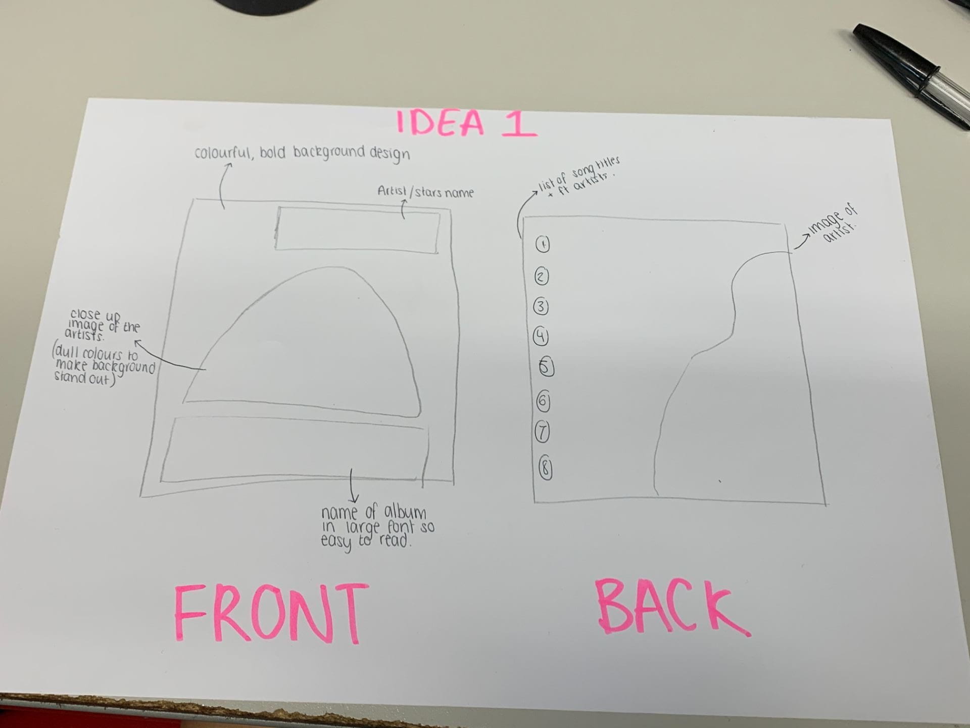
Hand drawn mock up
On these designs, it says what our colour pallet is and where our images and text will be placed. We have also annotated the designs with the conventional technical elements such as:
- Barcode
- Title
- Image
- Artist
- Song title
It is also important for our artists’ star image to be unique and different to other artists of the genre to keep the audience and engaged with the album cover and to make them want to purchase it.
For our Digipack, we want it to be bright and colourful, this is very conventional to our genre as it will stand out to the audience, more so than any other digi pack in our genre (pop). We will include colours such as green, blue, purple & pink as not only do they work well together but they are also bright:

October
12
Branding Moodboard
To prepare for our digipack, we made a moodboard full of pop artists, album covers and fonts used typically in pop album covers. This will give us inspiration on what we should use for our digipack. Our brand image will be developed by the ideas we have researched and a repertoire of elements will be involved in oreder to make the digipack conventional.
October
12
Digipak Conventions Analysis
This is the first time which I have annotated and analysed the different conventions within a digipak. I used Clean Bandit’s album ‘What is love?’ as they are a similar artists to Rudimental. This allowed me to pick out different things within the images that conveyed different meanings in what the artist wanted to portray. Now that I know what is needs to be include within a digipak such as barcode, copyright information and information of the contents of the album- I will be able to use my knowledge of the different conventions and include them when creating mine. The album cover is quirky and playful which infers that the artists are off beat.
Some of the technical conventions of any digipak, not specific to a genre, include:
- Imagery
- Album title
- Name of the star or band
- Spine
- Copyright information
- Barcode
- Track names