November 20

First Shoot Contact Sheet(s)

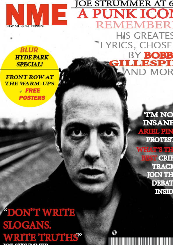
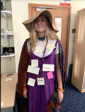
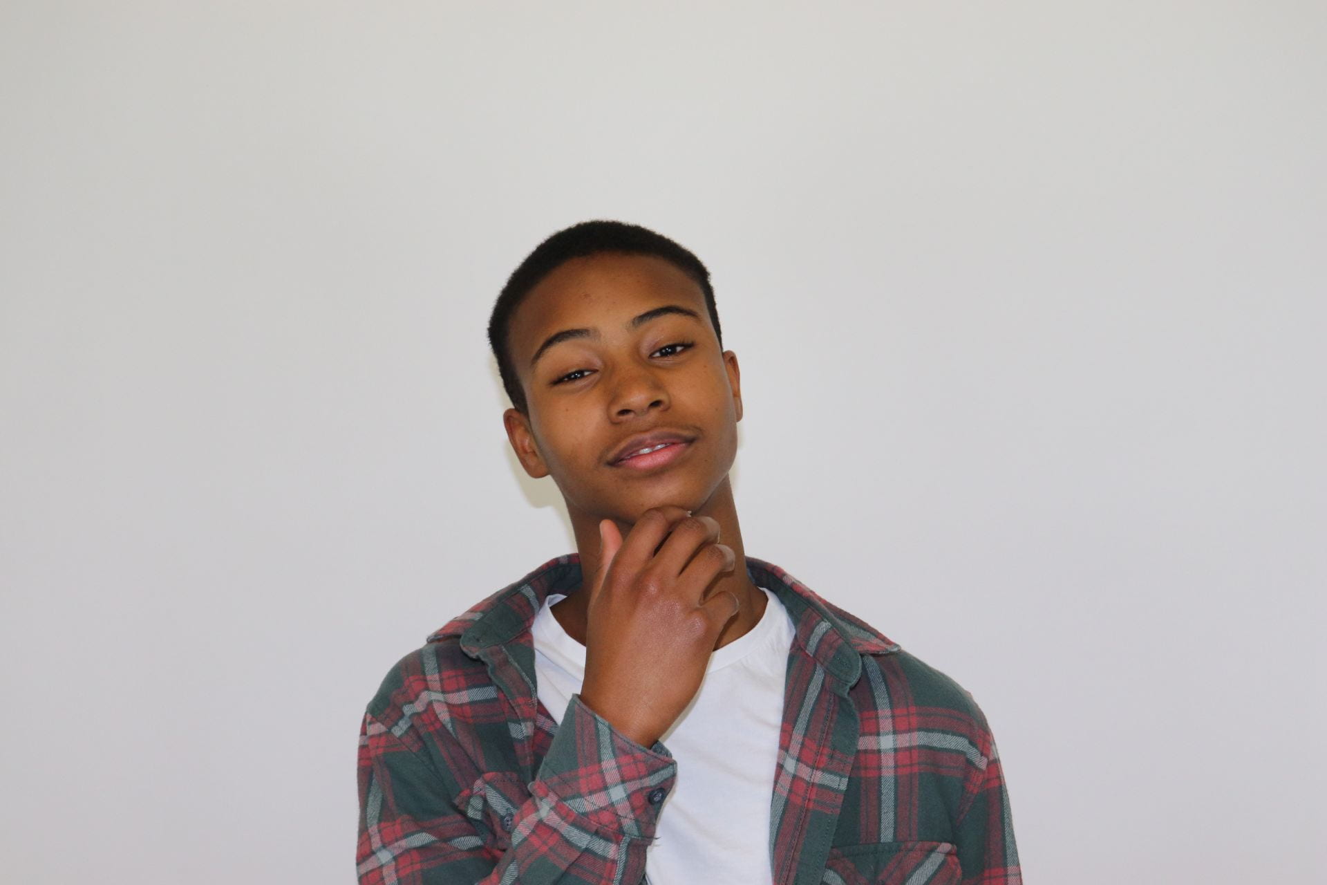
These three large photos are the three best in my opinion that have a chance of being my main cover photo.  I met almost everything on my production meeting sheet, the only thing I didn’t include was some glasses because I didn’t feel they would fit well with the genre and style that I had chosen.

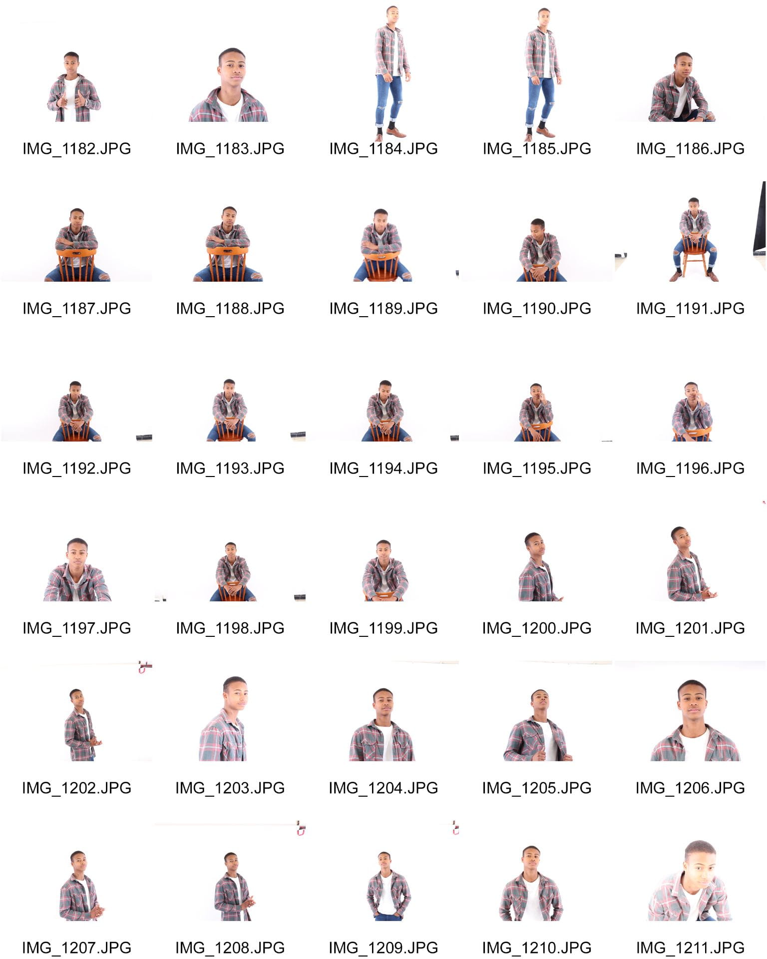
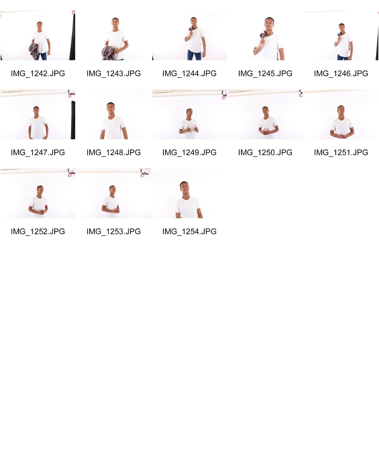
Below I have added a contact sheet from my shoot which includes all the photos I took.


November 19

Mast Head Designs

Below are five possible mastheads that I will use for my front cover on my music magazine.  The fonts I have created are appropriate for my brand and genre because the fonts are how you picture pop music writing to look like, also the colours are based on the pop genre, I know this due to research on the genre.


November 18

So… I am ready to photograph my star.

L.P (Let’s Play)  is a magazine that is aimed to sell and inspire all kinds of  singers.  The magazine is based on the genre pop, with this genre we feel that the magazine would reach a wider range of audience that will enjoy our magazine because the pop genre is so popular.

What have I learnt about the camera:

  • shutter speed
  • aperture
  • framing
  • distance
  • shot type
  • angle

What have I learnt about mise-en-scene:

  • costume
  • lighting
  • acting and proxemics
  • make-up and hair
  • props
  • setting

By using the terms I know I will be able to communicate my message to my audience because mise-en-scene and what I have learnt for a camera will help me make the best magazine possible and it will help convey my mission statement.  I also understand I need to encode my design so then the audience can then decode it and interpret it how they want to.  I want the star image to come across as popular but humble and thankful for all the fame.

October 10

My Magazine Front Page Swede

Please click on the picture to see a clearer image.


This week the task I was given was to copy a music magazine front cover, I created my version on Adobe InDesign.  This week we also learnt how to use InDesign and now I know the basic skills on how to use it.  Using my knowledge I created a duplicate of the image myself.  The skills I learnt allowed me to make my version as similar to the real one as possible.  In this task I managed to include many magazine conventions:

  • Cover lines
  • Pug
  • Plug
  • Inset
  • Barcode
  • Price
  • Main Cover Star
  • Captions
  • Masthead

What Went Well:

  • I managed to find the exact picture and made it so it wasn’t blurry.
  • I was able to find the correct colours for each text.

What Did I Struggle With:

  • I struggled with the spacing between the text and the edge of the page.
  • My fonts were not quite accurate, they shouldn’t have been curly but they were.  I found some fonts that were similar.
  • I also found that my image was a little zoomed in so some of the spacing wasn’t quite right.

These particular Youtube videos are great tutorials on how to use InDesign. They all give detailed instructions and advice on how to use it and create the best piece possible:


October 3

A Front Cover Analysed

I analysed this magazine cover and eventually found the target audience for this specific magazine.  From just one magazine so much can be found:

  • Cover lines
  • Pug
  • Plug
  • Inset
  • Barcode
  • Price
  • Main Cover Star
  • Captions
  • Masthead

And many more features that make the magazine stand out so much.  This also helped my find the target audience and make it appeal to them.  This magazine cover allowed me to uncover the target audience demographics.  The target audience are attracted to the colours and large text because it stands out to the audience and brings them in and closer to the poster.

When I come to do my music magazine I will need to research my target audience because I need to know their likes and dislikes and what kind of music they enjoy.  This will help because it will end up bringing in my target audience.  However the main features that appeal to the target audience are:

  • Colours
  • Fonts
  • Images
  • Language
October 2

Audience Profiling


Our task was to annotate a Magazine cover that we were given.  We annotated it with:

  • Masthead
  • Name
  • Colours
  • Design
  • Articles
  • Images

I pulled apart this magazine cover and found all of these features that make up the front cover.  By doing this I was able to find out the covers demographics, psychographics and target audience.

Demographics are categorised in terms of age, class, geographical location, gender and socio-economic groups.  Whereas Psychographics represents the groups of people by personality traits, values & beliefs , attitudes, interests and lifestyles and this may be because middle-age men still want to believe they are in their youth and still want to seem young.

I now understand it is important to know about my target audience.  This will help me when I am creating my music magazine because I will take into consideration all of these features to make sure I show my intended narrative.


October 2

Conventional design features of a magazine

A magazine cover can have lots of different features on it because it is what attracts the audience.  Each technical convention plays an important role to make the front cover look aesthetically pleasing:

  • Cover lines
  • Pug
  • Plug
  • Inset
  • Barcode
  • Price
  • Main Cover Star
  • Captions
  • Masthead

When making my music magazine I will know I need to use all of the feature on my cover to make sure I show my target audience my intended purpose, with this knowledge I should be successful when creating my Music Magazine cover.

October 1

So… How can an image communicate meaning?

There are many things you need to consider when creating an image (MES)

  • Costume
  • Lighting
  • Audience
  • Makeup
  • Props
  • Setting

These are in very important factors of mes-en-scene in portraying the intended narrative in media.  The costume for example, will help the audience understand which specific year it is in the image.

Camera shots and angles are very important when deciding which theme and image you are wanting to create:

  • XLS– extra long shot
  • LS– long shot
  • MLS– medium long shot
  • MS– medium shot
  • MCU– medium close up
  • CU– close up
  • XCU– extra close up

A low camera angle maybe represent to the audience different sizes which also could represent that the object is powerful, low angles look up so it could be a smaller person looking up at a better person who has power over them.  A high camera angle could represent power over the object in the image.  A close up shot could show fear in the persons eyes/face in a lot of detail, close ups can also show reflections of items of someone’s face (glasses) which could have a deeper meaning in the future.  A long shot can show somebody and their surrounding environment.

By knowing all of this it will help me with my final design because I will know when to take what image and what shot.

September 30

The Camera Talks


We were given a task to take lots of photos and to create a mood board with just nine of them, after that we then had to annotate the images with three connotations on each picture:

  • One technical term
  • One denotation
  • One analysis hashtag

We did take some good pictures but also some of them were not very good because some of the photos were blurry and dark.  My camera skills have improved because I now know what aperture and shutter speed is and how it can affect a photo and show off my high skill shots.  I did achieve my aims because I did take some good quality photos.  This will help me in the future with my own production because I will know what kind of angle and shot I will take to for the best possible looking picture.  When creating my final design I will take into consideration the distance, angles, framing, composition, narrative and represent to make sure my final design will be the best that it can be.


September 19

My image that uses mise-en-scene to communicate meaning.


Made with Padlet


We searched up about different aspects of the folk culture and chose some pictures that fits the theme of folk, we then added these picture and gifs onto our mood board that we created.  After we added the pictures we added text to the pictures to help the audience understand why we included the images.


These sticky notes were what the audience thought best describes what our model was looking and feeling like.  We picked out a random piece of paper from a hat and my group got ‘folk’ as our genre.  We then created a mood board with all different aspects from the genre of folk.  This will help the audience get more of an idea as to what the features of ‘folk’ really are.


Please click on the image to see all of the images.

For this picture we picked out the correct clothing for the genre (folk), we took the picture with a white background behind to make the picture look more professional and to make our model stand out more.  We also decided to make sure the sun was shining in our models direction to create natural light which could represent  a ‘folk’ lady who is very natural.  Our model also posed in a certain way to make you feel like you are actually looking at a folk lady.

All of this will help me with my magazine because I will know to focus on one genre and will be able to find appropriate images to go onto my magazine.  Also I now know I shouldn’t have objects in the pictures that have no relevance to the topic/genre.

Conventions is how media producers normally do certain tasks, this has made me aware that media producers plan and research a lot about the topic / genre of their next media post/activity.  The conventions are the ingredients that go into the genre e.g. ‘folk’.  The audience will understand this so it is giving them hat they want.