December 9

Draft of The Double Page Spread

This is the first draft of my double page spread:

Targets:

  • add more coverlines
  • make the picture better
  • take away some of the writing
  • add some rose petals
  • move the white writing inwards
  • make there gap bigger between the stand first and the interview
  • make the writing of my article a serif font because it is easier to read
December 9

Second Shoot Contact Sheet(s)

On the 11th of December my class went to Castle Cornet to take photos for my music magazine. In my opinion the day went well. I got a lot of striking photos and magical shots.

Here is the Contact Sheet of my shoot:


The photos I will most likely use are:

I like these photos because they show raw emotion and the props that my model is holding make a statement. I can make a number of different headlines and cover lines out of these pictures. The outfits I chose for my model is floaty and glamorous. I chose for my model to have light make up on so it was easier to see her natural emotions. In my opinion these pictures are clear and capture that connection between the artist and the audience. These photos are my favorite because they are striking and show the passion and emotion behind the eyes of the model. I prefer the photos of my model in the caves and castle for my magazine since they are all more dramatic.

December 5

A New And Improved Front Page

Here is the third draft of my music magazine cover:

Things that have changed:

  • the colour of the writing
  • the placement of the main cover star
  • the size of BD
  • added logo at the bottom
  • made my plug bigger

Targets:

  • change the logo because it doesn’t fit with the colour scheme
  • make the writing around the edges bigger
  • make my plug even bigger
  • perhaps change my background
  • make the bar-code thicker
December 3

Draft Feature Article

That was my voice memo for my music magazine article. I feel that there is a lot of things I could now change.

For example:

  • the quotes I use to entice the audience
  • the grammar
  • the flow of the article
  • the harshness of the topic
  • the message that I am trying to get across
  • the punctuation

Feedback:

This reads well generally Imogen but I would refocus the drugs aspect and also spend more time and detail on some specific music details i.e. awards, artists and some more detail on the new album and what it is called etc with a release date. Remember there is always a hidden agenda for any artist being interviewed.

Perhaps reorganise the opening too so that you set the scene for the interview and watch the tenses too….you also have to put her story into context….i.e. Naija was prepared to reveal all in this frank relaying of the past few months. This is what she told me…word for word as we met for a smoothie at her latest favouritre health food bar….or something like that…

Bit of work to do but you have broken the back of it.  Once you have redrafted this then you can put a version of it on the blog.

Targets:

  • Be more gentle with the situation since it is touchy
  • Phrase sentences better
  • Make more of a message for the fans


December 2

Language Analysis

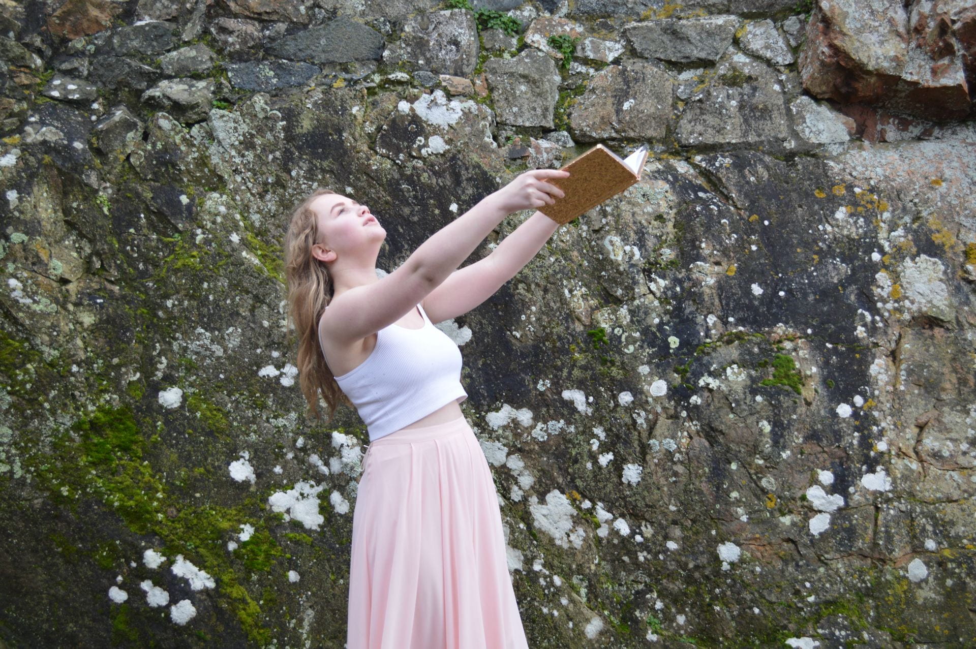
Part of the task is to not only take the photos and do the design of the magazine; but I am also required to write a double page article, and I will be assessed on that writing.

Therefore, I need to analyse an article from a professional music magazine and consider how it is written. I will consider the target audience and evaluate how the written word (copy) fulfils their needs, uses and pleasure of this particular media text.

Previously we agreed that their needs, uses and pleasures included:

  • Up to date information (gigs, trends, available media…)
  • Fashion ideas / new looks
  • Gaining an insight into stars’ lives and personalities
  • A reflection of their own values, attitudes and beliefs

Task:

’Billboard (June 20, 2015), Don’t Look Back, Adam Lambert’

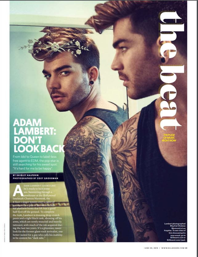
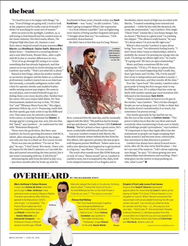
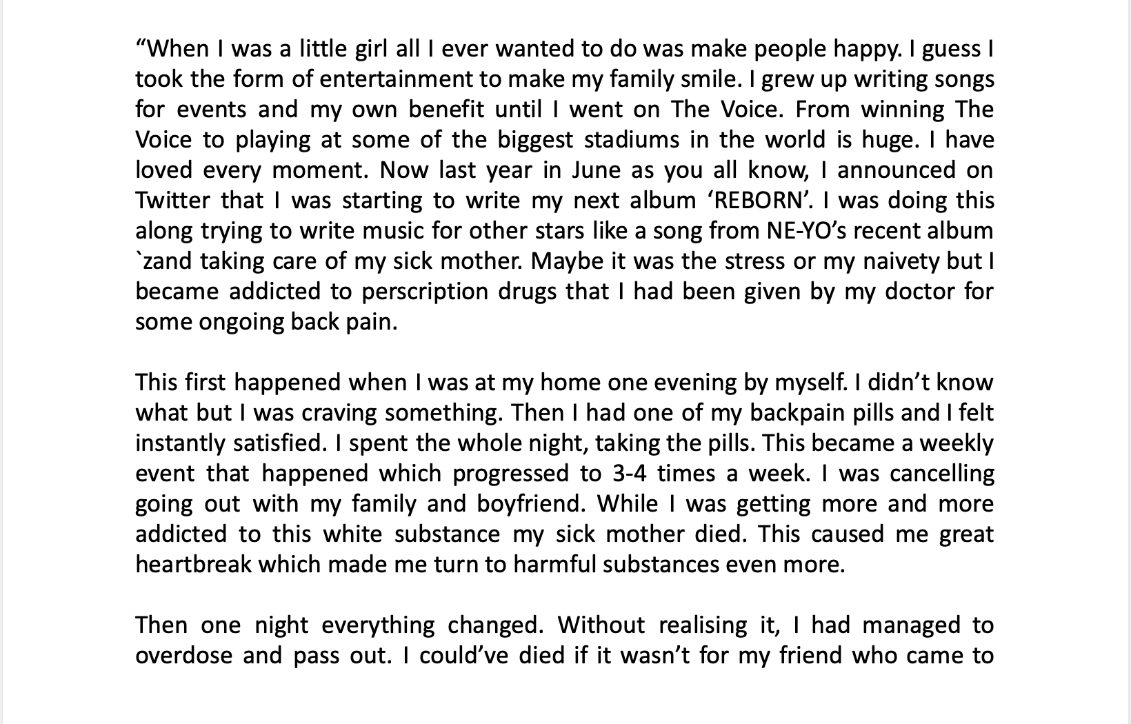
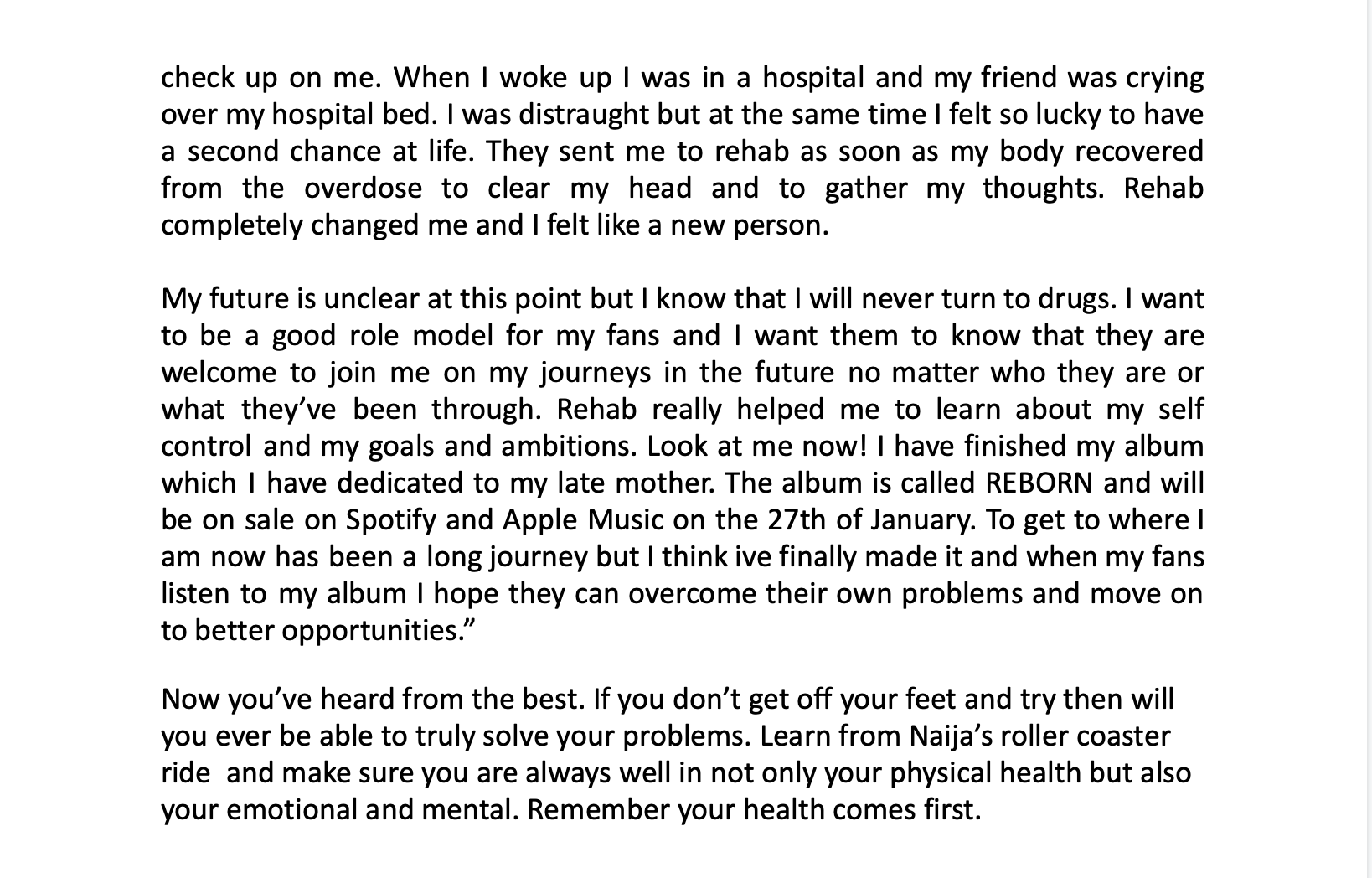
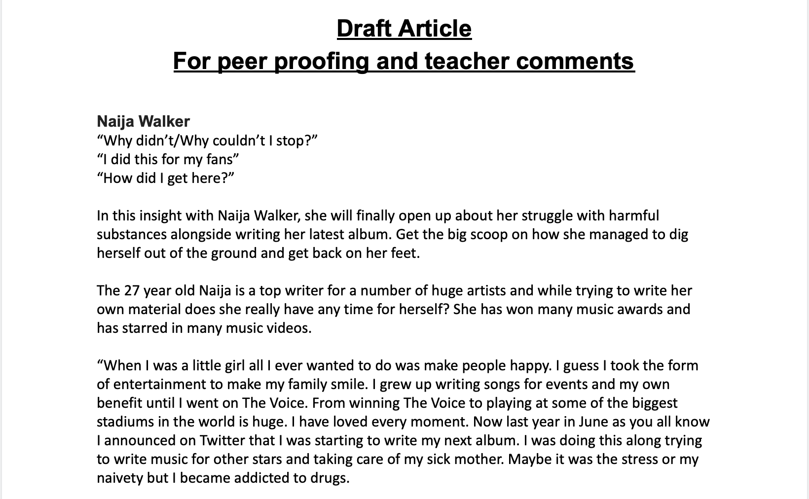
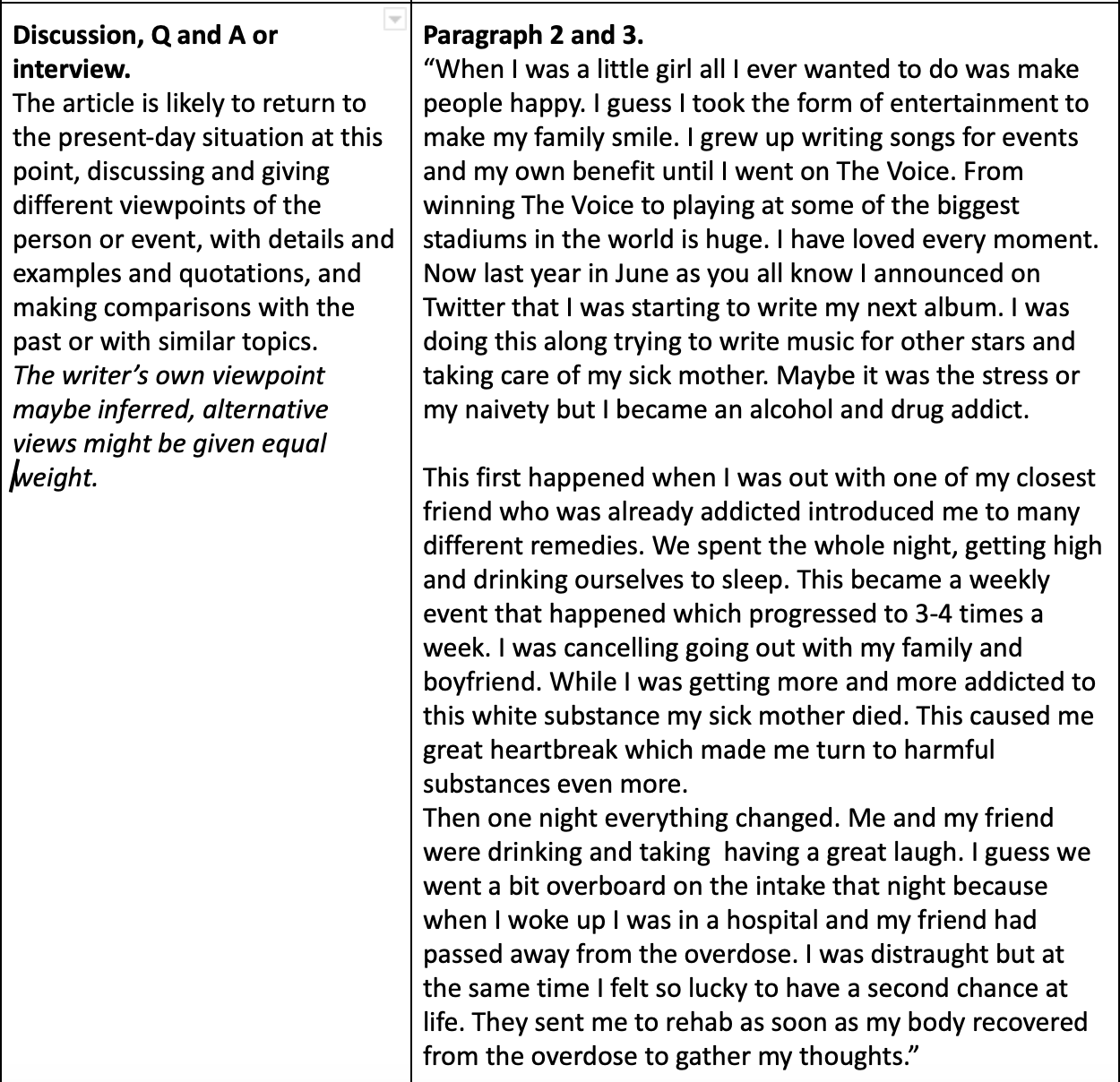
This interview in Billboard Magazine written in June 20, 2015 is called ‘Don’t Look Back’ with the artist Adam Lambert speaking about his experience working with artists and producing music. In this interview we are not aware that a journalist is there since Adam is just speaking and the journalist doesn’t say anything to him. This creates an inclusive sense like we are with the artist ourselves and we can feel involved in the fan club and all the gossip that is going on. The interview is written in 1st person which enhances the fact that we are the ones speaking to the artist so we feel wanted and important. This interview is a very personal experience for the reader which captures their interest and sparks their want to be noticed by the star in real life. There is a clear introduction and conclusion in this interview which sets the opening and closing scenes for the reader. In the intro the journalist sets the scene by telling the audience they are in a penthouse in Hollywood looking like he’s about to “kick ass”. This gets the audience interested in what Adam has to say since he seems intimidating and rebellious which is what teens look for in artists to help them stand up for themselves. The conclusion is positive and a contrast to the intro to portray that you can resolve your problems and nothing is that bad in the end. The actual interview itself creates the impression that us as the audience are involved with the celeb gossip and we get an insight to our favorite artists life. The writing of the article fits the genre of music since it is bold and smooth. There are many colors which keep the reader hooked as well. The quote “It’s hard for me to be happy” in the intro makes the audience have sympathy for the artist and read how difficult his struggles were with the world. The journalist represents the star as a wholesome, hardworking artist who loves his fans and like to take lots of different opportunities. The audience gets to learn how the artist like to critic every piece of work he does and how he is a perfectionist. The journalist presents the artist as a kind and genuine person through the soft writing and how the magazine is in 1st person. 

https://cpb-eu-w2.wpmucdn.com/blogs.grammar.sch.gg/dist/e/5/files/2018/01/Interview-1q7jddy.pdf

November 27

A New Improved Front Page

This is the second draft of my music magazine BD (Breakdown):

For my second draft I have made a few changes. For example:

  • I have taken the white off the red and purple writing
  • I have changed the font of “ABE”
  • I have taken out a picture since I felt like it wasn’t adding anything to my magazine
  • I have changed the bar-code to be horizontal
  • I have made my Masthead bigger
  • I have made my Main Cover star bigger
  • I have changed the font of the Plugs

I feel like this makes my magazine come together more so it looks more professional. Everything looks like it is meant to be there.

Targets for draft 3:

  • Make the bar-code thicker
  • Make the masthead smaller since it is too close to my models eyes
  • Change the colour purple since it is clashing with the other colours
  • Make my plug bigger
  • Make my Main Cover star bigger
November 20

Draft of Front Page

This is my first draft of my front cover of my magazine:


I have used the photo of Fabrice since I feel like it has more of an R&B feel. I have made sure the photo is big and centre so all the attention is on the star. The font I have used for the Mast Head is smooth and slick like I wanted and I used the colour blue to be calm and gentle. There is plugs and pugs around the outside of the front page to advertise more artist inside the magazine, however I have tried not to add to many so they don’t take the attention away from my main cover star. I have decided to call my main cover star because it is short and catchy. This way the audience will remember and think of the artist and magazine more often.

For my next draft I would like to change the font of the Main Cover Line because I think it clashes with the Masthead too much. I will hopefully come up with some better, catchy cover lines. I will also play around with the colours since I think some of them clash. I will make my cover star and my Masthead bigger as well.

Feedback

I asked another Media Student to comment on my choice of: font, photo, design and layout.

They said the magazine projected an R&B, soulful feel. They said they looked straight at the models eyes every time. He looks slick and smooth. They said the whits outline around my purple and red lines were distracting and took away from the feel. They also said that the green didn’t fit with the colour scheme so to try other colours. Finally they said that my bar-code should be chunkier and that it should be horizontal.

Targets:

  • Get rid of the white surrounding the white and purple
  • Change the colour of “ABE”
  • Turn my bar-code horizontal
  • Make my Masthead bigger
  • Make my cover star bigger