How did you integrate technologies in this project?
Category: Component 1
CCR3
How did your production skills develop throughout this project?
CCR2
CCR2: So.. How does your product engage with audiences and how would it be distributed as a real media text?
Here is my second CCR, there are 2 screencastify’s of me analysing every aspect of my magazine from audience, distribution, to advertisement etc.
CCR1
Adverts
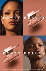
The last thing to add to my magazine is my adverts, these had to tie in with my genre so that they appeal to my target audience. I chose two different types of adverts to get as wide range of readers’ interests as possible.
The two I chose were;
- Rihanna’s Fenty Beauty makeup range
- Lovebox 2020 lineup along with information about the festival
As my magazine is targeting teenage girls, hopefully these adverts will grab the interest of my readers, and hopefully these brands will make money off of my audience. I looked at the Blumler and Katz theory to remind myself of the features I want my audience to feel, the elements of these theories being personal identity, entertainment, information and social interaction. I pciked my adverts based on what would portray these 4 elements the most. I feel they do cover the theory as the makeup allows people to have a sense of personal identity, and the festival poster feeds the audience information.
A new improved complete magazine draft
After being sent my screencstify by my teacher, I have made some of the adjustments that my teacher suggested.
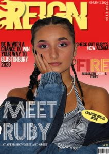
FRONT COVER
-Aligned the text either side of her head, so the writing faces inwards
-Made the cover lines slightly smaller
I did this to make the cover lines symmetrical either side of my model, this way it would be more pleasing to the eye and will look more formal
CONTENTS PAGE
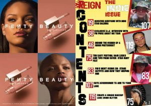
-Added a red gradient to the background of the images to match the gradient on my front cover
I did this to incorporate the colours and design of my front cover to my contents page to portray my brand further and so as the reader turns the page from the front cover to the contents page, they will notice the colour scheme being incoporated throughout my music magazine, red and especially yellow is a common theme within the Indie Issue.
DOUBLE PAGE SPREAD
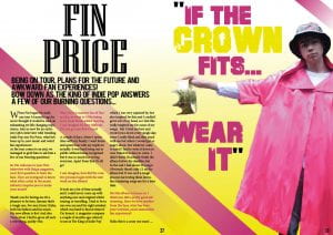
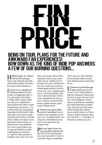
-Made the background yellow to make the page pop as I felt as though white was very dull especially as I cut my model out, there was no background anymore. Adding a colour makes the double page very vibrant and quirky.
-Added pink lines to create a bit of structure to the page and to also match my models’ coat
-Changed my pull quote to a different phrase, sounding less arrogant to portray a kinder, more Indie vibe
-Changed the font of my title ‘Fin Price’ because it was the same font as my masthead, my masthead is a brand and has to be unique and this font can’t be seen anywhere else throughout the magazine.
Complete magazine draft
Here is the first draft of my complete magazine…
I still have many changes to make however, some being;
-The colour scheme on my contents page
– The pull quote on my double page spread, I will change this to ‘If the crown fits, wear it’
-The background colour on my DPS, right now I feel as though it is quite dull
Once I have made these changes, I will have have completed my draft 2 and hope to be near finishing my product. Here is the screencastify sent from my teacher, reviewing the first draft of my music magazine.
So… How is it going?
What new transferable skills have you learnt? What went well and even better if…
Looking back on my progress so far, I have noticed I gave gained transferable skills, these are skills that don’t just apply to media, ones that will stay with me for life. Such as, organisation, communication, teamwork.
Here are how these skills have benefited me and why they are useful:
- Organisation- preparation ahead of schedule and planning all comes under the organisation category, I have had to do lots of planning and preparing before photoshoots etc.
- Teamwork- For the location shoot and when we film our music videos, I will/have been put into groups. This means you are out of your comfort zone by working with people you usually wouldn’t work with, and adjusting your ideas to fit the needs of everyone.
- Communication- I have learnt to communicate my ideas through my blog posts, my magazine such as the cover lines etc all to my audience and peers. I have communicated with classmates when giving feedback to them on their magazines, it also enables me to have to allow time for other people wanting my feedback and not to put myself first and to help others more.
These transferable skills will stick with me with the rest of the projects coming up in media studies and also are useful to have for my other subjects also.
Design skills 2
What went well
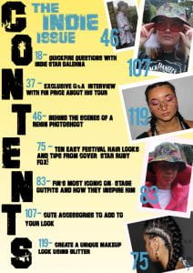
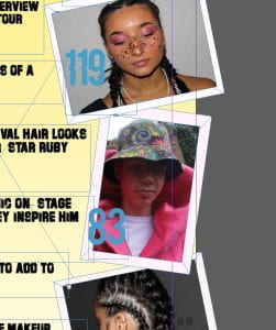
In both of my photoshoots, I took a lot of images that I really liked yet weren’t suitable for my front cover or double page spread, so the contents page was the perfect place for these images so I wanted them to look really good. On my contents page, I played a lot with the images I wanted to include and how to make them stand out. I first just placed them on the page but I didn’t like how they looked, I looked up and asked a classmate how to frame the images, but all I had to do was put a box behind the pictures to enhance them. Here is a screenshot of how they look placed like this on my first draft.
I have put the pictures at all different angles to look abstract. I have also gone over the side lines of the page so they look randomly placed and so I could fit my writing in the centre of my page without going on top of the images but I like the look of not all the images being perfectly on the page.
The tools I have used on this page is the spacing tools to make my fonts certain sizes and spaces between the letters. I have also used the align tool to measure the spaces between either sides of the images used with the background border.
I made the background light yellow to match my masthead but to also portray the indie pop theme by using a subtle, light colour. I like how my contents page ties in with my front cover and my genre because my cover star features twice on my contents page, stating the fact that she is a key person throughout this issue.
Even better if
My contents page will be even better if I make the changes I aim to make for draft 2, which include adjusting my text and colours to highlight the features of the page. I don’t think the blue works so I will change this to red which will make all my page numbers stand out too, which is good as this is the whole point of a contents page. This will really pull everything together and will conclude my contents page .
A new improved contents page
After lots of adjusting and adding colours, here is my second draft of my contents page …
What I have changed:
- I changed the whole colour scheme from blue to red. I feel as though this matches my front cover a lot more than draft 1 did.
- I added the masthead to the top of the page to advertise my brand
- Added red boxes around my page numbers so they stand out from my background
- Added a red gradient to the background/border of my images to match the red gradient on my front cover and to tie in with the rest of the red on the page.
- Changed the page number colours to white.
Making these changes, I have made the page more intriguing to the reader and nicer to look at. As it matches well with my front cover, this should draw the reader in so they find out what they can explore within my magazine.
Here is a voice recording from a classmate, Millie, analysing my new improved contents page.

