Critical Reflection Essay

  • How do the elements of your production work together to create a sense of ‘branding’?
  • How did your research inform your products and the way they use or challenge conventions?
  • How do your products represent social groups or issues?
  • How do your products engage with the audience?


A brand is a particular company under a name who sells their products to whatever market they are in. They tend to focus on selling the lifestyle to someone who uses their product, to engage the audience. It needs to be easily recognisable and you want it to stick in peoples head.

Dyer argued that star image is manufactured and is artificial and that individual stars have their own unique selling point. As exclaimed in Angel Delight’s mission statement, she states that her goal is for her ‘style to be as memorable as possible’ and that she is ‘not afraid to push boundaries and stereotypes’. We focused on this idea wh
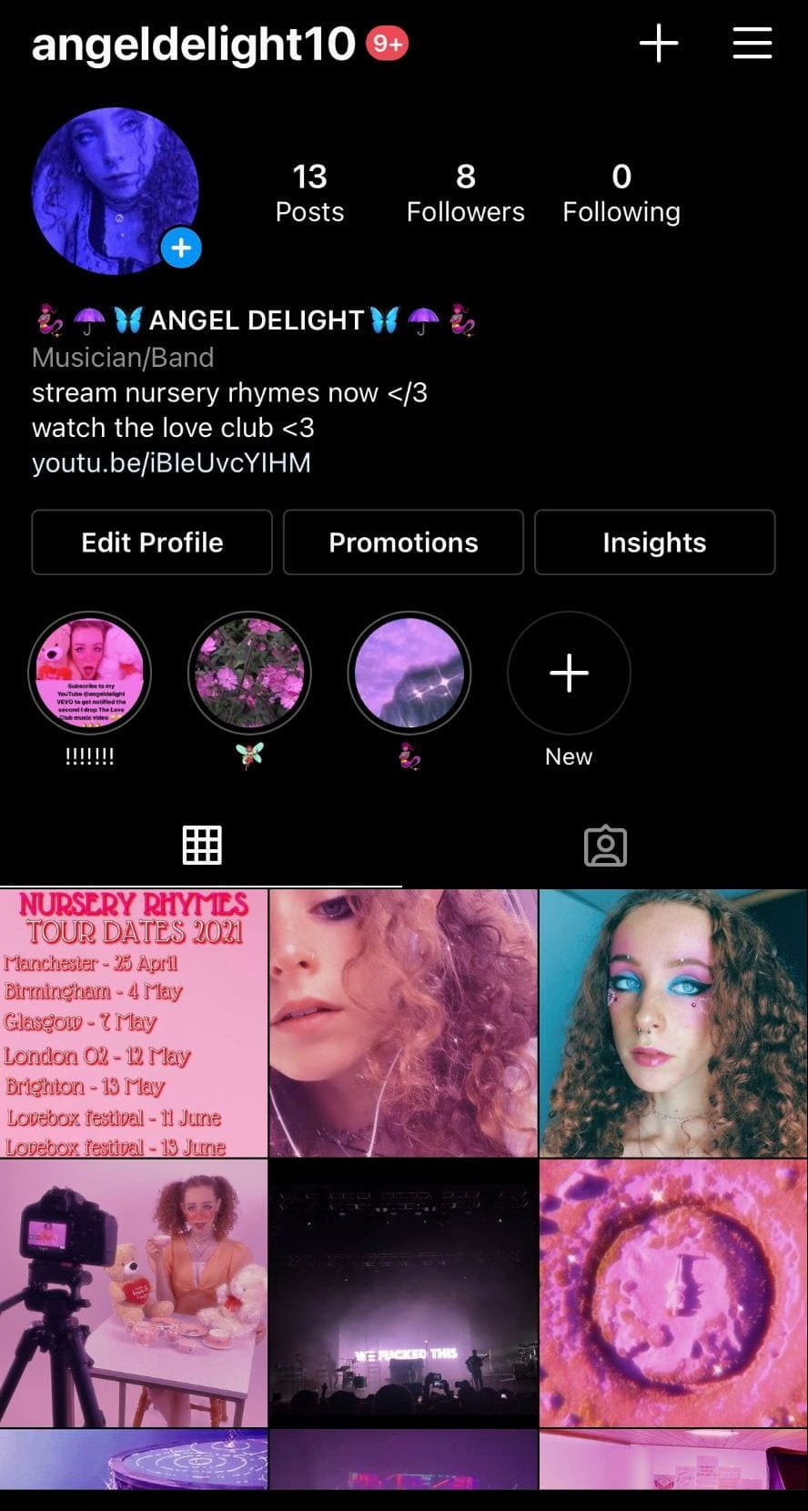
en selling and conveying our brand (the star) to an audience by making her overall look, social media pages and identity as eyecatching and as welcoming as possible.

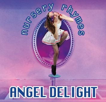
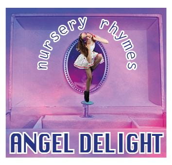
All of our products in the package work together to promote our bold, unique artist extremely well in my opinion. The ongoing colour scheme throughout all the products is something that we focused on selling and mentioned in our mission statement, which is one of the most stand out features in each product. It is extremely key to have a running theme throughout branding a product,  the childish pink colour scheme being ours. Hall suggested that audience decode ideology so when viewing our brand they will decode the message of the colour scheme.

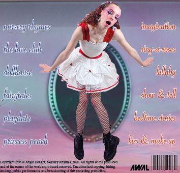
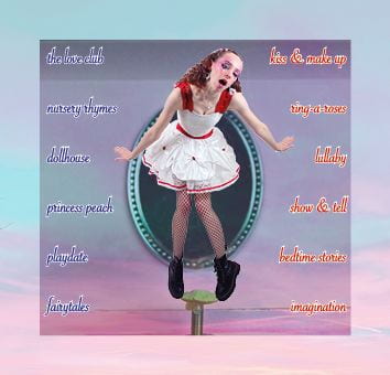
On top of this, we had the idea to convey a doll-like effect throughout all features of the package too to further convey this childish and playful theme in our star. Some examples being the name of the digipak is ‘nursery rhymes’ which is a term associated with children playing. Also the running theme of teddy bears throughout the music video and shoots further evidences this playful theme. These features all tie together to create and promote our overall brand.

We watched many pop music videos on the theme of love in pop and gathered key conventions and ideas that we wanted to convey in our own video. 

One example of a music video we watched was the K-12 series of music videos by Melanie Martinez – our favourite being The Principal; she was our biggest inspiration MES wise as we love her whole brand, colour scheme, pantamomic bright graphic makeup, themes and everything she promotes so being inspired by her is where our ideas stemmed from. 

Some conventional features we followed when conveying our genre in our music video was an increase in the editing pace towards the end of the video, fast editing pace is what Barthes would argue to be a semic code, it would be communicated to the audience as a sense of urgency, a build up to something significant. We followed the typical conventions as we thought this was a sensible idea as suggested by Altman and his Blueprint theory of knowing what is popular and sells a genre to an audience

‘Hating love’ was the key theme in our video therefore we had longshots and aerial shots to show our star being happy about love and skipping around then also contrasting extreme close up shots of her being angry and fed up almost acting as flashbacks throughout the video. These worked well as you really notice the angry emotion in her face because of the close up angle. Having repetitive anger shots of her ripping up paper and tearing apart the teddy bears portrays her destructive nature and rebelliousness alongside the unconventional mise en scene. 

We had an amplified music video as we took the themes of the lyrics to make the story about hating love and used exaggerated acting to portray this. We challenged the conventions of a typical pop music video as we had a different narrative structure and wanted to portray a series of different emotions, whereas conventionally it’s traditional to have a new equilibrium of a ‘happy ending’ in a love themed video but we had binary oppositions of love vs hate. 

Lacey states that audience have certain expectations, they want ‘the same but different’ this is considered a ‘repertoire of elements’. We have fulfilled Lacey’s statement of the same but different by our conventional use of MES in the camera angles and lighting, yet used unconventional MES  features in the outfit, hair and makeup looks throughout. Another symbolic unconventional feature we challenged was the use of the pink filter and pink clothes throughout the video, we did this in a not so girly way to symolise her unsterotypical nature – this makes our video stand out from competition in the market.

Looking at a variety of famous artists  album covers’ gave us an understanding for what the conventions are and what looks iconic. We looked at artists with a genre similar to ours, eg Melanie Martinez, Clairo and SIA to gather ideas for our digipak shoot. From these, we were inspired to use pink and girly imagery to match the stereotype of pink being associated with girls and the power of the female gender.

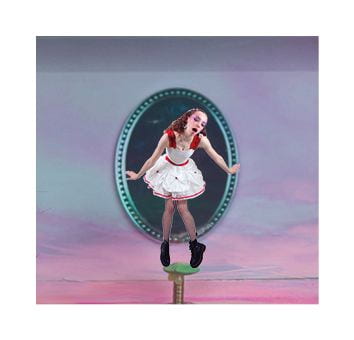
To match this, we enjoyed the idea of our star being heavily made up of over the top mise en scene to match the look of the music video, so this is exactly what we did. To help us convey this idea, we dressed our star as an unconventional ballerina; we put her in a tutu with fishnet tights with excessive jewelry and black doc martens to represent her as rebellious. These features also represent her as playful and unafraid of criticism. 

Dyer states that a star is both ordinary and extraordinary; suggesting that every artist is similar yet has their own musical and visual identity; different from the stereotype. In our digipak, we followed this idea by putting a twist on a typical ballerina’s look.

We relied on our audience understanding what Barthes would call our cultural code of the ballerina and music box imagery and the demographic of our star. We were passionate about  representing a theatrical and playful theme, this being a ballerina in a  music box which we thought was quite a childish and unconventional route to go down and hopefully the audience understood this by the amount of MES we encouraged on our model. 

Our Instagram page is a very visually engaging site which encourages other Instagram users to follow. Blumler and Katz suggested that there were four reasons, collectively known as Uses and Gratification, this theory described consumers and an active audience. These four are information, personal identity, social interaction and entertainment and we have taken these all into consideration when creating our social media site. 

We have designed the site so it is a blue/purple theme to entice our active audience and attract new consumers. We are very passionate about the social interaction side of this theory as we believe this is most important for maintaining followers so they don’t lose interest. Fans have been commenting that they are liking the content and are asking questions about touring! The more we post, the more interaction they have with us as a brand. We post teasers using polls and stories to get something back from our fans. 

We have many forms of engagement on our social media page from big announcements, like releasing the tour dates -which followers can share to their own stories to reach more people.  We also frequently do competitions, one of them being the chance to win tour tickets, to increase the reactions on posts and to feel a connection and engagement with the fans.

Some examples are doing polls on our stories to increase social interaction, or releasing the Love Club music video by sharing a link and asking people to comment on the post what they think, or with a specific emoji to signify they’ve listened to it or like it which creates a sense of personal identity of those commenting on the post. 

Hall suggested that there are 2 processes of the reception theory. First, the producer encodes ideology into an idea and wishes it to be viewed in a particular way. In this case, we encoded a specific colour scheme and special filters, called ‘san francisco’, and the idea to have a pastel, over saturated theme running throughout the social media page. After this, the audience then decodes the message or demographic, but they also bring their own ideology to the product which can be considered as personal identity – the viewers own opinion. We wanted them to decode it as being very girly, different from the stereotypes, female empowerment message. 


Social Media Page Draft 1

Below is the link to view Angel Delight’s Instagram page!

https://www.instagram.com/angeldelight10/

What went well:

  • We have kept to a very specific pink/purple colour scheme throughout our social media platforms to convey a nice aesthetic that follows our brand, music video and digipak which is key when promoting yourself as an artist
  • We have put promotion links of her album and most recent music video in the bio so when new followers visit the page, they are immediately enticed to watch
  • Lots of behind the scenes and teasers for fans to follow and keep up to date with
  • Using camera angles and other technical conventions to get the best pictures as possible for our site

What I am going to change/add for the final draft:

  • We are going to add a few more highlights to make the overall look more intriguing and it’ll match the colour scheme
  • We are still yet to do our final announcement post of the album
  • We will release some tour dates and some merch
  • We are going to add a call to action type post by promoting a product
  • We are going to post on stories promoting our other social media sites (cross media convergence) to reach a larger audience
  • Reply to fans comments
  • Release the digipak/album
  • Share more of various different charities posts to put our platform to good use and raise awareness to our audience and fans.

Synergy is a cooperation of two things to produce a combined effect, in this case a product to go along with the album. Synergy and will be clear to see on our social media platforms when we release our merchandise.

Our teacher has given us some constructive criticism for our social media page using a screencastify, which we will take her feedback and apply it to make our page better.

Timeline and Marketing ideas

I have made a timeline on google slides broadcasting what types of posts we are going to make on our Instagram page. This includes all the components from profile picture to stories, highlights and what sort of content we will typically post.

I have included examples of the type of content we will be posting on the social media page and reasons why these are good things to post eg. teasers.

I have at the end included sandbox famous examples of strategies that we could use in our own marketing techniques.


Audience interaction with a social media page – an analysis

To gain a better understanding of how an artist promotes themselves using their social media pages, it is good to analyse one. I have made a screencastify of myself going through and unpicking features of our biggest inspiration for our products, Melanie Martinez’s facebook account.

The uses and gratification model has once again enabled me to understand the importance of having an active audience. Her page clearly gives the audience all the information they need to know about herself and future events as well as keeping her followers entertained by posting exclusive clips and updates for them. Melanie is very big on the topic of being herself and being unique to form a sense of her own personal identity, unlike other similar artists she wants to stand out.

In the screencastify, I go over the importance of AIDA when posting on platforms as an artist. AIDA being Attention, Interest, Desire and Action.

Social Media Page Terminology

To grasp the conventions and themes across artists’ social media pages, we analysed some. I chose to analyse Melanie Martinez’s as she fits with our genre very well and was our biggest inspiration for our music video and digipak so I thought this was well suited.

She has social media accounts on many platforms such as Facebook, Instagram, Twitter and more but I analysed her Facebook page as this has most conventions such as an about section, header image and features like ‘pin to top’ whereas Instagram is just where she posts behind the scenes pictures and add to her story; meaning facebook was best to analyse for this task.

In this slideshow, I label her facebook page and what can be seen as soon as you go onto it, where the conventions are and how eyecatching she’s made it. She has put her album cover as her header image which is a really good way of advertising and marketing and getting her album cover out to an audience.

Digipak Draft 3

Finally we have draft 3 of our digipak in which we have altered to the feedback we were given in our screencastify from our teacher. She really liked our overall product but we have a few alterations to make which I have noted down below.


We have added the barcode and copyright etc, made the model bigger on the back page and most drastically, we have added some coloured opaque lines to the inside right page to add some effect as it was a dull image. We chose these colours because they match the inside left colours of the sunset really well and brings the whole theme together.

We asked our classmates what genre they thought our digipak was from first glance, without any indication, and everybody guessed pop. This is good because it means our brand is portrayed well in the colour scheme, name of the album and star and also the model and her mise en scene.

We are still yet to decide on a font for the name of the star on the front cover, but for now this is our draft 3!


Digipak draft 2

We have worked on our feedback and targets to improve and composed a draft 2.

What we changed:

  • Completely changed the inside right image to a plain picture of a sunset and the clouds to add some variety
  • Adjusted the whole back page as the fonts didn’t work
  • Swapped the picture from page 3 to the back page
  • Made the layout of the tracklist half and half, and different colours

What we are still yet to change:

  • Incorporate some colour from the inside left image into the inside right image, ie. yellows, oranges, purples (somehow)
  • Maybe change the font of ‘Angel Delight’ as doesn’t really fit the same theme as the tracklist
  • Make the model on the front page bigger.

Here is a screencastify feedback from our teacher of our draft 2 of our digipak

Targets for improvement:

  • Spine on back cover, barcode, copyright and music record company
  • Change font on either back page or front to match
  • Do something with 3rd page, we are going to add some colour

Digipak draft 1

We have finally completed the first draft of our digipak completing all 4 sides as a rough draft.

What we like and will keep for future drafts: 

  • The images of the model chosen, we will keep these as we are sticking with the model being in the music box idea
  • The inside left page, we love the transparency of the image of our model behind the sunset image, we think it is very eyecatching
  • The front image of the music box, it is perfectly zoomed in so you can really tell it is a music box especially with the model posing like a ballerina on the stand too, just helps portray the message.

What we are going to be changing in future drafts:

  • Finish the tracklist and be unconventional by not having the name of the tracks straight down the middle
  • Change some of the fonts, don’t feel like they fit very well
  • Use a plain image for inside right because otherwise our model is on all four sides.

Self assessment:

The use of camera and photoshop to manipulate engaging images is clear to see especially on the front pane by the  purposely artifical image of her in the music box . We are going to use photoshop when creating our draft 2 especially when cutting out and putting the model onto the music box again for the back pane. The use of camera angles has helped us create the perfect images of our model being a rebellious ballerina.

The use of unconventional mise en scene is clear with the contrast of the pretty ballerina dress alongside the black boots and fishnet tights to convey a playful look. We have also given the model extremely exaggerated pastel coloured makeup to match the theme of the rest of our digipak which is sunset colours.

It is clear to see we have used desktop publishing when forming this draft of our digipak. It is particularly evident that we have used InDesign in the inside left pane in which we have layered two images, a sunset and a picture of our model, to create a pastel transparent colour on her face.

Evaluation of shoot

To summarise our digipak shoot, it went very well and we got the images we really wanted to get which will fit onto the picture of the music box perfectly! Due to the outfit and mise en scene, she really looks like ballerina that doesn’t follow the stereotypes which is the idea we were going for.

These are the cut out images of her which we will then put onto InDesign onto the picture of the music box.

Here is the picture we got of the music box for our front cover, it is tattered and broken but this almost adds to the effect of the model being edgy and different and not perfect.

We will replace the plastic ballerina in the box with our model which will look really effective in the end. Overall our shoot went very well

Contact sheet

Here is a contact sheet with all the images taken in our digipak studio shoot.

Here are my top 3 favourite images from the shoot

The second image is the one we are using for the front cover of her posing in the music box which I think will look extremely efffective. The other two images we will be using in the inside pages of our digipak.