Month: October 2019

Communicating my Brand

In order to communicate my brand, I had to search for design ideas. As a designer, I have to search for ideas that I can appropriate (borrow) and incorporate (blend) into my work.

I searched up pictures, words, designs, outfits and accessories to which gave me a wider insight into the pop genre. This will give me inspiration for my own magazine.

Click on the image to see my Pinterest board

My magazine mood board will help re-direct me when I am struggling for inspiration and ideas as I design my magazine. By searching these design, graphics and typefaces and referring back to my word cloud I can build a bigger picture for my magazine and how each part can create a narrative to my target audience and make sure that my magazine can be easily decoded.

My Audience Profile

Above is my audience profile which explores a dating profile of a 17-year-old girl who loves the music genre Pop.

I researched into my target audience :

  • Demographics – who they are
  • Psycho graphics –  their personal ideology (values, opinion, beliefs)
  • Situated Culture
  • Cultural Experiences

The preferred reading I need to make sure I am encoding everything the audience can decode. This is through the producers ideology and what is being encoded and the audience ideology and what they can decode.  The reception theory by Stuart Hall will make sure that I can see the uses and gratifications through entertainment, education, social interactions and personal identity and provide a preferred reading ideas of my music genre through audience accepted the values and ideas encoded in the text.

Reflecting on my audience profile I can clearly see the preferred reading of my target audience member through their values and beliefs through demographics, psycho graphics and cultural experiences. Also through the Uses and Gratification – entertainment, education, social interaction and personal identity. I can focus as a producer of media myself on what I can encode into my magazine and if it can be easily decoded by my target audience.

Branding Ideas + Mission Statement

Genre: Pop Music

Name: Chartz 

Word cloud: An image displaying the ideology of pop.

Ideology – aim to appeal to a broader audience ins†ead of specific subcultures. As “pop” means “a piece of music having a popular appeal”. Appealing to a younger target audience associated with cheesy and straightforward songs. A characteristic with pop music is the idea that the production, recording and technology are more important on the record than life. It involves nr editing and sound techniques which are essential for pop records. A lot of pop music starting with no intentional meaning, become meaningful after being released to the public as everyone has a different perception and reaction to the song.

Pop music is associated with feminism, whereas genres such as rock seem very masculine. 

Pop music changes all the time, depending on exactly what style of music is getting the most coverage and good reception at the time. Stereotypically, people who enjoy listening to pop music have a very fashionable and up to date image because they are interested in new trends of clothing and styles, just as they are interested in the new trends of music. Pop music fans generally become engaged in anything that is current and up-to-date.

Mission Statement: Chartz provides readers with the chance to keep up to date with the latest charts and artists that interest them. We also strive to engage our readers with the magazine by doing so we will create a sense of belonging and interest.

So… I’m ready to make some media!

When making my own magazine cover I need to think about the many different components that can help represent my specific genre and portray a narrative. This includes :

  • Framing – midshot, highshot, long shot
  • Camera angles and distance – midshot, highshot, long shot  
  • Functions – Shutter Speed, ISO, Aperture 
  • Type of shot – tracking, panning, craine, aerial shot
  • Depth of field – Wide angle shot – point of view – rule of thirds
  • Mise-en-scene – costume, lighting, acting, make-up, props, setting 
  • Body Language, Proxemics, Class and Status
  • Master Shot, Framing Shot, Two-Shot
  • Psychographics – Cultural meaning

Also I will have to focus on : 

  • Typeface – easily understandable, what it suggests to the reader
  • Colour symbolism and emotional response
  • The page layout – the cover star and typefaces 
  • Pugs, call-outs, captions, slogans
  • Audience demographics and psychographics – the tone being presented to them.

Focusing forward I need to focus on the ‘AIDA’. My magazine should :

  • Attract the audience
  • Engage their interest
  • Create desire 
  • Call the action
  • I will also take into account Blumler and Katz concept of the Uses and Gratification Theory (1987) which explored Entertainment, Social Interaction, Information and Personal Identity and how audiences are attracted to different social platforms.

My Tour Poster

Psychedelic rock involves a lot of bright colours, patterns and images which provides an eye-catching element to the CD, magazine and poster covers. The bright, young and interesting elements draw attention to its target audience through their interest of psychedelic rock. The desire of this genre of rock stands out from the crowd to its customers by its lively and vibrant side which expresses an action and narrative in each image. It provides a conventional but unique side. Which I will follow to make mine stand out and provide attention, desire, action and inspire my target audience.

Look at the different covers that relate to my specific genres and I saw how ‘conventional’ the colour palettes are for each cover.  When making my poster I will need to make sure I  follow the conventions but create an innovative and eye-catching poster.

My Tour Poster  


Click on the image above to see the image clearer.

My Magazine Front Page Swede

Please click on this image to see the clearer pdf


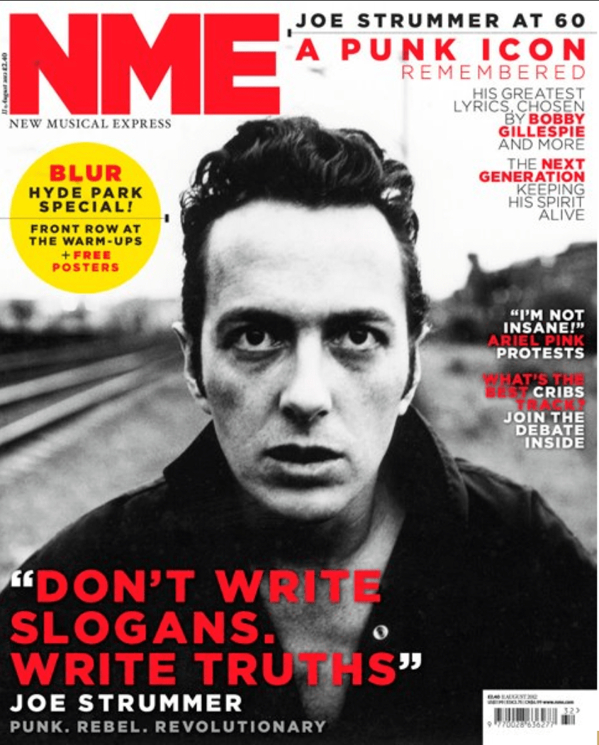
Original

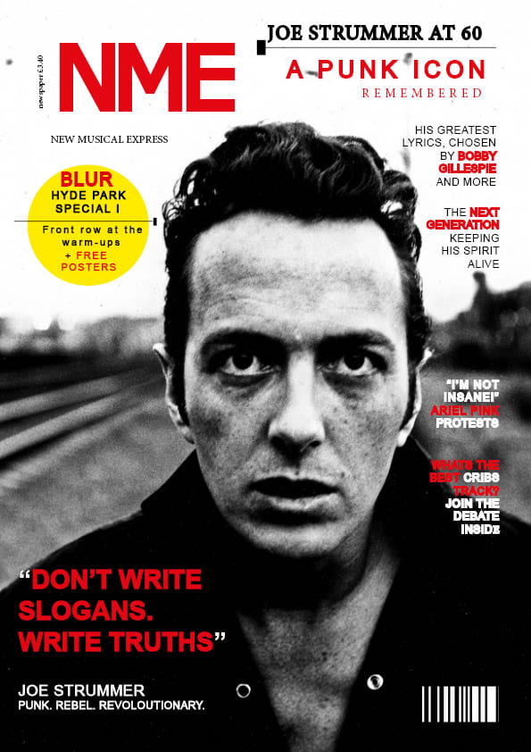
  • My music magazine swede focused on Joe Strummer and the iconic magazine NME.  I worked my way around Indesign concentrating on the specific features.Three strengths :
  • I used the ellipse tool, and the yellow fill to create a plug,  this mimics the real magazine.
  • I focused on the placement of each word on the layout of the magazine and which ones need bold with stroke weight.
  • I also inserted the key features of the magazine such as the bar code and the cover star image filling the page.

    Three weaknesses
    :
  • I struggled with finding the correct font in order to use stroke to add weight alongside it and still look like original.
  • The sizing of the fonts are too small (especially the NME Mast Head)
  • The barcode is not as small and detailed as the original.

I have learnt the different component to be used in Indesign. For example, the ellipses tool, stroke weight, font type, colour and the placing of letters. This will help me when creating my own cover front as it provides the knowledge to edit my masthead, image, main cover and plugs.

3 videos on the part I could improve in Indesign :

Start from 9 minutes into the video


A Front Cover Analysed

Focusing on the textual analysis of Billboard Music Magazine.I looked at the:

  • Font 
  • Colour Palette
  • Images
  • Language 

The textual analysis also had to fit with the audience demographic specific for Billboard and their target audience. This was successfully portrayed through the font being bold and easy to read and also italics used which is very eye catching and modern for the younger audience as it infers a young and carefree side. Furthermore the italics infers a light and elegant side to the cover and could bring a feminine side to the cover. 

The colour palette used provides white and a pastel blue colour connoting a friendly and uplifting side to the cover.This fits with the young target audience as they are fun seeking active young people and the colours infer a stylish side. 

The image used of the Cover Star Billie Eilish is perfect for their audience demographic as it focuses on her as an individual with her fixed eye contact and breaking the fourth wall to her youthful audience and how they can aspire to her. Her serious but moody face represents her carefree nature as most teens like to rebel and can relate to her.

The language used is simplistic but rebellious to infer the carefree and excitement to the target audience and an unconventional side to the cover for the unconventional audience with the wide range of multicultural music.


Audience Profiling

I researched in the UNCUT Magazine and their target market through the demographic and psychological group and also the socio-economic class. This will all help me in the lead up to my media magazine and how I will target my specific audience through their ages, gender, class and interests and clearly convey my mission statement.

Demographics –  data information is used in media marketing to classify an audience by age, gender, race and other categories. In media, as in all business, demographics are used to pinpoint potential audience growth and to spot under-performance.

Psychhographics – the study of consumers based on their activities, interests, and opinions. Psychographics focuses on understanding cognitive attributes, such as customer emotions, values, and attitudes, among other psychological factors.

These 2 different types of graphics help to identify communities interest and opinions and the growth in specific segmentations of a businesses audience through their Uses and Gratification of the media.The Blumer and Katz theory (entertainment, information, social interaction and personal identity) can be followed by using the correct content and successfully demonstrating their narrative to the target audience.

It is vital to know your customers and what their likes and interests.This helps to know you target audience and what type of magazine they are looking for.

  • Masthead – The Masthead is moderately large but is slightly covered by the cover stars heads, this makes The Black Keys stand out as the main focus.
  • Name – The name of the Magazine “UNCUT” means not trimmed. It represents how all the stories are there given to you straight.
  • Colours – The page is Burgandy. However, uses dark items of clothing and blue and red CD Case.
  • Design – The design is simple but many small features (plugs and captions) to give an insight into the magazine.
  • Articles – The issues contain The Black Keys and other rock artist (David Bowie, Bill Callahan)
  • Images – The image as the main focus of the cover is the band The Black Keys.