Please click on this image to see the clearer pdf
Original
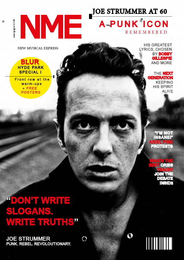
- My music magazine swede focused on Joe Strummer and the iconic magazine NME. I worked my way around Indesign concentrating on the specific features.Three strengths :
- I used the ellipse tool, and the yellow fill to create a plug, this mimics the real magazine.
- I focused on the placement of each word on the layout of the magazine and which ones need bold with stroke weight.
- I also inserted the key features of the magazine such as the bar code and the cover star image filling the page.
Three weaknesses : - I struggled with finding the correct font in order to use stroke to add weight alongside it and still look like original.
- The sizing of the fonts are too small (especially the NME Mast Head)
- The barcode is not as small and detailed as the original.
I have learnt the different component to be used in Indesign. For example, the ellipses tool, stroke weight, font type, colour and the placing of letters. This will help me when creating my own cover front as it provides the knowledge to edit my masthead, image, main cover and plugs.
3 videos on the part I could improve in Indesign :
Start from 9 minutes into the video
Leave a Reply